Port authorities, logistics companies, and infrastructure contractors handle complex tender processes every year. These tenders involve large contract values, multiple bidders, varying cargo types, long bid cycles, and significant financial risks. However, when tender data remains scattered across Excel sheets and static reports, tracking performance becomes slow and error-prone.
That is exactly why a Port Tender Dashboard in Power BI becomes a powerful solution.
This ready-to-use Power BI dashboard converts raw port tender data into clear, interactive, and actionable insights. It helps management track tender status, profitability, bidder performance, cargo-wise risk, and monthly trends from a single screen.
In this article, we will explain how the dashboard works, what each page shows, and how it supports better tender and financial decision-making.
What Is a Port Tender Dashboard in Power BI?
A Port Tender Dashboard in Power BI is an interactive analytical solution designed to monitor and analyze port-related tender activities. It consolidates data related to tenders, ports, bidders, cargo types, revenues, costs, and profitability into structured visuals.
Instead of manually reviewing hundreds of tender records, this dashboard allows users to:
-
Track awarded, under-evaluation, closed, and cancelled tenders
-
Monitor profit margins and expected revenue
-
Analyze port-wise and bidder-wise performance
-
Identify high-risk cargo types
-
Understand monthly tender trends
Because it is built in Power BI, the dashboard offers fast filtering, drill-downs, and real-time insights.
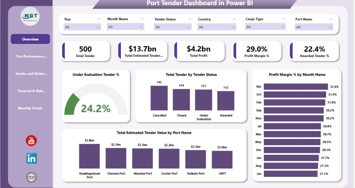
Overview Sheet – Executive Summary
Click to Buy Port Tender Dashboard in Power BI
The Overview page acts as the command center of the dashboard. It provides high-level KPIs and summary visuals that help leadership understand overall tender performance instantly.
KPI Cards
The following cards appear at the top of the dashboard:
-
Total Tenders
Shows the total number of tenders recorded in the system. -
Estimated Tender Value
Displays the combined estimated value of all tenders. -
Profit
Represents the total projected profit across all tenders. -
Profit Margin %
Shows overall profitability as a percentage. -
Awarded Tender %
Indicates the success rate of tenders awarded.
These KPIs help executives quickly assess financial health and tender success.
Overview Charts
The Overview page also includes powerful charts:
-
Total Tender by Tender Status
Visualizes how many tenders are awarded, under evaluation, closed, or cancelled. -
Under Evaluation Tender %
Highlights the proportion of tenders still pending decision. -
Profit Margin % by Month
Shows how profitability changes month by month. -
Total Estimated Tender Value by Port Name
Identifies which ports contribute the highest tender value.
Together, these visuals provide a fast and reliable snapshot of tender performance.

Click to Buy Port Tender Dashboard in Power BI
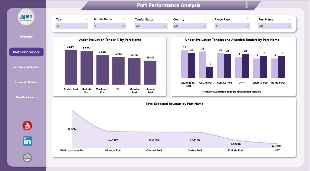
Port Performance Analysis
The Port Performance Analysis section focuses on comparing performance across different ports.
📊 Charts Included
-
Under Evaluation Tender % by Port Name
Helps identify ports with slower tender decision cycles. -
Under Evaluation vs Awarded Tenders by Port Name
Shows tender conversion efficiency for each port. -
Total Expected Revenue by Port Name
Highlights ports generating the highest expected revenue.
This analysis helps port authorities and contractors understand which ports perform efficiently and which require process improvements.
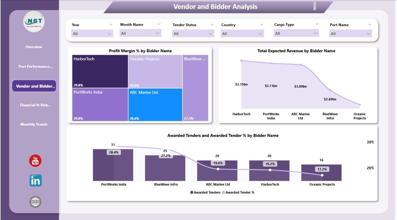
Vendor and Bidder Analysis
Bidders and vendors play a crucial role in tender success. This section helps evaluate bidder performance and financial contribution.
📊 Charts Included
-
Profit Margin % by Bidder Name
Shows which bidders deliver better margins. -
Total Expected Revenue by Bidder Name
Identifies high-value bidders.
These insights support better vendor selection, negotiation strategies, and long-term partnerships.
Click to Buy Port Tender Dashboard in Power BI
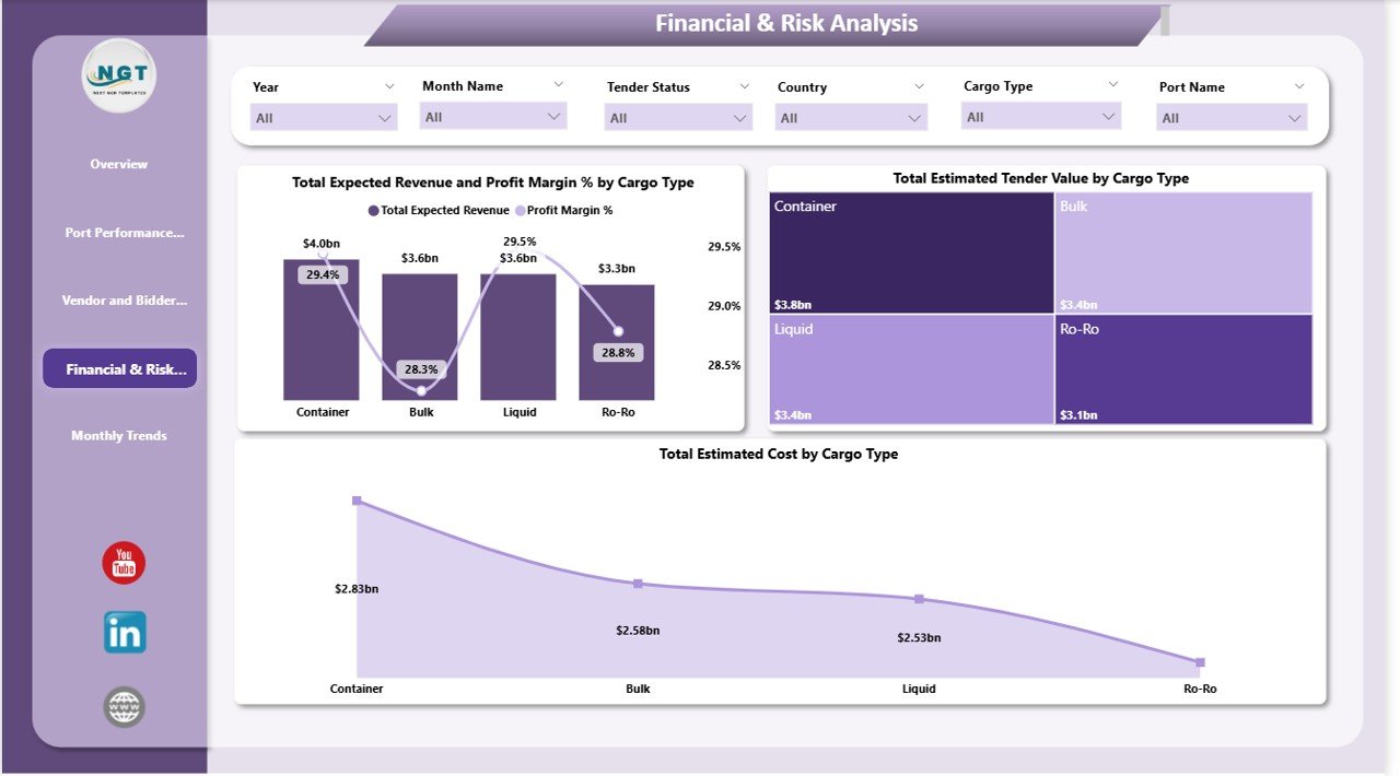
Financial & Risk Analysis
Different cargo types carry different cost structures, risks, and margins. This section helps analyze those variations clearly.
📊 Charts Included
-
Total Expected Revenue and Profit Margin % by Cargo Type
Compares revenue potential and profitability across cargo categories. -
Total Estimated Tender Value by Cargo Type
Shows where most tender value is concentrated. -
Total Estimated Cost by Cargo Type
Helps identify cost-intensive cargo operations.
This analysis allows teams to manage financial risk more effectively and prioritize profitable cargo segments.
Click to Buy Port Tender Dashboard in Power BI
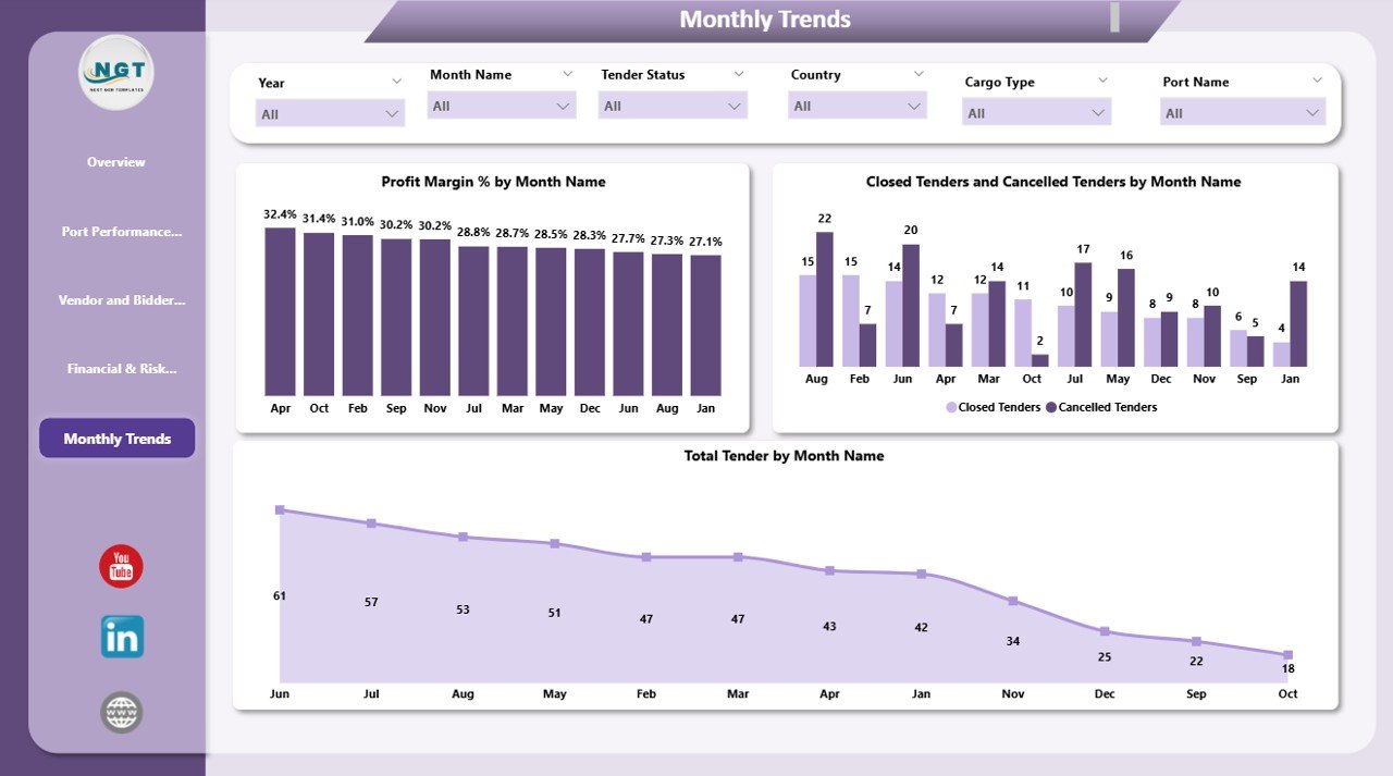
Monthly Trends Analysis
The Monthly Trends page tracks how tender activity evolves over time.
Charts Included
-
Profit Margin % by Month Name
Tracks profitability trends across months. -
Closed Tenders and Cancelled Tenders by Month Name
Shows operational efficiency and decision outcomes. -
Total Tender by Month Name
Highlights seasonal or cyclical tender activity.
This view supports forecasting, capacity planning, and strategic scheduling.
Click to Buy Port Tender Dashboard in Power BI
Key Benefits of the Port Tender Dashboard in Power BI
Using this dashboard delivers several business advantages:
Centralized Tender Visibility
All tender data stays in one interactive dashboard.
Faster Decision-Making
Executives access real-time insights without manual reports.
Improved Profitability Control
Profit margin and cost analysis reduce financial risk.
Better Vendor Management
Bidder performance becomes transparent and measurable.
Risk-Aware Cargo Planning
Cargo-wise analysis supports smarter tender selection.
Stronger Forecasting
Monthly trends help plan future tender strategies.
Who Can Use This Dashboard?
Click to Buy Port Tender Dashboard in Power BI
This dashboard suits multiple stakeholders:
-
Port Authorities
-
Logistics & Shipping Companies
-
Infrastructure Contractors
-
Procurement & Tender Teams
-
Finance & Risk Management Teams
-
Senior Management
Best Practices for Using the Dashboard
-
Update tender data regularly
-
Review under-evaluation tenders weekly
-
Track profit margins before awarding tenders
-
Compare bidder performance quarterly
-
Use monthly trends for forecasting
-
Align financial analysis with cargo risk profiles
Conclusion
Click to Buy Port Tender Dashboard in Power BI
The Port Tender Dashboard in Power BI transforms complex tender data into meaningful business insights. It enables organizations to track tender performance, manage financial risk, evaluate bidder efficiency, and improve profitability—all from a single, interactive dashboard.
Visit our YouTube channel to learn step-by-step video tutorials
Youtube.com/@NeotechNavigators
Watch the step-by-step video tutorial:
Click to Buy Port Tender Dashboard in Power BI