In today’s fast-paced business environment, monitoring project performance is critical for organizational success. A Project Management Office (PMO) KPI Dashboard in Power BI can provide clear insights into key metrics, helping managers make informed decisions. This ready-to-use dashboard simplifies tracking, analysis, and reporting of KPIs, ensuring your projects stay on time, within scope, and on budget.
In this article, we will explore the features, benefits, best practices, and usage of a PMO KPI Dashboard in Power BI.
Click to buy Project Management Office (PMO) KPI Dashboard in Power BI
What is a PMO KPI Dashboard in Power BI?
A PMO KPI Dashboard in Power BI is a dynamic reporting tool that displays project-related Key Performance Indicators (KPIs) in an interactive format. Using Power BI, project managers and executives can monitor, analyze, and compare performance data for multiple projects.
This dashboard helps organizations identify bottlenecks, assess project health, and make data-driven decisions. It is especially useful for PMOs that need to standardize project reporting across teams and departments.
Key Features of the PMO KPI Dashboard in Power BI
The PMO KPI Dashboard in Power BI comes ready to use and connects to an Excel data source. It includes three main pages:
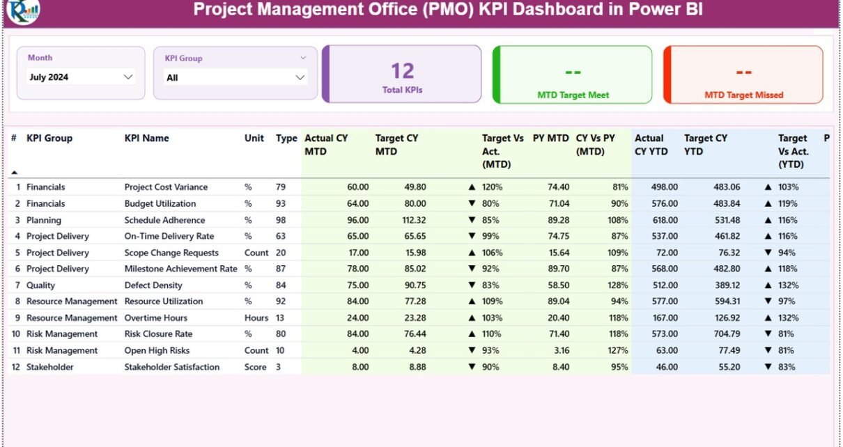
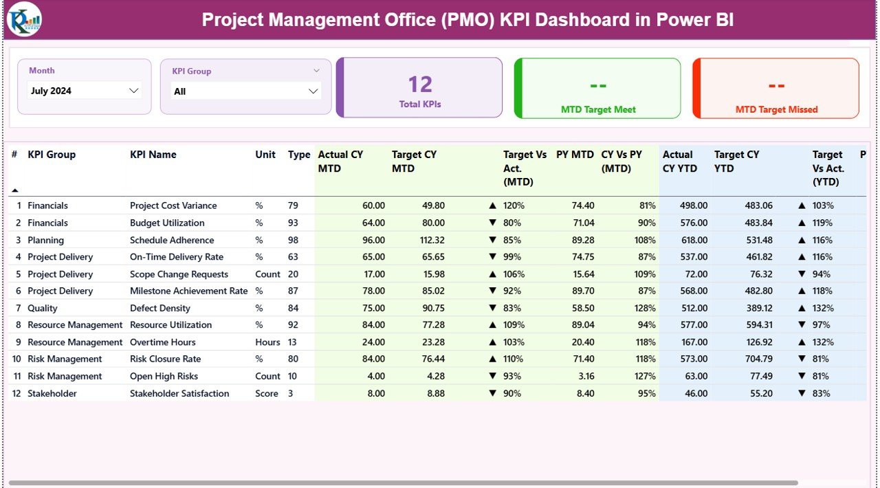
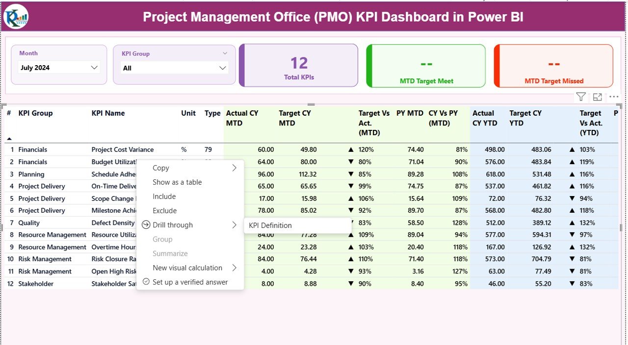
Summary Page
The summary page is the heart of the dashboard. It provides an overview of all KPIs in an intuitive layout.
Key elements include:
- Month and KPI Group Slicer: Filter KPIs by month or category.
- Cards: Display total KPIs count, MTD (Month-To-Date) target met count, and MTD target missed count.
- Detailed KPI Table: Includes the following columns:
- KPI Number: Sequence number of the KPI.
- KPI Group: The category or group of the KPI.
- KPI Name: The specific KPI name.
- Unit: Measurement unit for the KPI.
- Type: Indicates whether the KPI is LTB (Lower the Better) or UTB (Upper the Better).
- Actual CY MTD / Target CY MTD: Shows the current month’s actual and target values.
- MTD Icon: Red ▼ or green ▲ to indicate performance against target.
- Target vs Actual (MTD %): Calculates actual/target percentage.
- PY MTD: Previous year’s MTD value.
- CY vs PY (MTD %): Compares current MTD with previous year MTD.
- Actual CY YTD / Target CY YTD: Year-to-date values for current year.
- YTD Icon: Red ▼ or green ▲ to indicate YTD performance.
- Target vs Actual (YTD %): Calculates YTD actual/target percentage.
- PY YTD: Previous year’s YTD value.
- CY vs PY (YTD %): Compares current YTD with previous year YTD.
This page provides a snapshot of KPI performance at a glance. Managers can immediately see which KPIs are meeting targets and which require attention.
Click to buy Project Management Office (PMO) KPI Dashboard in Power BI
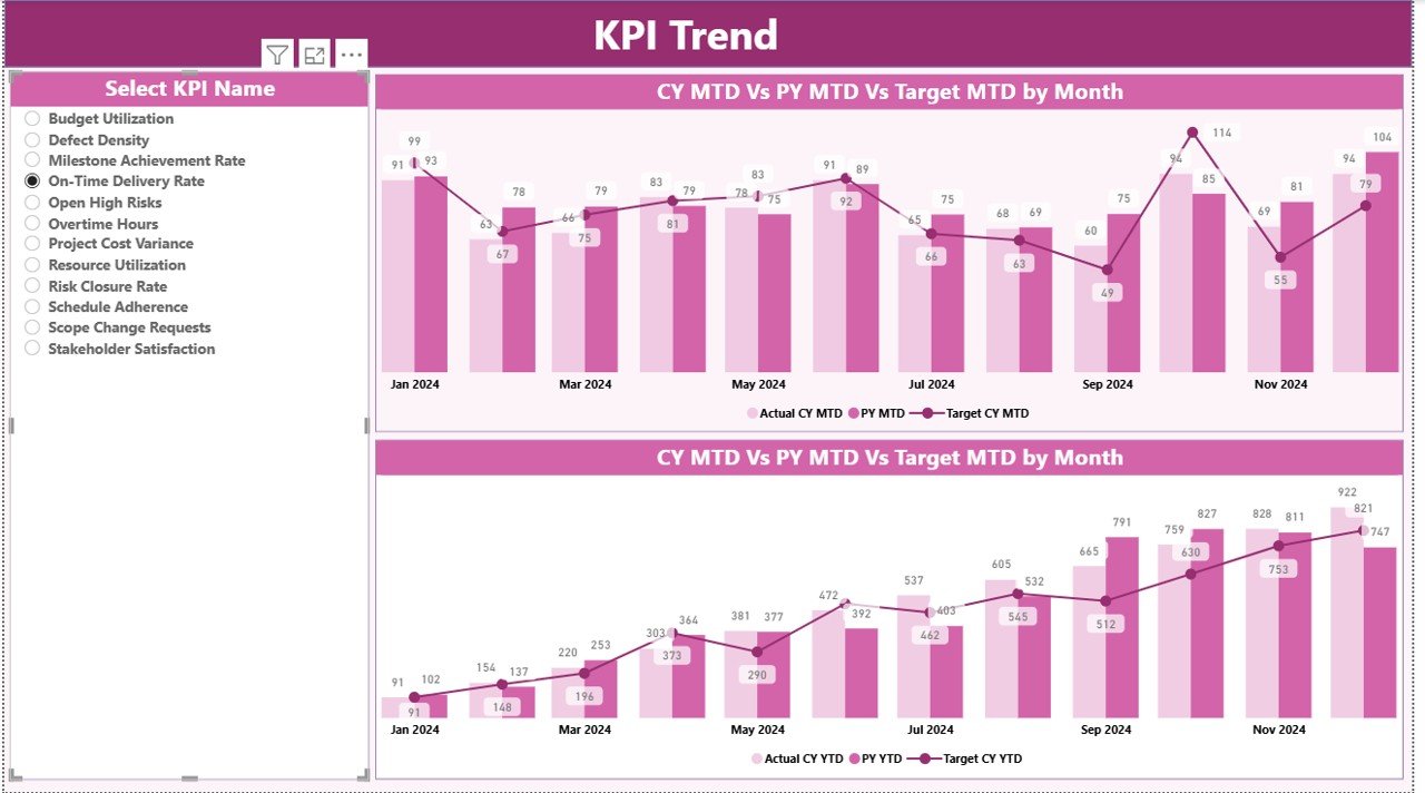
KPI Trend Page
The KPI Trend Page visualizes the progress of KPIs over time.
Key features:
- Combo Charts: Display actual numbers for current year, previous year, and targets for both MTD and YTD.
- KPI Slicer: Select individual KPIs to view their trend analysis.
This page is particularly useful for identifying trends, seasonal patterns, and areas requiring corrective action.
Click to buy Project Management Office (PMO) KPI Dashboard in Power BI
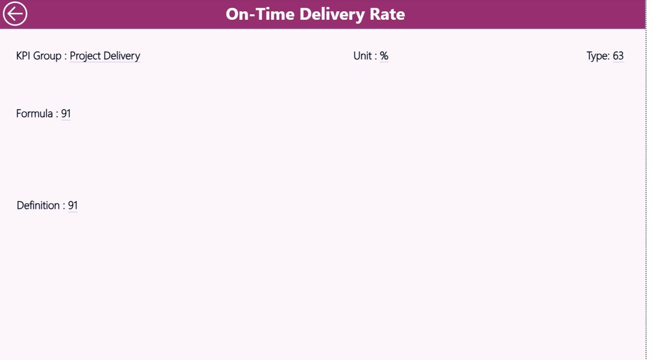
KPI Definition Page
The KPI Definition Page is a drill-through page that is hidden from the main view.
Features include:
- Detailed KPI definition
- Formula used to calculate the KPI
- KPI type (LTB or UTB)
Users can drill through from the Summary Page to view detailed information about each KPI. A back button allows easy navigation to the main dashboard.
Click to buy Project Management Office (PMO) KPI Dashboard in Power BI
How the PMO KPI Dashboard Works with Excel
The PMO KPI Dashboard in Power BI uses an Excel file as a data source. The Excel file has three worksheets:
- Input_Actual Sheet
- Fill in the actual numbers for each KPI.
- Include month (first date of month), MTD, and YTD numbers.
- Input_Target Sheet
- Fill in the target numbers for each KPI.
- Include month (first date of month), MTD, and YTD numbers.
- KPI Definition Sheet
- Fill in KPI details such as KPI Number, KPI Group, KPI Name, Unit, Formula, Definition, and Type (LTB or UTB).
This structure ensures seamless integration with Power BI, allowing for dynamic updates and real-time analysis.
Click to buy Project Management Office (PMO) KPI Dashboard in Power BI
Advantages of a PMO KPI Dashboard in Power BI
Implementing a PMO KPI Dashboard in Power BI offers several advantages for organizations of all sizes:
- Centralized Project Monitoring
The dashboard consolidates data from multiple projects, providing a single source of truth. Managers can monitor all KPIs in one place, reducing the need for manual reporting.
- Real-Time Insights
With Power BI, KPI values are updated in real-time. This helps project managers quickly respond to performance gaps and make proactive decisions.
- Improved Decision Making
Interactive visuals and trend analysis enable data-driven decisions. Leaders can focus on areas needing improvement and allocate resources efficiently.
- Enhanced Visibility
The summary and trend pages provide a clear view of project performance for executives, stakeholders, and team members.
- Time Efficiency
Automation of KPI tracking reduces manual work, allowing PMOs to focus on strategy and execution rather than data collection.
- Customizable Reporting
Organizations can customize dashboards to include additional KPIs or filter data by project, team, or period.
Best Practices for Using a PMO KPI Dashboard
To maximize the benefits of your PMO KPI Dashboard in Power BI, follow these best practices:
- Define Relevant KPIs
Choose KPIs that align with your organizational objectives. Avoid including unnecessary metrics that can create confusion.
- Maintain Data Accuracy
Ensure Excel input sheets are updated regularly and checked for accuracy. Accurate data ensures reliable insights.
- Use Interactive Filters
Leverage slicers and filters to enable detailed analysis. Filters for months, KPI groups, and project teams make dashboards more interactive.
- Visualize Trends Clearly
Use combo charts and conditional formatting (icons for MTD/YTD) to make trends and performance gaps visually clear.
- Regularly Review KPI Definitions
Keep KPI definitions up-to-date to reflect changing business goals. This ensures the dashboard remains relevant over time.
- Train Users
Provide training for PMO staff on how to navigate, filter, and interpret the dashboard for better adoption.
How PMO KPI Dashboards Enhance Project Performance
A well-designed PMO KPI Dashboard provides a wealth of information at your fingertips. Here’s how it helps:
- Track Progress: Keep an eye on all critical KPIs across projects.
- Identify Risks: Quickly spot KPIs that are off-target.
- Benchmark Performance: Compare current performance with previous periods.
- Optimize Resources: Allocate resources where they are needed most.
- Improve Accountability: Each KPI can be linked to a responsible team or individual.
By using this dashboard, PMOs can create a culture of accountability and continuous improvement.
Common KPIs to Track in a PMO Dashboard
Some of the most important KPIs to monitor in a PMO KPI Dashboard include:
- Project Completion Rate – Measures how many projects finish on time.
- Budget Variance – Tracks differences between planned and actual spending.
- Schedule Variance – Compares planned vs actual project timelines.
- Resource Utilization – Measures how efficiently resources are used.
- Risk Resolution Rate – Tracks how quickly identified risks are mitigated.
- Quality Metrics – Monitors project outputs against quality standards.
Tracking these KPIs ensures that projects align with organizational goals and deliver expected results.
Why Choose Power BI for PMO KPI Dashboards?
Power BI is an ideal tool for PMO KPI Dashboards due to its powerful features:
- Interactive Visuals: Drill-throughs, slicers, and filters make dashboards easy to navigate.
- Integration with Excel: Simple data input via Excel sheets ensures accessibility.
- Dynamic Updates: Automatic updates provide real-time insights.
- Customizable Reports: Create tailored reports for executives, project managers, or teams.
- Trend Analysis: Easily compare current performance with previous periods to spot trends.
Steps to Implement a PMO KPI Dashboard in Power BI
- Define Objectives: Identify the goals of the PMO and select relevant KPIs.
- Prepare Data: Use Excel sheets to input actual and target numbers for KPIs.
- Design Dashboard: Create pages for summary, trend analysis, and KPI definitions.
- Add Visuals: Use cards, tables, and combo charts for clear representation.
- Set Up Drill-Through: Allow detailed exploration of individual KPIs.
- Test and Validate: Ensure data is accurate and calculations are correct.
- Train Users: Provide guidance on interpreting and using the dashboard effectively.
Tips for Maximizing Dashboard Effectiveness
- Keep dashboards simple and focused.
- Highlight deviations from targets using color codes.
- Provide context with previous year comparisons.
- Use interactive slicers to explore data by project, month, or KPI group.
- Regularly update data to maintain relevance.
Conclusion
A Project Management Office (PMO) KPI Dashboard in Power BI is a must-have tool for any organization aiming to enhance project performance. By providing real-time insights, clear trend analysis, and detailed KPI definitions, it helps PMOs track progress, identify risks, and make data-driven decisions.
With its interactive features, customizable visuals, and seamless integration with Excel, the dashboard enables better project monitoring, improved accountability, and enhanced strategic decision-making.
Adopting a PMO KPI Dashboard in Power BI not only simplifies reporting but also ensures that your projects align with organizational goals and deliver expected results efficiently.
- Frequently Asked Questions (FAQs)
- What is a PMO KPI Dashboard in Power BI?
- It is a visual reporting tool that tracks project performance KPIs in real-time, providing insights into trends, targets, and project health.
- How does the dashboard work with Excel data?
- The dashboard uses three Excel sheets—Input_Actual, Input_Target, and KPI Definition—as a data source. Users fill in actual and target values, which Power BI then visualizes.
- What are the key pages in a PMO KPI Dashboard?
- The dashboard includes:
- Summary Page (overview)
- KPI Trend Page (charts and trend analysis)
- KPI Definition Page (drill-through details)
- What are the advantages of using this dashboard?
Key advantages include centralized monitoring, real-time insights, improved decision-making, enhanced visibility, time efficiency, and customizable reporting.
- Which KPIs should I track in a PMO dashboard?
- Common KPIs include project completion rate, budget variance, schedule variance, resource utilization, risk resolution rate, and quality metrics.
- How often should I update the dashboard data?
- It is recommended to update data monthly or whenever project data changes to ensure accurate and timely insights.
- Can I customize the PMO KPI Dashboard?
- Yes, Power BI allows customization of visuals, KPI groups, slicers, and drill-through options to match your organizational needs.
Visit our YouTube channel to learn step-by-step video tutorials
Watch the step-by-step video tutorial:
Click to buy Project Management Office (PMO) KPI Dashboard in Power BI