In today’s competitive business world, every marketing dollar must count. Companies invest heavily in promotional campaigns to drive brand awareness, customer engagement, and sales growth. However, measuring the effectiveness of these campaigns can be difficult without a centralized system to monitor performance.
That’s where the Promotional Campaign KPI Dashboard in Power BI becomes an essential tool. This dashboard offers a comprehensive and interactive way to track campaign performance metrics (KPIs), enabling marketers and managers to make data-driven decisions with confidence.
This article explores everything about the Promotional Campaign KPI Dashboard in Power BI — from its features, setup, and structure to its benefits, best practices, and FAQs.
Click to buyPromotional Campaign KPI Dashboard in Power BI
What Is a Promotional Campaign KPI Dashboard in Power BI?
A Promotional Campaign KPI Dashboard in Power BI is an analytical tool designed to monitor, visualize, and evaluate the success of marketing campaigns across various channels. It consolidates campaign data into a single Power BI file, allowing marketing teams to easily identify which campaigns perform well and which need optimization.
Instead of analyzing spreadsheets manually, Power BI transforms your raw data into dynamic visuals, trends, and summaries that tell a story — helping teams focus on what matters most: improving ROI and campaign performance.
Why Use Power BI for Promotional Campaigns?
Power BI is one of the most powerful business intelligence tools available today. It seamlessly connects to Excel, databases, and web sources, making it ideal for marketing analytics.
Using Power BI for promotional campaign tracking offers several key benefits:
- Real-time Insights — View performance metrics instantly as data updates.
- Interactive Visuals — Slice and dice campaign data by channel, region, or time.
- Data Integration — Combine campaign performance, cost, and sales impact in one place.
- Better Decisions — Quickly identify what drives conversions and where resources are best allocated.
- Time Efficiency — Eliminate manual report preparation through automation.
Key Features of the Promotional Campaign KPI Dashboard in Power BI
The Promotional Campaign KPI Dashboard is designed to make campaign tracking intuitive and actionable. It includes three main pages — each with a specific analytical purpose.
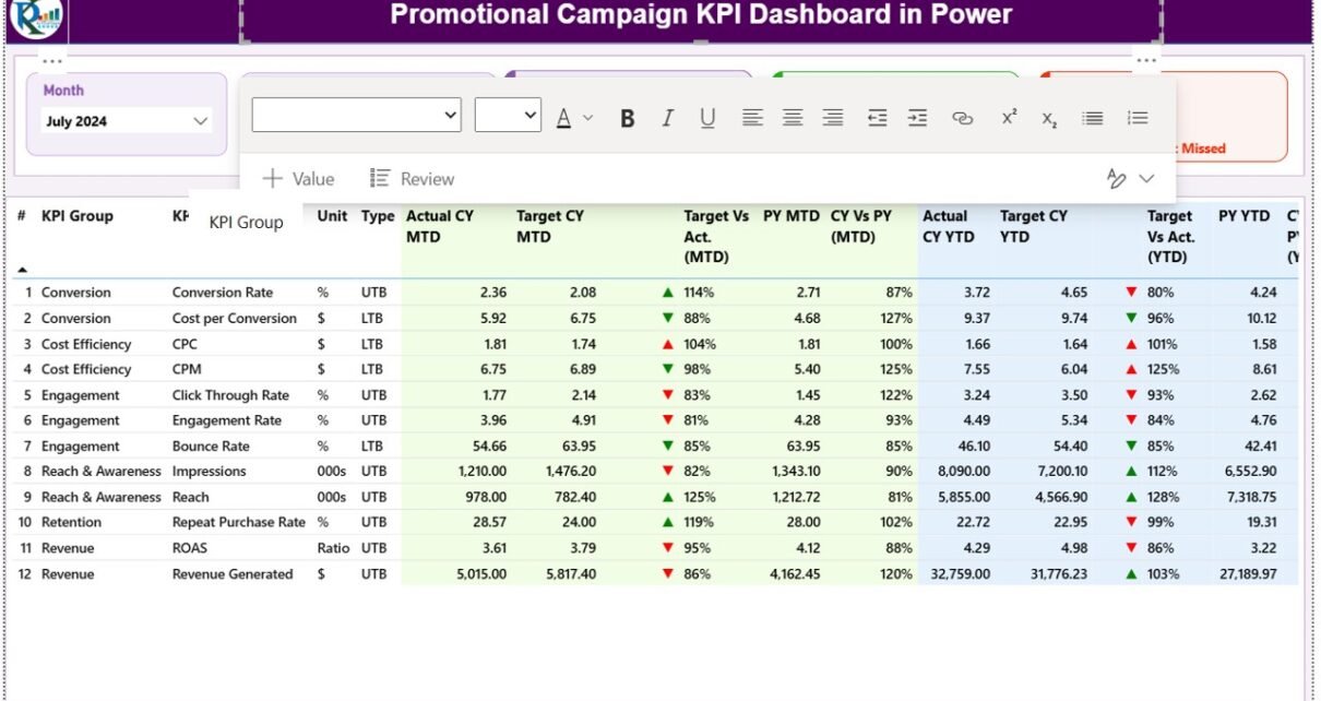
Summary Page: Your Campaign at a Glance
The Summary Page is the main interface of the dashboard. It provides an instant overview of all KPIs through dynamic visuals and key metrics.
Key elements include:
- Month and KPI Group Slicer:
These allow users to filter results by specific time periods or campaign categories. - KPI Summary Cards:
Three cards at the top display: - Total KPI Count
- MTD (Month-to-Date) Target Met Count
- MTD Target Missed Count
- Detailed KPI Table:
A structured table lists all KPIs with insights such as: - KPI Number — Serial identifier for each KPI.
- KPI Group — Category such as “Social Media,” “Email,” or “Sales Promotion.”
- KPI Name — Name of the specific metric being tracked.
- Unit — The measurement unit, e.g., %, $, or count.
- Type — LTB (Lower the Better) or UTB (Upper the Better).
- Actual CY MTD / Target CY MTD — Current month’s actual and target values.
- MTD Icon: Visual arrow indicators — ▲ (green) for achieved, ▼ (red) for missed.
- Target vs Actual (MTD): Displays performance percentage using Actual ÷ Target.
- PY MTD: Last year’s performance for comparison.
- CY vs PY (MTD): Year-over-year comparison ratio.
- Actual CY YTD / Target CY YTD: Year-to-date metrics for overall tracking.
- YTD Icons & Comparison: Similar green/red icons for YTD KPIs with percentage comparisons against the previous year.
This structured view ensures that users instantly recognize where the campaign is overperforming or underperforming.
Click to buyPromotional Campaign KPI Dashboard in Power BI
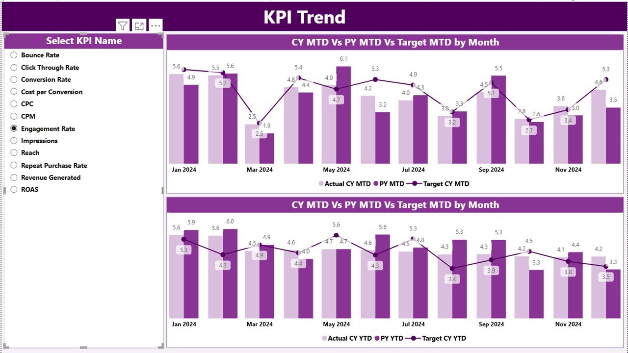
KPI Trend Page: Visualizing Campaign Momentum
The KPI Trend Page provides a deeper understanding of performance patterns. It uses combo charts to display Actuals, Targets, and Previous Year data side by side — enabling visual trend analysis.
Key elements:
- Two combo charts:
- One for MTD (Month-to-Date) comparison.
- One for YTD (Year-to-Date) analysis.
- KPI Slicer: Select any KPI from the dropdown to focus on its detailed trends.
This page helps marketers analyze campaign consistency, spot seasonal variations, and understand growth trajectories over time.
Click to buyPromotional Campaign KPI Dashboard in Power BI
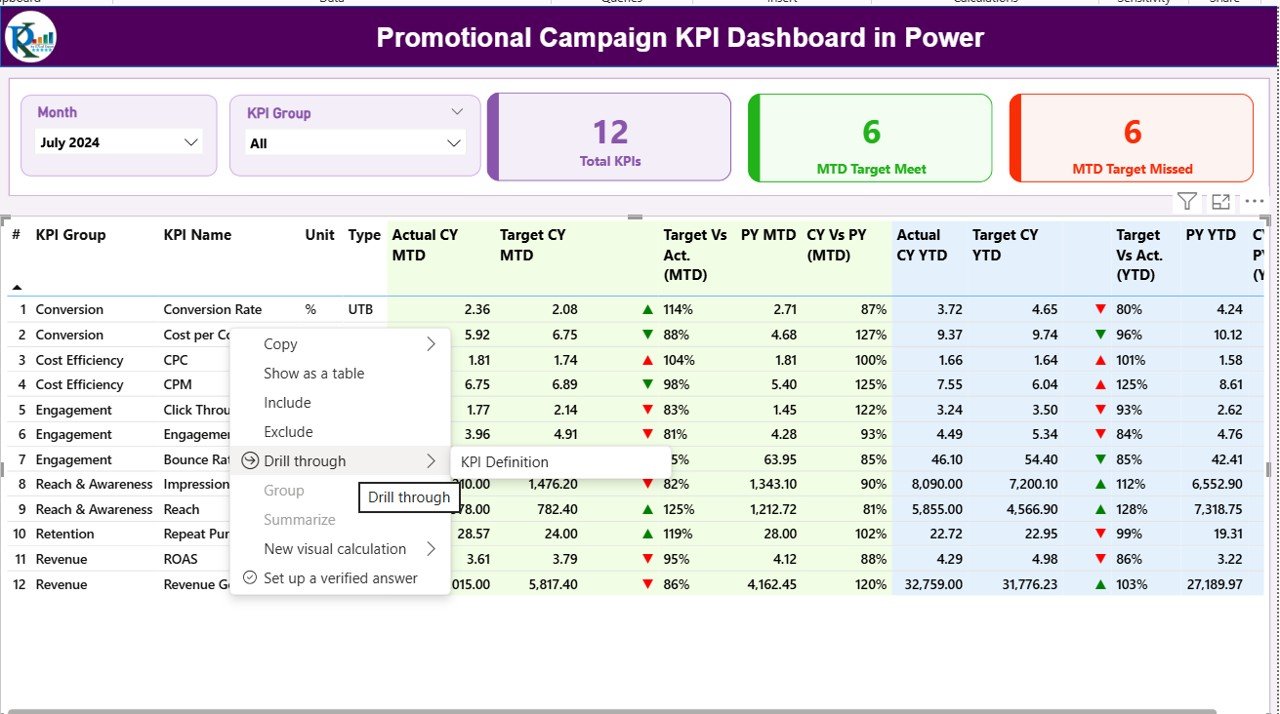
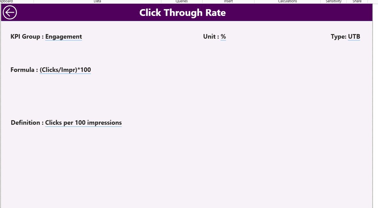
KPI Definition Page: Understanding the Metrics
This hidden drill-through page is designed for detailed KPI documentation.
From the Summary Page, users can drill through any KPI to access its:
- Formula
- Definition
- Measurement unit
- Type (UTB or LTB)
The Back Button on the top-left corner allows easy navigation back to the Summary Page, maintaining a smooth analytical experience.
Excel Data Source Structure
The dashboard is powered by an Excel data file, which acts as the backend source. It contains three essential worksheets that keep the dashboard dynamic and easy to update.
Click to buyPromotional Campaign KPI Dashboard in Power BI
Input_Actual Sheet
- Enter actual campaign numbers here.
- Fields include KPI Name, Month (use first date), MTD values, and YTD values.
- Example: If tracking “Click-Through Rate,” you’d record January’s MTD and YTD numbers.
Input_Target Sheet
- Stores monthly and yearly target figures for each KPI.
- Same structure as Actuals sheet — ensuring one-to-one comparison.
KPI Definition Sheet
- This sheet lists the metadata of every KPI:
- KPI Number
- KPI Group
- KPI Name
- Unit
- Formula
- Definition
- Type (UTB or LTB)
- By maintaining this structure, you can easily expand or modify your KPI framework without breaking the dashboard connection.
Click to buyPromotional Campaign KPI Dashboard in Power BI
Examples of Promotional Campaign KPIs
Here are some common KPIs marketers can track using this Power BI dashboard:
This mix of KPIs ensures you capture campaign performance from multiple angles — financial, operational, and behavioral.
How the Dashboard Enhances Marketing Performance
The Promotional Campaign KPI Dashboard goes beyond reporting — it becomes a decision-making engine.
Here’s how it improves campaign management:
- Instant Comparisons: Easily compare current and past performance.
- Early Warning System: Red icons or downward arrows immediately flag underperforming KPIs.
- Cross-Department Collaboration: Everyone from marketing to finance can view unified data.
- Target Alignment: Ensures each campaign goal aligns with overall marketing objectives.
- Continuous Improvement: Enables optimization by tracking results over time.
Advantages of the Promotional Campaign KPI Dashboard in Power BI
Implementing this dashboard offers significant advantages for businesses of all sizes:
Unified Campaign Tracking
All KPIs are visible in one place — eliminating scattered Excel files and manual aggregation.
Data-Driven Decisions
With Power BI visuals, marketing teams can make decisions backed by facts, not assumptions.
Real-Time Performance Monitoring
Automatic refreshes ensure the latest campaign data is always displayed.
Improved Accountability
Each KPI is linked to a responsible person or team, ensuring clear ownership.
Enhanced Visualization
Power BI’s charts, slicers, and cards transform complex data into easy-to-understand visuals.
Benchmarking and Comparison
By comparing MTD and YTD with the previous year, organizations can benchmark progress effectively.
Scalability
You can easily add new campaigns or KPIs without rebuilding the dashboard.
How to Build a Promotional Campaign KPI Dashboard in Power BI
Here’s a simplified process to create your own version:
- Prepare Data in Excel:
Create Actual, Target, and Definition sheets with clean data. - Load Data into Power BI:
Import all sheets using the “Get Data” option. - Model Relationships:
Create relationships between KPI tables using common fields like “KPI Name.” - Add DAX Measures:
Build measures for Target vs Actual, CY vs PY, and MTD/YTD percentages. - Design Visuals:
Use cards, combo charts, and tables to represent performance. - Add Slicers:
Create slicers for Month, KPI Group, and KPI Name for interactivity. - Apply Conditional Formatting:
Use green/red arrows or icons for instant visual status indicators. - Publish and Share:
Once ready, publish the dashboard to Power BI Service for team collaboration.
Best Practices for Using the Promotional Campaign KPI Dashboard
To maximize the value of your dashboard, follow these best practices:
- Keep KPIs Relevant: Only include metrics directly linked to campaign goals.
- Set Realistic Targets: Define achievable monthly and yearly goals.
- Update Data Regularly: Maintain the Excel file consistently for accurate insights.
- Use Visual Cues Wisely: Avoid cluttering with too many colors or charts.
- Drill Through for Detail: Use the KPI Definition page to educate new users on each metric.
- Encourage Collaboration: Share the dashboard with marketing, sales, and leadership teams.
- Review Monthly: Regularly review MTD and YTD trends to spot opportunities.
Opportunities for Improvement
Even though this dashboard is powerful, there’s always room for enhancement:
- Add Predictive Analytics: Use Power BI forecasting to anticipate future KPI trends.
- Integrate with CRM Tools: Automate data flow from Salesforce or HubSpot.
- Add Campaign Cost Analysis: Include budget utilization and cost-per-conversion metrics.
- Include Feedback Metrics: Capture customer sentiment or satisfaction from surveys.
- Automate Data Refresh: Schedule refreshes for daily or weekly intervals.
Conclusion
The Promotional Campaign KPI Dashboard in Power BI is more than just a visualization tool — it’s a strategic marketing compass. It helps you measure what matters, optimize campaign performance, and improve ROI with clarity and speed.
Whether you manage email campaigns, social ads, or retail promotions, this dashboard brings your data to life — empowering smarter marketing strategies and faster decisions.
Frequently Asked Questions (FAQs)
What is a Promotional Campaign KPI Dashboard?
It’s a Power BI tool designed to track marketing campaign performance metrics such as ROI, CTR, engagement rate, and conversion rate.
Can I customize the KPIs in the dashboard?
Yes. You can modify or add new KPIs by updating the Excel definition sheet — the dashboard will adjust automatically.
Do I need coding skills to use it?
No. The dashboard is prebuilt with easy-to-use visuals and formulas. Basic Power BI and Excel knowledge is enough.
How often should I update the data?
Ideally, update monthly to capture accurate MTD and YTD values. You can also set up auto-refresh if your data connects online.
Can I use this for multiple campaigns?
Absolutely. You can track multiple campaigns by adding campaign identifiers in the Excel source.
Is this suitable for small businesses?
Yes. Even small teams can benefit from real-time tracking and improved decision-making using this dashboard.
How can I share it with my team?
After publishing it to Power BI Service, you can share links, embed reports, or export to PDF for presentations.
Visit our YouTube channel to learn step-by-step video tutorials
Watch the step-by-step video tutorial:
Click to buyPromotional Campaign KPI Dashboard in Power BI

