Managing a sales pipeline effectively requires real-time insights into leads, opportunities, and conversions. The Sales Funnel Dashboard in Power BI provides a ready-to-use solution to track your sales process, analyze performance, and identify areas for improvement. With multiple pages and visualizations, this dashboard gives sales managers and executives a comprehensive overview of their pipeline.
In this article, we’ll explain the features, advantages, and best practices of using a Sales Funnel Dashboard in Power BI.
What is a Sales Funnel Dashboard?
A Sales Funnel Dashboard is a data visualization tool that represents the journey of leads through the sales pipeline. It tracks key metrics such as lead count, opportunity value, conversion rates, and stage-wise performance.
With Power BI, this dashboard offers interactive visuals, drill-down capabilities, and dynamic reporting that allow sales teams to:
-
Track leads and opportunities in real-time
-
Monitor conversion rates by stage, industry, region, and sales representative
-
Identify bottlenecks and optimize the sales process
-
Make data-driven decisions to increase revenue
Key Features of the Sales Funnel Dashboard
The Sales Funnel Dashboard in Power BI includes multiple pages with cards, charts, and drill-down analysis to provide a complete view of your sales process.
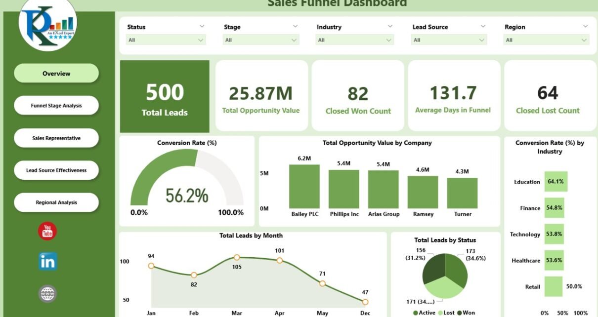
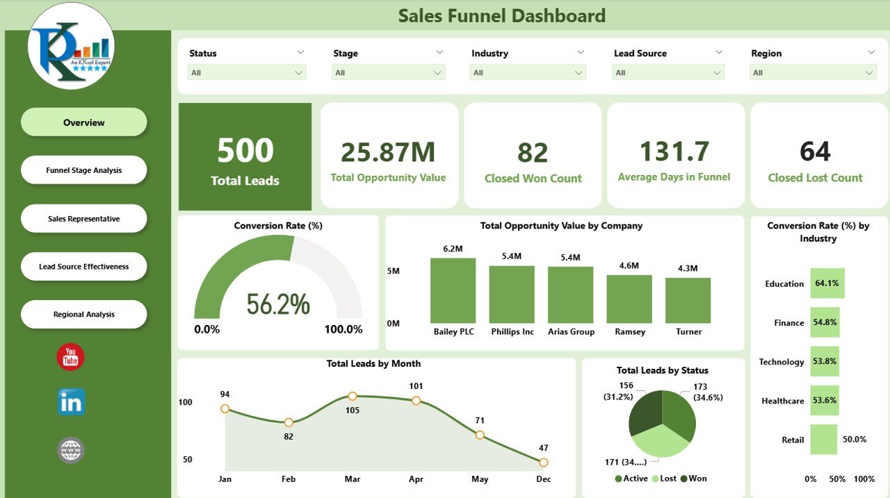
1. Overview Page
The Overview Page gives a high-level snapshot of your sales funnel.
Cards:
-
Total Leads – Number of active leads in the pipeline
-
Total Opportunity Value – Combined potential revenue from all opportunities
-
Closed Won Count – Total opportunities successfully closed
-
Closed Lost Count – Total opportunities lost
-
Average Days in Funnel – Average time a lead spends in the pipeline
Charts:
-
Conversion Rate (%) – Percentage of leads converted into opportunities
-
Total Opportunity Value by Company – Visualizes the revenue potential by client
-
Conversion Rate by Industry (%) – Shows which industries have higher conversion rates
-
Total Leads by Month – Trend of incoming leads over time
-
Total Leads by Status – Breakdown of leads by status (New, In Progress, Qualified, etc.)
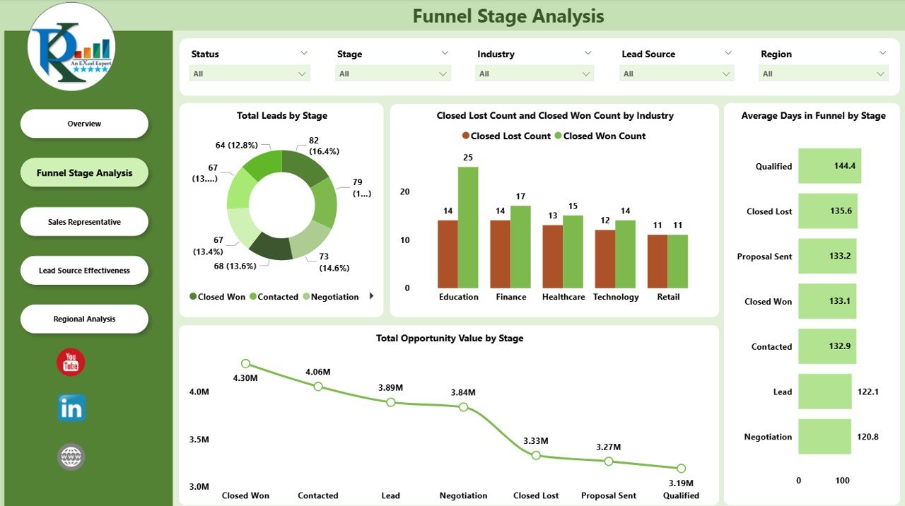
2. Funnel Stage Analysis
The Funnel Stage page provides insights into each stage of the sales pipeline.
Charts:
-
Total Leads by Stage – Visualizes lead distribution across pipeline stages
-
Closed Lost Count and Closed Won Count by Industry – Compares success and loss across industries
-
Total Opportunity Value by Stage – Shows revenue potential at each stage
-
Average Days in Funnel by Stage – Tracks how long leads remain in each stage
This helps identify bottlenecks and prioritize leads effectively.
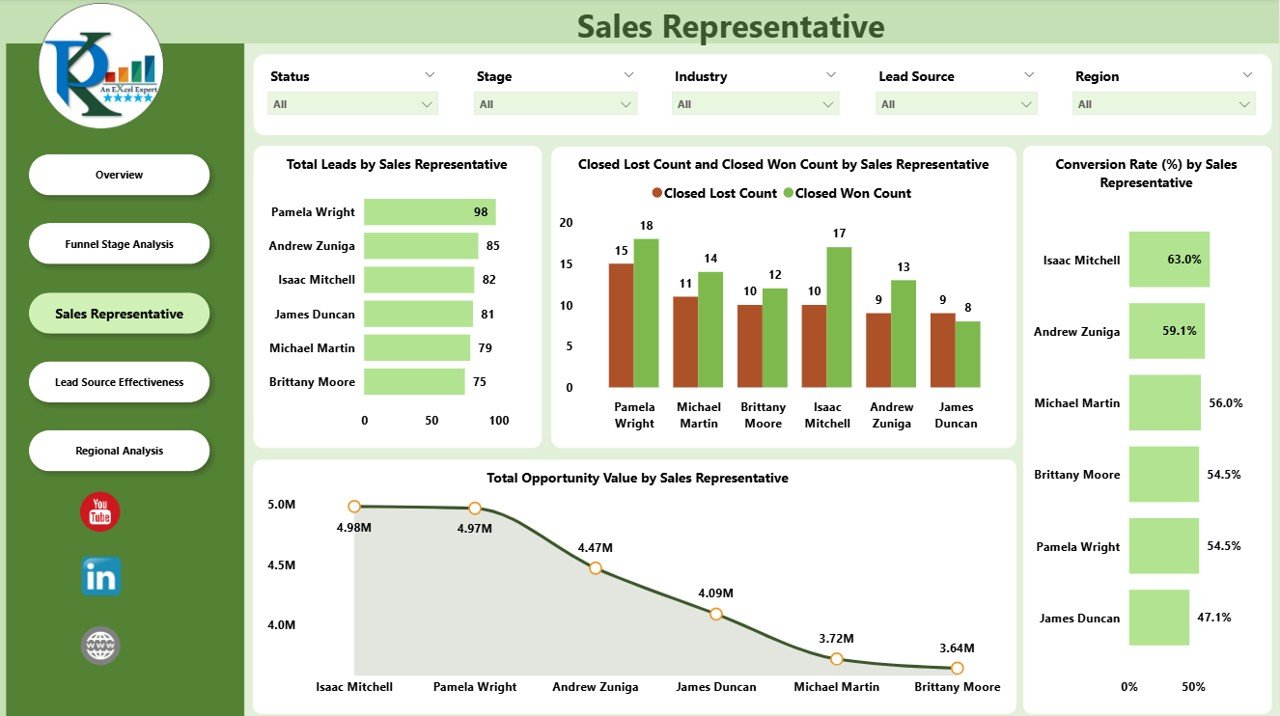
3. Sales Representative Page
The Sales Representative page evaluates the performance of individual sales reps.
Charts:
-
Total Leads by Sales Representative – Number of leads managed by each rep
-
Closed Lost Count and Closed Won Count by Sales Representative – Rep-level performance analysis
-
Total Opportunity Value by Sales Representative – Revenue contribution of each rep
-
Conversion Rate by Sales Representative (%) – Efficiency of each sales representative
This page helps managers reward top performers and support underperforming reps.
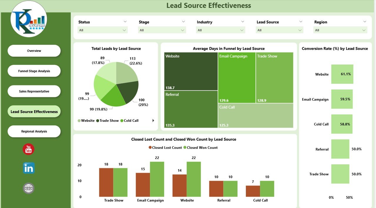
4. Lead Source Effectiveness
The Lead Source Effectiveness page tracks how leads from different channels perform in the pipeline.
Charts:
-
Total Leads by Lead Source – Number of leads generated from each source
-
Average Days in Funnel by Lead Source – Time spent in the pipeline per source
-
Conversion Rate by Lead Source (%) – Effectiveness of each source in converting leads
-
Opportunity Value by Lead Source – Revenue potential from each lead source
This allows sales and marketing teams to focus on the most profitable channels.
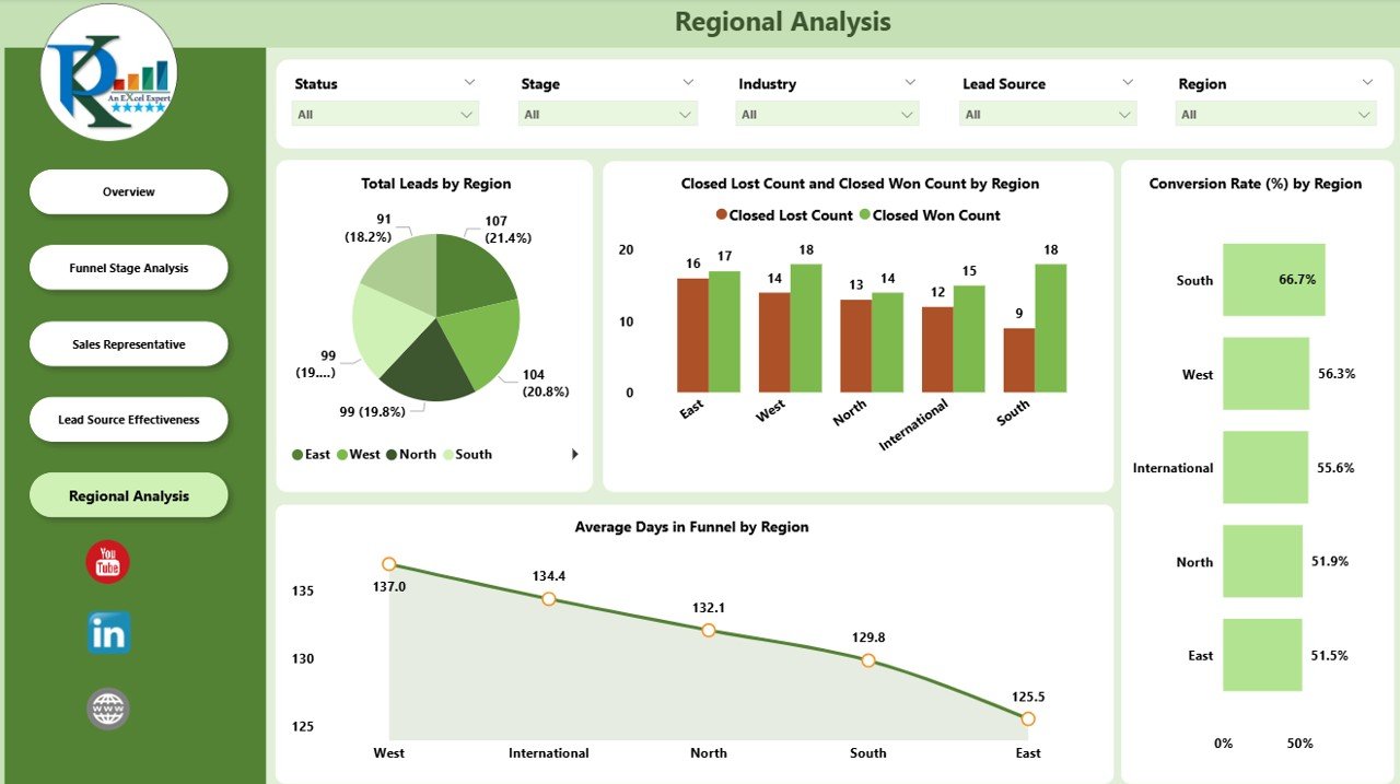
5. Regional Analysis
The Regional Analysis page evaluates the pipeline performance by geographic region.
Charts:
-
Total Leads by Region – Number of leads per region
-
Closed Lost Count and Closed Won Count by Region – Regional sales performance
-
Conversion Rate by Region (%) – Efficiency of the sales process in each region
-
Average Days in Funnel by Region – Time leads spend in the pipeline regionally
Regional analysis helps prioritize high-performing areas and allocate resources effectively.
Advantages of Using a Sales Funnel Dashboard
-
Real-Time Visibility: Instantly see the status of your pipeline across stages, reps, regions, and sources
-
Data-Driven Decisions: Make informed decisions based on actual performance metrics
-
Identify Bottlenecks: Spot stages or regions where leads are getting stuck
-
Sales Rep Performance Tracking: Evaluate individual performance and coaching opportunities
-
Channel Optimization: Focus on lead sources that generate the highest revenue potential
-
Revenue Forecasting: Predict potential revenue based on opportunity values
Best Practices for Using the Dashboard
-
Update Data Regularly: Ensure CRM or data sources are connected for real-time insights
-
Monitor Conversion Rates: Track stages with low conversion to optimize processes
-
Segment Leads: Use filters for industry, region, or lead source to identify trends
-
Review Sales Rep Performance: Support underperforming reps with coaching or training
-
Focus on High-Value Opportunities: Prioritize leads with high opportunity value
-
Analyze Trends Over Time: Monitor monthly and quarterly performance for strategic decisions
Conclusion
A Sales Funnel Dashboard in Power BI is an essential tool for sales teams and managers who want to optimize their sales process. By visualizing leads, opportunities, conversions, and sales rep performance, this dashboard provides actionable insights to increase revenue, improve efficiency, and streamline sales operations.
Implementing this dashboard ensures that every stage of the funnel is monitored, and data-driven decisions become the foundation of your sales strategy.
Frequently Asked Questions (FAQs)
Q1: Can I customize the dashboard for my organization?
Yes, Power BI dashboards are fully customizable, allowing you to add or remove KPIs, pages, or filters.
Q2: How often should the data be updated?
Ideally, update the data daily or weekly depending on lead flow and reporting needs.
Q3: Can I track performance by sales representative and region simultaneously?
Yes, you can use slicers and filters to view performance by both dimensions.
Q4: Does the dashboard support multiple lead sources?
Absolutely. You can track conversion rates, opportunity value, and time in funnel by any lead source.
Q5: Can this dashboard help with revenue forecasting?
Yes, by analyzing opportunity value at each stage, you can predict potential revenue and plan resources accordingly.
Watch the step-by-step video Demo:
Visit our YouTube channel to learn step-by-step video tutorials