Seasonal sales play a vital role in every business that experiences demand fluctuations throughout the year. Whether it’s holiday shopping, summer tourism, or back-to-school retail, understanding these seasonal trends helps companies maximize profits and allocate resources effectively.
The Seasonal Sales KPI Dashboard in Power BI provides a dynamic way to visualize sales data, compare targets with actual performance, and identify opportunities for improvement. It brings all your sales metrics into one powerful, interactive interface that simplifies decision-making.
In this comprehensive article, we will explore how this Power BI dashboard works, what makes it unique, and how you can use it to transform raw sales data into actionable insights.
Click to buy Seasonal Sales KPI Dashboard in Power BI
What Is a Seasonal Sales KPI Dashboard in Power BI?
A Seasonal Sales KPI Dashboard in Power BI is a visual management tool that consolidates key performance indicators related to sales activities over specific seasons or time periods. It enables teams to track actual versus target performance, monitor year-to-date (YTD) and month-to-date (MTD) data, and compare results against previous years.
By leveraging Power BI’s data visualization and interactivity, users can easily explore performance by month, category, or region. Instead of static reports, this dashboard updates dynamically, reflecting real-time changes from the connected Excel data source.
Key Features of the Seasonal Sales KPI Dashboard
The Seasonal Sales KPI Dashboard in Power BI is designed to make performance analysis efficient, accurate, and insightful. Below are the main components included in the dashboard:
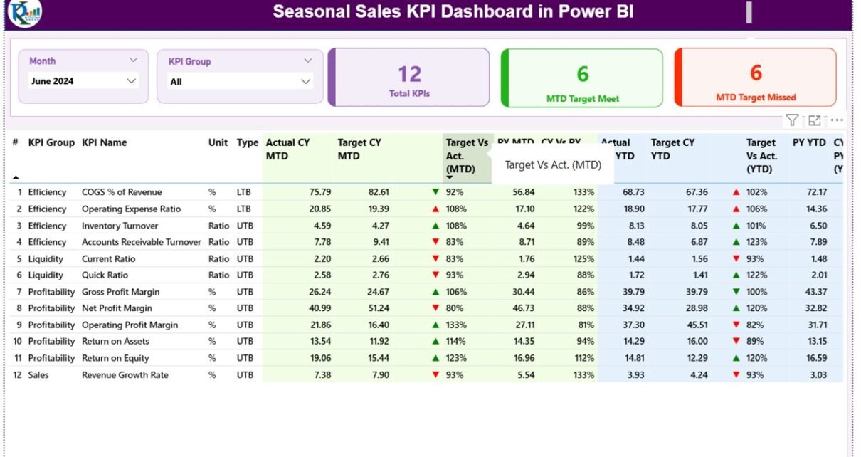
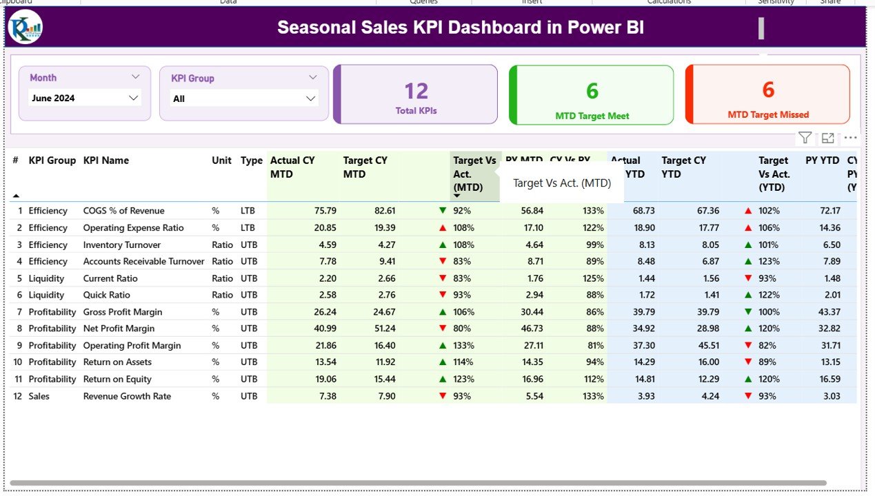
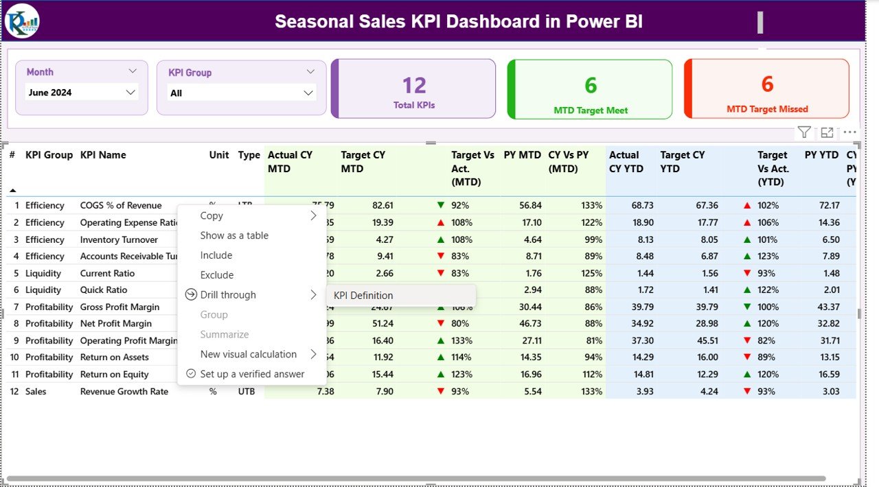
Summary Page
The Summary Page acts as the main control center of the dashboard. It provides a top-level overview of sales KPIs across different seasons and months.
Key elements include:
- Month and KPI Group Slicer: Allows users to filter results by a specific month or KPI category.
- KPI Cards: Three metric cards display the Total KPI Count, MTD Target Met Count, and MTD Target Missed Count—offering an instant performance snapshot.
- Detailed KPI Table: Lists all key metrics such as KPI Number, Group, Name, Unit, Type (LTB or UTB), Actuals, Targets, and comparative percentages.
Highlight features:
- Colored icons (▲ green for improvement, ▼ red for decline) indicate performance status.
- Formulas automatically calculate Target vs Actual and Current Year vs Previous Year percentages for both MTD and YTD data.
- Intuitive layout for faster analysis and better readability.
Click to buy Seasonal Sales KPI Dashboard in Power BI
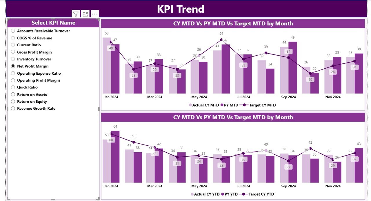
KPI Trend Page
The KPI Trend Page helps analyze performance progress over time. It uses combo charts that plot:
- Current Year Actuals
- Previous Year Actuals
- Current Year Targets
Users can choose any KPI from a slicer to visualize how the metric evolves month by month. This makes it easy to identify growth patterns, seasonal dips, and opportunities for improvement.
This trend-based visualization provides actionable insights—helping managers determine if recent strategies are effective or need adjustments.
Click to buy Seasonal Sales KPI Dashboard in Power BI
KPI Definition Page
The KPI Definition Page is a drill-through view where detailed definitions, formulas, and descriptions of each KPI are stored. Although hidden from the main navigation, it can be accessed directly from the Summary Page through a drill-through action.
It helps teams maintain a clear understanding of what each KPI represents, ensuring consistency across departments. Users can quickly check how metrics are calculated and what they indicate about sales performance.
Click to buy Seasonal Sales KPI Dashboard in Power BI
Excel Data Source Integration
The dashboard connects seamlessly with an Excel file that serves as the central data source. The Excel file includes three sheets:
- Input_Actual: Contains actual MTD and YTD values for each KPI by month.
- Input_Target: Holds the target MTD and YTD values for comparison.
- KPI_Definition: Lists KPI numbers, names, groups, units, formulas, and types (LTB or UTB).
This integration ensures data accuracy, easy maintenance, and flexibility—users can update the Excel sheets, and Power BI automatically refreshes the visuals.
Why Businesses Need a Seasonal Sales KPI Dashboard
- To Track Seasonal Performance Fluctuations
Sales often vary by season, and businesses need to monitor these patterns. The dashboard helps visualize sales peaks during festive months and identify off-season dips.
- To Compare Actual vs Target Achievements
Tracking actual performance against defined targets provides a realistic view of progress. It helps businesses recognize underperforming areas and act immediately.
- To Compare Current and Previous Year Trends
Comparing Current Year vs Previous Year sales reveals valuable insights into growth trends and seasonal demand changes.
- To Support Data-Driven Decisions
The dashboard empowers sales and marketing leaders to make data-driven decisions—such as planning promotions, optimizing inventory, or reallocating budgets.
Advantages of the Seasonal Sales KPI Dashboard in Power BI
- Real-Time Insights
Since Power BI connects directly with the Excel source, updates in data reflect instantly on the dashboard. This ensures that managers always view the latest figures.
- Interactive Visualization
Slicers, drill-through options, and dynamic charts make data exploration engaging and intuitive. Users can filter by months, regions, or KPI groups within seconds.
- Performance Transparency
Clear visualization of each KPI’s performance—supported by color indicators—enhances accountability across sales teams and departments.
- Customizable Metrics
The dashboard can easily adapt to different industries or sales models. Businesses can add or modify KPIs as per their requirements.
- Easy Integration with Excel
Most businesses already use Excel for data entry. This dashboard leverages existing workflows without additional technical complexity.
- Improved Forecasting Accuracy
By identifying seasonal trends, the dashboard helps create accurate forecasts for upcoming sales cycles.
KPIs Commonly Tracked in a Seasonal Sales Dashboard
Below are examples of key performance indicators typically tracked:
- Total Sales Revenue (USD)
- Average Order Value
- Number of Transactions
- Conversion Rate (%)
- Inventory Turnover
- Customer Acquisition Cost
- Gross Profit Margin (%)
- Repeat Purchase Rate
- Discount Utilization Rate
- Sales Growth (%)
- Target Achievement (%)
- Seasonal Product Performance
Each KPI helps measure a specific dimension of performance, and when combined, they give a holistic picture of seasonal business efficiency.
How to Use the Dashboard Effectively
- Step 1: Prepare Your Excel Data
- Ensure that the Input_Actual and Input_Target sheets are properly filled with accurate monthly data. Always use the first date of each month for consistency.
- Step 2: Refresh the Power BI File
- Once the Excel data is updated, refresh the Power BI file to sync the new data automatically.
- Step 3: Explore the Summary Page
- Start your analysis from the Summary Page to get a quick overview of how sales are performing in the current season.
- Step 4: Deep Dive into KPI Trends
- Navigate to the KPI Trend Page and use the slicer to explore individual KPI patterns. Identify where performance improved or declined.
- Step 5: Review KPI Definitions
- If you are unsure about any KPI’s calculation or meaning, drill through to the KPI Definition Page for clarity.
- Step 6: Share and Collaborate
- Power BI makes it easy to share dashboards across departments or stakeholders. You can publish the dashboard on the Power BI Service for online collaboration.
Best Practices for the Seasonal Sales KPI Dashboard
Keep KPIs Specific and Measurable
Avoid adding too many metrics. Focus on the most relevant KPIs that directly impact your seasonal goals.
Use Consistent Data Formats
Ensure data in Excel follows a consistent structure for seamless Power BI integration.
Refresh Data Regularly
Update the Excel file frequently to maintain accurate and real-time reporting.
Utilize Conditional Formatting Wisely
Use color codes (green/red arrows) strategically to highlight positive or negative trends.
Add Context to Data
Include comparisons like Target vs Actual and CY vs PY to add deeper insights into performance.
Use Drill-Throughs for Detail
Leverage the drill-through page to explain KPIs, ensuring every team member interprets metrics correctly.
Ensure Data Security
Keep your Excel files and Power BI datasets in secure, shared locations accessible only to authorized users.
Opportunities for Improvement
Even though the Seasonal Sales KPI Dashboard offers robust features, continuous improvement can enhance its effectiveness:
- Add Forecasting Models: Integrate predictive analytics to forecast future seasonal sales trends.
- Incorporate Regional Analysis: Visualize sales data across regions or store locations for geographic insights.
- Include Customer Segmentation: Analyze sales by customer demographics or purchase frequency.
- Automate Data Refresh: Connect Power BI directly to a cloud data source (like SharePoint or OneDrive) to enable automatic updates.
- Add Custom Alerts: Set up threshold-based alerts that notify managers when KPIs cross critical limits.
How Power BI Enhances Seasonal Sales Performance
Power BI transforms complex sales data into visually rich insights that drive performance optimization. With advanced features like:
- DAX Formulas for calculated metrics
- Drill-through and Drill-down Interactivity
- Custom Visuals such as combo charts, gauges, and cards
- Integration with Excel, SQL, and SharePoint
…it becomes easier for managers to gain a comprehensive view of sales across seasons and product lines.
This integration ensures that businesses can plan better promotions, manage stock efficiently, and predict demand accurately.
Conclusion
The Seasonal Sales KPI Dashboard in Power BI is more than just a reporting tool—it’s a complete performance management solution. By centralizing your data and visualizing it interactively, you can uncover seasonal patterns, identify weak areas, and plan proactive strategies.
From MTD and YTD analysis to year-over-year comparison, this dashboard provides every detail a sales leader needs to make informed, timely decisions. Whether you’re managing retail campaigns, holiday offers, or regional promotions, this dashboard keeps you one step ahead throughout every sales cycle.
Frequently Asked Questions (FAQs)
- What is a Seasonal Sales KPI Dashboard in Power BI?
It’s an interactive tool built in Power BI that visualizes sales KPIs across months or seasons, helping businesses track actual vs target performance.
- How does this dashboard connect with Excel data?
The dashboard links to three Excel sheets—Actuals, Targets, and KPI Definitions. Updating these sheets automatically refreshes the visuals in Power BI.
- Can I customize the KPIs in the dashboard?
Yes. You can add, remove, or modify KPIs in the Excel file. The changes will reflect automatically in Power BI once refreshed.
- What kind of charts are used in this dashboard?
Combo charts, cards, tables, and KPI icons are used to represent MTD, YTD, and comparison data clearly and interactively.
- Is this dashboard suitable for all industries?
Absolutely. Any business that experiences seasonal sales—retail, tourism, hospitality, manufacturing—can benefit from this tool.
- How can this dashboard improve sales performance?
By revealing seasonal patterns, comparing actuals vs targets, and enabling data-driven decisions, it helps improve sales strategies and forecasting accuracy.
Visit our YouTube channel to learn step-by-step video tutorials
Watch the step-by-step video tutorial:
Click to buy Seasonal Sales KPI Dashboard in Power BI