Special education teams work hard to support diverse learners, yet they often struggle to understand performance trends because their data stays scattered across reports, spreadsheets, and manual trackers. Teachers, coordinators, administrators, and school leaders want fast and clear insights, but traditional reporting methods slow them down.
A Special Education KPI Dashboard in Power BI solves these challenges. It offers a smart, visual, and interactive system that tracks every key performance indicator (KPI) that matters for special education programs. When schools monitor the right KPIs, they improve student outcomes, resource allocation, compliance reporting, and instructional planning.
In this guide, you will learn what a Special Education KPI Dashboard is, how it works, what pages it contains, and why it becomes a powerful tool for educators. You will also explore its advantages, best practices, and answers to common questions.
Click to buy Special Education KPI Dashboard in Power BI
What Is a Special Education KPI Dashboard in Power BI?
A Special Education KPI Dashboard in Power BI is a ready-to-use analytics system that helps special education teams track student performance, program efficiency, instructional outcomes, and compliance indicators. The dashboard connects to an Excel data file and refreshes instantly, which means every stakeholder gets current and accurate insights without any complex work.
The dashboard includes slicers, KPI summary cards, dynamic charts, trend analysis, and drill-through features. Because of these user-friendly elements, teachers and administrators understand the data quickly and take action faster.
Why Do Schools Need a Special Education KPI Dashboard?
Special education requires continuous monitoring because each student needs a unique learning plan. When schools use manual reports, they face:
- Delayed decision-making
- Errors in data entry
- Lack of visibility
- Difficulty in identifying trends
- Poor tracking of compliance metrics
A structured Power BI dashboard solves these issues because it transforms raw numbers into clear visuals. This way, educators track KPIs such as IEP completion rate, intervention progress, attendance patterns, student growth, and instructional hours in real time.
Key Features of the Special Education KPI Dashboard in Power BI
This dashboard includes three powerful pages that simplify performance tracking. Let’s explore each page in detail.
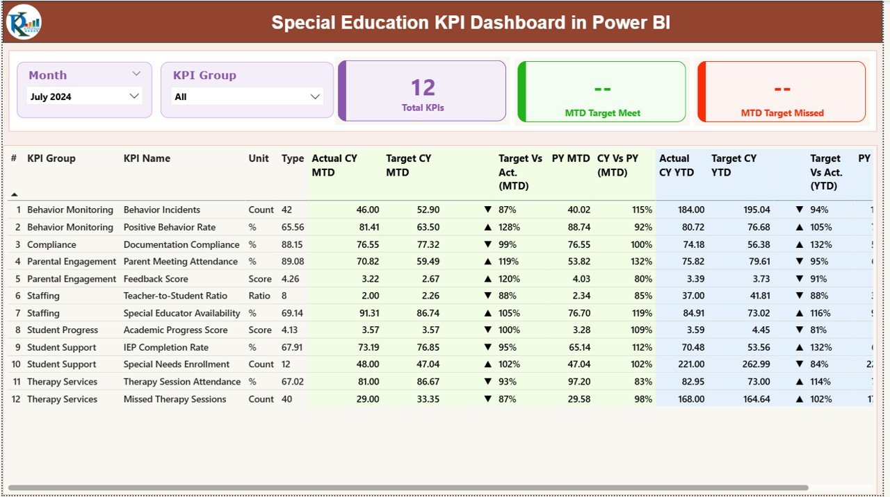
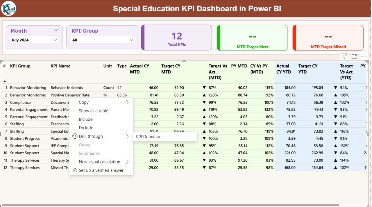
Summary Page – Your Complete Performance View
The Summary Page serves as the heart of the dashboard. It offers a complete snapshot of all KPIs so educators understand performance at a glance.
Main Highlights of the Summary Page
- Month Slicer – Users select the month they want to analyze.
- KPI Group Slicer – Users filter KPIs by category such as student outcomes, compliance, instructional delivery, or resource utilization.
- Three KPI Cards
- Total Count of KPIs
- MTD (Month-to-Date) KPIs Met
- MTD KPIs Missed
These three cards give a quick idea of how the special education program performs.
Detailed KPI Table
The dashboard displays a structured table with all important information:
- KPI Number – Serial number for each KPI.
- KPI Group – Category such as Student Progress, Compliance, or Support Services.
- KPI Name – The name of the performance indicator.
- Unit – Measurement type (percentage, count, hours, etc.).
- Type (UTB / LTB) – Whether higher is better (UTB) or lower is better (LTB).
- Actual CY MTD – Current Year Month-to-Date actual value.
- Target CY MTD – Target set for MTD.
- MTD Icon – Green ▲ for KPI achieved, Red ▼ for KPI missed.
- Target vs Actual (MTD) – Percentage showing performance against MTD target.
- PY MTD – Previous Year MTD value.
- CY vs PY (MTD) – Percentage comparing current and previous year MTD values.
- Actual CY YTD – Current Year Year-to-Date actual numbers.
- Target CY YTD – Year-to-Date target numbers.
- YTD Icon – Green ▲ or Red ▼ based on YTD performance.
- Target vs Actual (YTD) – Percentage showing how YTD actual compares to YTD target.
- PY YTD – Previous Year YTD value.
- CY vs PY (YTD) – Percentage comparing current and previous year YTD numbers.
This table brings deep transparency into the performance of every KPI.
Click to buy Special Education KPI Dashboard in Power BI
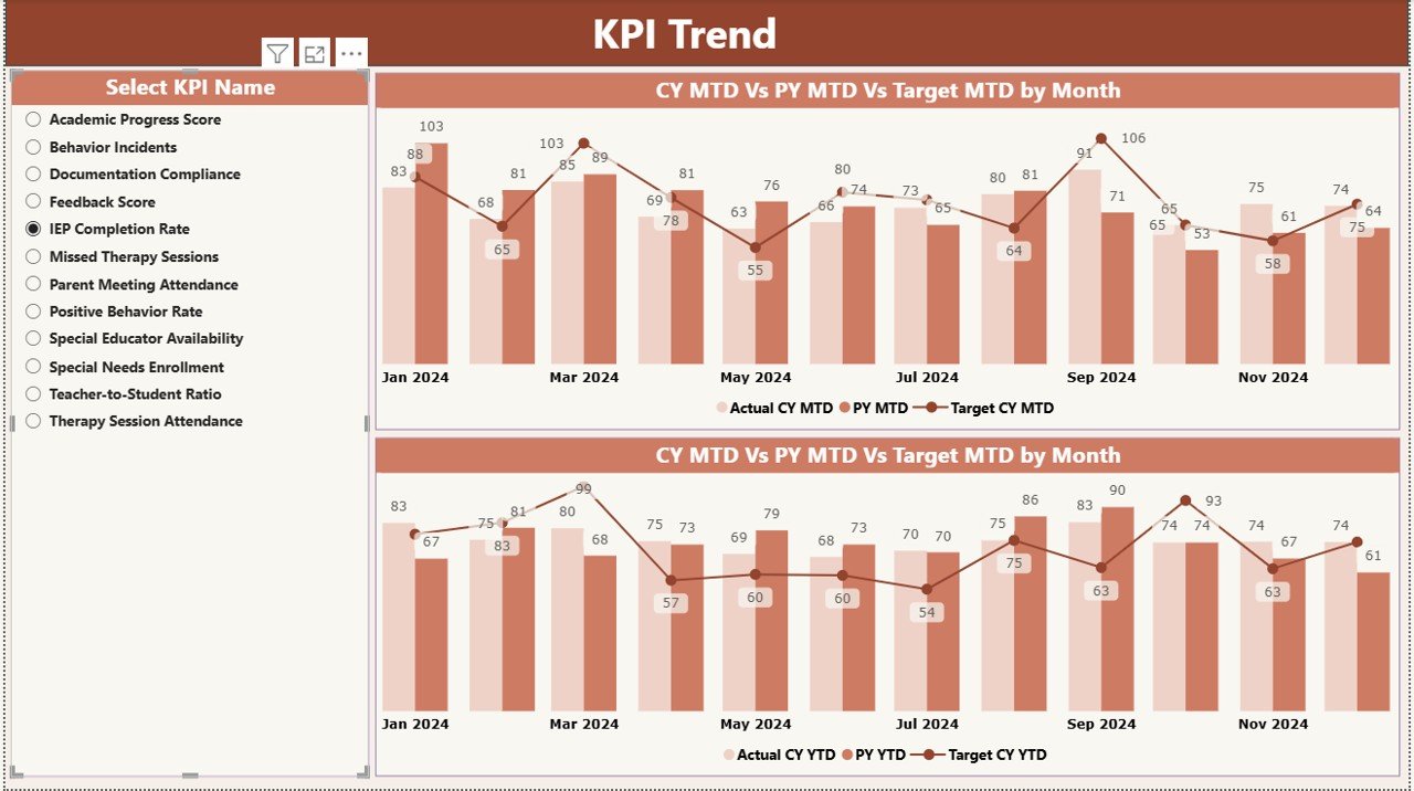
KPI Trend Page – Clear Monthly and Yearly Insights
This page shows how each KPI performs across months and years. Trend charts help educators understand growth, identify drops, and analyze gaps.
Key Elements on the KPI Trend Page
- KPI Slicer – Users select a KPI to explore in detail.
- Two Combo Charts
- MTD Chart comparing Current Year, Previous Year, and Target
- YTD Chart comparing Current Year, Previous Year, and Target
These combo charts help schools:
- Track improvement or decline
- Compare performance between years
- Understand if targets are realistic
- Identify patterns in student or program performance
Because the page updates instantly, it supports faster planning and timely interventions.
Click to buy Special Education KPI Dashboard in Power BI
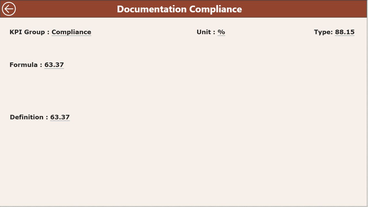
KPI Definition Page – Clear Understanding of Every KPI
The KPI Definition Page is a hidden drill-through page designed to explain KPIs in detail. Users open this page by right-clicking on any KPI in the Summary Page.
Details Available on This Page
- KPI Number
- KPI Group
- KPI Name
- Unit
- Formula
- Definition
- Type (UTB or LTB)
Since special education uses many different performance indicators, this page ensures everyone understands how each KPI works. This removes confusion and increases reporting accuracy.
Users return to the main page using the Back Button on the top-left corner.
Click to buy Special Education KPI Dashboard in Power BI
Excel Data Structure for This Dashboard
The dashboard uses an Excel file with three worksheets. Each sheet plays a crucial role in generating accurate Power BI visuals.
Input_Actual Sheet
Here schools enter:
- KPI Name
- Month (first date of the month)
- MTD values
- YTD values
This sheet holds every actual number required for performance tracking.
Input_Target Sheet
This sheet contains:
- Target numbers for each KPI
- Month (first date of the month)
- MTD targets
- YTD targets
These values help Power BI calculate achievement levels.
KPI Definition Sheet
This sheet includes:
- KPI Number
- KPI Group
- KPI Name
- Unit
- Formula
- Definition
- Type (UTB or LTB)
This sheet acts as the reference guide for all KPIs in the dashboard.
Click to buy Special Education KPI Dashboard in Power BI
How the Special Education KPI Dashboard Helps Educators
Schools that use Power BI dashboards improve decision-making because they get:
- Clear insights about student progress
- Accurate comparisons of year-over-year trends
- Transparent tracking of targets
- Faster reporting
- More confidence during audits and compliance checks
Because the dashboard refreshes instantly, educators save time that they can now use for instruction, support, and planning.
Advantages of Using a Special Education KPI Dashboard in Power BI
Let’s explore the major benefits of this reporting system.
- Better Student Progress Tracking
The dashboard shows real-time details on student performance, intervention progress, and learning outcomes. Teachers understand who needs support and who improves.
- Stronger Compliance and Reporting
Special education programs follow strict guidelines. The dashboard helps teams track:
- IEP timelines
- Service delivery hours
- Documentation accuracy
This prevents compliance gaps.
- Faster Decision-Making
Since the dashboard updates instantly, educators take decisions without delays. They understand trends, targets, and outcomes clearly.
- Easy Collaboration Across Teams
Power BI dashboards work on any device. Teachers, coordinators, therapists, and administrators share the same insights and discuss changes with confidence.
- Reduced Manual Work
The Excel-based input sheets simplify data entry. Schools avoid time-consuming reports and reduce human errors.
- Clear Visualization of Complex KPIs
Line charts, combo charts, cards, and icons help teams understand performance instantly.
Best Practices for Using the Special Education KPI Dashboard
Follow these best practices to get the best results from the dashboard.
- Update the Excel File Regularly
Enter actual and target data every month. When updates stay consistent, the dashboard becomes more accurate.
- Define KPIs Clearly
Use simple definitions and short formulas in the KPI Definition sheet. Clear KPIs create accurate reports.
- Review MTD and YTD Values Together
Both values matter. MTD shows monthly trends while YTD shows the overall program direction.
- Compare Performance With Previous Years
Use the CY vs PY charts to understand long-term progress.
- Use the KPI Group Filters
Group KPIs by instruction, compliance, student outcomes, or support services. This makes analysis easier.
- Discuss Dashboards in Team Meetings
Review KPIs together so everyone understands outcomes and action steps.
- Set Realistic Targets
Targets should align with student needs, available resources, and instructional hours.
Conclusion
A Special Education KPI Dashboard in Power BI empowers educators with clear, visual, and meaningful insights. Because the dashboard organizes every performance indicator, schools improve decision-making, track student outcomes, and manage compliance with confidence. With its trend charts, summary views, and drill-through pages, it becomes a complete performance-management tool for any special education program.
When schools use such a structured system, they simplify reporting, increase accuracy, and support every learner more effectively.
Frequently Asked Questions (FAQs)
- What is a Special Education KPI Dashboard in Power BI?
It is a ready-to-use reporting system that tracks key performance indicators for special education programs using visual charts and tables.
- Who can use this dashboard?
Teachers, special educators, school administrators, coordinators, therapists, compliance teams, and academic leaders use it.
- Do I need technical skills to use this dashboard?
No. You only update the Excel file. Power BI takes care of the visuals.
- Can I customize KPIs in the dashboard?
Yes, you can edit KPI names, groups, formulas, and definitions in the Excel file.
- How often should I update the dashboard?
Update it monthly to track MTD and YTD performance accurately.
- Can the dashboard compare performance across years?
Yes. It shows CY vs PY comparisons for both MTD and YTD.
- What chart types are included?
Combo charts, KPI cards, comparison charts, and detailed tables.
- Does the dashboard support drill-through?
Yes. You can open the KPI definition page to view formula and explanation details.
- Can the dashboard be used for audits or compliance?
Yes. It helps teams present accurate data quickly.
- Can multiple departments use this dashboard?
Yes. Instruction teams, compliance teams, and administration all benefit from it.
Visit our YouTube channel to learn step-by-step video tutorials
Click to buy Special Education KPI Dashboard in Power BI