In today’s digital age, a business’s success depends heavily on its website traffic performance. Whether you manage an e-commerce store, a content platform, or a corporate site, understanding how visitors interact with your website can help you boost engagement, increase conversions, and optimize marketing strategies.
To make this process easier, the Website Traffic KPI Dashboard in Power BI offers an interactive, data-driven, and ready-to-use solution that turns raw website metrics into meaningful insights.
This article will walk you through everything you need to know — including what this dashboard is, how it works, its features, advantages, best practices, and answers to frequently asked questions.
Click to Purchases Website Traffic KPI Dashboard in Power BI
What Is a Website Traffic KPI Dashboard in Power BI?
A Website Traffic KPI Dashboard in Power BI is a visual analytics tool that helps you track and analyze key performance indicators (KPIs) related to your website’s visitors, engagement, conversions, and growth over time.
Instead of manually analyzing spreadsheets or multiple web analytics tools, this Power BI dashboard centralizes all website metrics in one dynamic and interactive workspace.
You can view both Month-to-Date (MTD) and Year-to-Date (YTD) comparisons, analyze current performance versus targets, and monitor trends at a glance — all in real time.
This dashboard is ideal for:
-
Digital marketing managers
-
Web analysts and SEO experts
-
Content strategists
-
E-commerce and business owners
-
Agencies managing multiple client websites
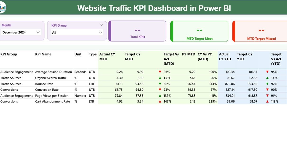
Structure of the Website Traffic KPI Dashboard
The dashboard is built in Microsoft Power BI Desktop, connected to an Excel data source, and includes three key pages that make navigation, analysis, and reporting simple and efficient.
Let’s explore each page in detail 👇
1️⃣ Summary Page — The Main Control Hub
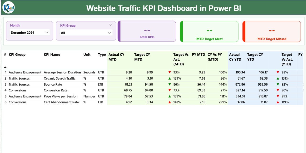
The Summary Page is the central point of the dashboard where you can view all website KPIs in one place.
At the top, there are slicers for:
-
Month Selector — to analyze traffic for a specific period
-
KPI Group Selector — to filter KPIs by category (e.g., Traffic, Conversion, SEO, Engagement)
Below the slicers, you’ll see three performance cards:
-
Total KPIs Count — displays the total number of website KPIs being monitored
-
MTD Target Met Count — shows how many KPIs have achieved or exceeded their Month-to-Date targets
-
MTD Target Missed Count — highlights the number of KPIs that failed to meet their targets
Then comes a detailed table view, showing performance breakdowns for each KPI.
Click to Purchases Website Traffic KPI Dashboard in Power BI
The Detailed KPI Table Includes:
-
KPI Number: The sequence or unique identifier for each KPI
-
KPI Group: The category (e.g., Traffic, Conversion, Engagement, SEO)
-
KPI Name: The metric being measured (e.g., Page Views, Bounce Rate, Conversion Rate)
-
Unit: The measurement unit (e.g., %, Count, Minutes)
-
Type: The KPI performance direction — LTB (Lower the Better) or UTB (Upper the Better)
-
Actual CY MTD: Current Year Month-to-Date actual values
-
Target CY MTD: Current Year Month-to-Date target values
-
MTD Icon: Visual arrow indicators (▲ green for improvement, ▼ red for decline)
-
Target vs Actual (MTD): Percentage ratio of performance against target — (Actual ÷ Target)
-
PY MTD: Previous Year Month-to-Date value
-
CY vs PY (MTD): Percentage change between current and previous year’s MTD
-
Actual CY YTD: Current Year cumulative (Year-to-Date) actual values
-
Target CY YTD: Current Year cumulative target values
-
YTD Icon: Similar red/green icons indicating Year-to-Date performance
-
Target vs Actual (YTD): (Actual ÷ Target) comparison for YTD
-
PY YTD: Previous Year’s YTD actual values
-
CY vs PY (YTD): Comparison between current and previous year’s performance
✅ Key Benefit: This page gives users a 360-degree view of performance across all website KPIs — helping identify areas of improvement instantly.
2️⃣ KPI Trend Page — Visualize Performance Over Time
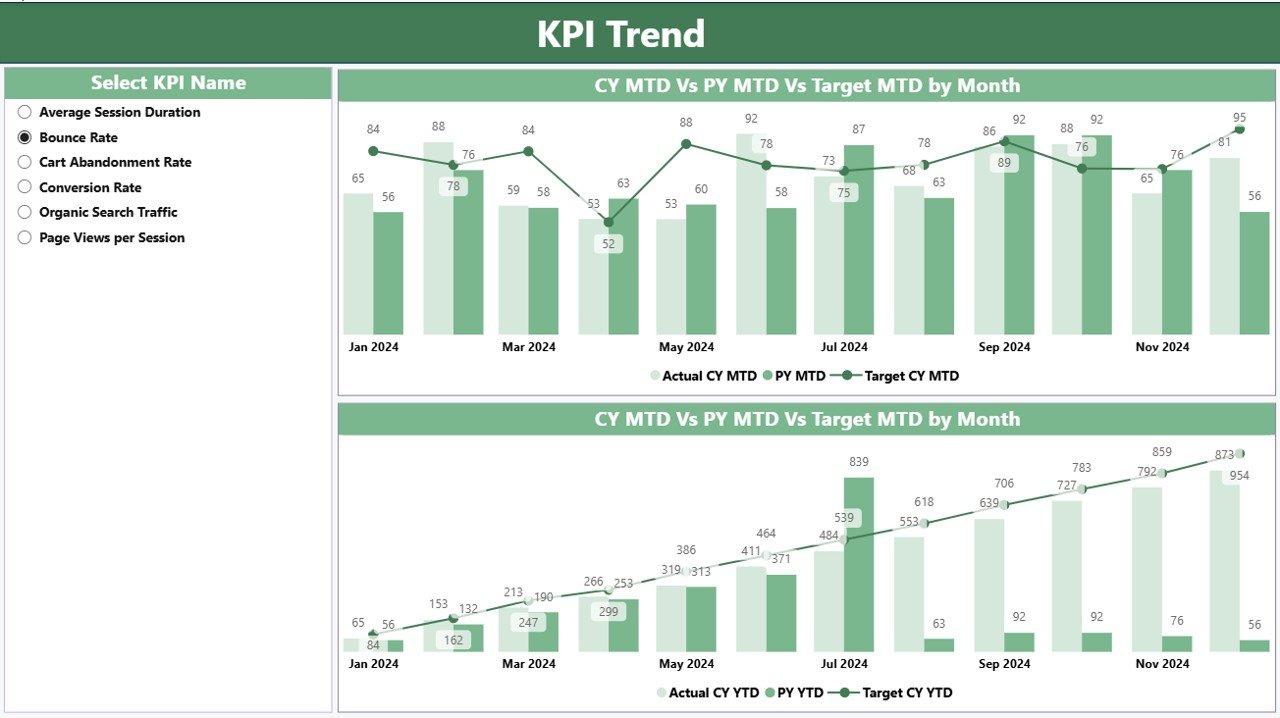
The KPI Trend Page is designed for data-driven storytelling.
This page contains two combo charts that visualize Actuals, Targets, and Previous Year values for both MTD and YTD metrics.
A slicer on the left allows you to select any KPI name and dynamically refresh both charts to display its trends.
For example:
-
Track how Bounce Rate % has changed over time
-
Compare Conversion Rate % across months
-
Visualize Page Views or Average Session Duration against their targets
✅ Key Benefit: This page makes it easy to spot patterns, trends, and anomalies, allowing managers to take quick corrective action.
3️⃣ KPI Definition Page — The Knowledge Reference
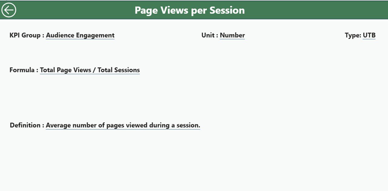
The KPI Definition Page serves as a drill-through and documentation layer.
When you right-click a KPI on the Summary Page and select Drill Through → KPI Definition, this page reveals more details, such as:
-
Formula: How the KPI is calculated (e.g., Sessions ÷ Users, Conversions ÷ Visitors × 100)
-
Definition: The description of what the KPI measures
-
Type: Whether higher or lower values indicate better performance
You can use the Back Button on the top-left corner to return to the Summary Page.
✅ Key Benefit: It ensures data transparency and clarity, especially useful for teams and stakeholders reviewing the metrics.
📊 Excel Data Structure for the Dashboard
The Power BI dashboard uses an Excel file as its data source. This makes it easy to update, maintain, and refresh.
The Excel workbook contains three sheets, each with a specific purpose:
1️⃣ Input_Actual Sheet
-
Enter actual performance data for each KPI
-
Include columns for:
-
KPI Name
-
Month (use the first date of each month for consistency)
-
MTD (Month-to-Date) Value
-
YTD (Year-to-Date) Value
-
2️⃣ Input_Target Sheet
-
Record target values for each KPI with the same structure:
-
KPI Name
-
Month
-
MTD Target
-
YTD Target
-
3️⃣ KPI Definition Sheet
-
Store metadata and formula references for every KPI:
-
KPI Number
-
KPI Group
-
KPI Name
-
Unit
-
Formula
-
Definition
-
Type (LTB/UTB)
-
✅ Pro Tip: Keeping consistent naming and date formatting across all three sheets ensures seamless Power BI refreshes and accurate visualizations.
🧠 Why Use a Website Traffic KPI Dashboard?
Monitoring website KPIs helps you answer essential questions like:
-
Are my visitors engaging with my site content?
-
Which traffic sources are bringing the most conversions?
-
How well am I performing compared to last year?
-
Are my SEO efforts improving overall traffic quality?
By consolidating data into one Power BI dashboard, you can analyze performance metrics faster and more effectively.
🚀 Advantages of the Website Traffic KPI Dashboard in Power BI
Here are the major benefits of using this dashboard for digital performance monitoring:
✅ 1. Centralized Web Analytics
Brings all website KPIs — from traffic to conversion metrics — into one unified workspace.
✅ 2. Interactive Visualization
Power BI’s dynamic slicers, combo charts, and icons make insights easy to interpret for both technical and non-technical users.
✅ 3. Time-Based Performance Comparison
Evaluate current performance vs. targets and previous year metrics with both MTD and YTD views.
✅ 4. Data Transparency
Every KPI includes its definition, formula, and type, ensuring no confusion among teams.
✅ 5. Fast Decision-Making
Quickly identify underperforming metrics using red/green indicators and take immediate corrective actions.
✅ 6. Easy Data Maintenance
Using Excel as the source simplifies updates — no need for complex databases.
✅ 7. Perfect for All Businesses
Whether you run a small blog or a multinational e-commerce platform, this dashboard adapts to any website type.
🧩 How This Dashboard Supports Decision-Making
This dashboard empowers decision-makers to:
-
Measure Marketing ROI — Understand how traffic changes correlate with campaigns.
-
Identify Conversion Barriers — Spot where users drop off or exit.
-
Optimize SEO Efforts — Track keyword traffic and organic growth.
-
Improve User Experience — Identify pages with low engagement or slow load times.
-
Benchmark Yearly Growth — Compare progress with the previous year’s data.
With real-time insights, you can act faster, refine strategies, and keep performance aligned with goals.
💼 Best Practices for Using the Website Traffic KPI Dashboard
To make the most of your Power BI dashboard, follow these proven best practices:
🟢 1. Maintain Data Accuracy
Regularly update your Excel input sheets and validate values before refreshing Power BI.
🟢 2. Standardize KPI Naming
Use consistent KPI names across all tabs and reports to prevent mismatched visuals.
🟢 3. Set SMART Targets
Ensure your KPI targets are Specific, Measurable, Achievable, Relevant, and Time-bound.
🟢 4. Review MTD and YTD Trends Monthly
Use the trend page to identify seasonal patterns and performance dips.
🟢 5. Keep Visualization Clean
Avoid cluttering visuals — use color codes and indicators sparingly for better focus.
🟢 6. Schedule Automatic Refreshes
If possible, use Power BI’s data gateway for automatic data updates from Excel.
🟢 7. Train Your Team
Ensure users understand each KPI definition and interpretation method.
🧾 Conclusion
The Website Traffic KPI Dashboard in Power BI is more than just a visualization tool — it’s a complete performance management system for digital success.
It allows businesses to track key website metrics, analyze real-time performance, and compare progress with historical data — all from a single dashboard.
By following the best practices and maintaining consistent data, organizations can make smarter decisions, improve user experience, and enhance overall web performance.
If you’re looking for a ready-to-use Power BI template, this dashboard is a perfect starting point for your analytics journey.
❓ Frequently Asked Questions (FAQs)
1. What is the main purpose of a Website Traffic KPI Dashboard?
It helps you monitor, analyze, and visualize key website performance indicators like visitors, conversions, and engagement levels.
2. Do I need coding skills to use this Power BI dashboard?
No. The dashboard is completely user-friendly and connects directly with Excel — no coding or DAX expertise is required for day-to-day use.
3. Can I customize the KPIs in this dashboard?
Yes, you can easily modify KPI names, formulas, and data categories in the Excel file and refresh the visuals in Power BI.
4. How often should I update the data?
Ideally, update the data weekly or monthly to maintain accuracy and trend consistency.
5. Is this dashboard suitable for small businesses?
Absolutely! It’s designed to work for all types of websites — from small blogs to large e-commerce platforms.
Visit our YouTube channel to learn step-by-step video tutorials