Managing healthcare data can be overwhelming, especially when you have a lot of information to process and analyze. That’s where a Healthcare Dashboard in Excel comes in. It is a powerful tool that allows healthcare providers to track key performance indicators (KPIs), such as patient statistics, financial data, and doctor performance, all in one place.
This article will provide a comprehensive explanation of the Healthcare Dashboard in Excel, detailing its key features, advantages, and best practices for maximizing its potential.
What is a Healthcare Dashboard in Excel?
A Healthcare Dashboard in Excel is a ready-to-use template designed to provide an organized view of critical healthcare data. It integrates different types of information, allowing healthcare professionals to monitor important metrics such as patient visits, costs, insurance statuses, and doctor performance. By using Excel’s powerful features, the dashboard displays key data in various charts and slicers, offering an intuitive way to make data-driven decisions.
Key Features of the Healthcare Dashboard in Excel
Click to buy Healthcare Dashboard in Excel
The Healthcare Dashboard in Excel template is composed of several sheets, each focusing on different aspects of healthcare operations. Below, we will go over the main sheets and their functionality:
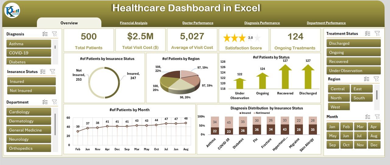
1. Overview Sheet Tab
The Overview Sheet serves as the main summary page, offering a quick glance at essential metrics and data points. This sheet includes:
Cards:
- Total Patients: Displays the total number of patients.
- Total Visit Cost ($): Shows the total cost of all patient visits.
- Average Visit Cost ($): Calculates the average cost per visit.
- Average Satisfaction Score: Presents the average patient satisfaction score.
- Ongoing Treatment Status: Highlights the current status of ongoing treatments.
Charts:
- # of Patients by Insurance Status: A chart that breaks down the number of patients based on their insurance status.
- # of Patients by Region: A chart that shows how many patients are visiting from each region.
- # of Patients by Status: Displays patients by their current treatment status.
- # of Patients by Month: A monthly breakdown of patient visits.
- Diagnosis Distribution by Insurance Status: Shows the distribution of diagnoses by insurance status.
Click to buy Healthcare Dashboard in Excel
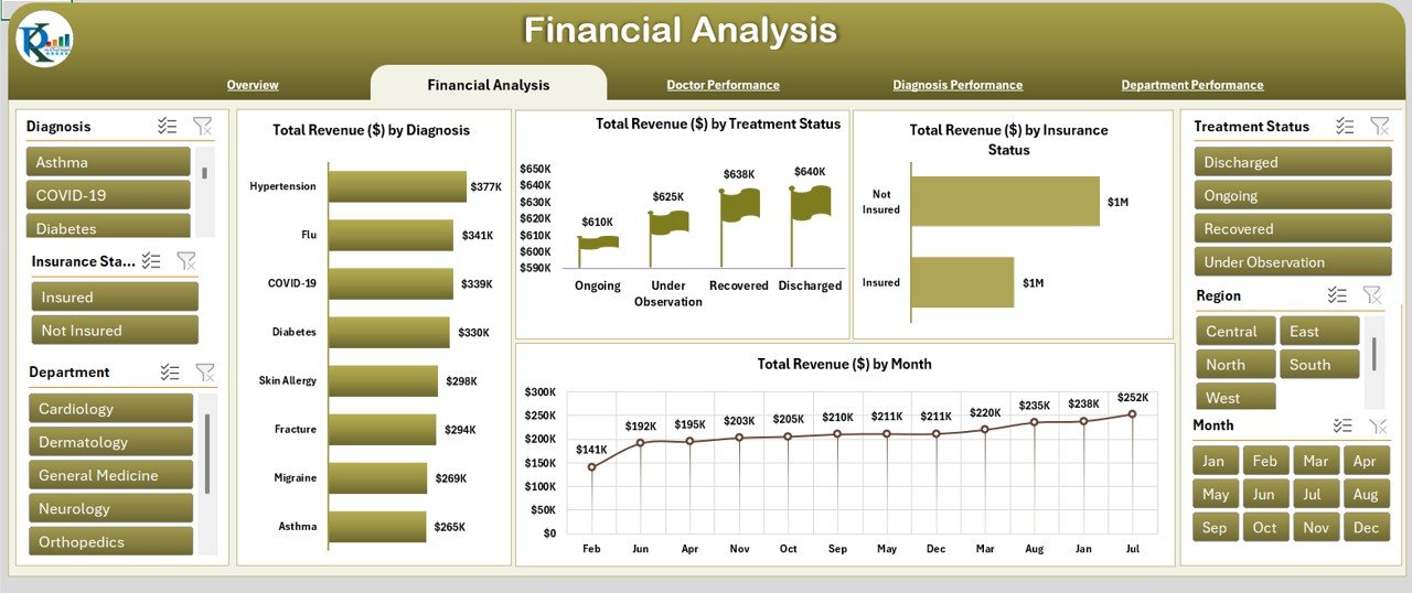
2. Financial Analysis Sheet Tab
This sheet focuses on financial data and helps healthcare providers track revenue trends. It includes the following charts:
-
Total Revenue ($) by Diagnosis: Shows revenue generated based on different diagnoses.
-
Total Revenue ($) by Treatment Status: Tracks revenue according to treatment status.
-
Total Revenue ($) by Insurance Status: Breaks down revenue by patients’ insurance status.
-
Total Revenue ($) by Month: Displays revenue trends over time, broken down by month.
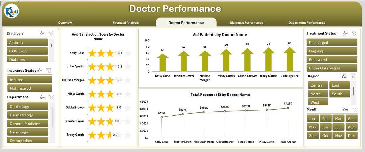
3. Doctor Performance Sheet Tab
The Doctor Performance Sheet helps evaluate the performance of individual doctors by showing the following charts:
-
Average Satisfaction Score by Doctor Name: Displays the average patient satisfaction score for each doctor.
-
# of Patients by Doctor Name: Tracks the number of patients each doctor has attended to.
-
Total Revenue ($) by Doctor Name: Breaks down total revenue based on the doctor handling the patients.
Click to buy Healthcare Dashboard in Excel
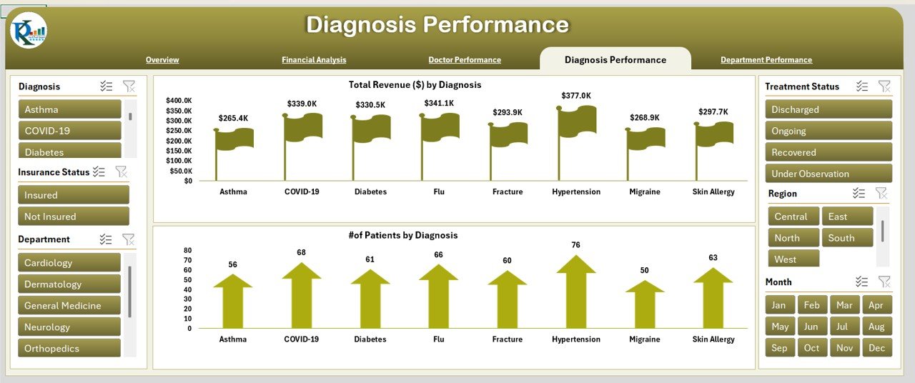
4. Diagnosis Performance Sheet Tab
This sheet focuses on tracking the performance of different diagnoses. It includes charts like:
-
Total Revenue ($) by Diagnosis: Shows the revenue generated from each type of diagnosis.
-
# of Patients by Diagnosis: Tracks the number of patients diagnosed with each condition.
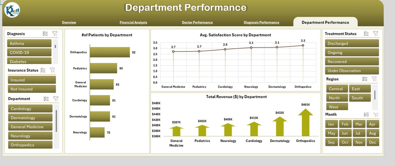
5. Department Performance Sheet Tab
The Department Performance Sheet allows you to track the performance of different hospital departments. It includes charts such as:
-
# of Patients by Department: Tracks the number of patients served by each department.
-
Average Satisfaction Score by Department: Displays average satisfaction scores by department.
-
Total Revenue ($) by Department: Tracks revenue by each department.
Click to buy Healthcare Dashboard in Excel
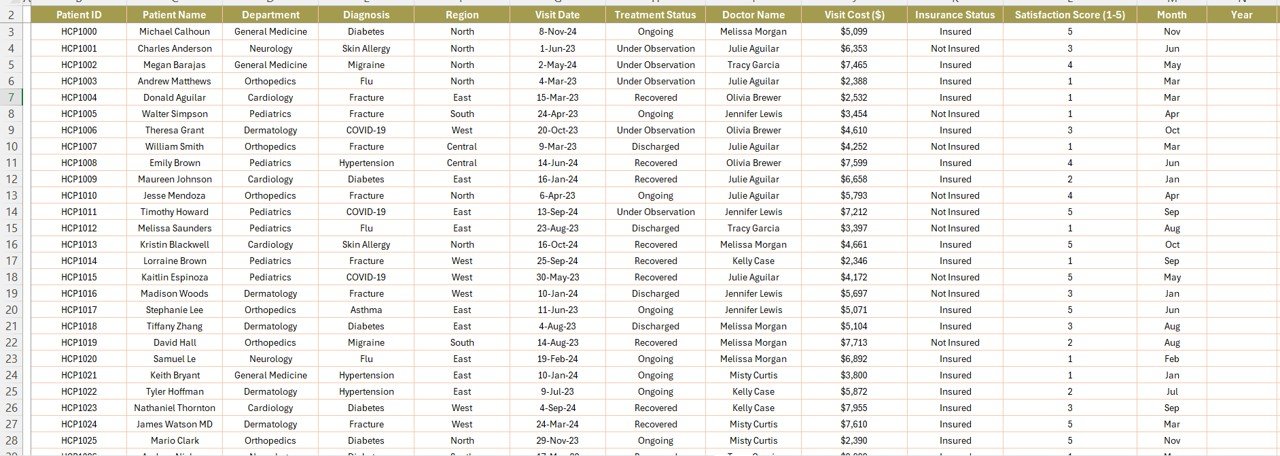
6. Data Sheet Tab
The Data Sheet is where you input raw data, and it serves as the backbone for all other sheets in the dashboard. Here, you will input essential patient and treatment information such as:
This sheet provides the foundation for the other sheets, as it stores all the essential details that feed into the charts and performance metrics.
Advantages of the Healthcare Dashboard in Excel
Centralized Data Management: The dashboard consolidates all key metrics in one place, saving time and effort while eliminating the need to manually track and organize data.
-
Easy Data Analysis: With built-in charts and slicers, healthcare providers can quickly identify trends and patterns in patient care, financial performance, and department metrics.
-
Improved Decision-Making: By monitoring performance data in real-time, healthcare professionals can make informed decisions that enhance patient care and operational efficiency.
-
Customizable for Specific Needs: The dashboard can be easily tailored to fit the specific requirements of any healthcare facility, whether you’re focusing on patient data, revenue, or doctor performance.
-
Cost-Effective Solution: Unlike expensive healthcare management software, the Excel dashboard is a free, easy-to-use solution that doesn’t require additional installations or training.
Best Practices for Using the Healthcare Dashboard in Excel
Click to buy Healthcare Dashboard in Excel
To get the most out of the Healthcare Dashboard in Excel, follow these best practices:
-
Regular Data Updates: Make sure to regularly update the data in the Data Sheet Tab to ensure accurate and up-to-date reporting. A consistent data feed is essential for accurate dashboard insights.
-
Leverage Filters and Slicers: Use slicers and filters to drill down into the data and view specific metrics, such as revenue by diagnosis, satisfaction scores by department, or patient numbers by region.
-
Focus on Key Metrics: Focus on tracking the most relevant KPIs for your healthcare organization. Metrics like patient satisfaction, visit costs, and revenue are often the most critical.
-
Data Quality: Ensure that the data inputted into the Data Sheet Tab is accurate and complete. Missing or incorrect data can skew the dashboard’s results.
-
Customize for Your Needs: Don’t be afraid to adjust the layout, add or remove charts, or include additional filters to tailor the dashboard to your specific needs.
Frequently Asked Questions (FAQ)
Click to buy Healthcare Dashboard in Excel
What is a Healthcare Dashboard in Excel?
A Healthcare Dashboard in Excel is a template designed to track and visualize critical healthcare metrics, such as patient data, treatment costs, and doctor performance. It uses charts and slicers to make data analysis easier and more efficient.
How does a Healthcare Dashboard benefit my practice?
A Healthcare Dashboard offers numerous benefits, including centralized data management, easy data analysis, improved decision-making, and cost-effective solutions for healthcare providers to track patient care and financial performance.
Can I customize the Healthcare Dashboard for my specific needs?
Yes, the Healthcare Dashboard in Excel is highly customizable. You can adjust the charts, add new metrics, and tailor the layout to suit your healthcare practice.
Do I need advanced Excel skills to use this dashboard?
Not at all. The Healthcare Dashboard in Excel is designed to be user-friendly, requiring only basic Excel knowledge. It is easy to use with drag-and-drop slicers and pre-designed charts.
How do I update the data in the dashboard?
Simply input new data into the Data Sheet Tab. The dashboard will automatically update with the new information. Regular updates ensure that the dashboard reflects the most current performance.
Conclusion
The Healthcare Dashboard in Excel is an invaluable tool for healthcare providers looking to monitor patient data, revenue, doctor performance, and department metrics in one place. It simplifies complex data, provides real-time insights, and empowers healthcare professionals to make data-driven decisions that enhance patient care and operational efficiency. By implementing this powerful tool, healthcare organizations can streamline their operations, improve patient satisfaction, and boost overall performance.
Visit our YouTube channel to learn step-by-step video tutorials
Click to buy Healthcare Dashboard in Excel