In the fast-paced telecommunications industry, tracking and managing service-related data is crucial for maintaining customer satisfaction and operational efficiency. A Telecommunications Dashboard in Excel is an essential tool for monitoring key metrics such as ticket resolution time, customer ratings, and technician performance. This article will provide an in-depth overview of how this powerful dashboard works, explain the different sheets and charts used, and explore the benefits and best practices for utilizing this dashboard.
What is a Telecommunications Dashboard in Excel?
A Telecommunications Dashboard in Excel is a data visualization tool designed to track various key performance indicators (KPIs) related to customer support, ticket management, and service performance. By using charts, slicers, and cards, the dashboard provides real-time insights into important metrics such as the total number of tickets, average response times, resolution times, customer satisfaction, and technician performance.
This ready-to-use template is customizable and includes multiple worksheets that focus on different aspects of the telecommunications service process. Whether you’re a customer support manager, service operations head, or technician, this dashboard can help you monitor performance and identify areas for improvement.
Key Features of the Telecommunications Dashboard in Excel
The Telecommunications Dashboard in Excel includes various sheets, charts, and slicers that help users gain valuable insights into service performance. Let’s take a closer look at each sheet and its features:
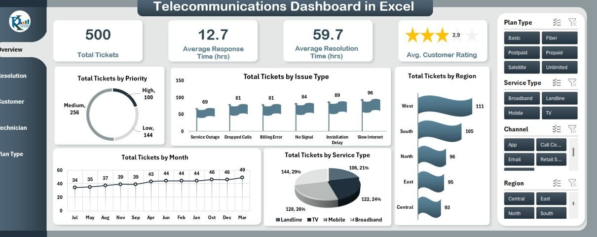
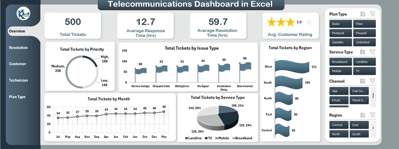
1. Overview Sheet Tab
The Overview Sheet provides a comprehensive snapshot of the overall performance. It contains multiple charts, slicers, and cards to track essential metrics:
Cards:
- Total Tickets: Displays the total number of support tickets raised.
- Avg. Resolution Time (hrs): Shows the average time taken to resolve tickets, measured in hours.
- Avg. Response Time (hrs): Displays the average time taken to respond to a ticket.
- Avg. Customer Rating: Shows the average customer rating on a scale of 1 to 5.
Charts:
- Total Tickets by Priority (Pie Chart): A pie chart that visualizes the distribution of tickets based on priority levels (e.g., Low, Medium, High).
- Total Tickets by Issue Type (Flag Chart): A flag chart showing the types of issues reported (e.g., billing issues, network problems, etc.).
- Total Tickets by Month (Line Chart): A line chart depicting the trend of ticket creation over the months.
- Total Tickets by Service Type (Pie Chart): A pie chart displaying the distribution of tickets across various service types.
- Total Tickets by Region (Bar Chart): A bar chart that shows ticket distribution based on geographic regions.
Click to buy Telecommunications Dashboard in Excel
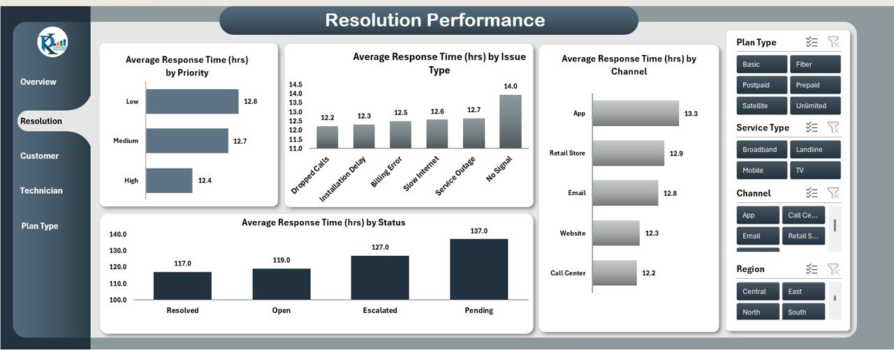
2. Resolution Performance Sheet Tab
This sheet focuses on Resolution Performance and provides insights into how efficiently tickets are resolved:
Charts:
- Average Response Time (hrs) by Priority (Bar Chart): A bar chart that shows the average response time for different priority levels.
- Average Response Time (hrs) by Issue Type (Column Chart): A column chart depicting the response time based on different types of issues.
- Average Response Time (hrs) by Status (Column Chart): A column chart that illustrates the response time based on the ticket status (e.g., open, closed, pending).
- Average Response Time (hrs) by Channel (Bar Chart): A bar chart showing the response times based on the communication channel (e.g., phone, email, chat).
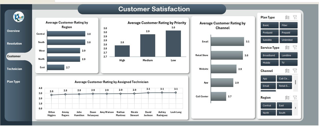
3. Customer Satisfaction Sheet Tab
This sheet helps track customer satisfaction and includes various charts for detailed insights:
Charts:
- Average Customer Rating by Region (Bar Chart): A bar chart that shows how customer ratings differ by region.
- Average Customer Rating by Priority (Column Chart): A column chart that tracks customer satisfaction based on ticket priority levels.
- Average Customer Rating by Channel (Bar Chart): A bar chart that displays how customer ratings vary by communication channel.
- Average Customer Rating by Assigned Technician (Line Chart): A line chart that shows the customer ratings by the assigned technician.
Click to buy Telecommunications Dashboard in Excel
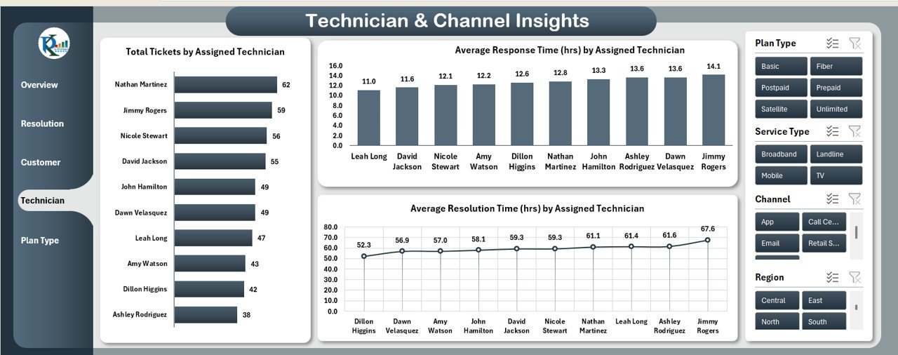
4. Technician & Channel Insights Sheet Tab
This sheet focuses on the performance of technicians and communication channels:
Charts:
- Total Tickets by Assigned Technician (Bar Chart): A bar chart showing how many tickets each technician has handled.
- Average Response Time (hrs) by Assigned Technician (Column Chart): A column chart displaying the average response time per technician.
- Average Resolution Time (hrs) by Assigned Technician (Line Chart): A line chart that tracks the average resolution time for each technician.
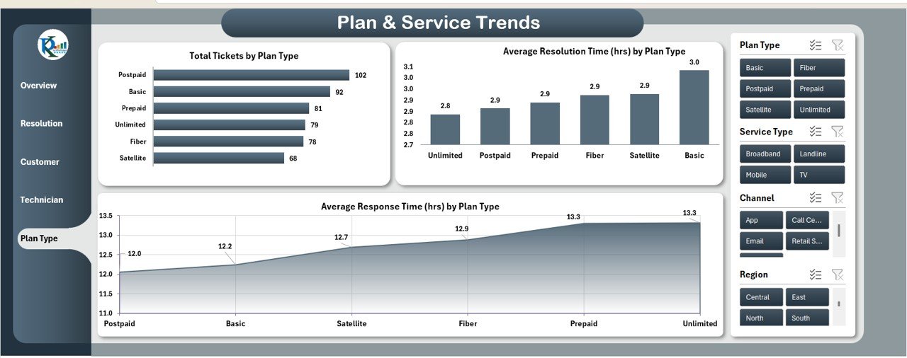
5. Plan & Service Trends Sheet Tab
This sheet tracks trends related to plans and services:
Charts:
- Total Tickets by Plan Type (Bar Chart): A bar chart that shows the number of tickets raised per plan type (e.g., Basic, Premium).
- Average Resolution Time (hrs) by Plan Type (Column Chart): A column chart displaying the resolution time based on plan type.
- Average Response Time (hrs) by Plan Type (Line Chart): A line chart that tracks the response time per plan type.
Click to buy Telecommunications Dashboard in Excel
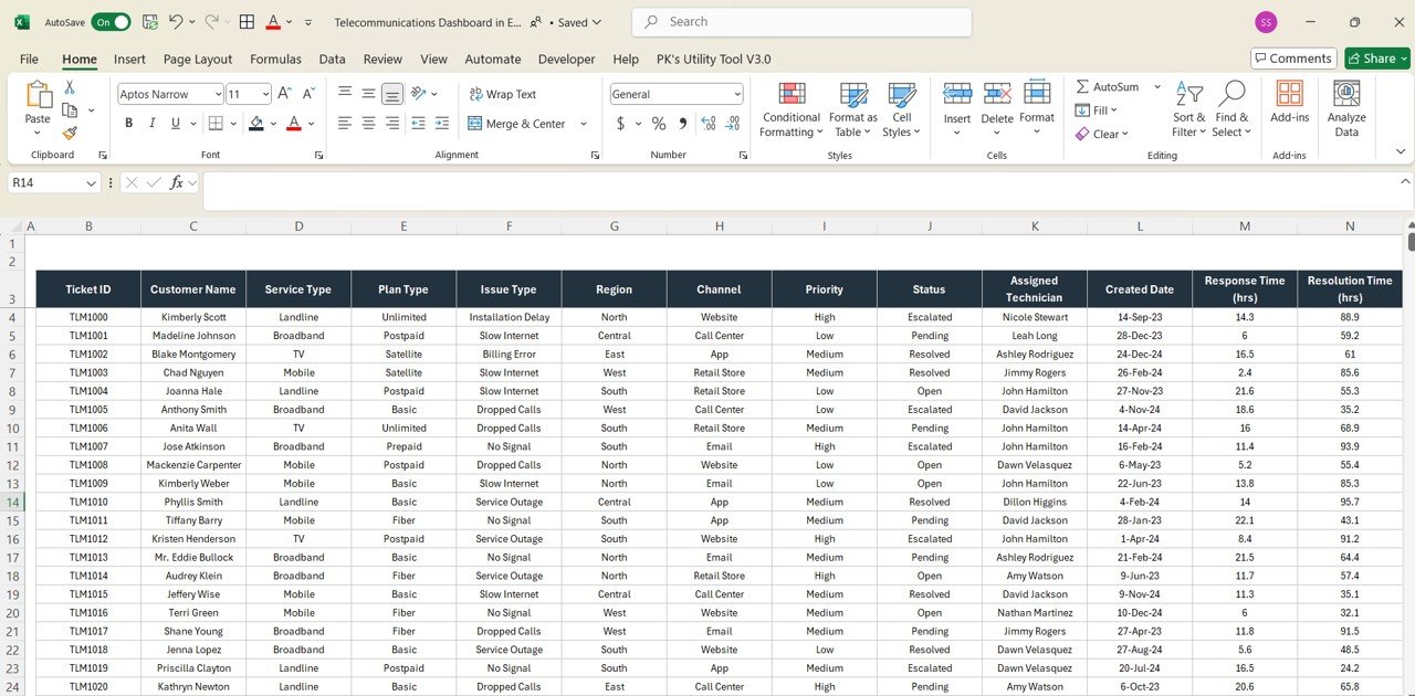
6. Data Sheet Tab
The Data Sheet contains the raw data input for the dashboard. This sheet includes the following columns:
-
Ticket ID: A unique identifier for each ticket.
-
Customer Name: The name of the customer who raised the ticket.
-
Service Type: The type of service (e.g., internet, phone).
-
Plan Type: The plan under which the customer is subscribed.
-
Issue Type: The type of issue raised in the ticket.
-
Region: The geographical region where the customer is located.
-
Channel: The channel through which the ticket was raised (e.g., phone, email, chat).
-
Priority: The priority level of the ticket (e.g., Low, Medium, High).
-
Status: The current status of the ticket (e.g., Open, Closed, Pending).
-
Assigned Technician: The technician assigned to resolve the ticket.
-
Created Date: The date the ticket was created.
-
Response Time (hrs): The time taken to respond to the ticket.
-
Resolution Time (hrs): The time taken to resolve the ticket.
-
Customer Rating (1-5): The rating given by the customer on a scale of 1 to 5.
-
Month: The month in which the ticket was created.
Click to buy Telecommunications Dashboard in Excel
Advantages of Using the Telecommunications Dashboard in Excel
The Telecommunications Dashboard in Excel offers several advantages for telecom companies, customer service managers, and technicians:
-
Real-Time Insights: The dashboard provides real-time data updates, allowing stakeholders to make informed decisions quickly.
-
Improved Efficiency: By visualizing key performance metrics, managers can identify bottlenecks and improve operational efficiency.
-
Customer Satisfaction Monitoring: The dashboard helps track customer ratings and satisfaction levels, allowing businesses to take corrective actions when necessary.
-
Data-Driven Decisions: The use of charts and slicers enables businesses to make decisions based on accurate and up-to-date data.
-
Customizable: The dashboard is customizable, allowing users to modify it according to their specific needs.
Opportunity for Improvement in the Telecommunications Dashboard
While the Telecommunications Dashboard in Excel offers numerous benefits, there is always room for improvement. Some opportunities include:
-
Integration with External Data Sources: Integrating the dashboard with external databases or CRM systems could streamline the data input process and reduce manual updates.
-
Predictive Analytics: Adding predictive analytics features could help forecast ticket volumes, customer satisfaction, and technician performance, allowing businesses to plan more effectively.
-
Automation of Reporting: Automating the generation of periodic reports could save time and provide timely insights to stakeholders.
-
Mobile Access: Developing a mobile version of the dashboard could allow managers and technicians to access real-time data on the go.
Best Practices for Using the Telecommunications Dashboard in Excel
Click to buy Telecommunications Dashboard in Excel
To maximize the value of the Telecommunications Dashboard in Excel, follow these best practices:
-
Regularly Update Data: Ensure that data is updated regularly to keep the dashboard accurate and reflective of current performance.
-
Set Clear KPIs: Define clear KPIs based on the data tracked in the dashboard. This will help focus efforts on improving key areas.
-
Leverage Slicers: Use slicers to filter data by region, service type, or priority, making it easier to analyze specific subsets of data.
-
Share Insights with the Team: Share the dashboard with the relevant teams to keep them informed about performance and encourage collaboration.
-
Use the Trends Tab: Track trends over time to identify patterns and areas for improvement.
Conclusion
The Telecommunications Dashboard in Excel is a powerful tool for managing and tracking key performance indicators in the telecommunications industry. With its detailed charts, slicers, and real-time data tracking, this dashboard helps businesses streamline their operations, improve customer service, and make data-driven decisions. By leveraging the power of Excel and customizing the dashboard to fit your specific needs, you can optimize your telecommunications operations and deliver better service to your customers.
Frequently Asked Questions (FAQs)
1. What are the key features of the Telecommunications Dashboard?
The dashboard includes multiple sheets, charts, and slicers to track key metrics like ticket volume, resolution time, customer satisfaction, and technician performance.
2. Can I customize the dashboard for my specific needs?
Yes, the dashboard is fully customizable. You can adjust the themes, add new charts, and modify the data input as needed.
3. How does the data update in the dashboard?
The dashboard updates in real time as you input new data into the Data Sheet tab. All charts and metrics will automatically reflect the latest data.
4. Can I use the dashboard to track multiple regions or service types?
Yes, you can use slicers to filter and analyze data based on different regions, service types, or other relevant categories.
5. How can the dashboard help improve customer satisfaction?
By tracking customer ratings and response times, you can identify areas where customer satisfaction is low and take corrective action to improve service.
Visit our YouTube channel to learn step-by-step video tutorials
Youtube.com/@NeotechNavigators
Click to buy Telecommunications Dashboard in Excel