In today’s highly competitive market, tracking customer satisfaction is essential for improving products, services, and overall business performance. One of the most effective ways to gauge customer satisfaction is by using the Net Promoter Score (NPS). In this article, we will walk you through a comprehensive NPS Dashboard in Excel, which allows businesses to efficiently track NPS ratings and analyze customer feedback in a visually engaging and easy-to-use format.
What is NPS?
The Net Promoter Score (NPS) is a metric used to measure customer loyalty and satisfaction. It is based on the question: “How likely are you to recommend our product or service to a friend or colleague?” Respondents rate their likelihood on a scale of 0-10, and based on their score, they are classified into three categories:
-
Promoters (9-10): Loyal customers who will continue buying and refer others.
-
Passives (7-8): Satisfied but not enthusiastic customers.
-
Detractors (0-6): Unhappy customers who are unlikely to recommend your product.
The NPS is then calculated by subtracting the percentage of Detractors from the percentage of Promoters. This number can range from -100 to +100 and provides a clear picture of overall customer satisfaction.
Key Features of the NPS Dashboard in Excel
Click to buy NPS Dashboard in Excel
The NPS Dashboard in Excel is a powerful, ready-to-use template that enables you to track and analyze your NPS data across multiple dimensions. The dashboard includes several key sheets that break down your NPS data into actionable insights.
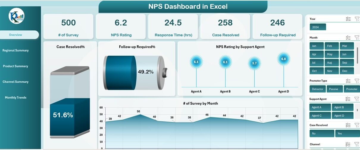
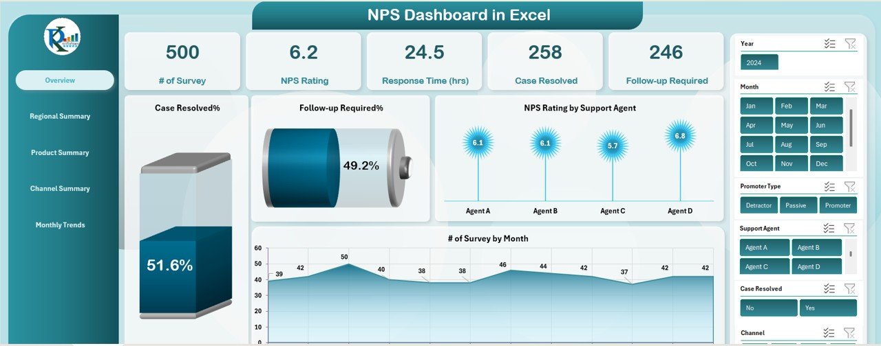
1. Overview Sheet Tab
The Overview sheet provides a summary of your NPS performance with multiple types of charts, slicers, and cards. Key metrics displayed in this section include:
Cards:
- # of Surveys: Total number of customer surveys collected.
- NPS Rating: Overall Net Promoter Score.
- Response Time (hrs): Average time taken to respond to customer inquiries.
- Case Resolved: Percentage of cases resolved successfully.
- Follow-up Required: Percentage of cases that require follow-up.
Charts:
- Case Resolved%: Displays the percentage of cases successfully resolved.
- Follow-up Required%: Displays the percentage of cases that require follow-up.
- NPS Rating by Support Agent: Breaks down NPS scores by individual support agents.
- # of Survey by Month: Displays the number of surveys collected each month.
Click to buy NPS Dashboard in Excel
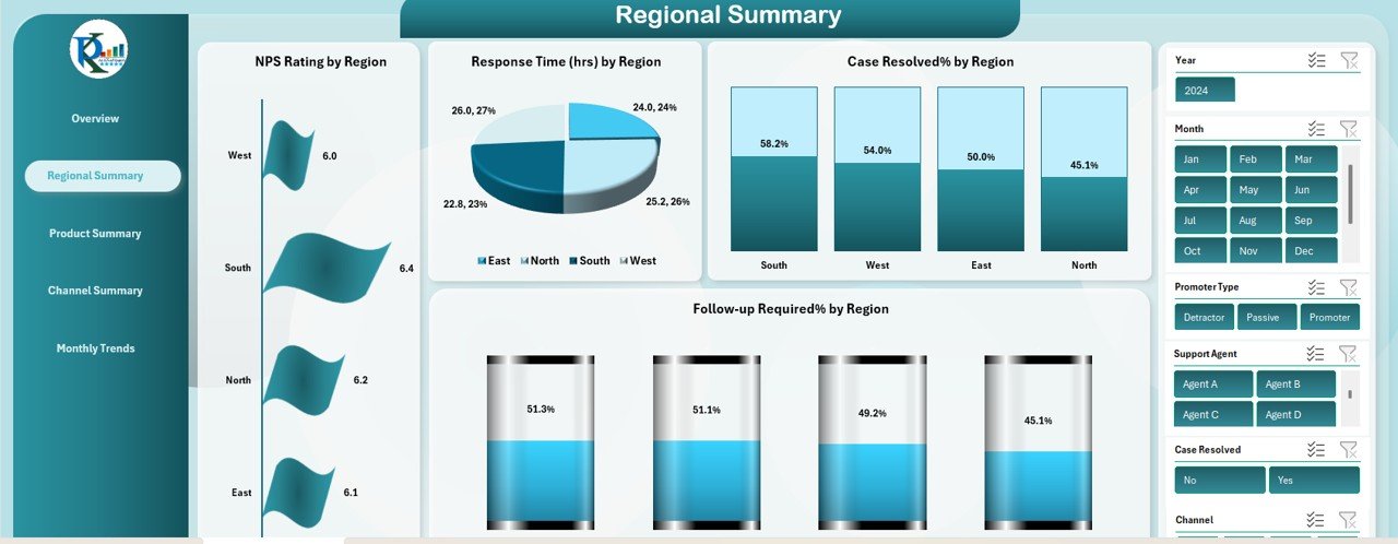
2. Regional Summary Sheet Tab
The Regional Summary sheet provides insights into NPS performance by region. This tab includes the following charts:
-
NPS Rating by Region: Tracks NPS scores by region.
-
Response Time (hrs) by Region: Displays average response times for each region.
-
Case Resolved% by Region: Shows the percentage of cases resolved by region.
-
Follow-up Required% by Region: Displays the percentage of cases requiring follow-up by region.
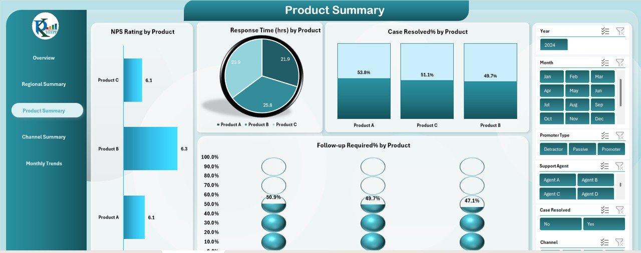
3. Product Summary Sheet Tab
The Product Summary sheet focuses on tracking NPS performance by product. It includes:
-
NPS Rating by Product: Displays NPS scores for each product.
-
Response Time (hrs) by Product: Tracks average response time per product.
-
Case Resolved% by Product: Shows the resolution percentage for each product.
-
Follow-up Required% by Product: Displays the percentage of cases requiring follow-up by product.
Click to buy NPS Dashboard in Excel
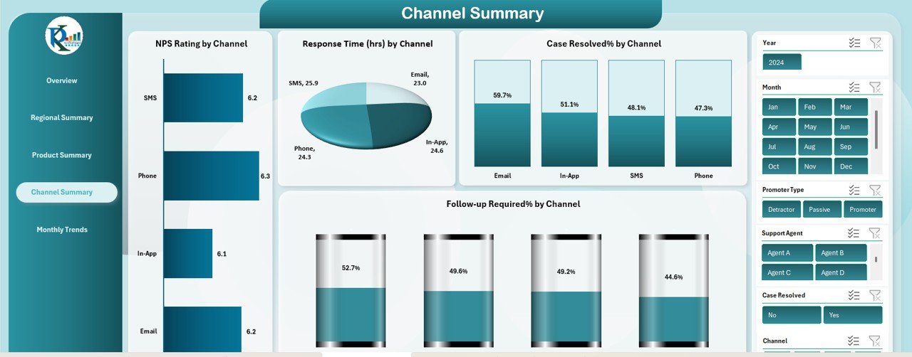
4. Channel Summary Sheet Tab
The Channel Summary sheet breaks down NPS performance by communication channel. This sheet includes:
-
NPS Rating by Channel: Tracks NPS scores across different channels (e.g., email, chat, phone).
-
Response Time (hrs) by Channel: Shows average response time by channel.
-
Case Resolved% by Channel: Displays case resolution percentages by communication channel.
-
Follow-up Required% by Channel: Shows the percentage of follow-up cases by channel.
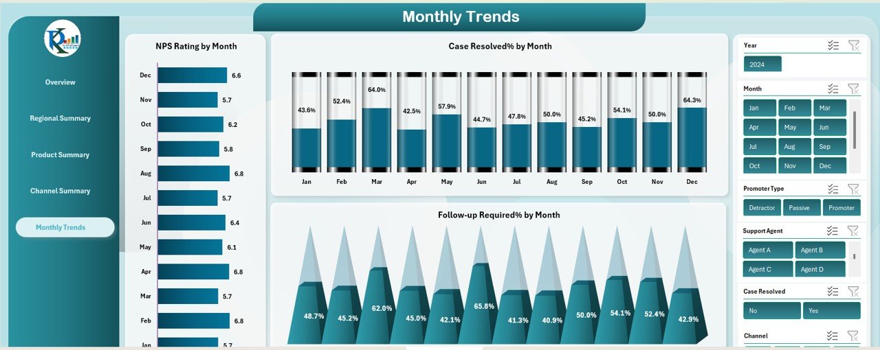
5. Monthly Trends Sheet Tab
The Monthly Trends sheet provides a historical view of NPS performance over time. Key charts include:
-
NPS Rating by Month: Tracks NPS ratings for each month.
-
Case Resolved% by Month: Displays case resolution percentages for each month.
-
Follow-up Required% by Month: Shows the monthly follow-up percentages.
Click to buy NPS Dashboard in Excel
6. Data Sheet Tab
The Data Sheet is where all raw customer feedback data is entered. This tab acts as the input source for all the charts and calculations in the other sheets. You can enter survey data, including NPS scores, response times, and case resolutions, which will automatically update the entire dashboard.
How the NPS Dashboard Helps Improve Customer Satisfaction
The NPS Dashboard in Excel helps businesses monitor customer satisfaction and take data-driven actions to improve their services. By analyzing the data across various dimensions (support agents, regions, products, and channels), you can pinpoint areas where your business excels and areas that need improvement. Here’s how the dashboard contributes to customer satisfaction:
-
Track Customer Sentiment: Understand overall customer sentiment by monitoring your NPS rating over time.
-
Measure Agent Performance: Analyze how different support agents perform in terms of NPS and case resolutions, helping to identify top performers and areas for training.
-
Optimize Response Times: Use response time data to identify bottlenecks in your support process and improve efficiency.
-
Focus on Products and Channels: Identify which products and channels are generating the most satisfaction (or dissatisfaction), enabling you to focus efforts where they matter most.
Advantages of Using the NPS Dashboard in Excel
Click to buy NPS Dashboard in Excel
-
Ease of Use: With its intuitive layout and ready-to-use functionality, the NPS Dashboard in Excel is simple to implement and use.
-
Customizable: Tailor the dashboard to suit your organization’s unique needs, whether it’s adjusting the KPIs, adding new charts, or changing the data inputs.
-
Real-Time Insights: The dashboard automatically updates as new data is entered, giving you up-to-date insights into customer satisfaction.
-
Data-Driven Decisions: By tracking key metrics like NPS scores, response times, and case resolutions, you can make informed decisions to improve customer service.
-
Cross-Department Insights: By viewing performance across regions, products, and channels, you can drive collaboration and optimize service delivery.
Best Practices for Using the NPS Dashboard
-
Consistent Data Entry: Ensure data is entered consistently and on time to maintain the accuracy of the dashboard’s insights.
-
Regular Review: Review the dashboard regularly to stay on top of customer satisfaction trends and identify areas for improvement.
-
Actionable Goals: Set clear, actionable goals based on dashboard insights. For example, aim to improve case resolution rates or reduce response times.
-
Feedback Loops: Use the insights from the dashboard to initiate feedback loops with your support team. Regular training and performance assessments should be based on data.
Conclusion
Click to buy NPS Dashboard in Excel
The NPS Dashboard in Excel is an invaluable tool for monitoring customer satisfaction, tracking performance, and making data-driven decisions to enhance customer experience. Whether you are a customer service manager, support team lead, or business executive, this dashboard gives you the tools you need to improve your customer support services and drive business success.
Frequently Asked Questions (FAQs)
1. How can I use the NPS Dashboard to track customer satisfaction?
You can use the NPS Dashboard by entering survey data into the Data Sheet, which will automatically update charts and metrics across various sheets, such as Overview, Regional Summary, and Product Summary.
2. Can I customize the NPS Dashboard to include additional metrics?
Yes, the NPS Dashboard is fully customizable. You can add new metrics, adjust formulas, or modify the layout to better suit your organization’s needs.
3. What are the key metrics tracked by the NPS Dashboard?
The key metrics tracked include NPS Rating, Response Time (hrs), Case Resolved%, and Follow-up Required% for various dimensions such as support agents, products, channels, and regions.
4. How does the NPS Dashboard help improve customer service?
By identifying trends and areas for improvement, the NPS Dashboard allows businesses to optimize response times, improve case resolutions, and focus on the products and channels that require attention.
5. Can the NPS Dashboard be used for multiple regions or products?
Yes, the NPS Dashboard allows you to analyze customer satisfaction by regions, products, and even channels, giving you a detailed view of performance across different aspects of your business.
Visit our YouTube channel to learn step-by-step video tutorials
Click to buy NPS Dashboard in Excel