In the fast-paced world of insurance, being able to visualize and manage key metrics is essential for making informed business decisions. The Insurance Dashboard in Power BI is a ready-to-use tool that provides valuable insights into insurance policy performance, premium collection, claims management, and more. With various interactive pages and slicers, this dashboard allows insurance companies to monitor their overall performance effectively, identify trends, and take necessary actions for optimization.
What is the Insurance Dashboard in Power BI?
The Insurance Dashboard in Power BI is an interactive tool designed to track key performance indicators (KPIs) related to insurance policies, premiums, claims, and agents. It combines multiple visualizations like cards, charts, and slicers to provide a comprehensive overview of insurance data. This dashboard helps insurance companies analyze policies, track premium collection, assess claims status, and evaluate performance across different dimensions such as region, policy type, and gender.
Key Features of the Insurance Dashboard in Power BI
Click to buy Insurance Dashboard in Power BI
The Insurance Dashboard in Power BI consists of several pages, each focusing on different aspects of the insurance business. Below are the key features of each page:
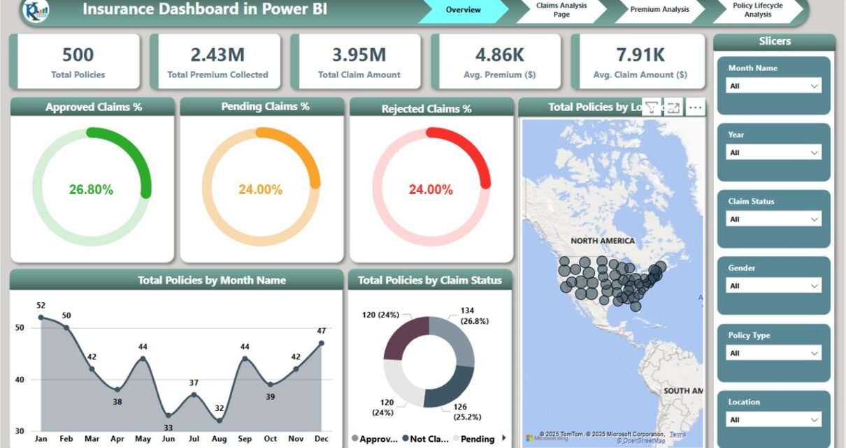
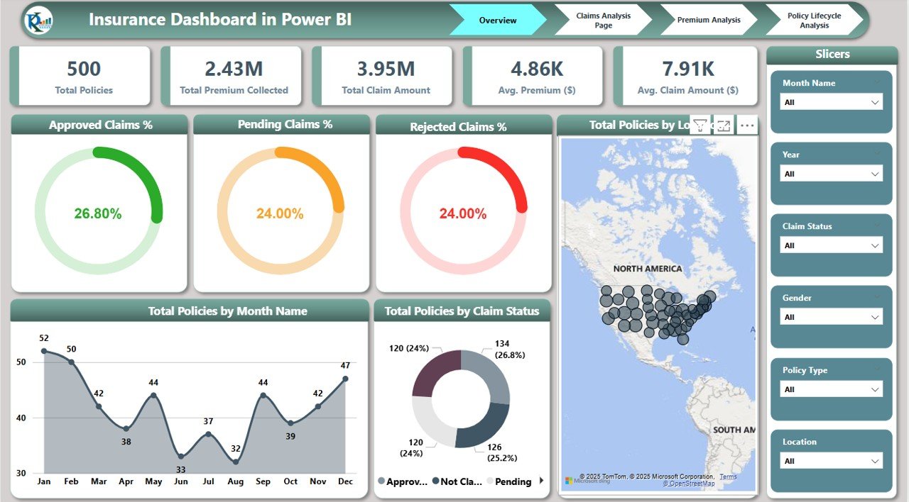
1. Overview Page
The Overview page provides a high-level snapshot of your insurance data through cards and charts:
Cards:
- Total Policies: Displays the total number of active insurance policies.
- Total Premium Collected: Shows the total amount of premium collected.
- Total Claim Amount: Displays the total amount of claims filed.
- Avg. Premium ($): Shows the average premium amount across all policies.
- Avg. Claim Amount ($): Displays the average claim amount.
Charts:
- Approved Claims %: Shows the percentage of approved claims compared to total claims.
- Pending Claims %: Tracks the percentage of claims that are still pending.
- Rejected Claims %: Displays the percentage of rejected claims.
- Total Policies by Month Name: Tracks the number of policies issued per month.
- Total Policies by Claim Status: Visualizes the number of policies in each claim status category.
Click to buy Insurance Dashboard in Power BI
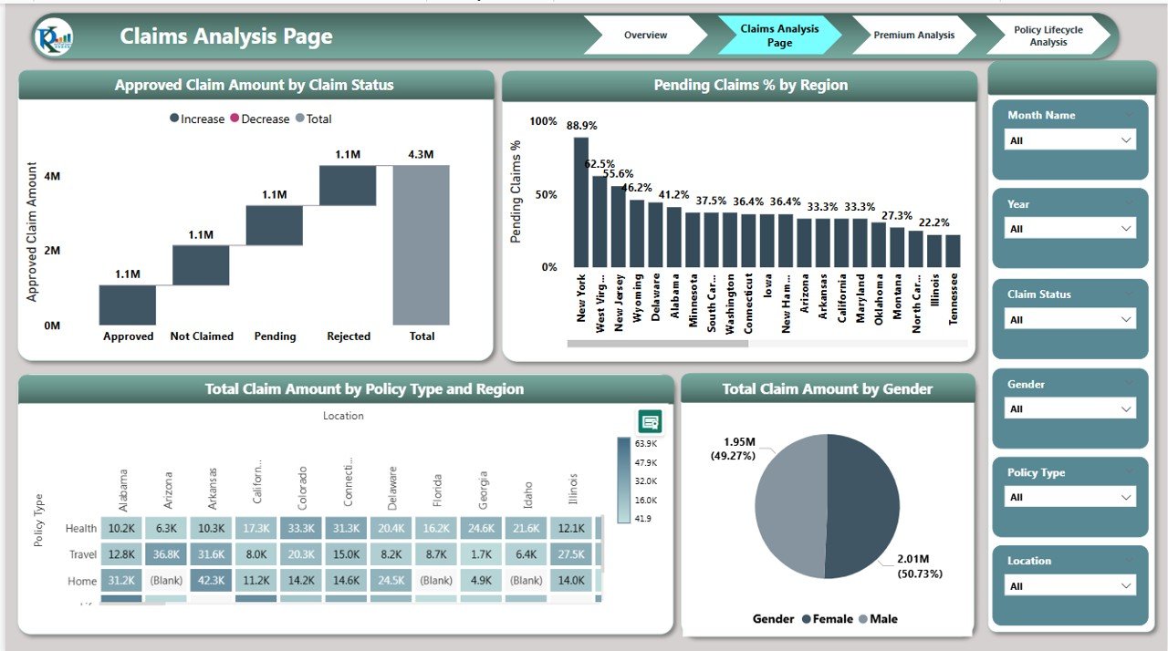
2. Claims Analysis Page
The Claims Analysis page provides deeper insights into claims and their outcomes:
Charts:
- Approved Claim Amount by Claim Status: Displays the total approved claim amount, segmented by claim status.
- Pending Claims % by Region: Tracks the percentage of pending claims, broken down by region.
- Total Claim Amount by Policy Type and Region: Shows the total claim amount by different policy types and regions.
- Total Claim Amount by Gender: Visualizes claim amounts based on the gender of policyholders.
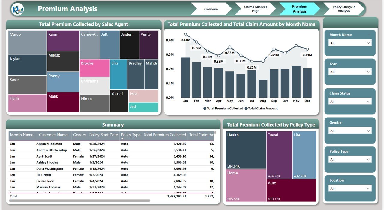
3. Premium Analysis Page
The Premium Analysis page focuses on premium-related metrics:
Charts:
- Total Premium Collected by Sales Agent: Displays premium collection figures for each sales agent.
- Total Premium Collected and Total Claim Amount by Month: Compares the total premium collected with the total claim amount for each month.
- Total Premium Collected by Policy Type: Shows the total premium collected by different policy types.
Click to buy Insurance Dashboard in Power BI
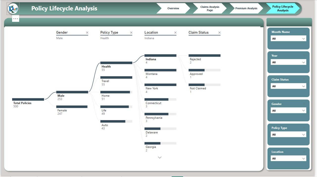
4. Policy Lifecycle Analysis Page
The Policy Lifecycle Analysis page tracks the lifecycle of policies:
Chart:
- Decomposition Tree: A visual representation of policy lifecycle stages, helping you understand how policies are distributed across various stages such as active, expired, and canceled.
How the Insurance Dashboard Helps Improve Insurance Operations
The Insurance Dashboard in Power BI provides valuable insights that help insurance companies optimize their operations and make data-driven decisions. Here’s how it helps:
-
Track Policy Performance: By monitoring key metrics such as the total number of policies and average premium collected, insurance companies can assess overall policy performance.
-
Claim Status Monitoring: The dashboard’s claim-related charts allow businesses to track the status of claims in real-time, helping identify delays and bottlenecks in the claims process.
-
Regional Insights: By breaking down data by region, policy type, and gender, insurance companies can identify trends and optimize their strategies for different demographics.
-
Sales Performance: The dashboard tracks premium collection by sales agents, helping managers evaluate the performance of individual agents and identify areas for improvement.
-
Financial Planning: With real-time tracking of total premium collected and claim amounts, insurance companies can better plan for financial performance and profitability.
Advantages of Using the Insurance Dashboard in Power BI
Click to buy Insurance Dashboard in Power BI
-
Real-Time Insights: The dashboard provides up-to-date information on policies, premiums, claims, and agent performance, enabling faster decision-making.
-
Interactive Visualizations: The use of slicers and charts makes it easy to explore data and identify trends across different dimensions.
-
Comprehensive Data: With multiple pages covering claims, premiums, policy types, and regional performance, the dashboard offers a holistic view of your insurance business.
-
Customizable: The dashboard can be easily customized to include additional metrics or adjust visualizations based on specific needs.
-
Efficient Reporting: The dashboard provides clear, visual reports that make it easier to communicate performance to stakeholders.
Best Practices for Using the Insurance Dashboard in Power BI
To get the most out of your Insurance Dashboard in Power BI, consider these best practices:
-
Update Data Regularly: Keep the data updated frequently to ensure that your insights reflect the most current status of your policies and claims.
-
Monitor Key Metrics: Regularly review key metrics like approved claims %, total premium collected, and claims by region to identify areas needing attention.
-
Set Clear Goals: Use the dashboard to set specific goals for sales agents, claims approval rates, and other KPIs to drive performance.
-
Share Insights with Stakeholders: The visual nature of the dashboard makes it ideal for sharing insights with senior management or other stakeholders.
-
Use Regional Insights: Leverage the regional data to tailor your strategies and marketing efforts to specific geographic areas, enhancing customer acquisition and retention.
Conclusion
Click to buy Insurance Dashboard in Power BI
The Insurance Dashboard in Power BI is an invaluable tool for insurance companies looking to optimize their operations, manage claims efficiently, and track premium collections. With its interactive charts, detailed insights, and real-time data updates, this dashboard provides the tools needed to make data-driven decisions, enhance operational efficiency, and improve financial performance. Whether you’re managing policies, claims, or agent performance, this dashboard ensures you have the right information to make informed decisions and drive growth.
Frequently Asked Questions (FAQs)
1. How do I enter data into the Insurance Dashboard?
Data is typically entered into Power BI through connected data sources such as databases or manual inputs, depending on the setup of your system.
2. Can I customize the Insurance Dashboard?
Yes, the dashboard is customizable. You can modify existing charts, add new KPIs, or adjust the layout to fit your specific needs.
3. How does the claims analysis help manage claims?
The claims analysis page breaks down claims by status and region, allowing you to track pending claims, approve claims, and address any delays promptly.
4. What does the Decomposition Tree show in the Policy Lifecycle Analysis?
The Decomposition Tree provides a visual representation of the policy lifecycle, helping you understand how policies are distributed across different stages like active, expired, and canceled.
5. How does the premium analysis benefit the sales team?
Visit our YouTube channel to learn step-by-step video tutorials
Watch the step-by-step video Demo:
Click to buy Insurance Dashboard in Power BI