Every consulting business wants to track performance, improve service delivery, and make informed decisions. However, most teams struggle because they rely on scattered spreadsheets, manual tracking, and inconsistent reporting. A Consulting KPI Dashboard in Power BI solves this problem. It brings all your performance indicators into one place so you can see trends, measure efficiency, and drive better outcomes.
This complete guide explains everything about the Consulting KPI Dashboard in Power BI. You will learn how it works, what features it includes, how each page supports your reporting needs, and why this dashboard makes your consulting operations easier and faster. Because the dashboard uses an Excel data source, you can manage the data easily without technical skills.
Click to buy Consulting KPI Dashboard in Power BI
What Is a Consulting KPI Dashboard in Power BI?
A Consulting KPI Dashboard in Power BI is an interactive reporting tool that helps consulting firms track monthly performance, targets, trends, and KPI definitions. It presents data in a simple, visual, and actionable way, so consulting teams can understand their performance at a glance.
You can track MTD (Month-to-Date), YTD (Year-to-Date), KPI Groups, Current Year vs Previous Year comparison, and performance icons that show whether you meet your targets. Because the dashboard uses slicers, charts, and dynamic visuals, you can explore insights quickly and make better decisions.
This dashboard works well for:
- Management consulting firms
- IT consulting companies
- Strategy and business advisory firms
- HR, finance, and operations consulting
- Independent consultants
- Professional service providers
Power BI makes it easy to explore data, compare performance, and improve KPIs month after month.
Why Consulting Teams Need a KPI Dashboard
Consulting teams deal with deadlines, client expectations, billable hours, resource planning, and project success metrics. When performance tracking becomes manual, teams lose visibility, and decision-making becomes slow.
A Consulting KPI Dashboard helps because:
- It keeps all KPIs organized
- It improves performance tracking
- It highlights target gaps
- It shows month-wise and year-wise growth
- It brings clarity to the team
- It supports data-based decision-making
Since Power BI updates visuals automatically, your team can save time and work smarter.
Key Features of the Consulting KPI Dashboard in Power BI
This ready-to-use dashboard contains three powerful pages inside the Power BI file. Each page focuses on a different type of reporting and analysis.
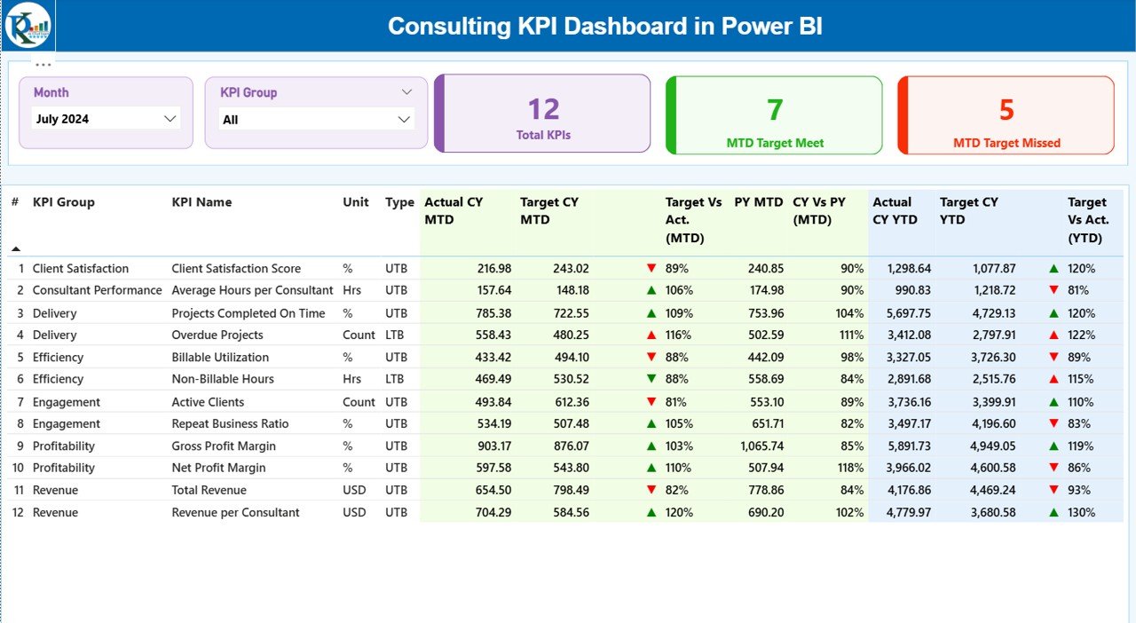
Summary Page – Your Main Performance View
The Summary Page is the first and most important page of the Consulting KPI Dashboard. It provides a complete overview of all KPIs for the selected month.
Key elements on the Summary Page
Month and KPI Group slicers
You can select any month and filter data by KPI group. This helps you drill down into specific categories like Finance, Operations, Delivery, Productivity, or Client Satisfaction.
Three performance cards
These cards give a quick snapshot of performance:
- Total KPIs Count
- MTD Target Met Count
- MTD Target Missed Count
You can quickly see whether your team is meeting expectations.
Detailed KPI Table
Below the cards, you see a detailed KPI table with many useful fields:
- KPI Number
A sequence number to identify each KPI.
- KPI Group
The category of the KPI—for example, Delivery, Client Experience, Financials, Productivity, or Operations.
- KPI Name
The exact name of the Key Performance Indicator.
- Unit
The unit of measurement—percentage, hours, count, days, revenue, etc.
- Type (LTB / UTB)
- LTB (Lower the Better)
- UTB (Upper the Better)
This helps you understand how to interpret each KPI.
MTD Analysis Section
- Actual CY MTD
Current Year Month-to-Date actual performance.
- Target CY MTD
The planned or target number for the month.
- MTD Icon
A visual indicator:
- ▲ Green – Target achieved
- ▼ Red – Target missed
These icons make analysis fast and simple.
- Target vs Actual (MTD)
A percentage that compares actual performance with the target.
Formula used:
Actual MTD / Target MTD
- PY MTD
Previous Year MTD number for comparison.
- CY vs PY (MTD)
The percentage comparison between current year and previous year.
Formula used:
Current MTD / Previous MTD
YTD Analysis Section
- Actual CY YTD
Year-to-Date actual performance.
- Target CY YTD
Year-to-Date target.
- YTD Icon
Same as MTD icons, showing achievement status.
- Target vs Actual (YTD)
Formula:
Actual YTD / Target YTD
- PY YTD
Previous Year YTD performance.
- CY vs PY (YTD)
Formula:
Current YTD / Previous YTD
This complete view helps consulting teams compare performance, see patterns, and act on insights.
Click to buy Consulting KPI Dashboard in Power BI
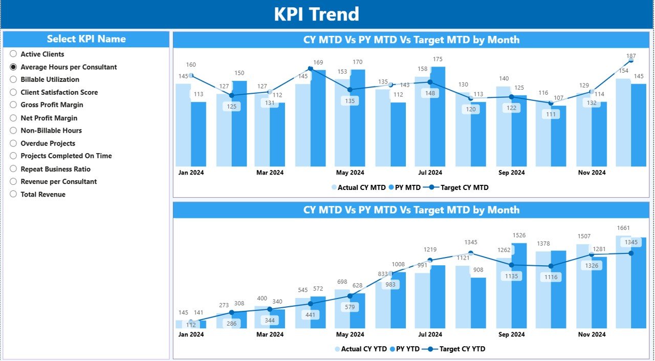
KPI Trend Page – Track Performance Over Time
The KPI Trend Page helps you understand long-term patterns. It includes two combo charts that show:
- Current year values
- Previous year values
- Target values
- MTD performance
- YTD performance
Slicer for KPI Selection
A slicer on the left lets you select the KPI you want to analyze. Once you choose a KPI, both charts update automatically.
This page is helpful for:
- Trend analysis
- MTD vs YTD comparison
- Growth tracking
- KPI forecasting
- Year-over-year improvement
You can easily identify whether performance is rising, stable, or declining.
Click to buy Consulting KPI Dashboard in Power BI
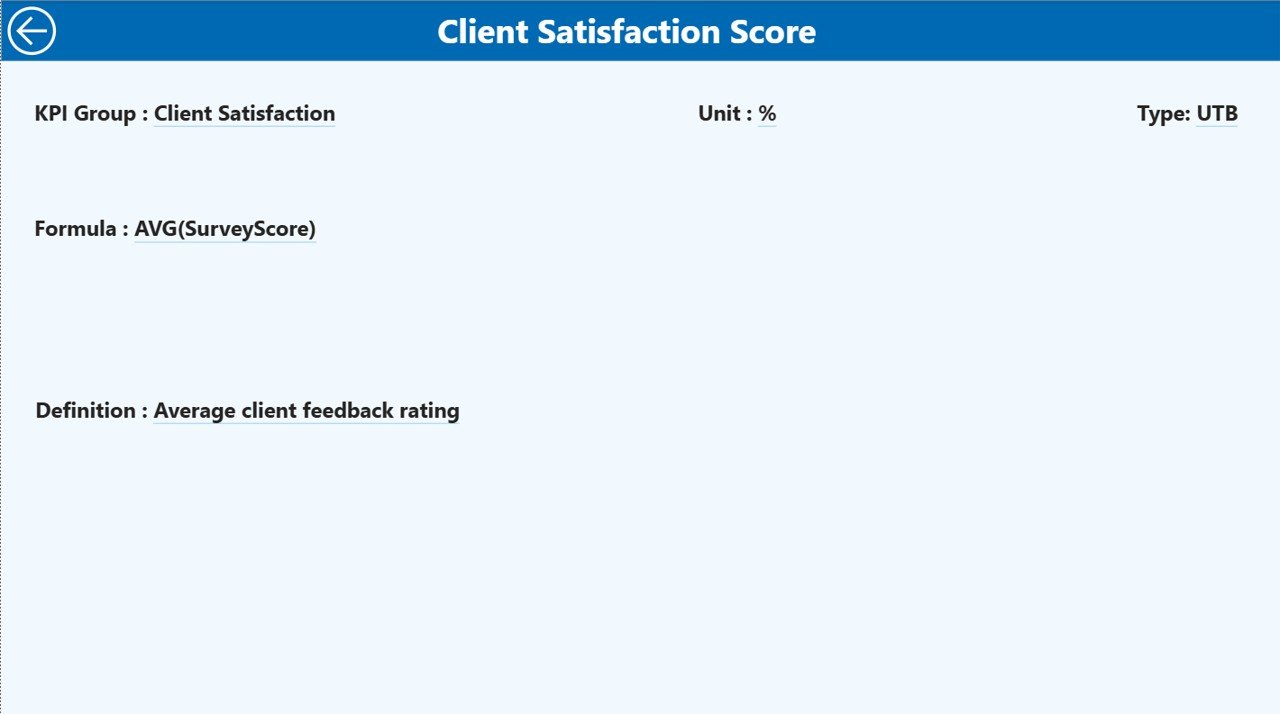
KPI Definition Page – Understand Each KPI Clearly
This page is a drill-through page, and it is hidden by default. You can access it from the Summary Page by right-clicking on a KPI.
Here you can see:
- KPI Number
- KPI Group
- KPI Name
- Unit
- Formula
- KPI Definition
- KPI Type (LTB / UTB)
This is useful because different consulting teams often have different definitions or formulas. The KPI Definition Page ensures everyone stays aligned.
To return to the main page, simply click the Back button on the top-left corner.
Click to buy Consulting KPI Dashboard in Power BI
Excel Data Source – Easy and Flexible Data Entry
This entire Consulting KPI Dashboard in Power BI runs on an Excel data source. This makes updates simple and easy for all users.
The Excel file contains three important worksheets:
Input_Actual Sheet
Here you fill:
- KPI Name
- Month (use the first day of the month)
- MTD numbers
- YTD numbers
These numbers represent the Actual values.
Input_Target Sheet
Here you fill:
- KPI Name
- Month
- MTD Target
- YTD Target
These numbers represent the Target values.
KPI Definition Sheet
This sheet stores:
- KPI Number
- KPI Group
- KPI Name
- Unit
- Formula
- Definition
- Type (LTB or UTB)
This helps the dashboard identify KPIs correctly.
Click to buy Consulting KPI Dashboard in Power BI
Advantages of a Consulting KPI Dashboard in Power BI
A Consulting KPI Dashboard offers many benefits to consulting firms. Here are the most important ones:
- Better Visibility Across All KPIs
You can see all critical KPIs in one place. This helps consulting teams understand the real performance instantly.
- Faster Decision Making
The dashboard shows real-time updates and trends. As a result, leaders can make decisions quickly and confidently.
- Easy Comparison with Targets
Visual indicators make it simple to see whether you meet or miss targets. You can track MTD, YTD, CY vs PY, and more.
- Improved Client Delivery
When performance improves, client satisfaction grows. Consulting firms can use this dashboard to fine-tune their services.
- Time-Saving Automation
Power BI updates data automatically. This reduces manual reporting and saves many hours every month.
- Clear and Transparent Reporting
Everyone in the team stays aligned because definitions, formulas, and numbers are consistent.
- Flexible and Scalable
You can add more KPIs, more groups, new data, or new reports anytime as your consulting business grows.
Best Practices for Using the Consulting KPI Dashboard in Power BI
Follow these best practices to get maximum value from your dashboard:
- Update Your Excel Data Regularly
Keep your MTD and YTD numbers current. Regular updates lead to accurate reporting.
- Define KPIs Clearly
Use the KPI Definition sheet to keep formulas and meanings clear for the whole organization.
- Review Monthly Trends
Use the KPI Trend page to understand patterns. Look for improvement or decline.
- Set Realistic Targets
Always set achievable MTD and YTD targets so you can improve performance steadily.
- Use Icons for Quick Insights
Red and green icons save time and highlight important issues immediately.
- Compare with Previous Year
Use CY vs PY comparison to measure long-term improvement.
- Refresh Power BI Regularly
Always refresh the Power BI file to get the latest visuals.
Conclusion
A Consulting KPI Dashboard in Power BI gives consulting firms the power to track performance, monitor KPIs, and make smarter decisions. With features like Summary Page analysis, KPI Trend charts, and a detailed KPI Definition Page, teams get a complete 360° performance picture.
Because the dashboard uses Excel as a data source, it becomes easy to manage, update, and customize. You can track MTD, YTD, CY vs PY trends, targets, and performance icons with clarity. This dashboard helps consultants focus on improvement, efficiency, and better client service.
Frequently Asked Questions (FAQs)
- What is a Consulting KPI Dashboard in Power BI?
It is a visual reporting tool that helps consulting firms track performance indicators like productivity, delivery, financial metrics, and client service.
- Why should consulting firms use a Power BI dashboard?
It saves time, improves accuracy, shows trends, and helps teams make informed decisions.
- What data source does this dashboard use?
It uses an Excel file with three sheets: Actuals, Targets, and KPI Definitions.
- Can I add more KPIs to the dashboard?
Yes, you can add as many KPIs as you want by updating the Excel sheets.
- Does the dashboard show MTD and YTD performance?
Yes, it includes both MTD and YTD values for Actuals and Targets.
- Can I compare Current Year and Previous Year performance?
Yes, the dashboard offers CY vs PY comparison for both MTD and YTD.
- Is this dashboard suitable for small consulting firms?
Yes, small and large consulting firms can use it to improve performance tracking.
- Does it include a KPI Definition Page?
Yes, you can drill through from the Summary Page to see KPI definitions and formulas.
Visit our YouTube channel to learn step-by-step video tutorials
Watch the step-by-step video tutorial:
Click to buy Consulting KPI Dashboard in Power BI