In today’s highly competitive market, customer satisfaction plays a vital role in a brand’s reputation and profitability. One of the most significant indicators of customer satisfaction is the Product Return Rate. High return rates often signal issues with product quality, customer expectations, or delivery accuracy. Managing and analyzing this data effectively can lead to better decision-making, improved quality control, and higher profitability.
That’s where the Product Return Rate KPI Dashboard in Power BI becomes an essential tool. It provides a real-time, data-driven view of product returns, allowing businesses to identify trends, measure performance, and take corrective actions quickly.
In this article, we’ll explore what the Product Return Rate KPI Dashboard in Power BI is, how it works, its advantages, and how you can use it to strengthen business performance.
Click to buy Product Return Rate KPI Dashboard in Power BI
What Is a Product Return Rate KPI Dashboard in Power BI?
A Product Return Rate KPI Dashboard in Power BI is a ready-to-use business intelligence solution that helps organizations track and analyze their product return metrics. It transforms raw data from Excel or ERP systems into interactive visuals that highlight key insights, such as return reasons, return percentages, product categories, and time-based trends.
Power BI enables you to integrate multiple data sources — such as sales records, return logs, and quality control databases — to create a unified and dynamic view of return performance. The dashboard allows management to compare actual results with targets, analyze performance trends, and make informed decisions to minimize return rates.
With features like slicers, trend charts, and KPI cards, this dashboard gives business leaders instant visibility into how product returns are affecting overall business performance.
Key Features of the Product Return Rate KPI Dashboard
The Product Return Rate KPI Dashboard in Power BI consists of three main pages, each designed to present data from a different perspective. Let’s look at them in detail:
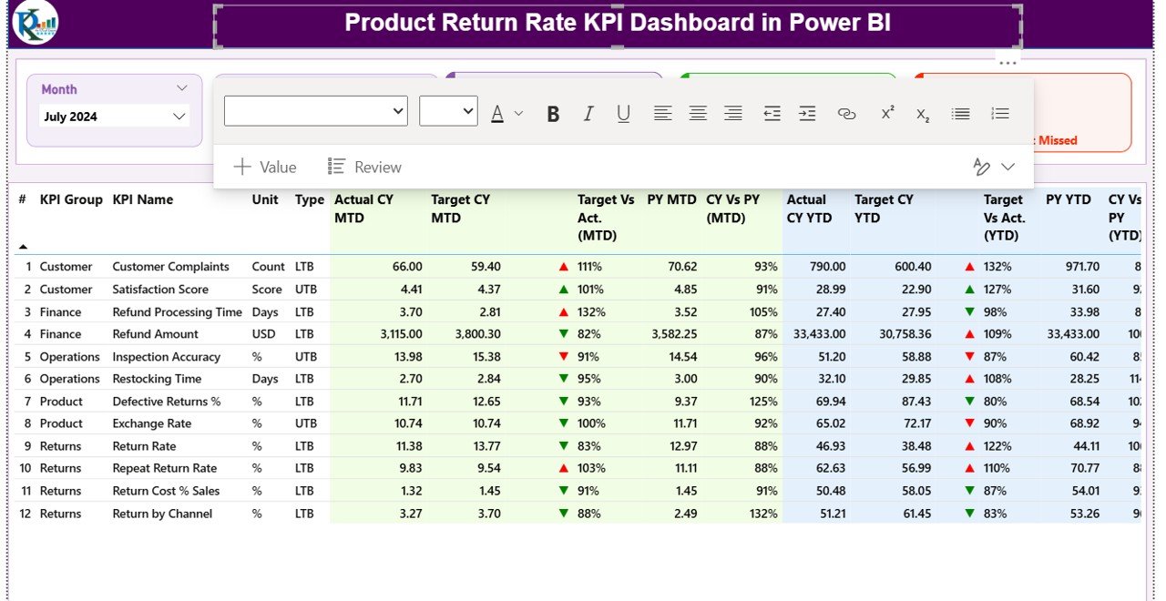
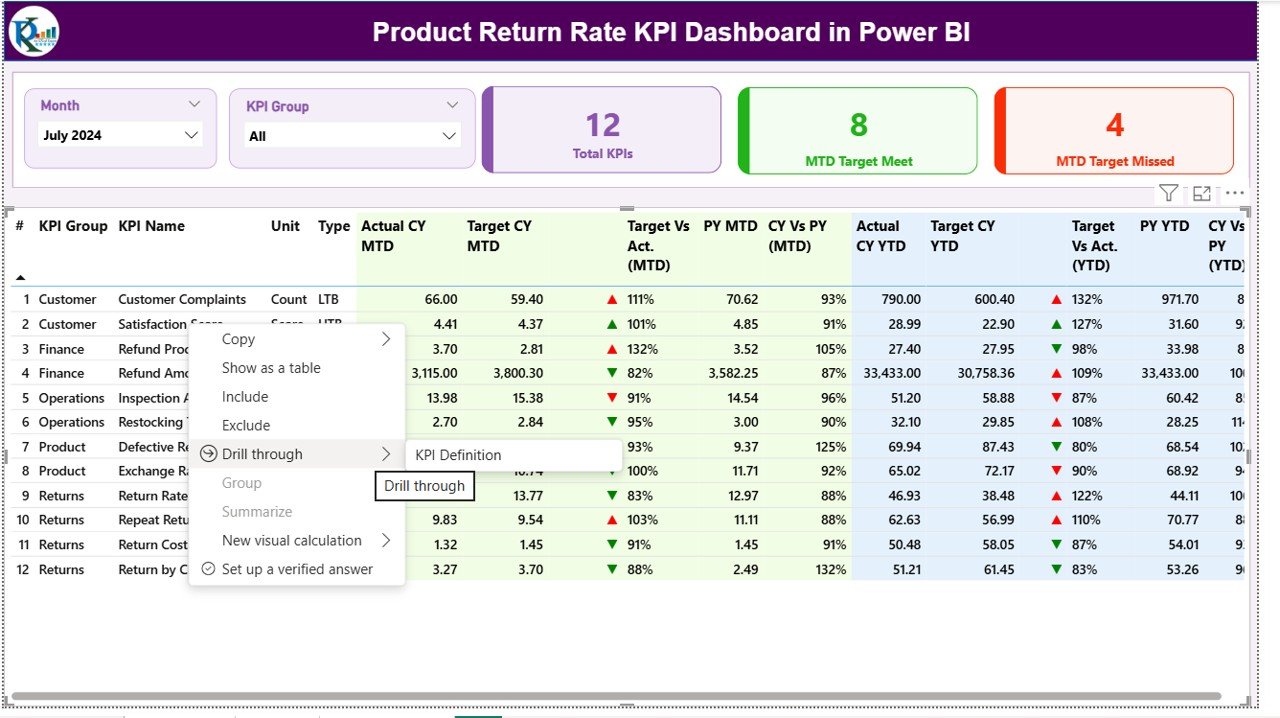
Summary Page
The Summary Page is the main interface of the dashboard. It displays high-level KPIs and comparison visuals for both Month-to-Date (MTD) and Year-to-Date (YTD) performance.
Here’s what you can find on this page:
- Month and KPI Group Slicers: Allow users to filter results dynamically by month or KPI category.
- KPI Cards: Display total KPIs count, MTD target met count, and MTD target missed count.
- Detailed KPI Table: Includes vital fields such as:
- KPI Number
- KPI Group
- KPI Name
- Unit of Measurement
- Type (LTB or UTB)
- Actual CY MTD, Target CY MTD, and PY MTD
- Icons (▲ or ▼) to indicate if performance is above or below target
- Target vs. Actual percentage
- Year-to-Date values with similar comparisons
- This page provides managers a comprehensive snapshot of overall performance, enabling them to quickly identify areas of concern and achievements.
Click to buy Product Return Rate KPI Dashboard in Power BI
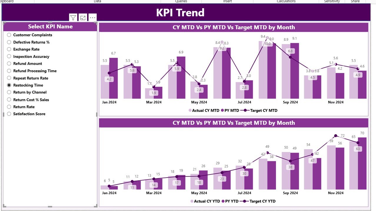
KPI Trend Page
The KPI Trend Page allows users to analyze performance trends over time.
It includes combo charts that visualize the actual, target, and previous year values for both MTD and YTD. Users can select any KPI from a slicer on the left to focus on its trend analysis.
This visualization helps identify:
- Whether return rates are improving or deteriorating over time.
- How actual values compare with targets and historical data.
- Which months experienced unusually high return rates.
The KPI Trend Page helps drive root-cause analysis by highlighting when performance shifted and enabling cross-comparison between different product categories or time periods.
Click to buy Product Return Rate KPI Dashboard in Power BI
KPI Definition Page
The KPI Definition Page acts as a reference guide. It’s a hidden drill-through page, meaning users can right-click on a KPI from the summary page and open this view to learn about the metric’s definition and formula.
Here, you’ll find details such as:
- KPI Number
- KPI Group
- KPI Name
- Unit
- Formula
- Definition
- Type (Lower the Better or Upper the Better)
A back button on the top-left corner allows users to return seamlessly to the main summary page. This structure promotes transparency and ensures all users understand how KPIs are calculated.
Click to buy Product Return Rate KPI Dashboard in Power BI
Excel Data Integration
The Product Return Rate KPI Dashboard pulls its data from an Excel source file, which includes three key worksheets:
Input_Actual Sheet
This sheet captures the actual performance values for each KPI.
Columns include:
- KPI Name
- Month (use first day of each month)
- MTD Number
- YTD Number
Input_Target Sheet
This sheet stores the target values for each KPI.
It follows the same structure as the Actual sheet for easy comparison.
KPI Definition Sheet
This sheet defines every KPI used in the dashboard, including:
- KPI Number
- KPI Group
- KPI Name
- Unit
- Formula
- Definition
- Type (LTB or UTB)
By organizing your Excel data in this structured format, Power BI can automatically refresh visuals and ensure that the analysis remains consistent and up to date.
Why Tracking Product Return Rate Matters
Monitoring the Product Return Rate (PRR) is essential for every business that sells physical goods. A high return rate can erode profits, disrupt inventory management, and damage customer trust.
Key reasons to track return rates include:
- Customer Feedback: Returns often reveal quality or expectation issues.
- Cost Control: Every return incurs handling, shipping, and restocking costs.
- Product Quality Improvement: Analyzing returns helps identify defects or design flaws.
- Operational Efficiency: Tracking return reasons can streamline logistics and reduce waste.
- Customer Loyalty: Fewer returns often translate to higher satisfaction and repeat business.
KPIs You Can Track in the Dashboard
A Product Return Rate KPI Dashboard can include several metrics, such as:
- Overall Product Return Rate (%): (Total Returns ÷ Total Sales) × 100
- Return Rate by Product Category
- Return Rate by Region or Store
- Return Rate by Supplier
- Customer-Initiated Returns (%)
- Defective Returns (%)
- Return Processing Time (Days)
- Refund Cycle Time
- Return Value (% of Revenue)
- Return Resolution Rate (%)
These KPIs provide a 360° view of your return process, helping identify where the highest issues occur and how effectively they are resolved.
Advantages of Using the Product Return Rate KPI Dashboard in Power BI
- Centralized Data Visualization
Power BI consolidates data from multiple systems — sales, warehouse, customer service — into a single interactive view. This reduces manual reporting and errors.
- Instant Insights
With real-time updates and automated visuals, decision-makers can spot performance gaps instantly without waiting for manual reports.
- Trend Analysis
Historical data and month-to-month comparisons make it easy to identify improvement areas and seasonal trends in product returns.
- Improved Product Quality
By identifying which products have the highest return rates, quality control teams can take targeted corrective actions.
- Customer Experience Enhancement
Monitoring returns helps improve after-sales support and customer trust.
- Better Financial Planning
Return rate tracking directly influences cost control, revenue forecasting, and profit margin optimization.
Opportunities for Improvement
While Power BI dashboards are powerful, continuous improvement ensures better outcomes. Here’s what businesses can enhance:
- Data Accuracy: Ensure data entry consistency between sales and returns logs.
- Automated Refresh: Set up scheduled data refreshes to keep visuals current.
- Root Cause Tagging: Add return reasons such as “Defective,” “Wrong Item,” or “Size Issue” for deeper insights.
- Integration with CRM or ERP: Connect customer and supplier data for end-to-end visibility.
- User Training: Help business teams understand how to interpret visuals and KPIs.
Best Practices for Using the Product Return Rate KPI Dashboard
Implementing best practices ensures accuracy, usability, and maximum business value.
- Standardize KPI Definitions
Define all KPIs clearly in the KPI Definition Sheet to avoid confusion and maintain alignment across departments.
- Refresh Data Regularly
Schedule automatic refreshes in Power BI to keep all numbers current and reliable.
- Use Conditional Formatting
Use icons (▲, ▼) or color codes (green, red) to quickly communicate performance status.
- Compare MTD and YTD Values
This comparison provides both short-term and long-term perspectives, making it easier to track trends and stability.
- Analyze Root Causes
Drill down into product or regional data to uncover reasons for higher returns.
- Involve Stakeholders
Encourage collaboration between sales, operations, and quality teams to create actionable strategies from insights.
- Leverage Power BI Features
Use bookmarks, drill-through, and tooltips to enhance interactivity and user engagement.
How the Dashboard Supports Business Decisions
The Product Return Rate KPI Dashboard helps leaders answer critical business questions such as:
- Which products are returned most frequently and why?
- Are return rates increasing compared to last year?
- Which regions have higher return percentages?
- How effective are current quality improvement initiatives?
- What financial impact do product returns have on the company?
By addressing these questions with data-driven insights, managers can take immediate corrective actions and optimize their return processes.
Steps to Build the Product Return Rate KPI Dashboard in Power BI
- Prepare Data in Excel:
Structure your data into the three worksheets — Input_Actual, Input_Target, and KPI Definition. - Load Data into Power BI:
Use the “Get Data” feature to import data from Excel. - Create Relationships:
Link tables using KPI Name or KPI Number as common keys. - Build Visuals:
Use cards, combo charts, tables, and slicers for different KPI views. - Add Conditional Formatting:
Use red/green indicators to reflect performance status. - Create Navigation Buttons:
Add Home, Trend, and Definition navigation for better interactivity. - Publish and Share:
Publish the dashboard to Power BI Service and share it with stakeholders.
Advantages of Building It in Power BI Over Excel
- Interactivity: Power BI offers drill-through and slicers for instant filtering.
- Scalability: Handle large datasets easily compared to Excel limitations.
- Automation: Schedule data refresh without manual updates.
- Integration: Connect to ERP, CRM, and cloud databases.
- Visualization Power: Interactive visuals and real-time KPIs provide better clarity.
Conclusion
The Product Return Rate KPI Dashboard in Power BI is a game-changer for businesses seeking to minimize returns, optimize quality control, and enhance profitability. It transforms raw data into actionable insights, enabling faster decisions and continuous improvement.
By tracking return metrics accurately, companies can understand the root causes of customer dissatisfaction, improve operational efficiency, and ultimately deliver better products and services.
Whether you are a retailer, manufacturer, or e-commerce brand, implementing this dashboard ensures you stay ahead of competition and maintain strong customer loyalty.
Frequently Asked Questions (FAQs)
- What is the Product Return Rate KPI?
The Product Return Rate KPI measures the percentage of sold products that customers return within a specific period. It helps track product quality and customer satisfaction levels.
- How do I calculate the Product Return Rate?
Use the formula:
(Number of Returned Products ÷ Number of Sold Products) × 100
- What are common causes of product returns?
Common causes include product defects, wrong size or specifications, misleading descriptions, and delayed deliveries.
- Can I customize the dashboard for my industry?
Yes, Power BI allows customization. You can modify KPI groups, data fields, visuals, and formulas according to your business needs.
- How often should I update the data?
Ideally, update it monthly or weekly to monitor real-time performance and identify emerging issues early.
- What tools do I need to use this dashboard?
You need Microsoft Power BI Desktop and an Excel file structured with Actual, Target, and KPI Definition sheets.
- Is Power BI suitable for small businesses?
Absolutely! Power BI’s free desktop version offers robust analytics features ideal for startups and small to medium-sized businesses.
- What are the benefits of comparing YTD and MTD data?
It provides both short-term and long-term insights, helping managers balance immediate corrective actions with strategic improvements.
- How can reducing product return rates improve profit margins?
Lower returns mean less wasted logistics costs, fewer refunds, and higher customer retention — all of which directly boost profitability.
- Can the dashboard integrate with online sales platforms?
Yes. You can connect Power BI with e-commerce systems like Shopify, WooCommerce, or Amazon Seller data through APIs or Excel exports.
Visit our YouTube channel to learn step-by-step video tutorials
Watch the step-by-step video tutorial:
Click to buy Product Return Rate KPI Dashboard in Power BI