A Project Management Office (PMO) drives project success, supports the teams, monitors performance, and ensures that every project moves in the right direction. However, many PMO teams still track their KPIs in scattered spreadsheets or manual reports. When they do that, they lose visibility, delay decisions, and struggle to measure true performance.
A PMO KPI Dashboard in Excel solves these challenges. It gives you one structured place to track all KPIs, compare them with targets, view historical trends, and identify risks early. This article explains everything about this dashboard—its features, benefits, advantages, structure, and best practices. You will also understand how it helps your team move from manual reporting to a smart and data-driven workflow.Project Management Office (PMO) KPI Dashboard in Excel
Let’s explore this complete and ready-to-use PMO KPI Dashboard in Excel.
Click to buy Project Management Office (PMO) KPI Dashboard in Excel
What Is a PMO KPI Dashboard in Excel?
A PMO KPI Dashboard in Excel is a smart and organized tool that helps project management teams track key performance indicators such as project progress, cost variance, schedule variance, resource utilization, risk level, on-time delivery, and more. It works as a centralized performance tracker where you can view real-time numbers for the current month (MTD), year-to-date (YTD), and previous year.
Since the dashboard is built in Excel, you can update the numbers easily, use slicers, check dynamic charts, and monitor KPIs using automatic conditional formatting. It improves visibility and helps leaders take action quickly.
Why Do PMO Teams Need a KPI Dashboard?
PMO teams manage multiple projects, deadlines, risks, and resource demands. Without a structured dashboard:
- Teams miss early warning signs
- Leadership cannot see the overall performance
- Managers struggle to justify decisions
- Reports take hours or days to prepare
- Data becomes inconsistent or outdated
A dashboard prevents these issues and supports smooth operations throughout all projects.
Key Features of the PMO KPI Dashboard in Excel
This PMO KPI Dashboard includes 7 powerful worksheets that allow teams to input, monitor, analyze, and compare performance indicators.Project Management Office (PMO) KPI Dashboard in Excel
Let’s go through each sheet in detail.
Summary Page
The Summary Page works as the home screen of the dashboard. It contains navigation buttons that help users jump quickly to different parts of the workbook. This makes the dashboard user-friendly and easy to explore even for non-technical team members.
It usually contains:
- Buttons for Dashboard, Trend Analysis, KPI Definition, Input Sheets, and other sections
- Basic instructions for using the file
- Quick links to major analysis areas
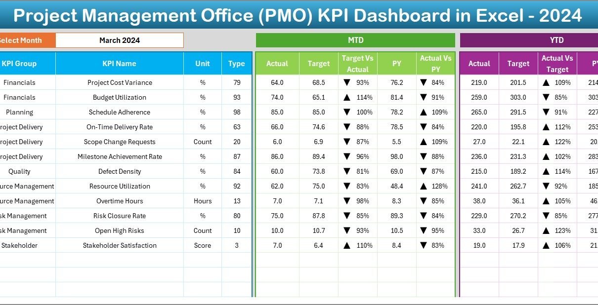
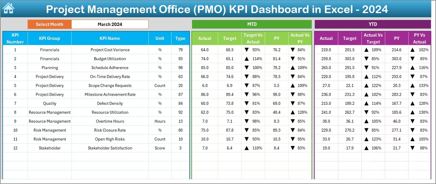
Dashboard Sheet Tab
This is the main dashboard page where PMO leaders track monthly and yearly performance.
Key elements of this page include:
- A Month selector (drop-down in cell D3)
- MTD and YTD Actual values
- MTD and YTD Target values
- MTD and YTD Previous Year values
- Comparison metrics like Target vs Actual and PY vs Actual
- Conditional formatting using up/down arrows
This page gives a quick overview of how PMO KPIs perform throughout the organization. Since the page updates when you change the month, you can analyze performance instantly without preparing a new report every time.
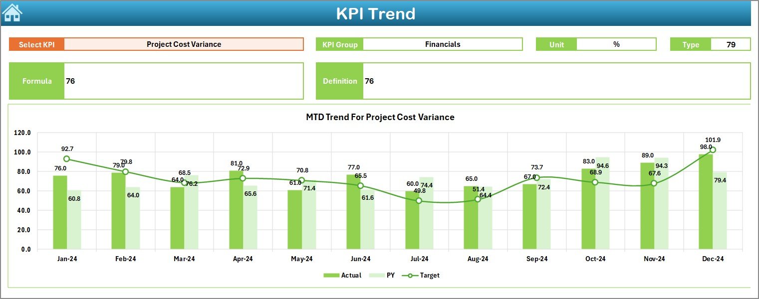
Trend Sheet Tab
The Trend Sheet helps you analyze KPI performance over time.
It includes:
- Drop-down to select a KPI name (C3)
- Display of KPI Group, Unit, KPI Type (LTB/UTB), Formula, and Definition
- Trend charts for MTD and YTD comparing Actual, Target, and Previous Year
- Helps identify improvement areas instantly
This sheet helps managers understand performance patterns—whether a KPI is improving, dropping, or staying consistent.
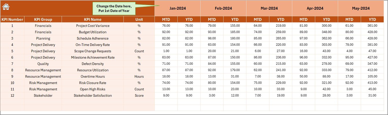
Actual Numbers Input Sheet
This sheet is where you enter the MTD and YTD actual values for each month. You can change the starting month from cell E1.
The automation ensures:
- Once you update actual data, all dashboards update instantly
- You avoid manual recalculations
- Your reports stay accurate every month
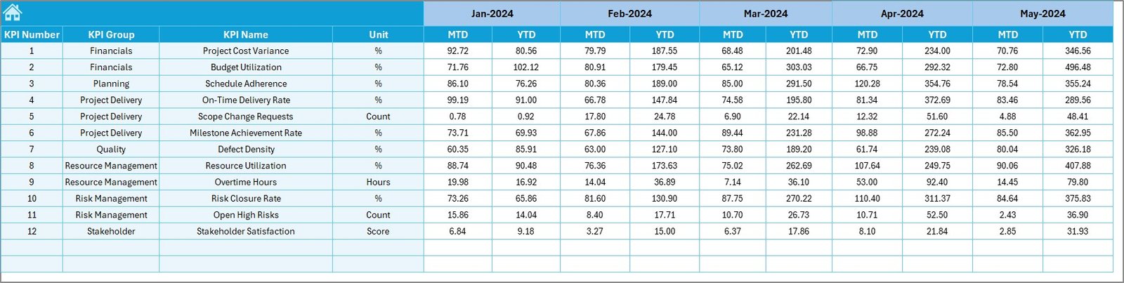
Target Sheet Tab
PMO teams use this page to enter MTD and YTD target values for every KPI.
Targets help measure:
- Performance gaps
- Improvement trends
- Strategic alignment
- Goal achievement readiness
With proper targets, the dashboard becomes a powerful decision-making tool.
Click to buy Project Management Office (PMO) KPI Dashboard in Excel
Previous Year Numbers Sheet Tab
This sheet allows you to enter the previous year values for all KPIs. These numbers help understand:
- Growth
- Declines
- Performance stability
- Year-over-year improvements
This comparison helps managers understand long-term performance patterns.

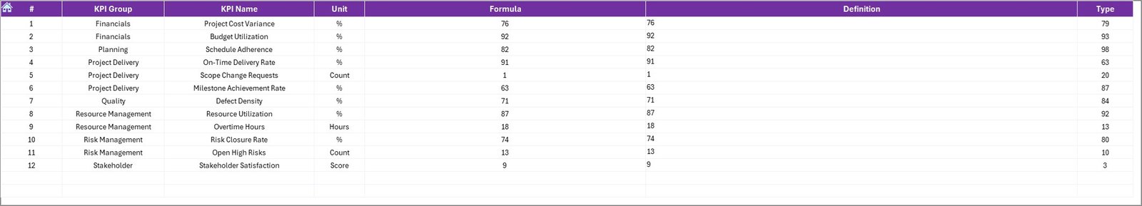
KPI Definition Sheet Tab
This sheet gives complete clarity about KPIs.
It includes:
- KPI Name
- KPI Group
- Unit of measurement
- KPI Formula
- KPI Type (UTB or LTB)
- KPI Definition
This section ensures that every team member interprets KPIs correctly. It prevents confusion and aligns the entire organization with consistent measurement standards.
Click to buy Project Management Office (PMO) KPI Dashboard in Excel
How Does the PMO KPI Dashboard Improve Project Management?
A PMO handles many responsibilities. A KPI dashboard makes this job easier by offering:
- Complete Visibility
Teams see real-time KPI performance in one place. This eliminates the need to open multiple files or rely on outdated reports.
- Faster Decision-Making
Since the dashboard highlights performance gaps, teams can take fast action. This leads to:
- Quick issue resolution
- Timely resource allocation
- Better risk handling
- Enhanced Accountability
KPIs show clear performance expectations. Managers can track progress and take corrective measures whenever needed.
- Consistent Reporting
The dashboard follows a standard reporting structure. It reduces confusion and ensures everyone sees the same figures.
- More Accurate Planning
With MTD, YTD, and PY data in one place, leaders can plan future projects more accurately.
Advantages of a PMO KPI Dashboard in Excel
A PMO KPI Dashboard offers many benefits. The most important ones are listed below.
- Easy to Use
Excel dashboards are simple to understand. Anyone with basic Excel knowledge can maintain the file.
- Real-Time Updates
You update the input sheet, and the whole dashboard updates instantly.
- Cost-Effective Tool
Unlike expensive software, Excel dashboards require no additional investment.
- Helps Track All KPIs in One Place
You get a clear picture of every KPI—cost, timeline, quality, resources, risk, and more.
- Supports Better Communication
Managers can present clear and data-driven reports during meetings.
- Strong Data Comparisons
Comparisons between Actual, Target, and Previous Year help identify the gaps and improvement areas.
- Strong Trend Analysis
Trend charts show how KPIs move across months. This lets teams predict upcoming challenges.
Best Practices for Using the PMO KPI Dashboard in Excel
Follow these best practices to use this dashboard effectively.
- Update Data Regularly
Input actual, target, and previous year data every month. This keeps your dashboard fresh and meaningful.
- Define KPIs Clearly
Ensure every KPI has:
- A clear name
- Unit of measurement
- Calculation formula
- Type (UTB or LTB)
- Clear definition
- Set Realistic Targets
Targets should match your project timelines and team capability.
- Use Conditional Formatting Wisely
Conditional formatting helps highlight:
- Risks
- Delays
- Underperformance
- High performance
Use it to bring attention to key numbers.
- Check Trends Before Making Decisions
Trends provide more meaningful insights than isolated monthly numbers. Use trend charts to understand long-term movement.
- Validate Data Before Updating
Always verify numbers before entering them. Wrong data leads to wrong decisions.
- Conduct Monthly Reviews
Review dashboard insights with your team every month to stay aligned.
How to Build a PMO KPI Dashboard in Excel?
If you want to build your own dashboard, follow these steps:
Step 1: List All KPIs
Start with important PMO KPIs like:
- Schedule variance
- Cost variance
- Resource utilization
- On-time delivery
- Risk severity
- Stakeholder satisfaction
Step 2: Create a Data Structure
Build clean sheets for:
- Actual values
- Target values
- Previous year values
- KPI definitions
Step 3: Add Formulas and Calculations
Use:
- SUM
- IF
- AVERAGE
- LOOKUP
- INDEX/MATCH
- Conditional formatting
Step 4: Create Charts
Add trend charts and comparison visuals for clarity.
Step 5: Design the Dashboard
Use shapes, formatting, and color coding to highlight key information.
Step 6: Automate with Drop-Downs
Add slicers and drop-down menus for smooth navigation.
Conclusion
A PMO KPI Dashboard in Excel is a powerful tool that makes project management simple, organized, and data-driven. It helps teams monitor KPIs, understand gaps, compare performance, view trends, and make smart decisions. With clear structure and dynamic visuals, this dashboard supports accurate planning and enhances overall project performance.
PMO leaders can save time, reduce manual work, and improve reporting quality by using this ready-to-use Excel-based dashboard.
Frequently Asked Questions (FAQs)
- What is a PMO KPI Dashboard?
A PMO KPI Dashboard is an Excel-based tool that tracks key performance indicators related to project management operations.
- Why should PMO teams use this dashboard?
PMO teams use it to monitor performance, view trends, compare targets, and make faster decisions.
- Can beginners use this dashboard?
Yes. The dashboard is simple and user-friendly. Anyone with basic Excel knowledge can use it.
- Do I need advanced Excel skills?
No. Most formulas and charts are already built into the dashboard.
- What type of KPIs can we track?
You can track schedule, cost, resource, risk, quality, and governance KPIs.
- Can I customize the dashboard?
Yes. You can add or modify KPIs, update formulas, change layouts, and redesign charts.
- How often should I update the data?
You should update MTD, YTD, and target numbers every month to keep the dashboard accurate.
- Is Excel better than costly PM tools?
Excel is cost-effective and flexible. Many teams prefer Excel dashboards because they offer full customization without extra software cost.
Visit our YouTube channel to learn step-by-step video tutorials
Watch the step-by-step video tutorial:
Click to buy Project Management Office (PMO) KPI Dashboard in Excel