Effective management and analysis of customer service tickets are essential for delivering excellent service in the telecommunications industry. The Telecommunications Dashboard in Power BI is a ready-to-use tool that provides deep insights into the performance of customer service operations. With visualized data on ticket statuses, resolution times, customer satisfaction, and technician performance, this dashboard allows you to monitor and optimize your customer service operations effectively.
In this article, we will walk you through the key features and functions of the Telecommunications Dashboard in Power BI, explaining how it can help you manage your service operations and enhance customer satisfaction.
What is the Telecommunications Dashboard in Power BI?
The Telecommunications Dashboard in Power BI is a powerful business intelligence tool designed to track and analyze customer service tickets in the telecommunications industry. It leverages the capabilities of Power BI to provide data visualization, performance metrics, and insights related to ticket management, resolution times, customer satisfaction, and more. This dashboard includes multiple pages that present detailed insights into various aspects of the customer service process.
The dashboard includes the following pages:
Key Features of the Telecommunications Dashboard
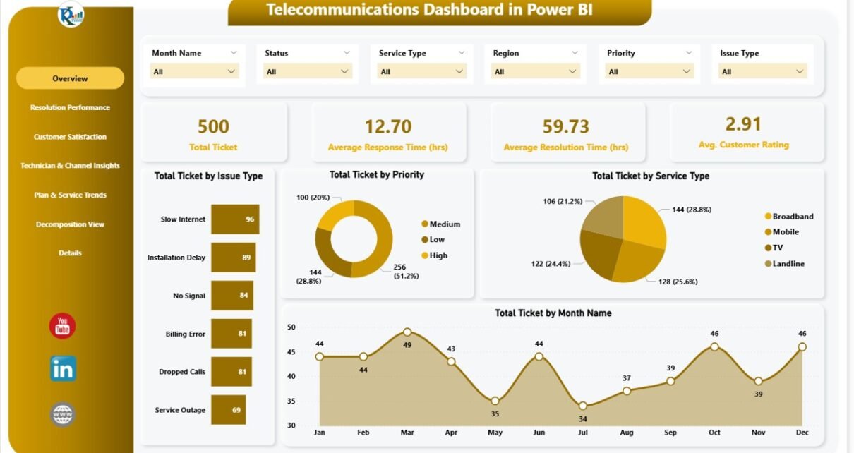
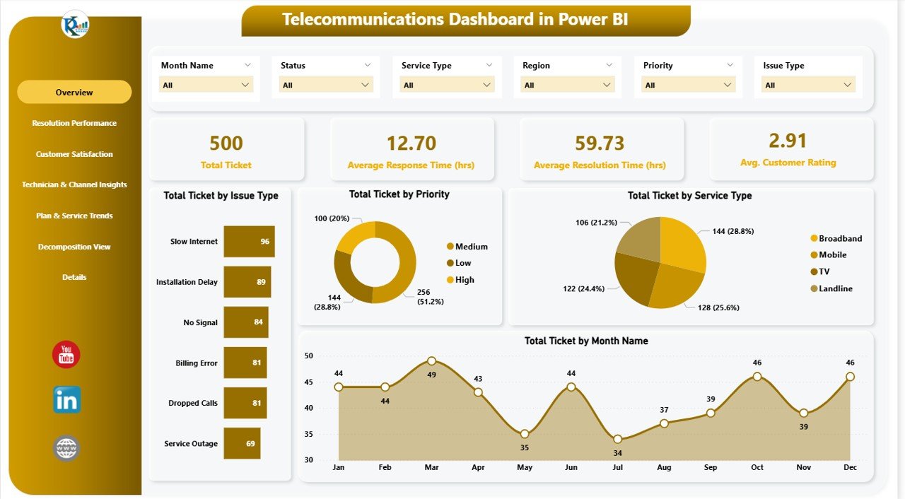
1) Overview Page: Key Performance Indicators
The Overview Page provides a summary of the key performance indicators (KPIs) related to customer service tickets. It includes the following:
Cards:
- Total Ticket: Displays the total number of customer service tickets that have been logged.
- Avg. Response Time: Shows the average time taken to respond to customer tickets.
- Avg. Resolution Time: Displays the average time it takes to resolve customer tickets.
- Avg. Customer Rating: The average rating given by customers after their issue is resolved.
Charts:
- Total Tickets by Issue Type: Breaks down the total tickets based on the type of issue reported (e.g., network issues, billing, etc.).
- Total Tickets by Priority: Categorizes tickets by their priority level (e.g., high, medium, low).
- Total Tickets by Service Type: Shows the number of tickets for each service type (e.g., mobile, broadband, TV).
- Total Tickets by Month: Displays the total number of tickets logged each month.
This page gives you a high-level overview of your customer service performance, helping you monitor ticket volumes, resolution efficiency, and customer satisfaction.
Click to buy Telecommunications Dashboard in Power BI
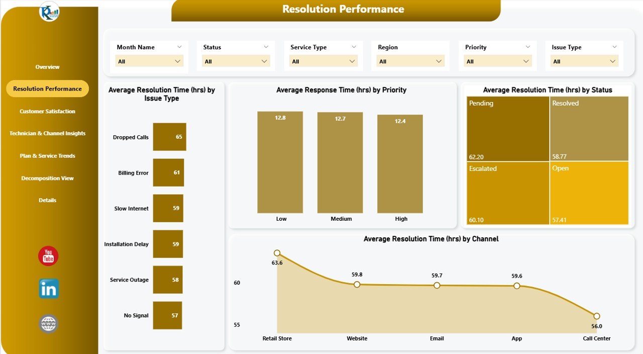
2) Resolution Performance Page: Analyzing Resolution Times
The Resolution Performance Page provides insights into how efficiently customer service teams are resolving tickets. It includes the following charts:
Charts:
- Average Resolution Time (hrs) by Issue Type: Displays the average time taken to resolve tickets, categorized by issue type.
- Average Response Time (hrs) by Priority: Shows the average response time for tickets, categorized by priority level.
- Average Resolution Time (hrs) by Status: Breaks down the resolution time by ticket status (e.g., resolved, pending).
- Average Resolution Time (hrs) by Channel: Displays the average resolution time for tickets based on the communication channel used (e.g., email, phone, chat).
This page helps you track the efficiency of your resolution process, allowing you to identify bottlenecks and areas for improvement.
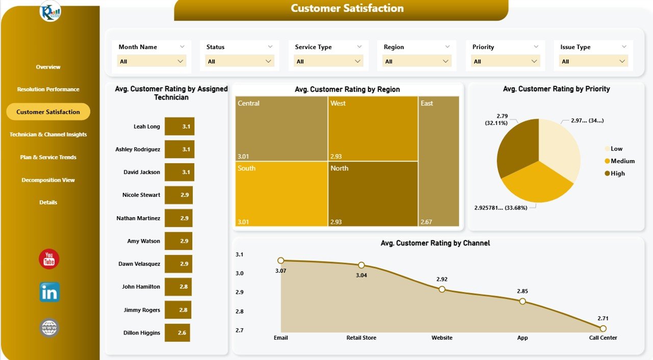
3) Customer Satisfaction Page: Measuring Customer Feedback
The Customer Satisfaction Page focuses on customer feedback and ratings. It includes the following charts:
Charts:
- Avg. Customer Rating by Assigned Technician: Displays the average customer rating for each technician who resolved a ticket.
- Avg. Customer Rating by Region: Shows the average customer satisfaction ratings by geographic region.
- Avg. Customer Rating by Priority: Breaks down the average customer rating based on ticket priority.
- Avg. Customer Rating by Channel: Displays the average customer rating by communication channel.
This page allows you to assess how satisfied customers are with your service and identify trends based on different factors such as technician performance, region, and communication channel.
Click to buy Telecommunications Dashboard in Power BI
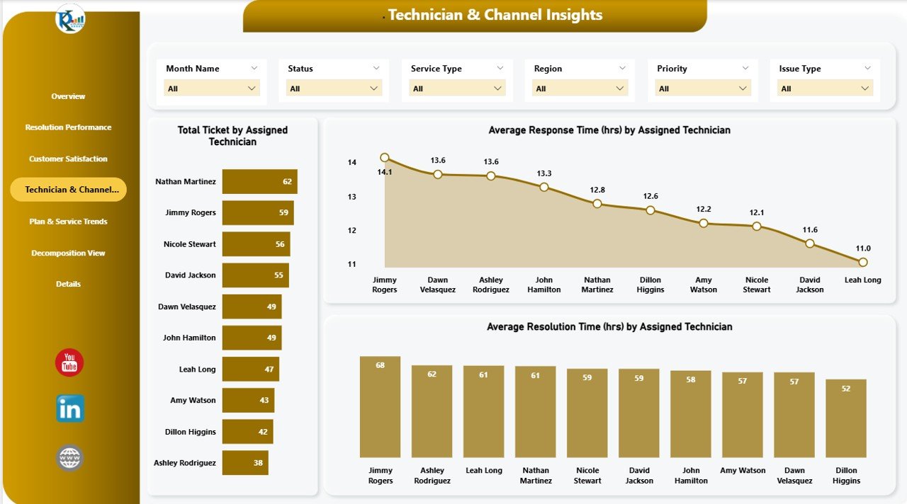
4) Technician & Channel Insights Page: Monitoring Technician Performance
The Technician & Channel Insights Page provides detailed analysis of individual technician performance and the effectiveness of different communication channels. It includes:
Charts:
- Total Tickets by Assigned Technician: Displays the total number of tickets assigned to each technician.
- Average Response Time (hrs) by Assigned Technician: Shows the average response time for tickets handled by each technician.
- Average Resolution Time (hrs) by Assigned Technician: Displays the average resolution time for tickets handled by each technician.
- In Progress vs. Completed Training by Trainer: Tracks the number of in-progress versus completed tickets assigned to each technician.
This page is ideal for monitoring technician performance, identifying high performers, and pinpointing areas for improvement.
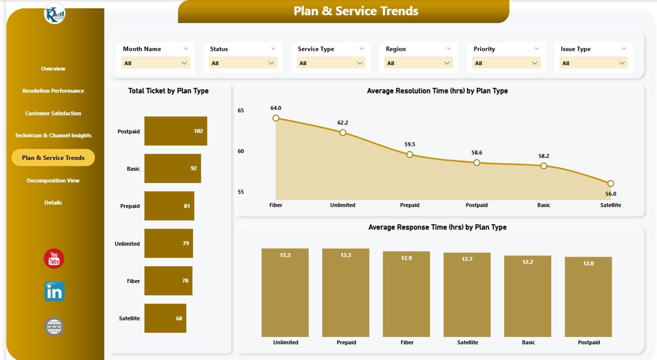
5) Plan & Service Trends Page: Tracking Ticket Trends
The Plan & Service Trends Page offers insights into ticket trends related to service types and plans. It includes the following charts:
Charts:
- Total Tickets by Plan Type: Tracks the total number of tickets logged for each plan type (e.g., prepaid, postpaid).
- Average Resolution Time (hrs) by Plan Type: Displays the average resolution time for tickets based on plan type.
- Average Response Time (hrs) by Plan Type: Shows the average response time for tickets based on plan type.
This page helps you understand how different plan types and service categories impact ticket volumes and resolution times, allowing you to optimize your service offerings.
Click to buy Telecommunications Dashboard in Power BI
6) Decomposition View Page: Drill-Down Analysis
The Decomposition View Page allows for in-depth analysis of your ticket data. This page provides a detailed breakdown of your tickets based on various factors like issue type, priority, service type, and more. It gives you a comprehensive view of how different aspects of your customer service operations interact and impact overall performance.

Benefits of Using the Telecommunications Dashboard in Power BI
The Telecommunications Dashboard in Power BI offers several advantages:
-
Comprehensive Insights: The dashboard provides a complete view of key customer service metrics, allowing you to track performance and customer satisfaction.
-
Data-Driven Decision Making: By visualizing key performance indicators and customer feedback, the dashboard helps you make informed decisions to improve your service operations.
-
Improved Customer Service: By tracking resolution times, technician performance, and customer ratings, you can identify areas for improvement and enhance the quality of service.
-
Real-Time Monitoring: Power BI’s real-time data visualization allows you to track performance and make adjustments as needed.
-
Customization: The dashboard is customizable to suit your organization’s specific needs, whether you’re tracking different service types, issue categories, or performance metrics.
Best Practices for Using the Telecommunications Dashboard
Click to buy Telecommunications Dashboard in Power BI
To make the most of the Telecommunications Dashboard in Power BI, follow these best practices:
- Regularly Update Data: Ensure that the data is updated regularly so you can monitor the latest trends and performance.
- Analyze Technician Performance: Use the Technician & Channel Insights page to track technician performance and identify areas for improvement.
- Monitor Customer Satisfaction: Regularly assess customer satisfaction through the Customer Satisfaction page to ensure you’re meeting customer expectations.
- Track Service Trends: Use the Plan & Service Trends page to track how different service types and plans impact ticket volumes and resolution times.
- Share Insights Across Teams: Share the dashboard with team members and stakeholders to ensure that everyone is aligned and working towards the same goals.
Conclusion
The Telecommunications Dashboard in Power BI is an essential tool for managing and optimizing customer service operations. With its powerful data visualization, comprehensive insights, and customizable features, this dashboard helps you track and analyze key metrics such as ticket status, resolution times, customer satisfaction, and technician performance. By using this dashboard, you can ensure that your telecommunications service team is operating at its best and delivering exceptional customer experiences.
Frequently Asked Questions (FAQs)
Click to buy Telecommunications Dashboard in Power BI
1. How do I update the Telecommunications Dashboard?
You can update the dashboard by adding new data to the data source. The charts and metrics will automatically update based on the new data.
2. Can I track multiple service types with this dashboard?
Yes, the dashboard allows you to track tickets across various service types, including mobile, broadband, and TV, providing insights into each service category.
3. How do I monitor technician performance?
Use the Technician & Channel Insights page to track the number of tickets assigned to each technician, along with their response and resolution times.
4. Can I share the dashboard with my team?
Yes, since the dashboard is created in Power BI, you can easily share it with your team for real-time collaboration and updates.
5. Is the dashboard customizable for my organization’s needs?
Yes, the dashboard is fully customizable. You can modify the charts, add additional filters, and adjust the layout to fit your organization’s specific requirements.
Visit our YouTube channel to learn step-by-step video tutorials
Youtube.com/@NeotechNavigators
Watch the step-by-step video Demo:
Click to buy Telecommunications Dashboard in Power BI