Renewable energy projects grow rapidly across the world. However, managing data from solar, wind, hydro, and other renewable sources often becomes complex. Multiple plants, regions, customer sectors, and PPA types generate massive volumes of data every month. Therefore, decision-makers need a clear, simple, and reliable reporting system.
A Renewable Energy Dashboard in Excel solves this challenge effectively. It converts raw energy data into meaningful insights using structured sheets, KPIs, and trend analysis. Moreover, it helps energy companies, analysts, and project managers monitor performance without expensive software.
In this detailed article, you will learn what a Renewable Energy Dashboard in Excel is, why it matters, how each sheet works, its advantages, best practices, and frequently asked questions. The explanation uses simple language, smooth transitions, and practical insights so that anyone can understand and apply it easily.
Click to buy Renewable Energy Dashboard in Excel
What Is a Renewable Energy Dashboard in Excel?
A Renewable Energy Dashboard in Excel is a ready-to-use analytical tool designed to track, monitor, and analyze renewable energy performance metrics. It brings together data related to generation, revenue, grid export, downtime, capacity, and customer sectors into one structured workbook.
Instead of reviewing multiple spreadsheets, users access one dashboard with interactive sheets. As a result, they save time, reduce errors, and make faster decisions.
Why Do Energy Teams Prefer Excel Dashboards?
Excel remains popular because it offers flexibility and accessibility. Additionally, most organizations already use Excel, which eliminates training and licensing costs. Furthermore, Excel dashboards support pivot tables, slicers, and charts that update automatically.
Why Is a Renewable Energy Dashboard Important?
Renewable energy operations depend on efficiency, uptime, and accurate reporting. However, manual tracking often leads to confusion and delays. Therefore, dashboards play a critical role.
Key Reasons Why This Dashboard Matters
- It centralizes renewable energy data
- It improves visibility across regions and plants
- It supports faster operational decisions
- It highlights underperforming assets early
- It improves stakeholder reporting
As a result, management gains confidence in both operational and financial performance.
How Is the Renewable Energy Dashboard in Excel Structured?
This dashboard includes multiple analytical sheets, each focusing on a specific performance area. Every sheet answers a different business question while maintaining consistency.
Let’s explore each sheet in detail.
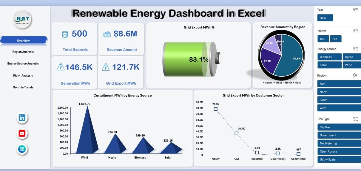
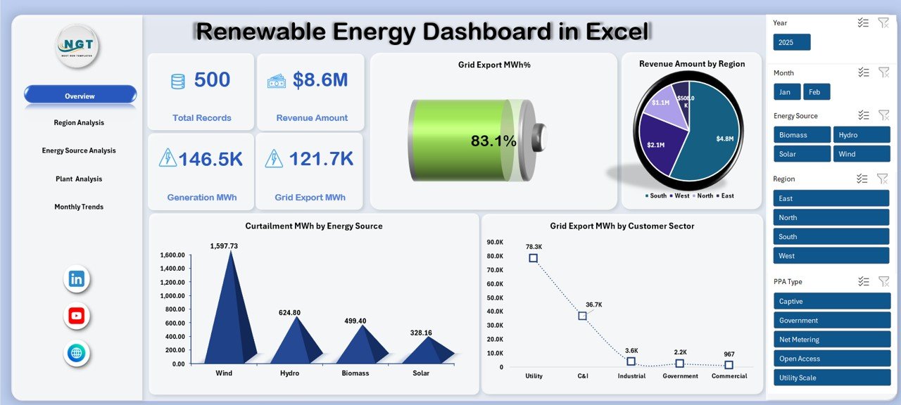
Overview Sheet
The Overview Sheet works as the executive summary of the dashboard. It provides a quick snapshot of overall renewable energy performance.
Key Metrics on the Overview Sheet
- Total Records – Total data entries captured in the system
- Revenue Amount – Total revenue generated from renewable energy
- Generation MWh – Total energy generated
- Grid Export MWh – Energy exported to the grid
- Grid Export MWh % – Export efficiency percentage
Key Visual Analysis
- Curtailment MWh by Energy Source
This chart shows how much energy gets curtailed across different sources such as solar or wind. - Grid Export MWh by Customer Sector
This analysis highlights which sectors consume exported energy. - Revenue Amount by Region
This chart helps identify top-performing regions instantly.
Click to buy Renewable Energy Dashboard in Excel
Because of this structured layout, decision-makers understand performance in seconds.
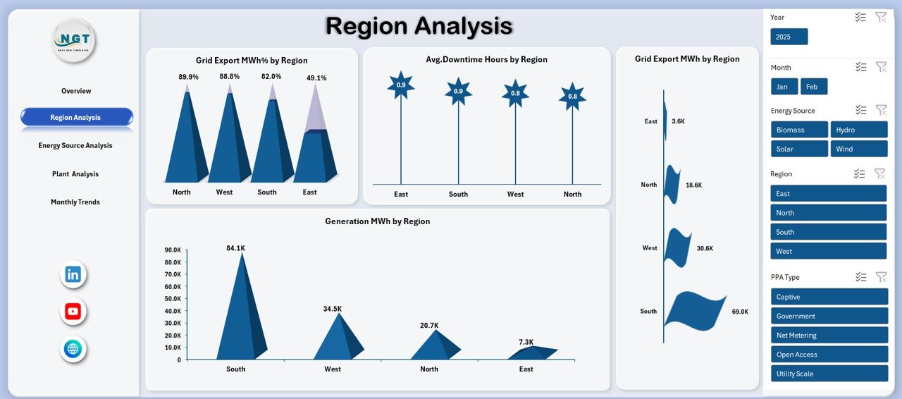
Region Analysis
The Region Analysis Sheet focuses on geographical performance. Since renewable energy plants operate across locations, regional comparison becomes essential.
Key Insights from Region Analysis
- Grid Export MWh % by Region
This metric shows export efficiency across regions. - Average Downtime Hours by Region
This analysis highlights operational issues affecting uptime. - Generation MWh by Region
This chart compares energy output geographically. - Grid Export MWh by Region
This view shows total exported energy by location.
Therefore, regional managers can benchmark performance and address gaps effectively.
Click to buy Renewable Energy Dashboard in Excel
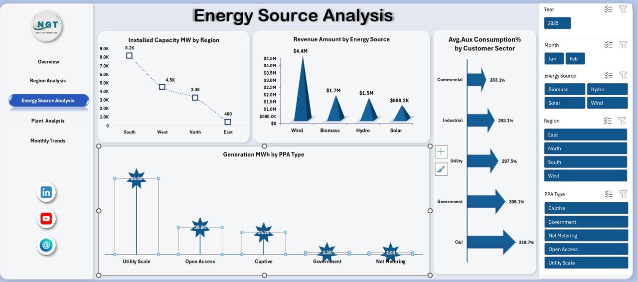
Energy Source Analysis
Different renewable sources perform differently. Hence, the Energy Source Analysis Sheet breaks down performance by energy type and contract structure.
Key Metrics in Energy Source Analysis
- Installed Capacity MW by Region
This shows capacity distribution across locations. - Revenue Amount by Energy Source
This chart reveals which energy source generates the highest revenue. - Generation MWh by PPA Type
This analysis compares generation under different power purchase agreements. - Average Auxiliary Consumption % by Customer Sector
This metric highlights efficiency at the customer level.
As a result, energy planners optimize investments across sources and contracts.
Click to buy Renewable Energy Dashboard in Excel
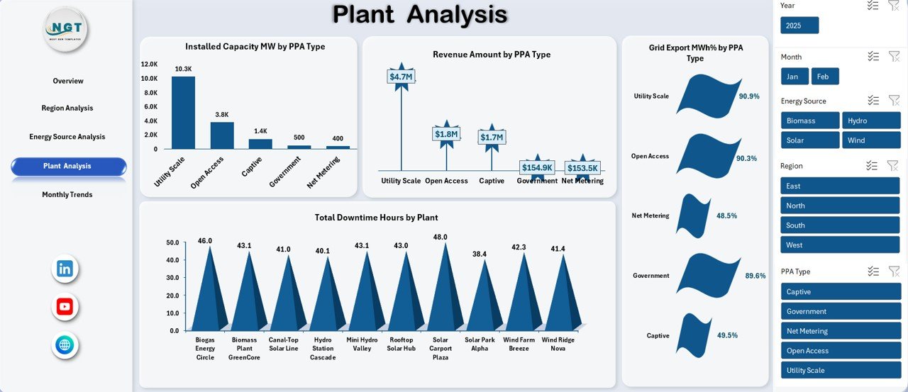
Plant Analysis Sheet
Plant-level monitoring ensures asset reliability. The Plant Analysis Sheet focuses on operational performance and efficiency.
Key Insights from Plant Analysis
- Installed Capacity MW by PPA Type
This shows capacity allocation by contract type. - Total Downtime Hours by Plant
This chart identifies plants with frequent breakdowns. - Revenue Amount by PPA Type
This analysis links revenue performance to contracts. - Grid Export MWh % by PPA Type
This metric measures export efficiency under each agreement.
Therefore, plant managers can prioritize maintenance and optimize operations.
Click to buy Renewable Energy Dashboard in Excel
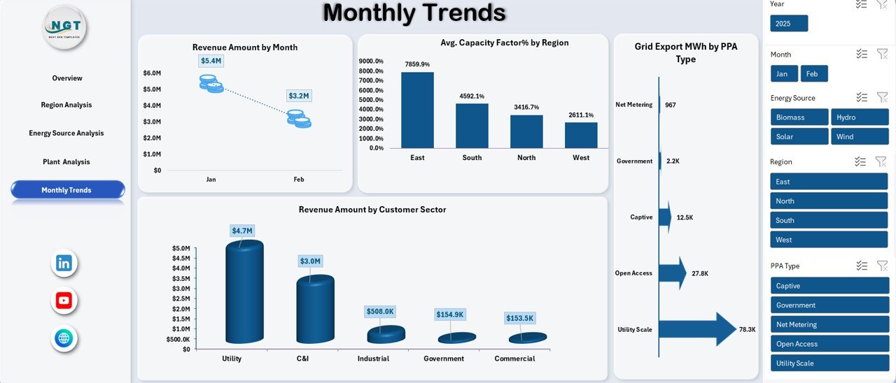
Monthly Trends Sheet
Performance changes every month. Hence, trend analysis becomes essential. The Monthly Trends Sheet tracks time-based performance.
Monthly Trend Metrics
- Revenue Amount by Month
This chart shows revenue fluctuations over time. - Average Capacity Factor % by Region
This metric measures utilization efficiency monthly. - Revenue Amount by Customer Sector
This analysis identifies high-value customer segments.
With this data, management forecasts future performance and adjusts strategy proactively.
Click to buy Renewable Energy Dashboard in Excel
Advantages of Renewable Energy Dashboard in Excel
Using a Renewable Energy Dashboard in Excel offers several practical advantages.
Key Advantages
- Centralized Reporting – One dashboard replaces multiple files
- Quick Decision-Making – KPIs update instantly
- Cost-Effective – No need for expensive BI tools
- Easy Customization – Modify charts and metrics anytime
- Trend Visibility – Spot performance patterns quickly
- User-Friendly – Works with familiar Excel features
As a result, organizations improve operational efficiency and reporting accuracy.
Who Can Use a Renewable Energy Dashboard in Excel?
This dashboard fits multiple roles and industries.
Ideal Users
- Renewable energy companies
- Solar and wind farm operators
- Energy analysts
- Operations and maintenance teams
- Finance and revenue managers
- Sustainability consultants
Therefore, both technical and non-technical users benefit equally.
How Does This Dashboard Improve Decision-Making?
Data-driven decisions require clarity. This dashboard converts complex data into visual insights. Consequently, users identify risks, opportunities, and trends instantly.
Moreover, consistent reporting improves communication across departments and stakeholders.
Best Practices for the Renewable Energy Dashboard in Excel
To get maximum value, follow these best practices.
Best Practices You Should Follow
- Use structured tables for all input data
- Update data regularly to maintain accuracy
- Use pivot charts instead of static charts
- Keep KPIs consistent across sheets
- Apply slicers for region, energy source, and time
- Validate formulas periodically
- Avoid manual overwriting of calculated fields
By following these practices, your dashboard stays reliable and scalable.
How Can You Customize the Renewable Energy Dashboard?
Excel dashboards allow deep customization. You can add new KPIs, adjust charts, or include additional sheets.
Customization Ideas
- Add carbon emission reduction metrics
- Include plant-wise maintenance cost analysis
- Introduce target vs actual comparisons
- Add year-over-year trend analysis
Therefore, the dashboard grows with your business needs.
What Makes Excel Dashboards Better Than Manual Reports?
Manual reports consume time and increase error risk. In contrast, Excel dashboards automate calculations and visualization.
Because of automation, teams focus more on insights instead of data preparation.
Conclusion: Why Should You Use a Renewable Energy Dashboard in Excel?
A Renewable Energy Dashboard in Excel simplifies performance monitoring, enhances visibility, and improves decision-making. It combines operational, financial, and efficiency metrics into one structured system. Moreover, it supports renewable energy growth by enabling smarter management.
If you want clarity, efficiency, and control over renewable energy data, this dashboard becomes an essential tool.
Frequently Asked Questions (FAQs)
What is the main purpose of a Renewable Energy Dashboard in Excel?
The main purpose is to track, analyze, and visualize renewable energy performance in a structured and user-friendly format.
Can small renewable energy companies use this dashboard?
Yes, small and large organizations can use it because Excel supports scalability and customization.
Does this dashboard require advanced Excel skills?
No, basic Excel knowledge is enough to use and maintain the dashboard.
Can I add new energy sources to the dashboard?
Yes, you can easily add new energy sources by updating the data tables and pivot charts.
How often should I update the dashboard?
You should update it monthly or weekly, depending on operational needs.
Does the dashboard support multiple regions and plants?
Yes, the dashboard supports region-wise and plant-wise analysis using slicers and pivot tables.
Is this dashboard suitable for reporting to stakeholders?
Absolutely. The visual layout and KPIs make it ideal for management and investor reporting.
Visit our YouTube channel to learn step-by-step video tutorials
Watch the step-by-step video tutorial:
Click to buy Renewable Energy Dashboard in Excel