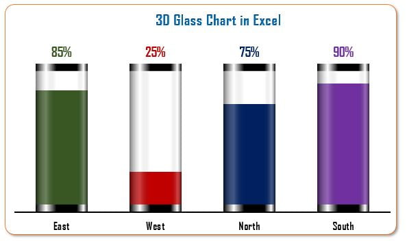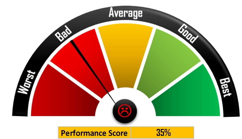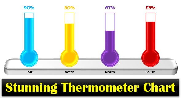
Info-graphics: Stunning Thermometer Chart in Excel
I am back with one more innovative chart which is a Stunning Thermometer Chart. This chart can be used for display KPI metrics. You can display your data by category
Transforming Data into Decisions
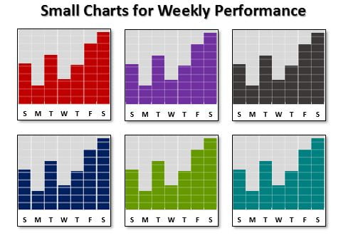
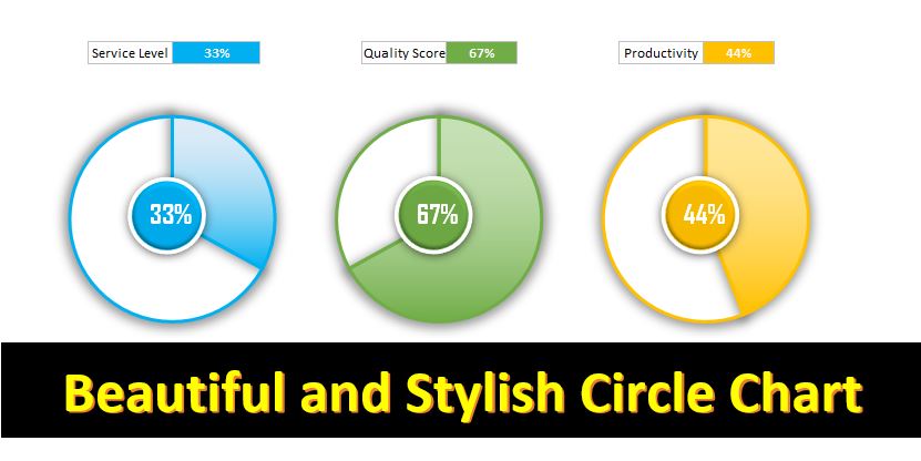
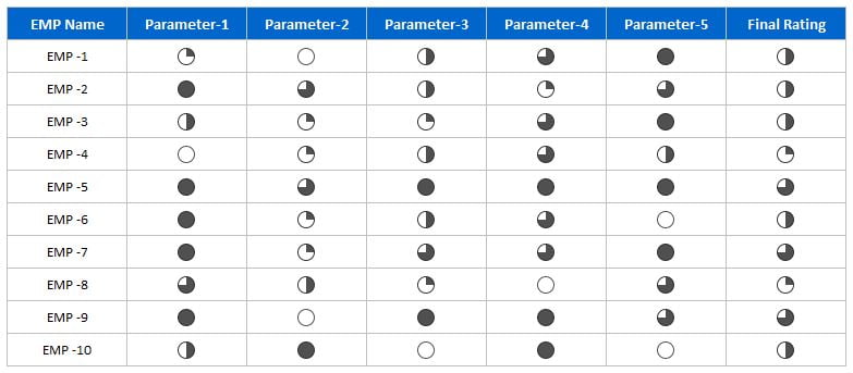
In this category, you will find comprehensive tutorials on creating stunning charts and visualizations in Excel. Impress your colleagues and boss with attractive and informative visuals by following our step-by-step guides. Each tutorial comes with a free practice file for download and tutorial videos to help you understand the process. Explore this category now and enhance your data analysis and presentation skills with Excel.