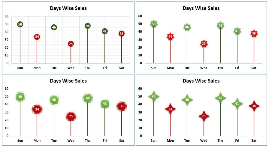
Using the Conditional Formatting in a Lollipop Chart in Excel is very useful. It helps to audience to identify which category is meeting the target and which is not meeting. Here, we have used the Conditional Formatting in a beautiful Lollipop Chart. We also have created 4 variants of this chart with some different shapes which make it more eye catching.
Conditional Formatting in a Lollipop Chart in Excel
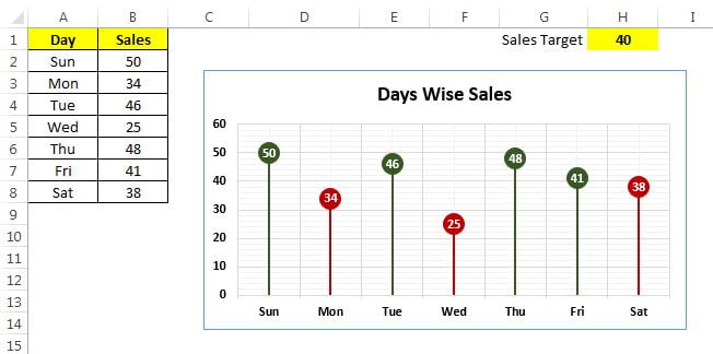
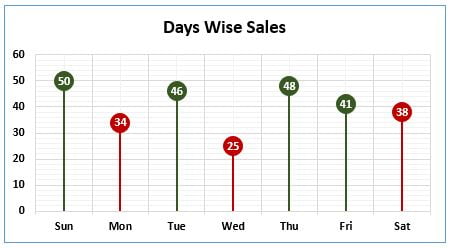
Days wise sales are available on range “A1:B8” and target is available on range “H1”. Wherever sale value is less than the target value then it will be red otherwise it will be in green. It is a dynamic chart whenever target value will be changed color will changed accordingly.
Click to buy Conditional Formatting in a Lollipop Chart in Excel
Variant – 1 of Lollipop chart
Click to buy Conditional Formatting in a Lollipop Chart in Excel
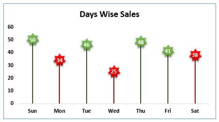
Variant – 2 of Lollipop chart
Click to buy Conditional Formatting in a Lollipop Chart in Excel
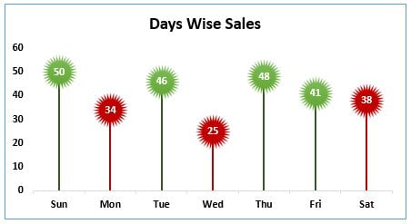
Variant – 3 of Lollipop chart
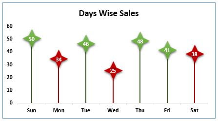
Variant – 4 of Lollipop chart
Click to buy Conditional Formatting in a Lollipop Chart in Excel
Visit our YouTube channel to learn step-by-step video tutorials
Watch the step by step video tutorial:
Click to buy Conditional Formatting in a Lollipop Chart in Excel