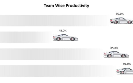
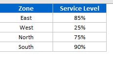
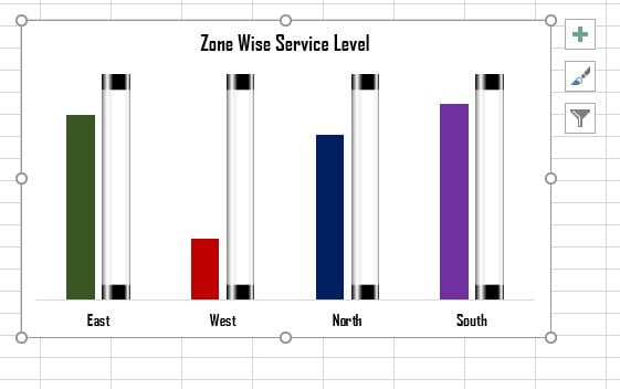
I am back with a very innovative and Informative chart that is 3D Glass Chart in Excel. This chart can be used to display a KPI metrics like Service Level, Quality Score, Productivity etc. Here we have created this chart for Zone Wise Service Level.
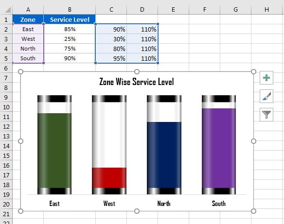
Below are the data points for which we will create this chart
Steps to create 3D Glass Chart in Excel:
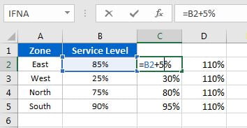
- First, we need 2 support columns. In the First column we will put the formula Service Level Value + 5% (B2+5%). We are taking 5% because Actual Service Level value will be displayed on the Lower Cap. So, we are taking 5% for Lower Cap and 5% for Upper Cap. In the 2nd Support Column we will take the maximum value which 110% (Lower Cap 5% + Upper Cap 5% + Maximum Value for Service Level 100%)
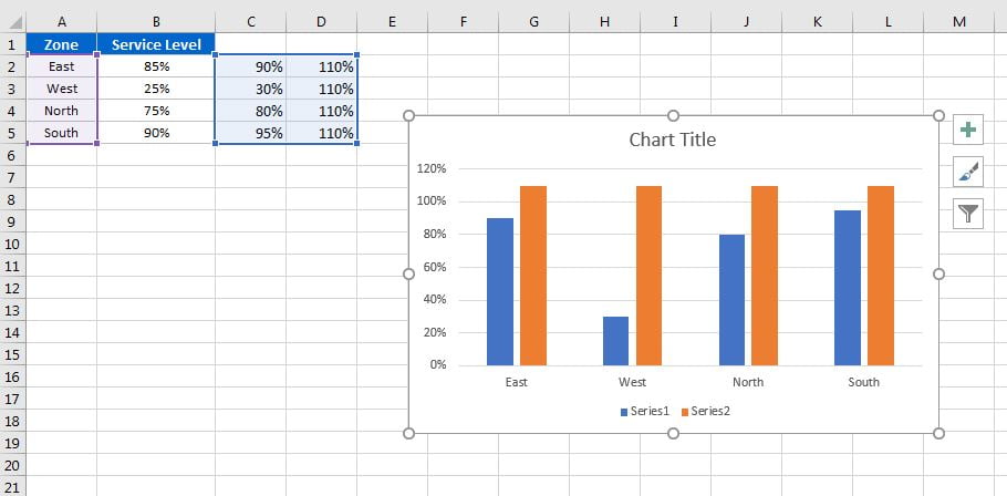
- Select the Range of Column A, Column C and Column D (Use Ctrl+Mouse to select Multiple Ranges)
- Insert a 2D Clustered Column Chart.
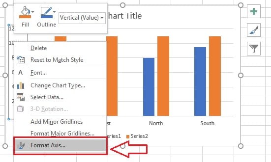
Right Click on the Vertical Axis and click on Format Axis.
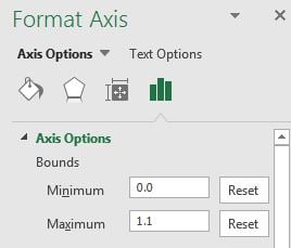
- Put the Minimum Value as “0” and Maximum value as “1.1”
- Now Insert a Rectangle Shape from Insert Tab >> Shapes>>Rectangle Shape
- Resize the Shape Height as “0.2” and Width as “1” as given in below image
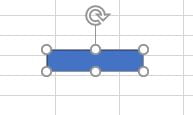
- Remove the Shape outline from the Rectangle Shape.
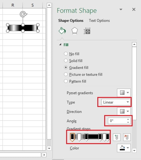
- Right click on the Rectangle Shape and Click on Format Shape.
- Go to the Fill option in Fill and Line.
- Select the Gradient Fill.
- Select the Type as Linear.
- Select the Angle as 0 degree.
- Add the Six Gradient Stops and change the position as 0%, 20%, 40%, 80%, 90% and 100% respectively.
- Change the Color Gradient Stops as First as Black, Second as White, Third as Black, Forth as Black, Fifth as White and Sixth as Black.
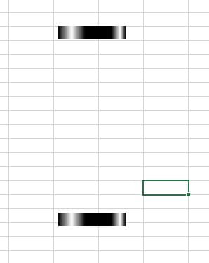
- Make a Copy of this rectangle as keep below of the first one as given in below image.
- Make another copy and keep it in the middle of both rectangles and change the height accordingly.
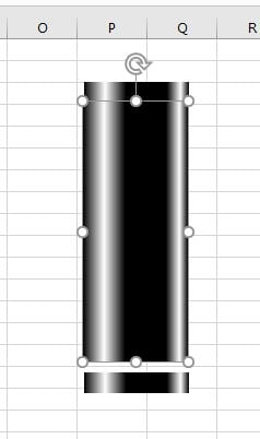
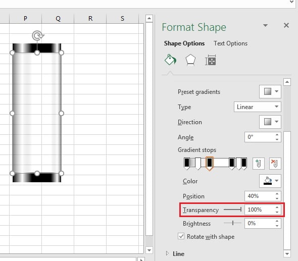
- For the middle Rectangle, go to the Format Shape and change the Transparency of Gradient Stops.
- Transparency of Gradient Stops should be – First as 50%, Second as 75%, Third as 100%, Forth as 100%, Fifth as 75% and Sixed as 50%.
- Select all three rectangles together and make a group.
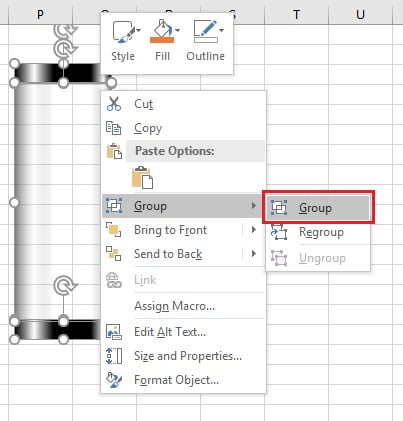
- Copy the rectangles group and paste it on Max series (110% on orange color)
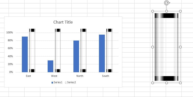
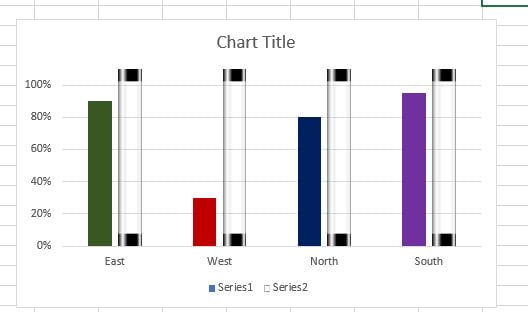
- Change the Colors of First Series (Choose some dark colors)
- Change Chart Title and Format it.
- Remove the Vertical Axis, Gridlines, and Legends from the chart.
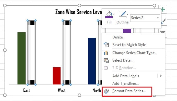
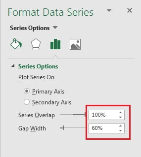
- Right Click on the column and Click on Format Data Series
- Take the Series Overlap as 100%
- Gap Width as 60%
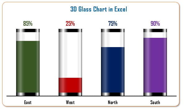
- Our Chart is ready, and it will look like below image
- Right click on the columns and Add the data label. It will show 110% for all.
- Right click on the data label and click on Format Data label.
- Use the Value from cells option and Connect with the actual service level value.
- Change the color and Font as the Chart Theme.
- Add Border Outline and Rounded corner of chart.
Click to buy 3D Glass Chart in Excel
Visit our YouTube channel to learn step-by-step video tutorials
Watch the step by step tutorial:
Click to buy 3D Glass Chart in Excel