Effective customer service is crucial for ensuring customer satisfaction, loyalty, and business growth. The Customer Service Dashboard in Power BI is a powerful tool designed to help organizations monitor key customer service metrics and make data-driven decisions to improve service quality. This dashboard provides insights into ticket management, customer satisfaction, agent performance, and issue resolution, all in one place.
In this article, we will explain the Customer Service Dashboard in Power BI, its key features, and how it can help you optimize your customer support operations.
What is the Customer Service Dashboard in Power BI?
The Customer Service Dashboard in Power BI is an interactive, ready-to-use dashboard that helps businesses track various customer service KPIs. From ticket resolution times to customer satisfaction scores, this dashboard provides an at-a-glance overview of your customer support operations. The dashboard is designed to help managers and teams identify areas for improvement and make data-driven decisions that enhance service quality.
The dashboard consists of multiple sheets, each focused on a specific aspect of customer service. These sheets provide comprehensive insights into ticket volume, resolution times, customer satisfaction, and agent performance, all with visually engaging charts and slicers for easy exploration.
Key Features of the Customer Service Dashboard in Power BI
This dashboard is divided into several sheets, each providing valuable insights into different customer service areas. Below are the key features of each sheet:
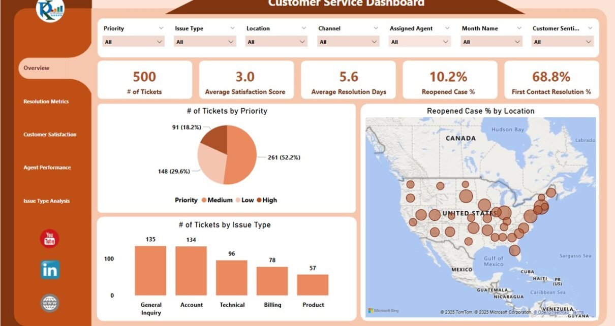
1. Overview Sheet Tab
The Overview Sheet provides a high-level snapshot of the most important customer service metrics. It includes several cards, slicers, and charts for easy monitoring and analysis.
Cards:
- # of Tickets: Displays the total number of customer service tickets, giving you an idea of the workload.
- Avg. Satisfaction Score: Shows the average customer satisfaction score, indicating overall customer satisfaction with your service.
- Avg. Resolution Days: Displays the average number of days taken to resolve tickets, helping you assess the efficiency of your team.
- Reopened Case%: The percentage of tickets that were reopened, helping you identify recurring issues.
- First Contact Resolution%: Displays the percentage of tickets resolved on the first contact, which is an indicator of customer service efficiency.
Charts:
- # of Tickets by Priority: Shows the number of tickets categorized by priority (e.g., high, medium, low).
- # of Tickets by Issue Type: Displays the number of tickets categorized by issue type (e.g., technical support, billing, product issues).
- Reopened Case% by Location: Shows the percentage of reopened cases, segmented by location to identify regional service issues.
Click to buy Customer Service Dashboard in Power BI
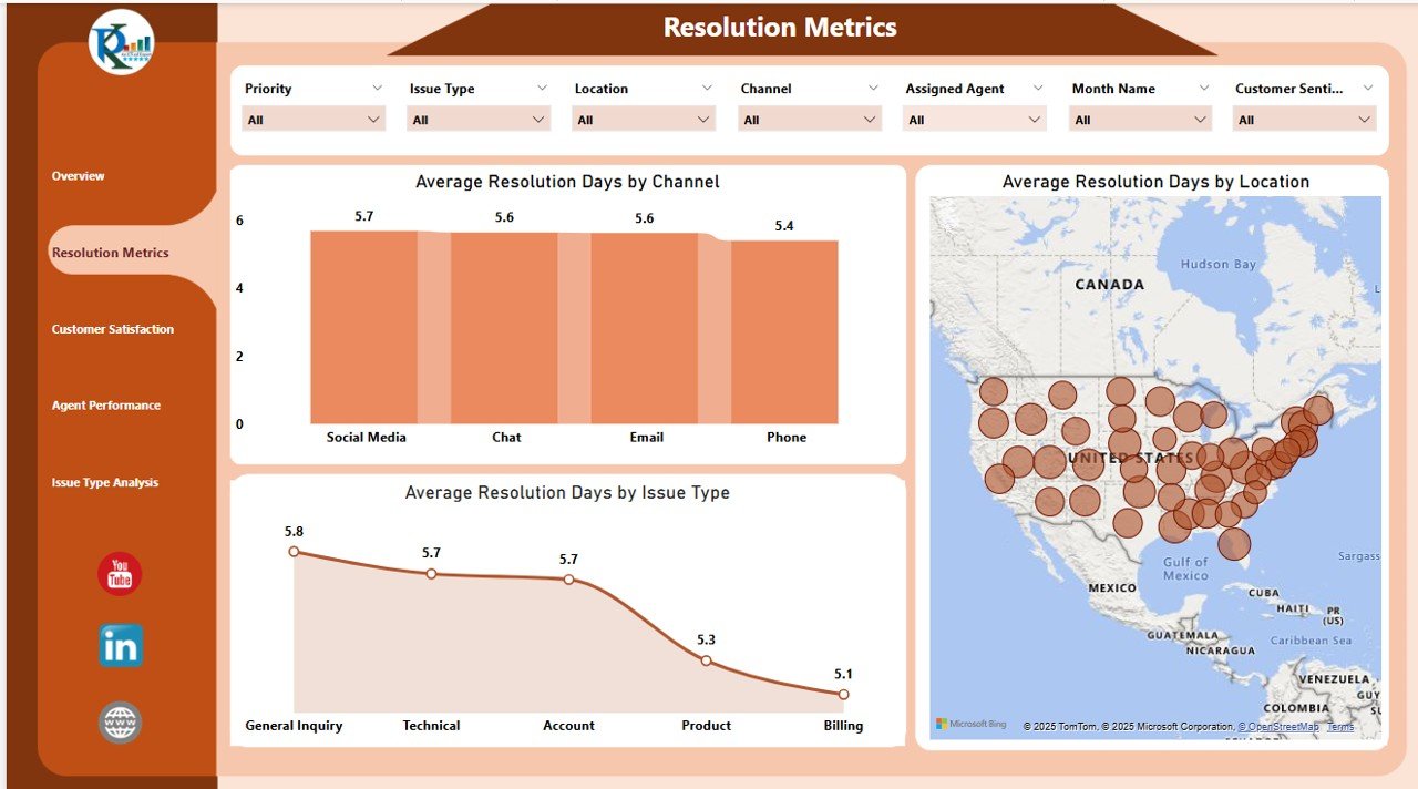
2. Resolution Metrics Sheet Tab
The Resolution Metrics Sheet focuses on analyzing the resolution time for tickets, helping you evaluate the speed and efficiency of your customer service team.
Charts:
- Avg. Resolution Days by Issue Type: Displays the average resolution time, segmented by issue type, to help you understand how long it takes to resolve different issues.
- Avg. Resolution Days by Channel: Shows the average resolution time across various communication channels (e.g., email, phone, live chat).
- Avg. Resolution Days by Location: Analyzes resolution times across different locations to identify any regional differences in service delivery.
Click to buy Customer Service Dashboard in Power BI
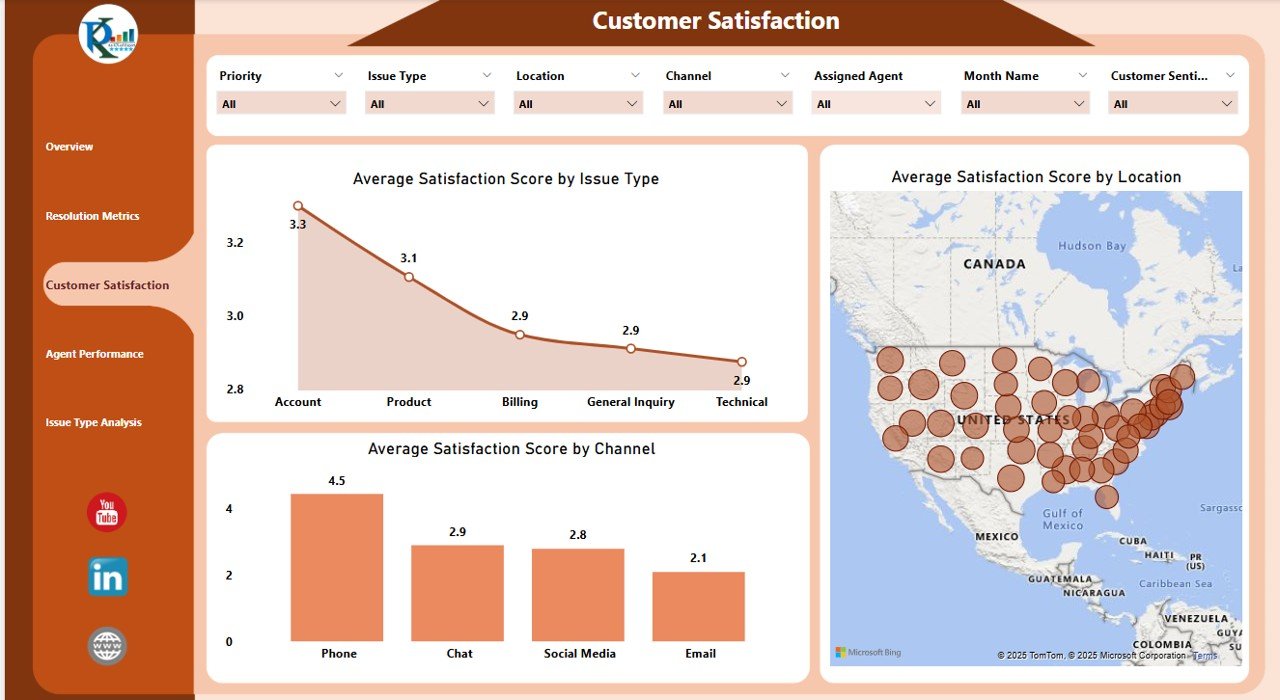
3. Customer Satisfaction Sheet Tab
The Customer Satisfaction Sheet focuses on customer feedback, particularly the satisfaction scores received through various channels.
Charts:
- Average Satisfaction Score by Issue Type: Displays the average satisfaction score for each type of issue, allowing you to see which types of issues are most likely to lead to customer dissatisfaction.
- Average Satisfaction Score by Channel: Shows the satisfaction scores for different communication channels, helping you determine which channel provides the best customer experience.
- Average Satisfaction Score by Location: Analyzes satisfaction scores across different locations to identify regional variations in customer satisfaction.
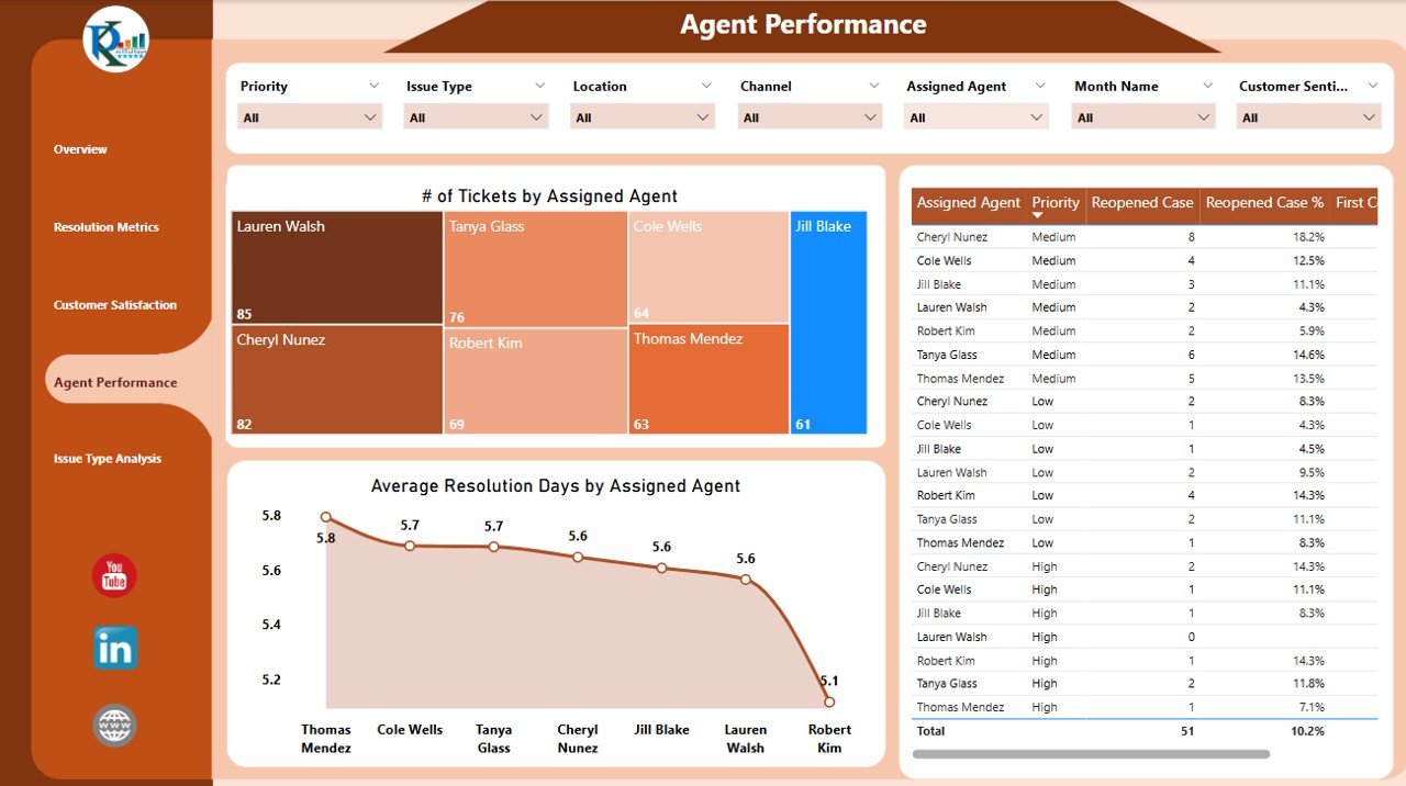
4. Agent Performance Sheet Tab
The Agent Performance Sheet provides insights into the performance of individual customer service agents, helping you assess efficiency and identify areas for improvement.
Metrics:
- # of Tickets by Assigned Agent: Displays the number of tickets handled by each agent, providing a clear view of workload distribution.
- Average Resolution Days by Assigned Agent: Shows the average resolution time for each agent, helping you identify agents who are taking longer to resolve issues.
- Table: The table contains agent-wise information, providing detailed insights into each agent’s performance, such as the number of tickets handled, average resolution time, and customer satisfaction scores.
Click to buy Customer Service Dashboard in Power BI
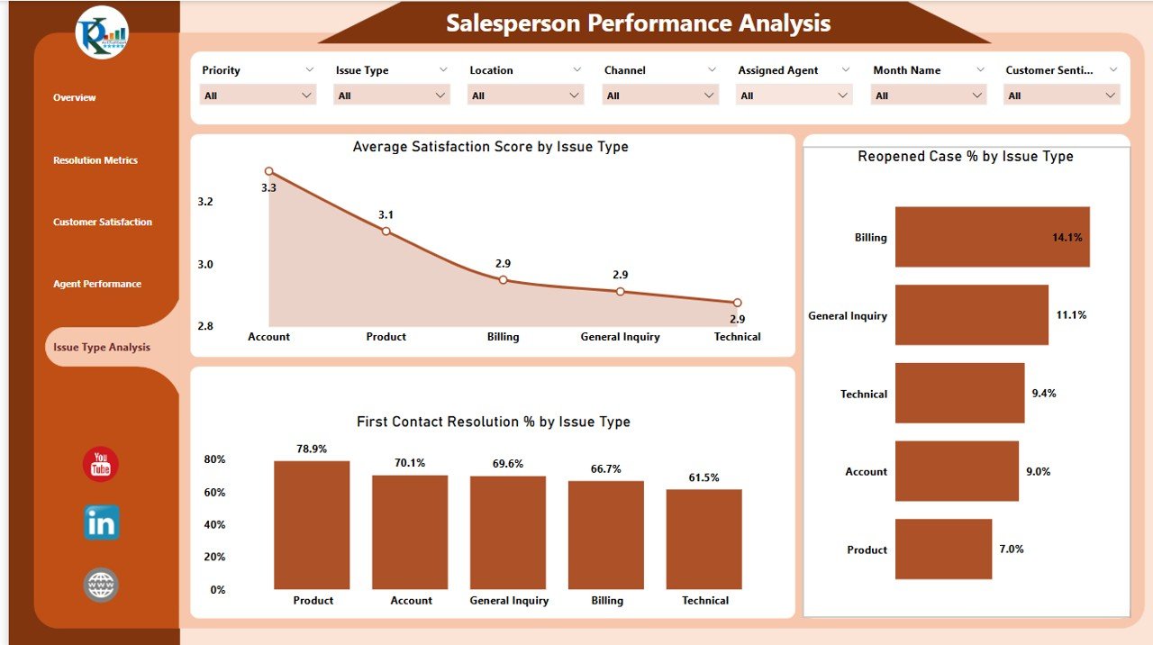
5. Issue Type Analysis Sheet Tab
The Issue Type Analysis Sheet provides a deep dive into the types of issues your customer service team is handling, helping you identify common problems and recurring issues.
Charts:
- Average Satisfaction Score by Issue Type: Displays satisfaction scores segmented by issue type, helping you see which issues are most likely to impact customer satisfaction.
- Reopened Case % by Issue Type: Shows the percentage of cases that are reopened, segmented by issue type, to highlight recurring problems that need attention.
- First Contact Resolution % by Issue Type: Analyzes the percentage of tickets resolved on the first contact, segmented by issue type, to identify areas where first-contact resolution is struggling.
-
Issue Type Analysis Sheet Tab
Advantages of Using the Customer Service Dashboard in Power BI
-
Real-Time Insights: The dashboard updates in real time, providing you with up-to-date data on your customer service performance.
-
Customizable Filters: The slicers allow you to filter and analyze data based on different dimensions (e.g., time, priority, location), giving you the flexibility to track performance the way you need.
-
Comprehensive Tracking: Track all critical customer service metrics, from ticket volume and resolution times to customer satisfaction and agent performance, in one place.
-
Visual Data Representation: The dashboard uses visually engaging charts and cards to display important KPIs, making it easy to spot trends and areas for improvement.
-
Data-Driven Decision Making: By providing real-time, data-driven insights into your customer service operations, this dashboard helps you make informed decisions that improve customer satisfaction and operational efficiency.
Best Practices for Using the Customer Service Dashboard in Power BI
Click to buy Customer Service Dashboard in Power BI
-
Regularly Update Data: Ensure that your customer service data is regularly updated to maintain the accuracy of the dashboard.
-
Monitor Key Metrics: Focus on tracking KPIs such as First Contact Resolution, Customer Satisfaction, and Resolution Times to identify areas for improvement.
-
Analyze Agent Performance: Use the Agent Performance Sheet to track agent productivity and identify opportunities for coaching or training.
-
Use Data for Continuous Improvement: Regularly review the dashboard’s insights to identify trends, recurring issues, and opportunities for improvement in your customer service operations.
Frequently Asked Questions (FAQs)
Click to buy Customer Service Dashboard in Power BI
1. How do I update the Customer Service Dashboard?
Simply enter the latest data for tickets, resolutions, satisfaction scores, and agent performance into the appropriate tables, and the dashboard will automatically update.
2. Can I customize the dashboard for my business needs?
Yes, the Power BI dashboard is fully customizable. You can add new metrics, modify existing charts, or adjust the slicers to fit your specific requirements.
3. How do I analyze agent performance?
Use the Agent Performance Sheet to track the number of tickets handled, resolution times, and customer satisfaction scores for each agent. This helps identify areas for improvement.
Conclusion
The Customer Service Dashboard in Power BI is a powerful tool that provides real-time insights into your customer service operations. With features like interactive slicers, performance tracking, and detailed customer satisfaction analysis, this dashboard enables businesses to optimize customer support processes, improve service quality, and make data-driven decisions. Whether you’re managing a small customer service team or overseeing a large call center, this dashboard is an essential tool for tracking and improving your customer service performance.
Visit our YouTube channel to learn step-by-step video tutorials
Watch the step-by-step video Demo:
Watch the step-by-step video Demo:
Click to buy Customer Service Dashboard in Power BI