Healthcare organizations manage complex projects every day. These projects include hospital expansions, equipment installations, IT system upgrades, compliance initiatives, and patient service improvements. Because budgets stay tight and timelines remain critical, project teams must track costs, progress, and performance carefully. However, when project data stays scattered across spreadsheets or manual reports, visibility drops and risks increase.
That is exactly why a Health Project Management Dashboard in Excel becomes a powerful and practical solution. This ready-to-use dashboard converts raw project data into clear, visual, and actionable insights. Moreover, it helps healthcare leaders monitor budgets, control costs, track progress, and improve accountability—without using expensive project management software.
In this article, you will learn how the dashboard works, what each sheet contains, how every chart supports decision-making, and why this Excel dashboard is essential for modern healthcare project management.
What Is a Health Project Management Dashboard in Excel?
A Health Project Management Dashboard in Excel is a structured reporting tool designed to monitor healthcare projects from planning to completion. It tracks planned budgets, actual costs, project status, cost variance, progress percentage, and performance across hospitals, managers, and project types.
Because the dashboard is built in Microsoft Excel, it remains:
-
Easy to use
-
Familiar to healthcare teams
-
Flexible and customizable
-
Cost-effective
-
Suitable for executive reviews
As a result, project managers and hospital leadership gain real-time visibility into project health.
Key Features of the Health Project Management Dashboard
Click to Buy Health Project Management Dashboard in Excel
This dashboard is a ready-to-use Excel solution that includes:
-
Overview insights for leadership
-
Detailed project performance analysis
-
Financial control and variance tracking
-
Manager-level accountability
-
Monthly trend analysis
Each feature works together to support faster and smarter decisions.
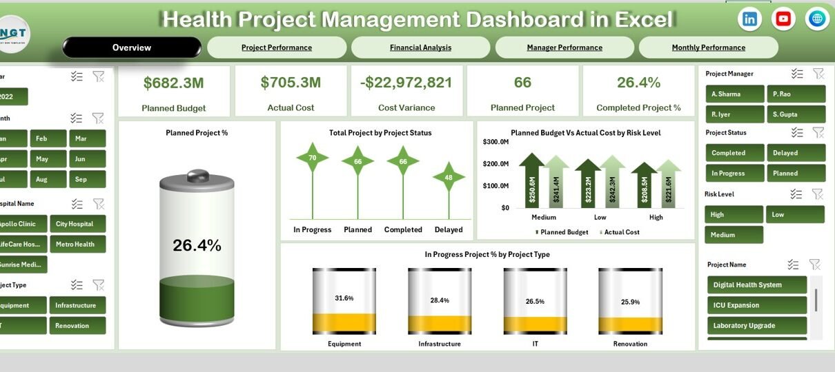
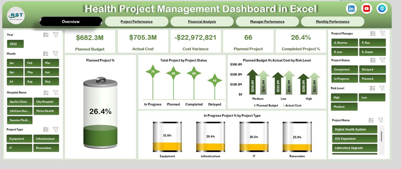
Overview Sheet Tab – Executive Summary
The Overview sheet provides a high-level snapshot of all healthcare projects. It helps decision-makers understand performance instantly.
🔹 KPI Cards on the Overview Page
The dashboard includes the following KPI cards:
-
Planned Budget – Total approved budget for all projects
-
Actual Cost – Total cost incurred so far
-
Cost Variance – Difference between planned budget and actual cost
-
Planned Project – Total number of planned projects
-
Completed Project % – Percentage of projects completed
These cards highlight financial health and delivery status at a glance.
Charts on the Overview Page
The Overview sheet also includes powerful charts that explain project status clearly.
Planned Project %
Shows how many projects reached the planned stage compared to total projects.
Total Project by Project Status
Displays projects by status such as Planned, In Progress, Completed, or On Hold.
Planned Budget vs Actual Cost by Risk Level
Helps identify whether high-risk projects exceed budgets.
In Progress Project % by Project Type
Shows which project types remain active and require attention.
Together, these visuals give leadership a complete summary of project performance.
Click to Buy Health Project Management Dashboard in Excel
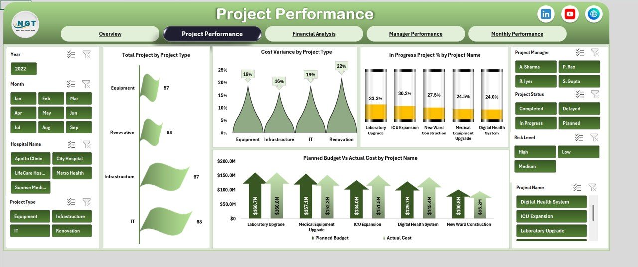
Project Performance Sheet – Operational Insights
The Project Performance section focuses on how different projects perform across types and names.
Charts in Project Performance
Total Project by Project Type
Shows how projects distribute across categories such as infrastructure, IT, medical equipment, or compliance.
Cost Variance by Project Type
Highlights which project categories face budget overruns.
In Progress Project % by Project Name
Helps teams track which projects remain active.
Planned Budget vs Actual Cost by Project Name
Identifies individual projects that exceed or stay within budget.
This section helps project teams prioritize corrective actions.
Click to Buy Health Project Management Dashboard in Excel
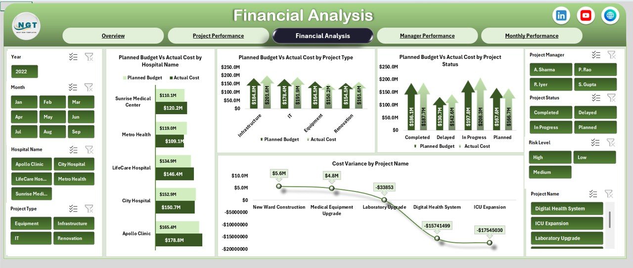
Financial Analysis Sheet – Cost Control & Budget Oversight
Healthcare projects require strict financial discipline. Therefore, the Financial Analysis sheet focuses on cost management.
Charts in Financial Analysis
Planned Budget vs Actual Cost by Hospital Name
Compares project spending across hospitals.
Planned Budget vs Actual Cost by Project Type
Identifies project types that create higher financial pressure.
Planned Budget vs Actual Cost by Project Status
Shows cost behavior at different stages.
Cost Variance by Project Name
Pinpoints projects with the highest variance.
This sheet supports finance teams and hospital administrators during budget reviews.
Click to Buy Health Project Management Dashboard in Excel
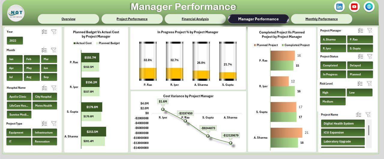
Manager Performance Sheet – Accountability & Leadership
Project success depends heavily on strong leadership. The Manager Performance sheet measures manager-level outcomes.
Charts in Manager Performance
Planned Budget vs Actual Cost by Project Manager
Shows how well managers control budgets.
In Progress Project % by Project Manager
Highlights workload distribution.
Completed Project vs Planned Project by Project Manager
Measures delivery efficiency.
Cost Variance by Project Manager
Identifies managers who consistently stay within budget.
This view improves accountability and supports leadership development.
Click to Buy Health Project Management Dashboard in Excel
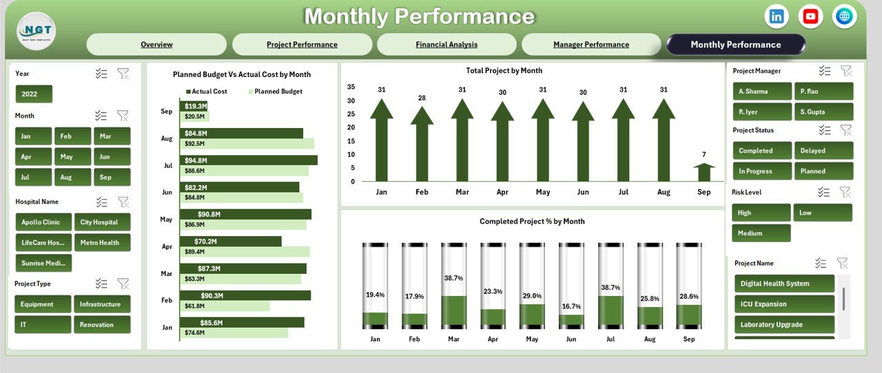
Monthly Performance Sheet – Trend Analysis
The Monthly Performance sheet tracks how projects evolve over time.
Charts in Monthly Performance
Planned Budget vs Actual Cost by Month
Shows monthly spending trends.
Total Project by Month
Tracks project volume changes.
Completed Project % by Month
Measures delivery improvement.
Monthly trends help organizations forecast risks early and adjust plans.\
Click to Buy Health Project Management Dashboard in Excel
Advantages of Using a Health Project Management Dashboard in Excel
Using this dashboard delivers several benefits:
-
Centralized project tracking
-
Improved budget control
-
Faster decision-making
-
Clear executive reporting
-
Better accountability
-
Reduced project overruns
-
No additional software cost
Because Excel remains familiar, adoption stays high across healthcare teams.
Opportunities for Improvement in Health Project Management
Although the dashboard is powerful, organizations can enhance it further:
-
Add risk severity scoring
-
Include milestone-level tracking
-
Integrate with procurement data
-
Add forecasted cost projections
-
Include patient impact indicators
These improvements create deeper insights for strategic planning.
Best Practices for Using the Health Project Management Dashboard
Click to Buy Health Project Management Dashboard in Excel
To get maximum value from this dashboard:
-
Update costs and progress regularly
-
Review cost variance monthly
-
Focus on high-risk projects early
-
Compare manager performance quarterly
-
Use charts during leadership reviews
-
Maintain clean and consistent data
Following these practices improves project success rates.
Conclusion
A Health Project Management Dashboard in Excel gives healthcare organizations complete visibility into project costs, progress, and performance. It transforms complex project data into clear insights that support confident decisions. Because it is ready to use, flexible, and cost-effective, this dashboard becomes an essential tool for hospitals, healthcare groups, and project management teams.
With structured reporting and powerful visuals, healthcare leaders can control budgets, improve delivery, and ensure project success.
Frequently Asked Questions (FAQs)
Click to Buy Health Project Management Dashboard in Excel
What is the main purpose of this dashboard?
It tracks project cost, progress, and performance in healthcare projects.
Who should use this dashboard?
Hospital administrators, project managers, finance teams, and leadership.
Can I customize project types and statuses?
Yes, the dashboard is fully customizable.
Does it support multi-hospital projects?
Yes, hospital-level analysis is included.
Is Excel enough for healthcare project tracking?
Yes, for structured reporting and cost control, Excel works very well.
Visit our YouTube channel to learn step-by-step video tutorials
Watch the step-by-step video tutorial:
Click to Buy Health Project Management Dashboard in Excel