Efficient IT support management is essential for ensuring business continuity and employee productivity. Tracking ticket resolution, monitoring technician performance, and analyzing trends can be challenging without a centralized system. The IT Support Ticket Dashboard in Power BI provides a ready-to-use solution to manage, monitor, and optimize IT service operations effectively.
This dashboard combines interactive visualizations, performance metrics, and insightful analytics across multiple pages, helping IT managers and support teams make data-driven decisions.
Key Features of the IT Support Ticket Dashboard
The dashboard is organized into multiple pages, each providing insights into different aspects of IT support ticket management.
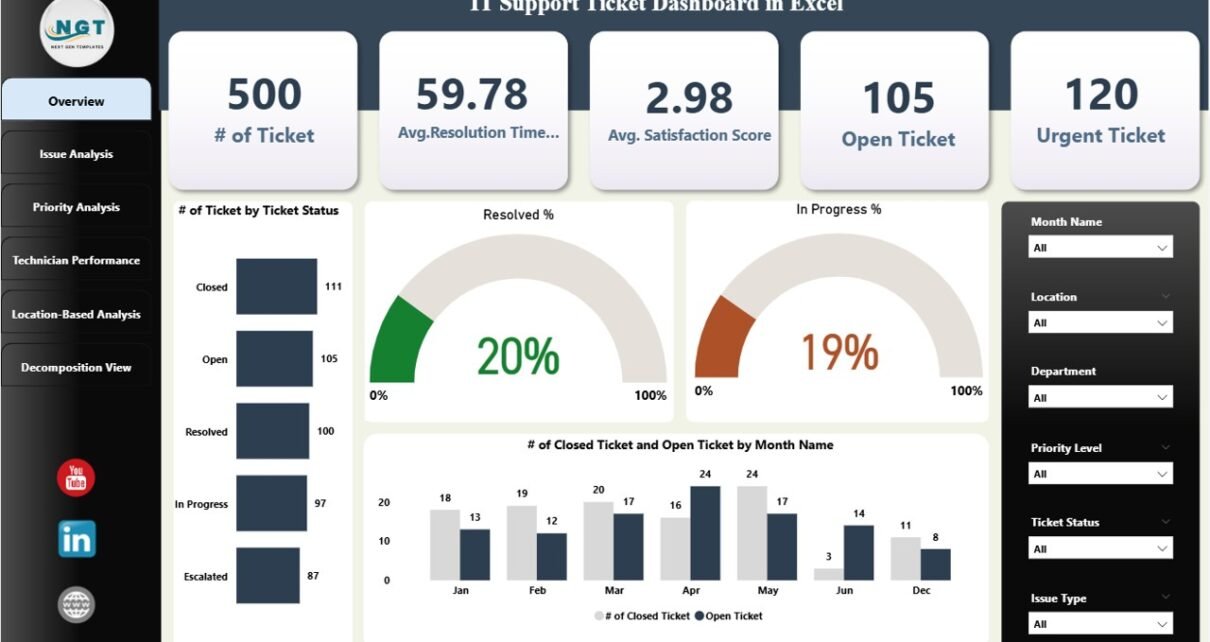
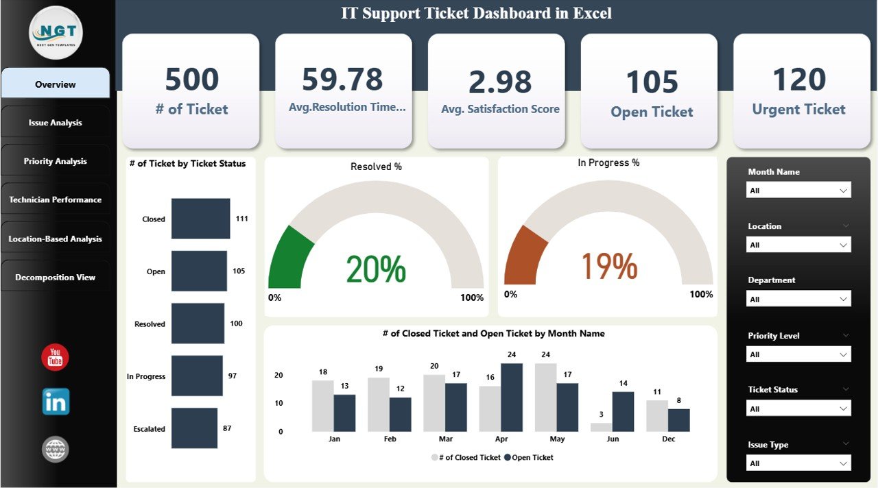
. Overview Page
The Overview page offers a high-level summary of IT support ticket activity.
Cards displayed:
-
# of Tickets: Total number of tickets raised.
-
Avg. Resolution Time (Hours): Average time taken to resolve tickets.
-
Avg. Satisfaction Score: Average feedback rating from end-users.
-
Open Tickets: Count of currently open tickets.
-
Urgent Tickets: Count of tickets flagged as urgent.
Charts included:
-
# of Tickets by Ticket Status: Visualize tickets as Open, In Progress, and Closed.
-
Resolved %: Percentage of tickets resolved successfully.
-
In Progress %: Percentage of tickets currently in progress.
-
# of Closed Ticket and Open Ticket by Month Name: Track monthly ticket trends to identify peak periods.
The Overview page allows IT managers to quickly assess the overall health of the IT support function and identify areas needing immediate attention.
Click to Buy IT Support Ticket Dashboard in Power BI
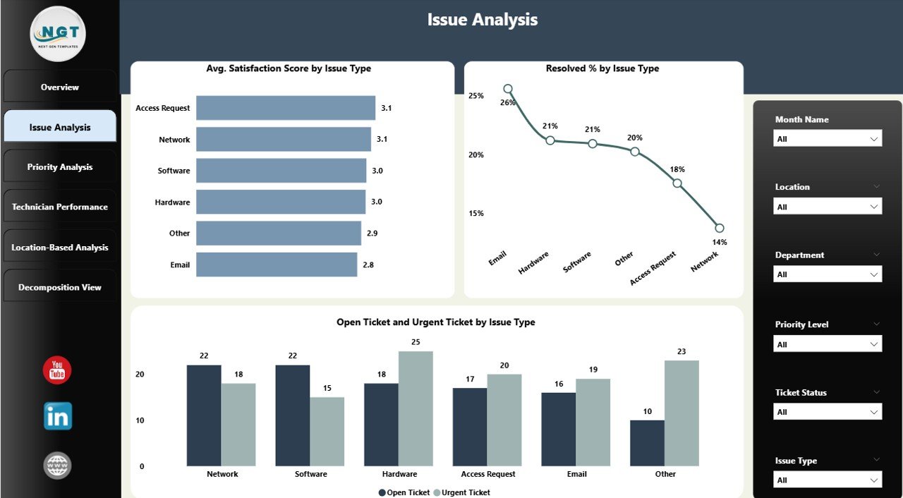
2. Issue Analysis Page
The Issue Analysis page provides insights into the types of issues being reported.
Charts included:
-
Avg. Satisfaction Score by Issue Type: Monitor user satisfaction across different issue categories.
-
Resolved % by Issue Type: Evaluate how efficiently each type of issue is resolved.
-
Open Ticket and Urgent Ticket by Issue Type: Identify critical issues that require prioritization.
This page helps IT teams to focus on recurring or high-impact issues and improve overall service quality.
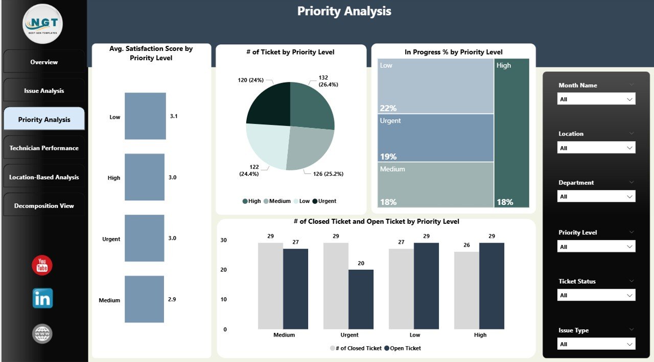
3. Priority Analysis Page
The Priority Analysis page focuses on the urgency of tickets and their impact on resolution times.
Charts included:
-
Avg. Satisfaction Score by Priority Level: Understand satisfaction levels for High, Medium, and Low priority tickets.
-
# of Tickets by Priority Level: Track the distribution of tickets based on urgency.
-
In Progress % by Priority Level: Monitor unresolved tickets according to priority.
-
# of Closed Ticket and Open Ticket by Priority Level: Compare completed versus pending tickets by priority.
Analyzing priority levels ensures that urgent tickets receive timely attention and critical issues are not delayed.
Click to Buy IT Support Ticket Dashboard in Power BI
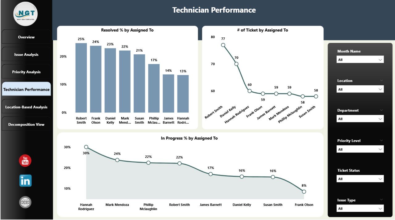
4. Technician Performance Page
The Technician Performance page evaluates individual and team performance in resolving tickets.
Charts included:
-
Resolved % by Assigned To: Track the resolution efficiency of each technician.
-
# of Tickets by Assigned To: Monitor the workload handled by each technician.
-
In Progress % by Assigned To: Identify technicians with pending tickets that require support.
This page enables managers to recognize high-performing staff, allocate workloads effectively, and ensure timely service delivery.
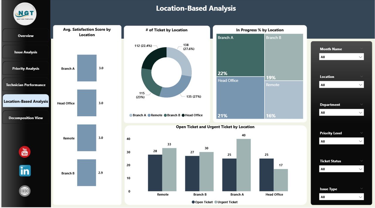
5. Location-Based Analysis Page
The Location-Based Analysis page highlights support trends based on office locations or departments.
Charts included:
-
Avg. Satisfaction Score by Location: Evaluate satisfaction levels across different locations.
-
# of Tickets by Location: Track ticket volume by site or department.
-
Open Ticket and Urgent Ticket by Location: Identify locations experiencing more critical issues.
This page helps multi-location organizations to ensure consistent IT support and allocate resources efficiently.
Click to Buy IT Support Ticket Dashboard in Power BI
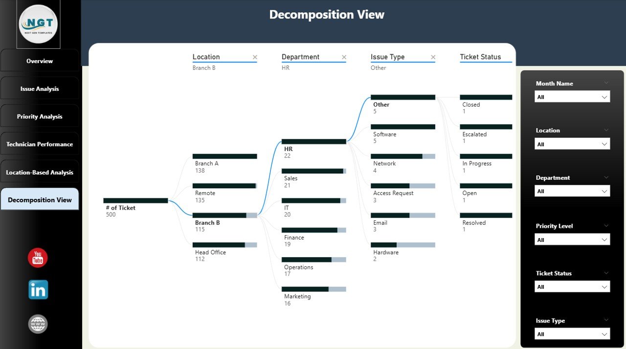
6. Decomposition View Page
The Decomposition View page provides a hierarchical analysis of ticket data.
Chart included:
-
Decomposition Tree: Drill down into tickets by various attributes such as Issue Type, Priority, Technician, and Location.
This interactive visual helps identify root causes, understand contributing factors, and prioritize improvement initiatives.
Advantages of the IT Support Ticket Dashboard
-
Centralizes all IT support ticket data in one interactive dashboard
-
Tracks resolution times, satisfaction scores, and workload distribution
-
Provides insights on issue types, priority, and location-specific trends
-
Helps IT managers optimize technician performance and resource allocation
-
Supports proactive decision-making to improve overall service quality
Opportunities for Improvement
Click to Buy IT Support Ticket Dashboard in Power BI
-
Integrate with IT service management tools (e.g., Jira, ServiceNow) for real-time ticket updates
-
Include trend forecasting to predict peak ticket periods
-
Add SLA compliance metrics for better service monitoring
-
Incorporate user feedback sentiment analysis for qualitative insights
Best Practices
-
Regularly update ticket data to maintain accuracy
-
Monitor technician performance to balance workload and improve efficiency
-
Review issue types and priority levels periodically to identify recurring problems
-
Use location-based insights to optimize IT resource allocation
Conclusion
Click to Buy IT Support Ticket Dashboard in Power BI
The IT Support Ticket Dashboard in Power BI is a comprehensive solution for organizations seeking to streamline IT support operations. By providing real-time metrics, interactive visualizations, and detailed analysis across multiple dimensions, this dashboard enables IT managers to monitor performance, improve service quality, and enhance user satisfaction.
Visit our YouTube channel to learn step-by-step video tutorials
Youtube.com/@NeotechNavigators
Watch the step-by-step video Demo:
Click to Buy IT Support Ticket Dashboard in Power BI