Managing translation and localization projects becomes easier when you track performance with clarity. Global companies deal with several languages, tight deadlines, skilled translators, quality standards, and fast delivery expectations. Because of this, teams need accurate and real-time insights. A Translation & Localization KPI Dashboard in Power BI solves this problem by bringing all important metrics together in one place.
In this detailed article, you will learn what this dashboard is, how it works, why it matters, and how it helps translation teams stay organized and productive. You will also see key features, advantages, best practices, and answers to the most common questions.
Click to buy Translation & Localization KPI Dashboard in Power BI
What Is a Translation & Localization KPI Dashboard in Power BI?
A Translation & Localization KPI Dashboard in Power BI is a ready-to-use performance management tool. It displays monthly, yearly, and real-time KPIs for translation and localization teams. It helps language service providers (LSPs), in-house localization teams, and freelance project managers track every important metric in one interactive visual dashboard.
This dashboard connects to an Excel-based dataset, which includes actual performance numbers, targets, KPI definitions, and category details. Once you load the data in Power BI, the dashboard updates automatically and shows clear insights through slicers, cards, trend charts, and comparison visuals.
Teams use this dashboard to:
- Monitor translation quality
- Track delivery timelines
- Compare current performance with targets
- Analyze month-to-date (MTD) and year-to-date (YTD) trends
- Review performance across KPI groups
- Improve planning and resource allocation
- Make fast and confident decisions
Because Power BI is user-friendly and highly visual, organizations enjoy smooth reporting without manual calculations or complex spreadsheets.
Why Do Translation and Localization Teams Need a KPI Dashboard?
Translation and localization workflows involve several moving parts. You deal with multiple languages, translation memories, reviewers, quality control processes, and subject-matter experts. Without organized tracking, tasks fall behind. Teams often miss quality expectations, and clients lose trust.
A KPI Dashboard in Power BI brings structure and visibility. It helps you identify bottlenecks early, improve translator performance, minimize rework, and ensure consistent quality delivery.
Since the dashboard updates insights instantly, teams stay aligned and make smarter decisions across projects.
Key Features of the Translation & Localization KPI Dashboard in Power BI
This dashboard includes three fully designed pages, each created to support different stages of performance review.
Let’s explore each page in detail.
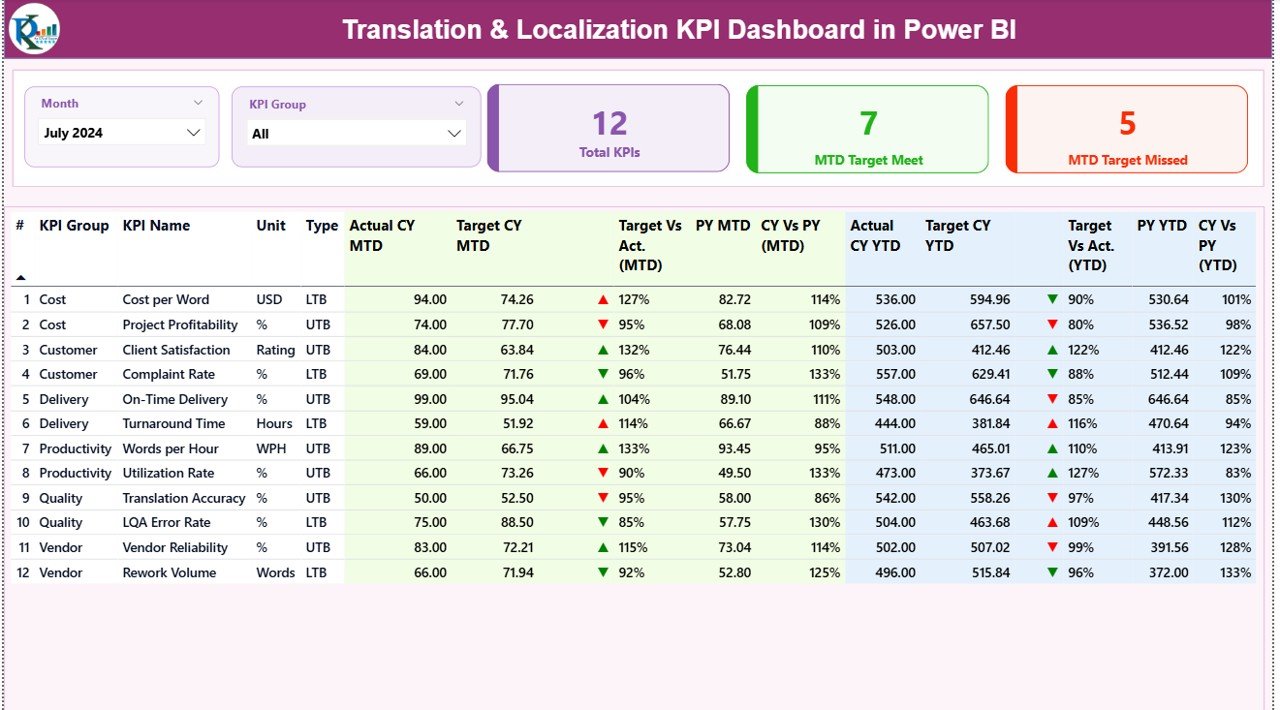
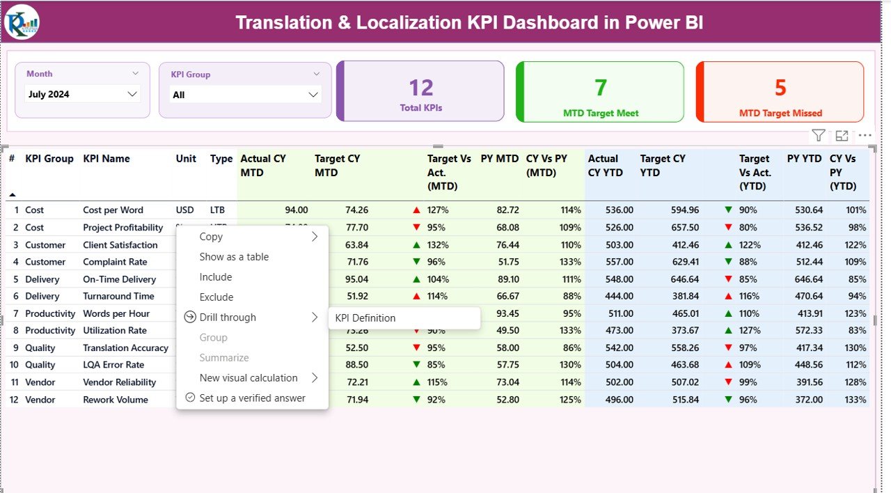
Summary Page – Your Main Performance Overview
The Summary Page is the central page of this dashboard. It works like a control panel for all KPIs. The layout stays clean and interactive, helping you navigate through performance data with ease.
Top Slicers
You will find two slicers at the top:
- Month Selector – Choose the reporting period
- KPI Group Selector – Filter metrics by category
These slicers help you quickly adjust the view and focus on a specific time or KPI category.
KPI Overview Cards
The page shows three cards that help you understand overall performance at a glance:
- Total KPIs Count
- MTD Target Met Count
- MTD Target Missed Count
These cards give you a summary of how well the team is performing in the selected month.
Detailed KPI Performance Table
Below the cards, you will find a detailed KPI table. This table displays all relevant metrics, such as:
- KPI Number – Unique identifier for each KPI
- KPI Group – Category of KPI (Quality, Delivery, Productivity, etc.)
- KPI Name – Title of the KPI
- Unit – Measurement unit such as %, hours, words, or scores
- Type – UTB (Upper the Better) or LTB (Lower the Better)
The table displays performance data for both MTD and YTD, including:
- Actual CY MTD
- Target CY MTD
- MTD Status Icon (▲ or ▼)
- Target vs Actual (MTD %)
- Previous Year MTD
- CY vs PY (MTD %)
- Actual CY YTD
- Target CY YTD
- YTD Status Icon (▲ or ▼)
- Target vs Actual (YTD %)
- Previous Year YTD
- CY vs PY (YTD %)
The icons in green or red help you understand performance instantly. Since the table shows MTD, YTD, and year-over-year comparisons, teams can evaluate progress from multiple angles.
Click to buy Translation & Localization KPI Dashboard in Power BI
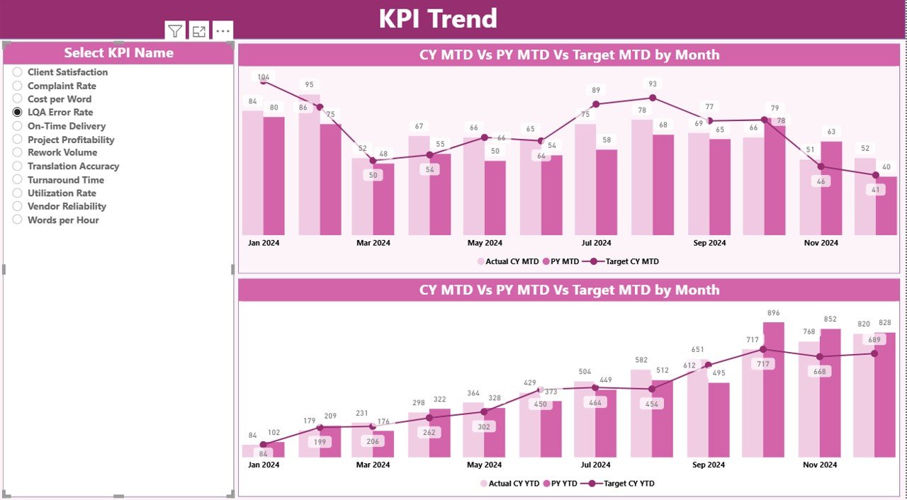
KPI Trend Page – Visual Trend Analysis
The KPI Trend Page helps you analyze how each KPI is moving over time. This page includes two combo charts:
- MTD Trend Chart
- YTD Trend Chart
These charts compare:
- Current Year Actuals
- Previous Year Actuals
- Target Values
You will also find a KPI selector slicer on the left side. Once you pick a KPI, the charts update and show the full performance trend.
This section helps teams:
- Identify improvements
- Spot declining trends
- Review seasonality
- Compare performance against targets
Trend analysis is important for localization teams because workloads often shift based on client volumes, product updates, and language demand. This page makes those patterns easier to understand.
Click to buy Translation & Localization KPI Dashboard in Power BI
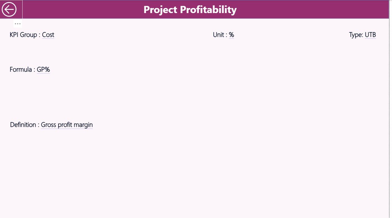
KPI Definition Page – Detailed KPI Documentation
The third page is a drill-through page. It stays hidden by default, but you can access it from the Summary Page.
When you select a KPI and apply drill-through, you will see:
- KPI Number
- KPI Group
- KPI Name
- Unit
- Formula
- Definition
- Type (UTB or LTB)
This helps your team understand exactly how each KPI works. Clear definitions remove confusion and create a unified understanding across all language teams and translators.
To return to the Summary Page, click the back button in the top-left corner.
Click to buy Translation & Localization KPI Dashboard in Power BI
Excel Data Source Structure
This dashboard works with an Excel data file that includes three worksheets:
Input_Actual Sheet
Here you fill:
- KPI Name
- Month (use first date of each month)
- MTD Actual
- YTD Actual
This sheet provides the actual performance values.
Input_Target Sheet
Here you fill:
- KPI Name
- Month
- MTD Target
- YTD Target
These values help Power BI calculate comparisons.
KPI Definition Sheet
This sheet includes:
- KPI Number
- KPI Group
- KPI Name
- Unit
- Formula
- KPI Definition
- Type (LTB or UTB)
The dashboard uses this sheet to build the drill-through page and the KPI structure.
Click to buy Translation & Localization KPI Dashboard in Power BI
What KPIs Can You Track in Translation & Localization?
Although KPIs vary from company to company, here are the most common categories:
Quality KPIs
- Translation Quality Score
- Review Error Rate
- Linguistic Quality Index (LQI)
- Rework Percentage
Productivity KPIs
- Words Translated Per Day
- On-Time Delivery Rate
- First-Time Quality Rate
- Speed of Translation
Financial KPIs
- Cost Per Word
- Profitability Per Project
- Client Cost Variance
Delivery KPIs
- Turnaround Time
- Number of Delayed Deliveries
- Client Revision Requests
Customer KPIs
- Client Satisfaction Score
- Client Feedback Count
Since the dashboard allows custom KPIs, you can easily add more based on your workflow.
Why Does a Translation & Localization KPI Dashboard in Power BI Matter?
This dashboard helps organizations improve every part of their translation workflow. Let’s look at the major advantages.
Advantages of Translation & Localization KPI Dashboard in Power BI
- Real-Time Visibility
You see performance the moment you update the Excel file. This saves time and removes manual reporting.
- Clear Comparison With Targets
The dashboard shows MTD and YTD comparisons along with earlier year performance. This helps teams understand progress quickly.
- Improved Translator Productivity
When translators and reviewers see their performance trends, they improve quality and reduce delays.
- Better Resource Planning
Managers identify where extra support is needed and allocate work with more balance.
- Higher Translation Quality
Quality drops become visible early. Because of this, teams take action before issues impact clients.
- Streamlined Client Reporting
Most clients demand regular reporting. This dashboard gives clean visuals that you can share easily.
- Easy to Maintain
You only update the Excel file. Power BI handles visual updates automatically.
- Enhanced Decision Making
Managers make quick decisions based on solid data. This reduces delays and improves project delivery timelines.
How Does This Dashboard Improve Localization Workflows?
Localization involves text, images, UI strings, help documents, legal content, marketing content, and more. With so many content types, errors can easily slip in.
The dashboard provides:
- Timely insights
- Strong performance monitoring
- Quality metrics
- Trend analysis
- Reviewer productivity data
- Client feedback indicators
Because of this, localization teams stay confident and deliver better output.
Best Practices for Using the Translation & Localization KPI Dashboard in Power BI
To get maximum value from the dashboard, follow these best practices:
- Keep Data Updated Regularly
Update MTD and YTD values consistently. Daily or weekly updates work best.
- Use Clear KPI Definitions
Well-defined KPIs prevent confusion. Make sure everyone understands formulas and units.
- Set Realistic Targets
Use past performance and client expectations to set achievable targets.
- Train Your Team
Explain how the dashboard works and how they can use trend charts and filters.
- Review Performance Monthly
Hold monthly review meetings to track progress and identify issues early.
- Compare Year-over-Year Progress
YOY comparisons show long-term improvement patterns clearly.
- Keep KPI Groups Organized
Segregate KPIs by category like Quality, Productivity, Finance, Delivery, and Customer.
- Use Drill-Through Wisely
The KPI Definition page helps teams understand what each KPI means.
Common Challenges in Translation & Localization and How This Dashboard Solves Them
- Inconsistent Quality
The dashboard highlights quality-related KPIs so you can take early corrective action.
- Missed Deadlines
MTD and YTD comparisons show if delivery performance is dropping.
- Cost Overruns
Cost KPIs help identify efficiency gaps.
- Low Translator Productivity
Trend lines show declining performance trends.
- Lack of Visibility
The Summary Page shows everything in a single view.
How to Get Started With This Dashboard
You can start using this dashboard with a few simple steps:
- Prepare your KPI list
- Fill KPI definitions in Excel
- Fill actual data in the input sheet
- Enter target data in the target sheet
- Load Excel into Power BI
- Refresh Power BI to update visuals
Once the setup is complete, you can use the dashboard instantly.
Conclusion
The Translation & Localization KPI Dashboard in Power BI is a practical and powerful tool for teams that want clarity, speed, and accuracy. It helps you improve translation quality, meet deadlines, reduce costs, and streamline your entire localization process. With clear visuals, smart slicers, KPI comparisons, and trend analysis, the dashboard becomes a complete performance monitoring solution for any language-focused organization.
Whether you manage a small team or a global translation department, this dashboard helps you stay organized and deliver high-quality results every time.
Frequently Asked Questions (FAQs)
- Who can use this Translation & Localization KPI Dashboard?
Localization managers, project coordinators, translators, reviewers, and LSPs can use this dashboard easily.
- Do I need advanced Power BI skills?
No. You only need basic knowledge. The dashboard runs automatically once data is updated.
- Can I add more KPIs?
Yes. The Excel file allows unlimited KPI entries.
- How often should I update the data?
Weekly updates work best, but you can update monthly if your workload is low.
- Can I use this dashboard for client reporting?
Yes. The visuals are clean and ready for professional presentations.
- Does this dashboard support multiple languages?
Yes. You can add KPIs for each language separately.
- Can I connect this dashboard to another data source?
Yes. Power BI allows integration with SQL, SharePoint, and many other systems.
Visit our YouTube channel to learn step-by-step video tutorials
Watch the step-by-step video tutorial:
Click to buy Translation & Localization KPI Dashboard in Power BI