In today’s fast-paced energy and utility sectors, managing operational data efficiently can significantly impact the overall performance of facilities. An Energy & Utility Dashboard in Excel is a powerful tool that helps visualize key metrics, track performance, and monitor various aspects like energy output, efficiency, emissions, downtime, and more.
This article explains the features, advantages, opportunities for improvement, and best practices for using an Energy & Utility Dashboard in Excel. Let’s dive into how this dashboard works and how it can help optimize your energy and utility operations.
What is an Energy & Utility Dashboard in Excel?
An Energy & Utility Dashboard in Excel is a ready-to-use, interactive tool designed to track and analyze the performance of energy production and utility operations. The dashboard is built using multiple sheets and charts that present data visually, making it easier to interpret and manage critical operational metrics.
This dashboard integrates various key performance indicators (KPIs) such as total energy output, downtime, emissions, efficiency, and facility performance. With Excel’s dynamic features, such as slicers, pivot tables, and charts, users can gain deeper insights into their operations and make data-driven decisions.
Key Features of the Energy & Utility Dashboard
The Energy & Utility Dashboard in Excel contains several sheets, each tailored to a specific operational aspect. These sheets allow users to track and visualize important metrics effectively.
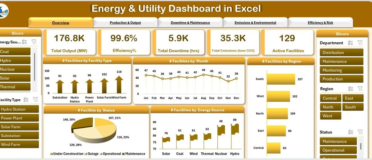
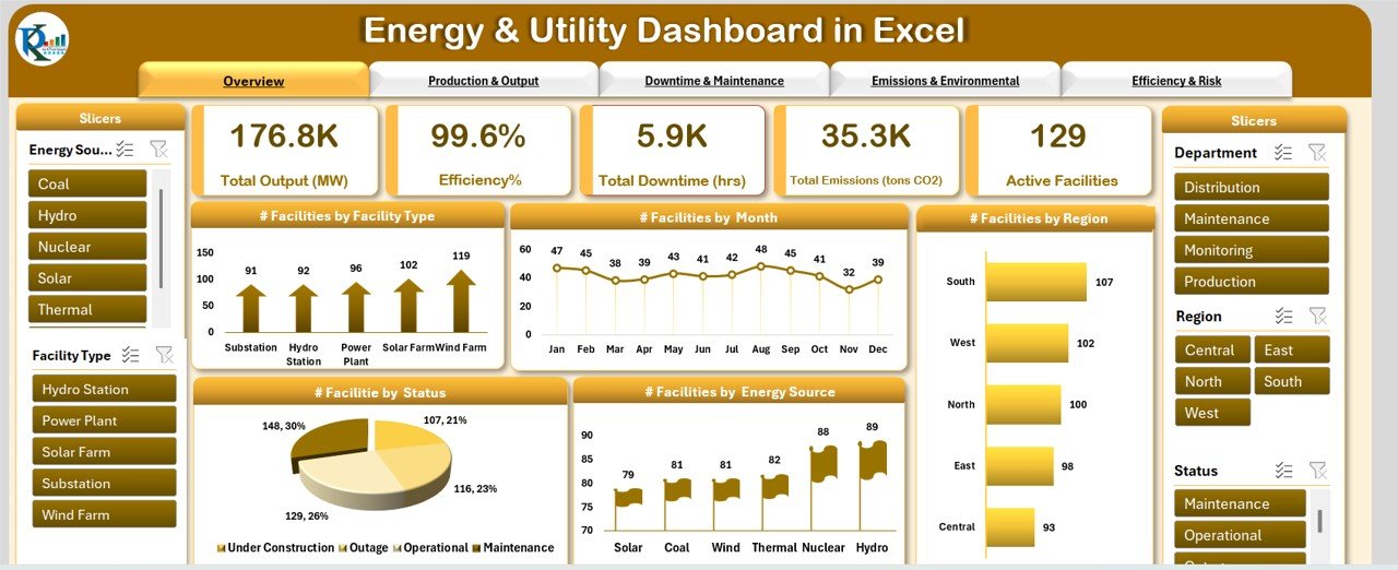
1. Overview Sheet Tab
The Overview Sheet provides a high-level snapshot of your energy and utility operations. It includes various charts, slicers, and cards to give you a quick overview of the most important data.
Cards:
- Total Output (MW) – Displays the total energy output in megawatts (MW).
- Efficiency % – Shows the overall efficiency of energy production.
- Total Downtime (hrs) – Total hours of downtime for facilities.
- Total Emissions (tons CO2) – Total carbon dioxide emissions.
- Active Facilities – Number of active facilities in operation.
Charts:
- Facilities by Facility Type – A chart showing the distribution of facilities by their type.
- Facilities by Month – Visualizes facility performance over the months.
- Facilities by Region – A regional breakdown of facilities.
- Facilities by Status – Displays facilities based on their operational status.
- Facilities by Energy Source – A chart showing the distribution of facilities by their energy sources.
Click to buy Energy & Utility Dashboard in Excel
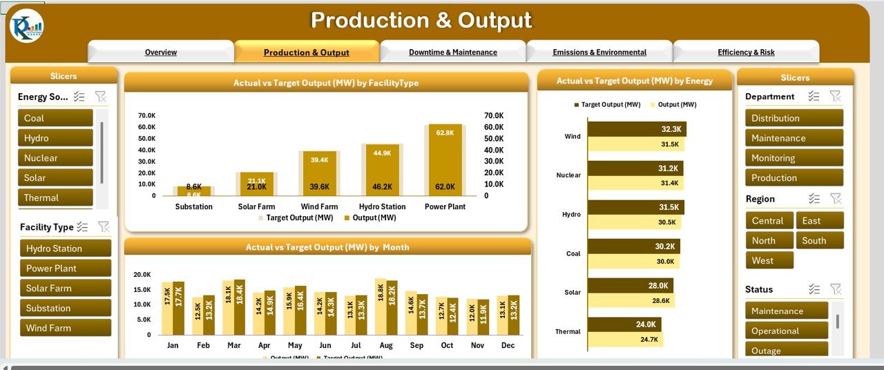
2. Production & Output Sheet Tab
This sheet focuses on the energy production and output from various facilities.
Charts:
- Actual vs Target Output (MW) by Facility Type – Compares the actual output with the target output for each facility type.
- Actual vs Target Output (MW) by Energy Source – Shows the output performance based on different energy sources.
- Actual vs Target Output (MW) by Month – A comparison of monthly actual output with the target values.
Click to buy Energy & Utility Dashboard in Excel
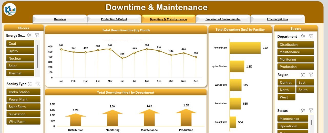
3. Downtime & Maintenance Sheet Tab
This tab is dedicated to tracking downtime and maintenance activities across facilities.
Charts:
- Total Downtime (hrs) by Month – Displays the downtime per month.
- Total Downtime (hrs) by Facility Type – Breakdown of downtime across different facility types.
- Total Downtime (hrs) by Department – Shows downtime categorized by different departments.
Click to buy Energy & Utility Dashboard in Excel
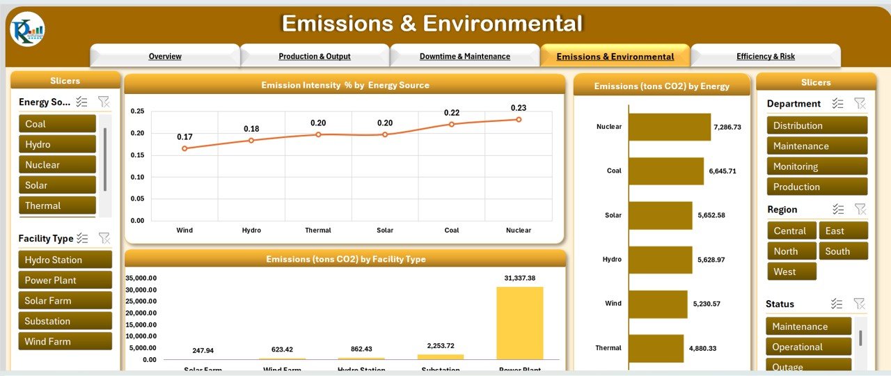
4. Emissions & Environmental Sheet Tab
This section tracks emissions data, helping to monitor and manage environmental impact.
Charts:
- Emission Intensity (%) by Energy Source – Measures the emission intensity by the energy source used.
- Emissions (tons CO2) by Facility Type – Displays emissions by facility type.
- Emissions (tons CO2) by Energy Source – Shows emissions for each energy source.
Click to buy Energy & Utility Dashboard in Excel
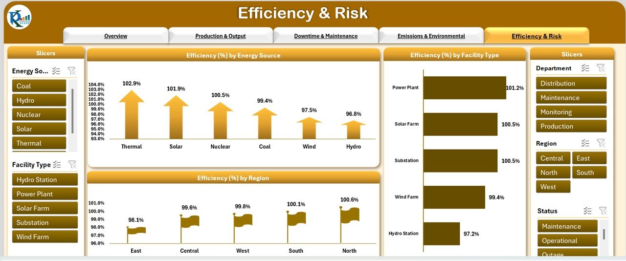
5. Efficiency & Risk Sheet Tab
The Efficiency & Risk tab helps assess the overall operational efficiency and risks associated with each facility.
Charts:
- Efficiency (%) by Energy Source – A visual representation of efficiency across different energy sources.
- Efficiency (%) by Facility Type – Shows efficiency data segmented by facility types.
- Efficiency (%) by Region – A geographical breakdown of efficiency percentages.
6. Data Sheet Tab
This is where all the raw data is entered for analysis and reporting. The data includes:
-
Facility ID – Unique identifier for each facility.
-
Facility Name – Name of the facility.
-
Energy Source – Type of energy used.
-
Facility Type – Category of facility (e.g., power plant, substation).
-
Region – Geographical location of the facility.
-
Department – The department managing the facility.
-
Status – Operational status of the facility.
-
Start Date – The date when the facility was commissioned.
-
Output (MW) – Actual energy output.
-
Target Output (MW) – The target energy output.
-
Downtime (hrs) – Recorded downtime in hours.
-
Emissions (tons CO2) – CO2 emissions.
-
Emission Intensity (tons/MW) – Emissions per unit of output.
-
Efficiency (%) – The efficiency percentage of the facility.
-
Month – The month for the data record.
-
Year – The year for the data record.
Advantages of the Energy & Utility Dashboard in Excel
Click to buy Energy & Utility Dashboard in Excel
The Energy & Utility Dashboard offers several advantages to organizations and professionals working in the energy sector:
- Comprehensive Data Visualization”: The dashboard displays key metrics visually, making it easier for users to grasp performance trends at a glance.
- Real-Time Monitoring: With dynamic features like slicers and interactive charts, the dashboard updates in real-time, allowing users to track operations on an ongoing basis.
- Improved Decision Making: By having all key metrics in one place, decision-makers can easily identify issues, set targets, and optimize operations for better performance.
- Enhanced Operational Efficiency: The dashboard helps identify underperforming areas like excessive downtime or emissions, enabling corrective action that improves efficiency.
Opportunity for Improvement in the Energy & Utility Dashboard
While the Energy & Utility Dashboard in Excel provides valuable insights, there are always opportunities to enhance its functionality:
- Integration with Real-Time Data: Linking the dashboard to real-time data sources, such as IoT sensors or SCADA systems, would enable even more accurate and up-to-date reporting.
- Incorporating Predictive Analytics: Adding predictive analytics could help forecast potential issues like downtime, energy shortages, or emission spikes, enabling proactive management.
- Enhanced Customization: Users may benefit from additional customization options, such as integrating external data sources or using more sophisticated chart types.
Best Practices for Using the Energy & Utility Dashboard in Excel
Click to buy Energy & Utility Dashboard in Excel
To maximize the utility of the Energy & Utility Dashboard, consider the following best practices:
- Data Accuracy and Consistency: Ensure that data entered into the dashboard is accurate and updated regularly. Consistent data ensures reliable reporting and analysis.
- Monitor Key Metrics Regularly; Use the dashboard regularly to track performance indicators like output, downtime, emissions, and efficiency to stay on top of operations.
- Optimize for Performance: As your dataset grows, ensure the dashboard is optimized for performance by using Excel’s built-in features like Power Query and Pivot Tables to manage large datasets efficiently.
- User Training: Ensure that all users are properly trained in how to navigate and interpret the dashboard. This will help prevent errors and ensure effective use.
Frequently Asked Questions (FAQs)
1. What is an Energy & Utility Dashboard in Excel?
An Energy & Utility Dashboard in Excel is a tool used to visualize and track key operational metrics like energy output, efficiency, emissions, and downtime. It helps decision-makers monitor and optimize performance in the energy and utility sectors.
2. How can I update data in the dashboard?
Data is updated by entering new information into the Data Sheet tab. Once new data is added, the dashboard charts and metrics will automatically refresh to reflect the updated information.
3. Can I customize the dashboard to fit my specific needs?
Yes, you can customize the dashboard to suit your needs by adjusting charts, metrics, and data categories. Excel’s flexibility allows for easy modifications and additions.
4. Is the Energy & Utility Dashboard compatible with all Excel versions?
The dashboard is compatible with Excel 2016 and later versions. Ensure you are using a version that supports features like slicers, pivot tables, and advanced charting.
Conclusion
Click to buy Energy & Utility Dashboard in Excel
The Energy & Utility Dashboard in Excel is a comprehensive tool for managing and optimizing energy production and utility operations. With its wide array of charts and metrics, it offers insightful data visualization that helps organizations make data-driven decisions. By integrating best practices and exploring opportunities for improvement, the dashboard can further enhance operational efficiency and sustainability.
Visit our YouTube channel to learn step-by-step video tutorials
Click to buy Energy & Utility Dashboard in Excel