Risk Management Dashboard in Power BI is a ready-to-use reporting template for enterprise risk managers, finance teams, department heads, compliance coordinators, internal audit teams, and Power BI consultants. Allianz Commercial’s 2026 Risk Barometer ranks cyber incidents as the top global business risk for the fifth year in a row, with 42% of responses, and business interruption remains a top-three concern. That is why risk data should not sit in scattered spreadsheets, emails, and review notes.
This Power BI dashboard gives users five report pages for overall exposure, risk trend, category analysis, ownership, and budget control. You can open the PBIX file in Power BI Desktop, replace the sample data with your own structured risk register, refresh the report, and start reviewing scores, escalations, spend, potential loss, priority, closure, and budget variance without building every visual from scratch.
Click to Buy Risk Management Dashboard in Power BI
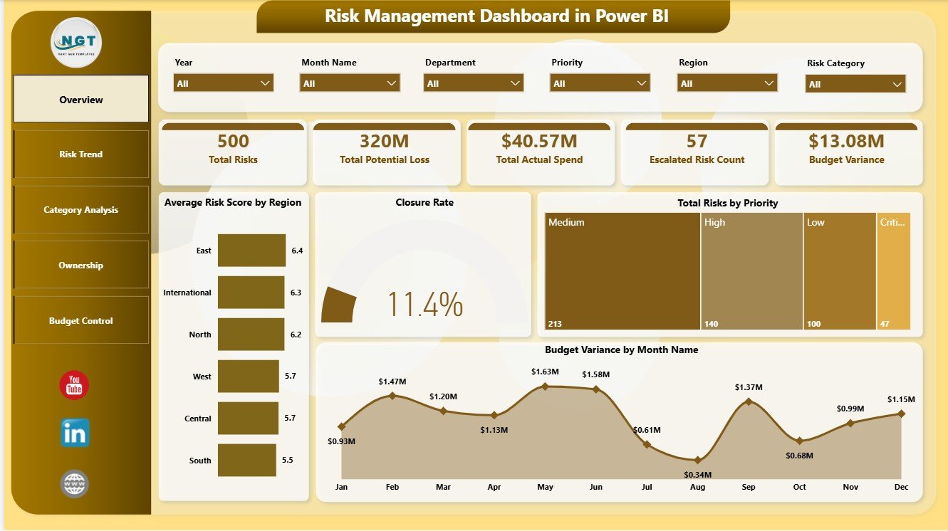
Key Features of Risk Management Dashboard in Power BI
- Five Power BI report pages: Overview, Risk Trend, Category Analysis, Ownership, and Budget Control.
- Five executive cards: Total Risks, Total Potential Loss, Total Actual Spend, Escalated Risk Count, and Budget Variance.
- Risk score analysis: Compare average risk score by region, risk owner, month, and business unit.
- Escalation monitoring: Track escalated risk count by region to understand where urgent attention is needed.
- Priority and closure views: Review total risks by priority and closure rate by total risks.
- Budget control: Analyze variance by month, quarter, department, business unit, risk category, and review frequency.
- Interactive slicers: Filter the dashboard quickly during risk committee, finance, audit, and management meetings.
- Editable PBIX file: Customize pages, visuals, measures, labels, colors, and data connections in Power BI Desktop.
Dashboard Pages Explanation
1 – Overview Page
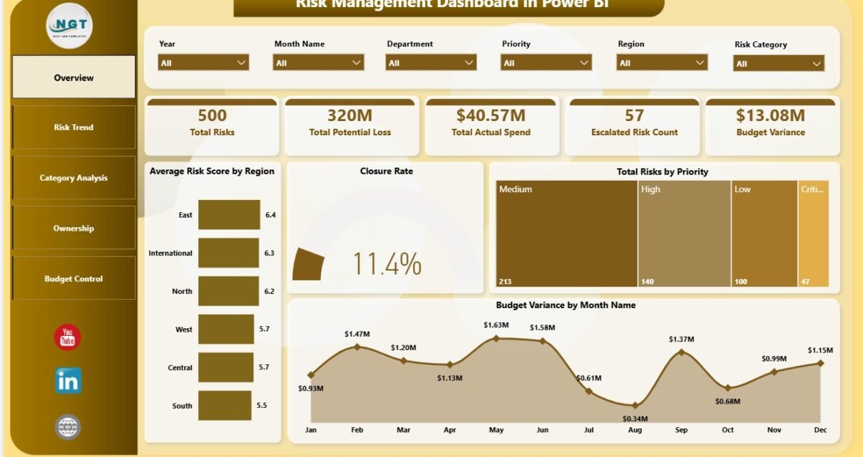
The Overview page is the executive summary of the report. The top cards show Total Risks, Total Potential Loss, Total Actual Spend, Escalated Risk Count, and Budget Variance, so leadership can understand exposure, cost, and escalation pressure before reviewing the detailed pages.
Average Risk Score by Region: This chart compares average risk score across regions. It helps risk leaders identify locations where exposure is higher and where mitigation plans may need stronger follow-up.
Closure Rate by Total Risks: This chart connects closure performance with overall risk volume. It helps teams see whether larger risk groups are being resolved at a healthy pace.
Total Risks by Priority: This visual breaks risk volume into priority groups. It gives management a quick way to separate high-priority issues from routine monitoring items.
Budget Variance by Month Name: This monthly chart shows how mitigation spend is moving against budget. It helps finance and risk teams identify periods where actual spending is above or below plan.
2 – Risk Trend
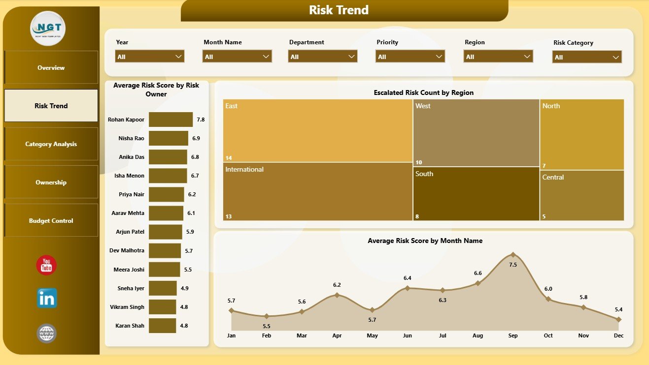
The Risk Trend page is built for monitoring risk movement over owners, regions, and months. It is useful for recurring review meetings where the team wants to know whether exposure is improving, worsening, or shifting ownership.
Average Risk Score by Risk Owner: This chart compares risk severity by owner. It helps managers see which owners carry higher-risk items and where support or escalation may be needed.
Escalated Risk Count by Region: This chart shows escalated risk count across regions. It helps teams identify regions with urgent follow-up requirements.
Average Risk Score by Month Name: This visual tracks risk score movement over time. It helps leaders understand whether overall risk severity is trending down after mitigation activity or rising due to new exposure.
3 – Category Analysis
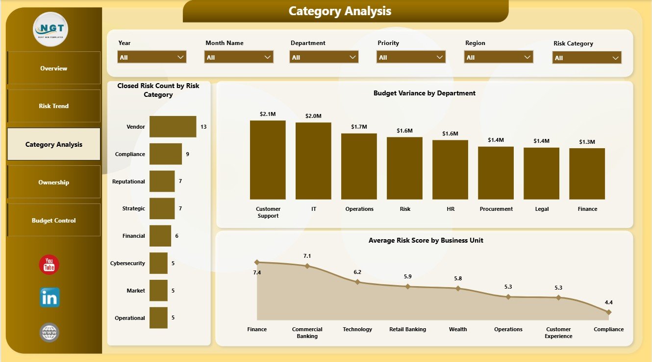
The Category Analysis page explains risk closure, departmental budget variance, and business unit severity. It is helpful when risk teams need to compare risk categories and understand which parts of the organization are creating the largest exposure.
Closed Risk Count by Risk Category: This chart shows how many risks have been closed by category. It helps teams understand which categories are moving toward resolution and which may need more attention.
Budget Variance by Department: This chart compares budget variance across departments. It helps finance partners and department leaders see where risk mitigation spending is above or below plan.
Average Risk Score by Business Unit: This visual compares severity by business unit. It helps management identify teams or operating groups with higher exposure.
4 – Ownership
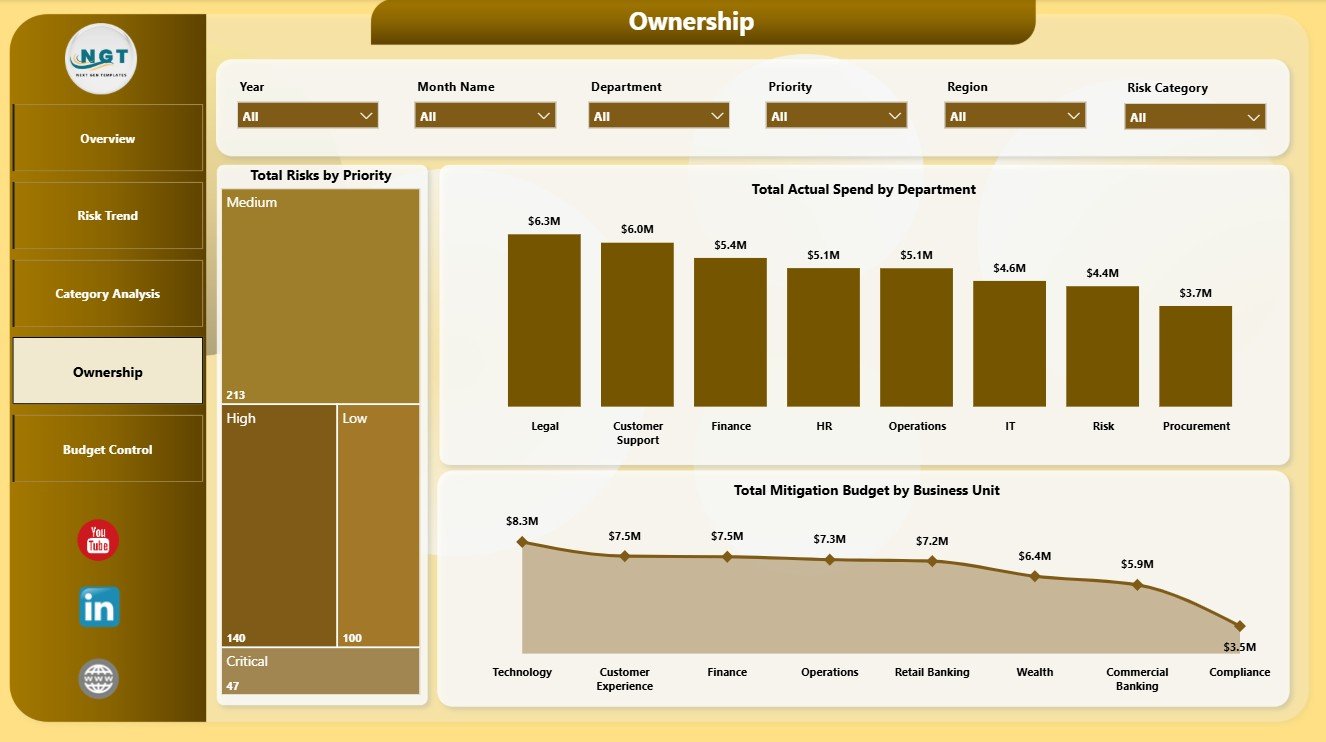
The Ownership page is designed for accountability and resource review. It helps teams discuss who owns risk, where actual spending is happening, and how mitigation budgets are distributed by business unit.
Total Risks by Priority: This chart keeps priority distribution visible during ownership review. It helps teams focus discussion on high-priority and escalated items first.
Total Actual Spend by Department: This visual compares mitigation spend by department. It helps leaders understand which departments are consuming the most risk-related spend.
Total Mitigation Budget by Business Unit: This chart shows planned mitigation budget by business unit. It helps compare funding allocation across operating groups.
5 – Budget Control
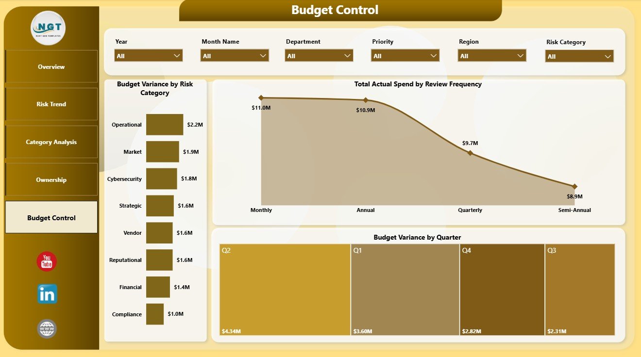
The Budget Control page supports finance, risk, and internal control reviews. It connects variance, review frequency, quarter, and risk category so teams can see where mitigation budgets need attention.
Budget Variance by Risk Category: This chart shows which risk categories are over or under budget. It helps prioritize financial review by risk group.
Total Actual Spend by Review Frequency: This visual compares actual spend by review cadence. It helps teams understand whether frequently reviewed risks are also consuming more spend.
Budget Variance by Quarter: This chart tracks quarterly variance. It helps management monitor spending discipline across the reporting year.
Risk Management Dashboard in Power BI vs. Tableau vs. Paid CRM/SaaS – Feature Comparison
| Feature | Risk Management Dashboard in Power BI | Tableau or Qlik Alternative | Paid Risk SaaS |
|---|---|---|---|
| Cost | One-time template purchase | License cost plus analyst build time | Monthly or annual subscription |
| Platform | Power BI Desktop and optional Power BI Service | Tableau or Qlik environment | Vendor cloud platform |
| Setup time | Open PBIX, replace data, refresh | Build model, measures, and visuals manually | Implementation and configuration |
| Real-time team collaboration | Available through Power BI Service licensing | Available by plan | Usually included |
| Mobile access | Available through Power BI mobile apps after publishing | Available through vendor mobile apps | Usually included |
| Customizable fields | Editable PBIX report, visuals, measures, slicers, and source connections | Editable, but requires BI design work | Limited by vendor configuration |
| Share with link | Possible through Power BI workspace permissions | Possible through platform permissions | Usually login controlled |
| Year-1 cost at 5 users | Template price plus existing Microsoft licensing | License cost plus build time | Often hundreds or thousands per year |
| Risk reporting focus | Pre-built around risk score, escalation, priority, closure, owner, category, potential loss, spend, and budget variance | Requires custom design | Depends on vendor reporting module |
Who Should Use This Template
This template is useful for enterprise risk managers, operations leaders, finance analysts, compliance teams, internal auditors, department heads, PMO teams, governance teams, and consultants who prepare recurring risk reporting in Power BI.
It works best when your team already maintains structured risk data with fields such as risk category, owner, region, department, business unit, priority, score, spend, budget, review frequency, month, and quarter. It is not a replacement for a full GRC workflow platform, incident management system, audit evidence repository, control testing tool, or automated risk engine.
Real-World Use Cases
Monthly risk committee review: A risk manager uses the Overview and Risk Trend pages to discuss total risks, potential loss, escalations, risk score movement, and owner-level exposure.
Budget variance meeting: A finance partner uses Category Analysis and Budget Control to review mitigation spend, department variance, quarterly movement, and category-level budget pressure.
Department accountability review: An operations leader uses Ownership to compare risk priority, actual spend, mitigation budget, and business unit accountability before assigning follow-up actions.
Advantages of Risk Management Dashboard in Power BI
- It gives teams a working Power BI report instead of a blank PBIX file.
- It combines exposure, score, escalation, closure, ownership, and budget control in one report.
- It supports leadership summaries and detailed page-level review.
- It uses familiar Power BI slicers, visuals, and page structure, making customization easier for analysts.
- It can be published to Power BI Service when your Microsoft licensing and workspace setup supports sharing and scheduled refresh.
Opportunities for Improvement
The dashboard depends on clean source data. Before refreshing, standardize names for risk category, owner, region, department, business unit, priority, review frequency, month, and quarter. Also validate numeric fields such as potential loss, mitigation budget, actual spend, budget variance, and risk score.
Larger teams may eventually connect the PBIX file to SharePoint, SQL, Excel exports, a data warehouse, or a GRC system export. Microsoft Learn provides a helpful Power BI Desktop getting started guide for users who want to understand the report-building environment.
Best Practices
- Keep a backup copy of the original PBIX before editing pages, visuals, relationships, or measures.
- Use consistent values for risk owners, departments, business units, categories, regions, priorities, and review frequencies.
- Validate the top cards against your source data before presenting the report.
- Review spend and exposure together so budget discussions stay connected to actual risk severity.
- Use slicers deliberately during meetings so everyone understands the active filter context.
- Document any custom measures or data-source changes if multiple analysts will maintain the file.
Explore Relevant Templates
You may also like Peer to Peer Insurance Dashboard in Power BI, Nursing Homes Dashboard in Power BI, Online Certification Providers Dashboard in Power BI, and Power BI Dashboard Mega Collection.
Browse more Power BI templates and Power BI Dashboard templates.
Frequently Asked Questions
What does the Risk Management Dashboard in Power BI track?
It tracks total risks, total potential loss, total actual spend, escalated risk count, budget variance, average risk score, closure rate, priority, risk category, owner, region, department, business unit, review frequency, month, and quarter.
Can I use my own risk register data?
Yes. Replace or connect the sample source with your structured risk data, then refresh the report in Power BI Desktop.
Do I need Power BI Desktop?
Yes. Power BI Desktop is recommended for opening and editing the PBIX file. Power BI Service is optional for sharing and scheduled refresh.
Can I customize the visuals?
Yes. You can edit visuals, pages, slicers, colors, labels, measures, relationships, and source connections.
Is this dashboard connected to a live GRC system?
No. It is a standalone Power BI reporting template. Your team controls the source data and refresh process.
Is this a full risk management workflow tool?
No. It is an analytics and reporting dashboard, not a control testing workflow, audit evidence repository, incident response system, or automated risk engine.
About the Author
Built by PK – Microsoft Certified Professional with 15+ years of Excel, Google Sheets, and Power BI experience. Founder of NextGenTemplates, reaching 300K+ subscribers across YouTube channels. Every template is hand-built and tested before release.
Conclusion
The Risk Management Dashboard in Power BI gives teams a structured way to review total risks, potential loss, actual spend, escalated risk count, budget variance, average risk score, closure rate, priority, ownership, categories, departments, regions, business units, and quarterly budget movement. With five focused pages and interactive slicers, it can support risk committee meetings, finance reviews, internal audit discussions, and department accountability check-ins.
Click here to purchase Risk Management Dashboard in Power BI
Instant download. One-time payment. No subscription.
Visit our YouTube channel for step-by-step video tutorials: Youtube.com/@PK-AnExcelExpert
Last updated: July 22, 2026