In the fast-paced world of digital content, tracking performance is not a luxury—it’s a necessity. Whether you’re a solo YouTuber, a team of bloggers, a marketing agency, or an influencer network, understanding how your content performs allows you to make informed decisions, optimize output, and drive better engagement. That’s where the Content Creator KPI Dashboard in Power BI comes into play.
This article will take you through everything you need to know about this dynamic dashboard. From key features to benefits, best practices, and FAQs—we’ve got you covered. Whether you’re a seasoned content strategist or just starting your content journey, this dashboard is your strategic ally.
Click to Purchases Content Creator KPI Dashboard in Power BI
What is the Content Creator KPI Dashboard in Power BI?
The Content Creator KPI Dashboard is a ready-to-use Power BI dashboard, powered by an Excel data source. It’s designed to help content creators track their key performance indicators (KPIs) in a clean, structured, and visual format.
With just a few clicks, users can monitor metrics such as:
-
Total content created
-
MTD (Month-To-Date) performance
-
YTD (Year-To-Date) trends
-
KPI vs. Target status
-
Year-over-year comparisons
This tool simplifies the process of performance tracking while offering deep insights into what’s working and what’s not. It empowers creators to shift from gut-feeling decisions to data-driven strategies.
Key Features of the Content Creator KPI Dashboard
Let’s break down the dashboard into its three main pages and explain what each one offers:
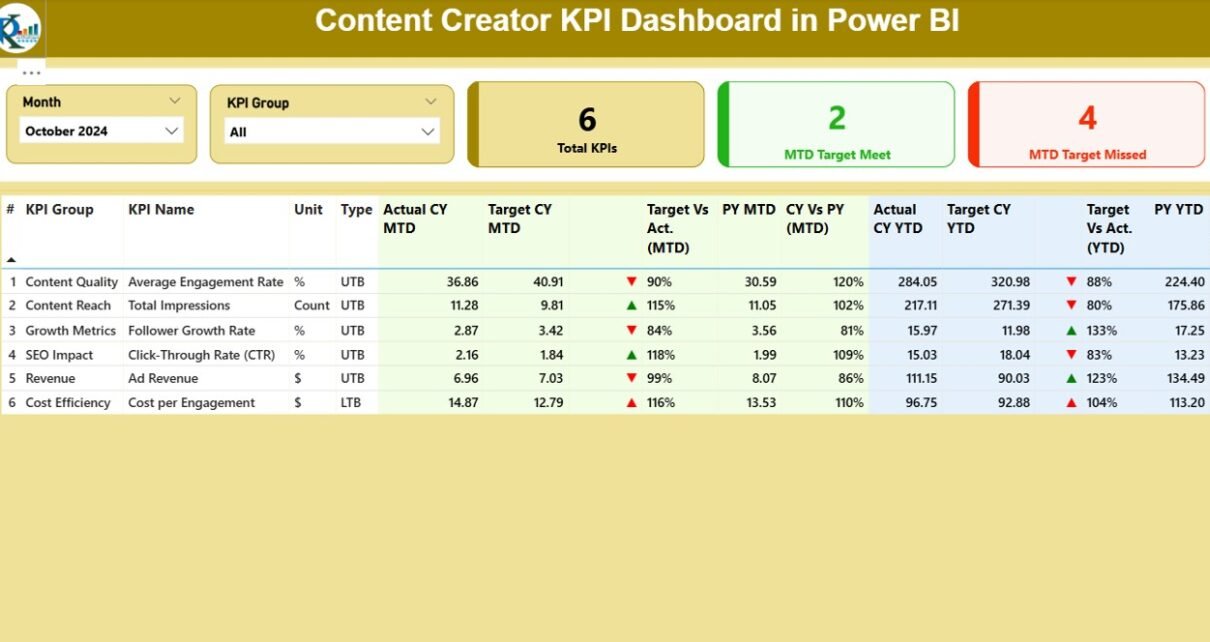
Summary Page – The Command Center
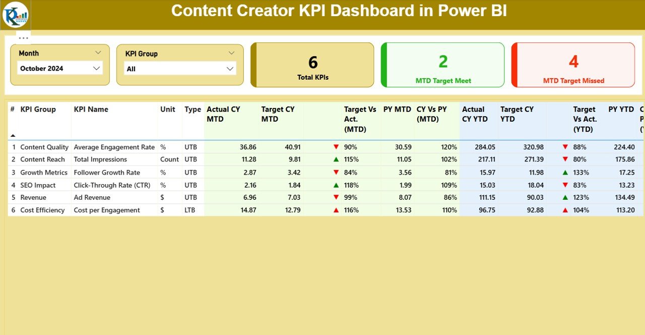
This is the main page where the most important data lives.
Top Controls:
-
Month Slicer: Select the month you want to analyze.
-
KPI Group Slicer: Filter by performance areas such as reach, engagement, monetization, or publishing volume.
Performance Cards:
-
Total KPIs Count
-
MTD Target Met
-
MTD Target Missed
Detailed KPI Table:
This is the heart of the page, with powerful comparison and trend data. Each row represents a KPI and includes:
-
KPI Number – Unique identifier.
-
KPI Group – Category like Views, Subscribers, Engagement, etc.
-
KPI Name – Specific KPI title.
-
Unit – Measured in %, count, or hours.
-
Type – LTB (Lower The Better) or UTB (Upper The Better).
-
Actual CY MTD – Current Month-To-Date number.
-
Target CY MTD – Monthly target.
-
MTD Icon – Red ▼ or green ▲ icon to indicate performance.
-
Target vs Actual (MTD) – Percentage of target achieved.
-
PY MTD – Previous Year same month value.
-
CY vs PY (MTD) – Growth % over last year’s MTD.
-
Actual CY YTD – Current Year-To-Date total.
-
Target CY YTD – Year-To-Date target.
-
YTD Icon – Status symbol for YTD performance.
-
Target vs Actual (YTD) – % of YTD target achieved.
-
PY YTD – Previous Year-To-Date value.
-
CY vs PY (YTD) – Year-over-year growth percentage.
This format delivers a 360-degree view of KPI performance—instantly identifying what’s on track and what needs attention.
KPI Trend Page – Visualize the Momentum
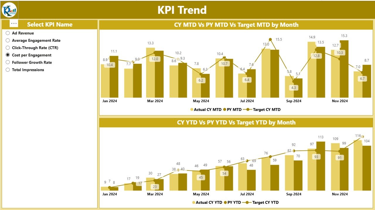
This page focuses on trend visualization, using combo charts for:
-
MTD Performance: Actual vs Target vs Previous Year
-
YTD Performance: Actual vs Target vs Previous Year
A slicer on the left allows you to choose any KPI to explore trends over time. These visualizations help content teams see progress clearly and plan future actions with confidence.
KPI Definition Page – Drilldown Into Logic
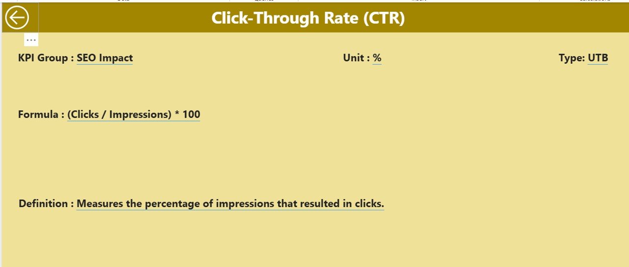
This is a hidden drillthrough page. You access it by right-clicking on a KPI from the Summary page and selecting Drillthrough.
It shows:
-
KPI Formula
-
Detailed Definition
-
Calculation logic
This feature ensures complete transparency and understanding—perfect for team presentations or internal reviews. You can also return to the Summary page easily using the Back button in the top-left corner.
Excel-Based Data Source: Simple & Effective
The dashboard runs on data from a structured Excel workbook with three tabs:
1. Input_Actual
-
Columns: KPI Name, Month (as first date of the month), MTD, YTD
-
Enter your actual values here.
2. Input_Target
-
Same structure as Actual sheet.
-
Fill in your KPI targets for each month.
3. KPI Definition
-
Describe the KPI Name, KPI Group, Unit, Type (UTB/LTB), and Formula
-
Serves as the metadata backbone for the dashboard
This Excel-to-Power BI workflow makes the dashboard highly flexible and accessible for non-tech users.
Advantages of the Content Creator KPI Dashboard
Let’s explore why this dashboard stands out:
✔️ 1. All-in-One Dashboard for Creators
No more switching between spreadsheets, analytics tools, or notepads. Everything lives in one dashboard.
✔️ 2. Monthly & Yearly Views
You can track both short-term (MTD) and long-term (YTD) progress.
✔️ 3. Smart Visual Indicators
Red and green arrows give instant feedback on performance—no need to interpret complex numbers.
✔️ 4. Year-Over-Year Comparisons
Easily spot seasonal trends or growth across years.
✔️ 5. Drillthrough Capability
Dive deep into any KPI to understand the logic behind it.
✔️ 6. Excel-Based Input
No need for complex database connections. Just update Excel and click “Refresh” in Power BI.
Use Cases: Who Should Use This Dashboard?
This dashboard is ideal for:
-
YouTubers tracking video engagement
-
Blogging teams monitoring content frequency and views
-
Marketing managers analyzing influencer performance
-
Agencies measuring campaign ROI
-
Podcast hosts checking subscriber and download growth
No matter your content platform—YouTube, Instagram, Substack, Spotify, TikTok—this dashboard can adapt to your KPIs.
Best Practices for the Content Creator KPI Dashboard
To get the most out of this dashboard, follow these proven tips:
🔄 1. Update Data Monthly
Keep your Excel sheets updated every month to reflect the latest actuals and targets.
🧠 2. Define KPIs Clearly
Use the KPI Definition page to write simple, understandable explanations for each metric.
🎯 3. Set Realistic Targets
Make sure monthly and yearly targets align with your goals and resources.
📊 4. Use Trend Charts for Planning
Review the KPI Trend page before making major campaign or content calendar decisions.
🚦 5. Monitor Red Arrows
Use MTD and YTD icons to spot issues early and take corrective action.
🤝 6. Share with Your Team
Use Power BI sharing or export to PDF to present dashboards to stakeholders.
How to Customize the Dashboard?
Even though it’s plug-and-play, the dashboard is highly customizable:
-
Add New KPIs by extending the Excel data tables
-
Group KPIs by performance area, platform, or department
-
Change Icons/Color Coding to match your brand palette
-
Embed Dashboard in Teams or SharePoint for seamless access
Why Power BI is Perfect for Content KPI Tracking?
Power BI provides many benefits over Excel-only dashboards or third-party analytics platforms:
-
Interactive filters and slicers
-
Scalable visuals for teams and clients
-
Better data modeling capabilities
-
Integration with Excel and Office 365
-
Export to PDF or PowerPoint for reporting
And the best part—once you set it up, it’s just “Refresh and Go.”
Conclusion
The Content Creator KPI Dashboard in Power BI is more than just a tool—it’s a digital companion for any content strategist or creator. It empowers you to take charge of your metrics, visualize performance, and make faster, smarter decisions. Whether you’re analyzing content engagement, tracking growth, or reporting to clients, this dashboard brings clarity and insight in a visually engaging format.
With an easy Excel-based input method, customizable views, and trend tracking features—it’s the ultimate solution for creators who mean business.
Click to Purchases Content Creator KPI Dashboard in Power BI
Frequently Asked Questions (FAQs)
1. Can I use this dashboard without prior Power BI experience?
Yes! The dashboard is beginner-friendly. Just input data into Excel and hit refresh in Power BI.
2. Can I add or remove KPIs from the dashboard?
Absolutely. You can add more KPIs in the Excel sheets. Just make sure to match the format.
3. How do I share the dashboard with others?
You can publish it to the Power BI service and share via web link, or export as PDF for email sharing.
4. What kind of KPIs can I track?
Any content performance KPI—such as Views, Likes, Watch Time, Comments, Subscribers, Blog Posts Published, or Revenue Earned.
5. How often should I update the data?
Monthly updates are recommended for the best insights and comparisons.
6. What is the difference between UTB and LTB?
-
UTB (Upper the Better): Higher values are better, like Views or Revenue.
-
LTB (Lower the Better): Lower values are ideal, like Bounce Rate or Video Drop-off Rate.
7. Does the dashboard support multiple creators or platforms?
Yes! Use KPI Group or Name to distinguish between platforms or team members.
Visit our YouTube channel to learn step-by-step video tutorials