An Education and Learning Inventory Management KPI Dashboard for the education sector is an Excel tool designed to monitor and evaluate key metrics related to stock and supplies. This dashboard gives you a bird’s-eye view of your inventory performance by comparing actuals with targets and previous years, helping you make better, data-driven decisions.
It tracks monthly and year-to-date (YTD) data and visualizes trends through charts and KPIs so that you can quickly identify shortages, surpluses, or inefficiencies in your inventory system.
Click to Purchases Education and Learning Inventory Management KPI Dashboard in Excel
Key Features of the Excel KPI Dashboard
The dashboard includes seven interactive and easy-to-navigate worksheets, each serving a specific purpose:
Home Sheet
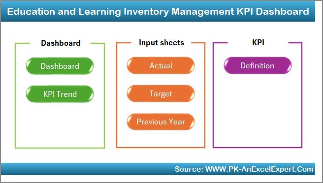
- Acts as the control panel of the workbook
- Contains 6 clickable buttons to jump to relevant worksheets quickly
Dashboard Sheet Tab
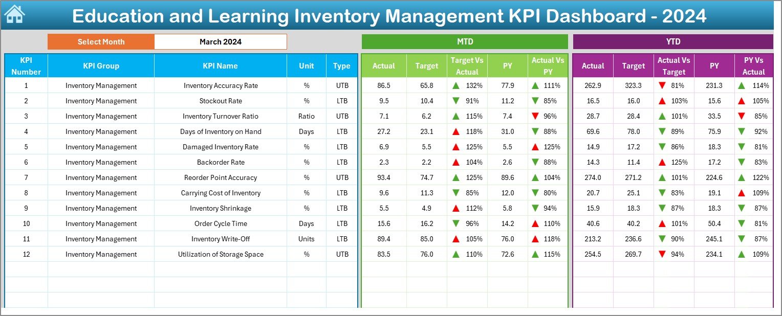
- Displays all KPIs in one place
- Drop-down filter at cell D3 lets you select a month
- Automatically updates MTD (Month-to-Date) and YTD metrics
Includes:
- Actual vs Target
- Actual vs Previous Year
- Conditional formatting with arrows to indicate trends
Click to Purchases Education and Learning Inventory Management KPI Dashboard in Excel
KPI Trend Sheet Tab
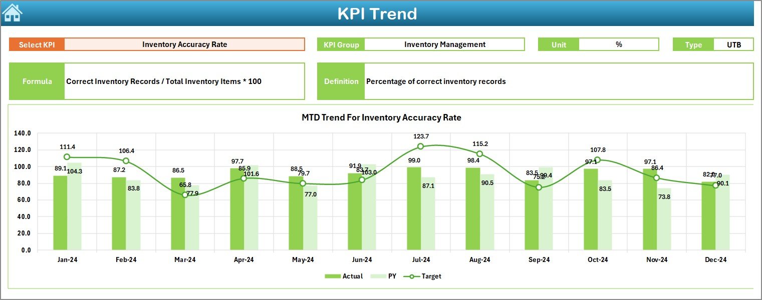
- Allows you to pick a KPI from cell C3
- Shows KPI group, unit, type (UTB/LTB), formula, and a short definition
- Visualizes monthly trends for Actual, Target, and Previous Year
Actual Numbers Input Sheet
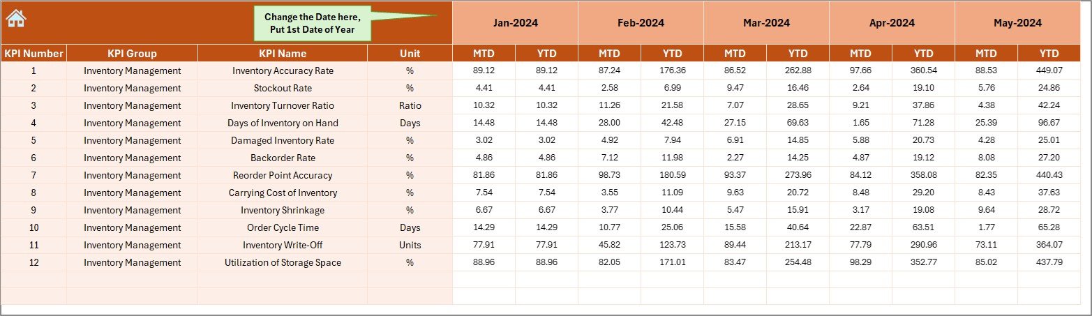
- Input MTD and YTD data for each KPI
- Change the reporting start month in cell E1
Target Sheet Tab
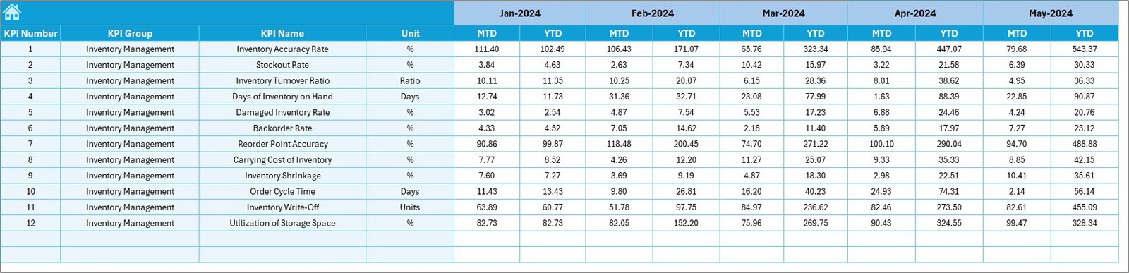
- Set monthly MTD and YTD targets for each KPI
- Keeps your goals well-aligned
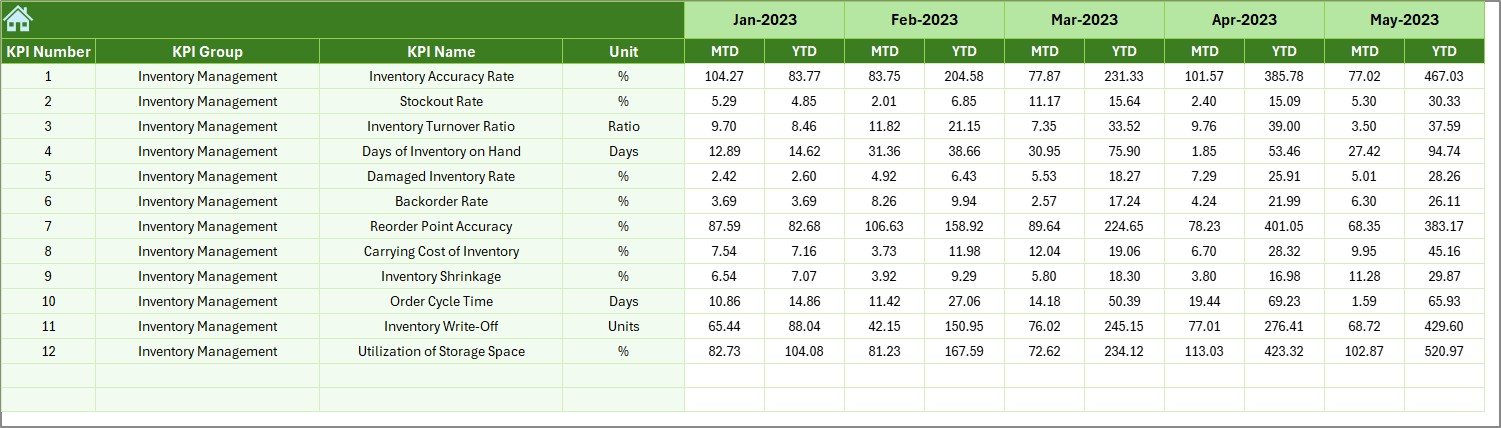
Previous Year Numbers Sheet Tab
- Enter data from last year to make meaningful comparisons
KPI Definition Sheet Tab
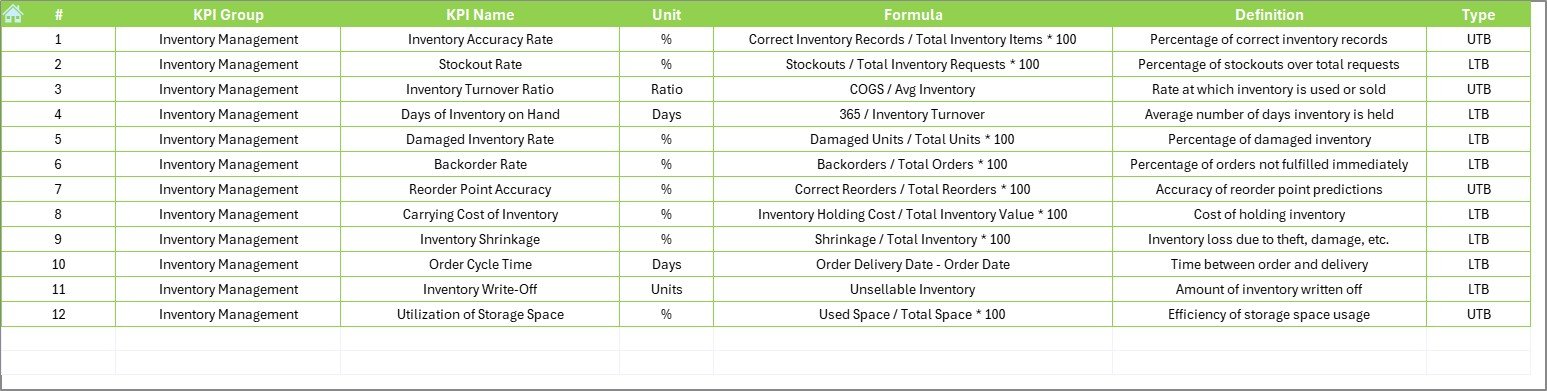
Maintain a record of each KPI including:
- Name
- Group
- Unit
- Formula
- Definition
Advantages of Using This Dashboard
Click to Purchases Education and Learning Inventory Management KPI Dashboard in Excel
🌟 Improved Visibility
You can instantly see which items are overstocked, understocked, or used inefficiently.
🌟 Data-Driven Decision Making
Track trends over time to make smarter procurement and budgeting decisions.
🌟 Time-Saving Automation
Automated charts and conditional formatting reduce manual analysis and increase productivity.
🌟 Customizable and Scalable
Easily add more KPIs or change targets as your institution grows or priorities shift.
🌟 Better Planning and Forecasting
Compare actuals with targets and previous year data to adjust your inventory strategies ahead of time.
Common KPIs Tracked in This Dashboard
Here are some common KPIs included in the Education and Learning Inventory Management Dashboard:
- Inventory Turnover Ratio: How quickly inventory is consumed and replenished
- Stock Availability Rate: Percentage of time items are available when needed
- Order Fulfillment Rate: Orders completed without shortages or backorders
- Average Holding Cost: Cost incurred to store inventory
- Out-of-Stock Rate: How often items run out of stock
- Damaged Item Rate: Percentage of inventory that is damaged
- Lead Time: Time between ordering and receiving supplies
- Utilization Rate: How effectively inventory is being used
Each KPI includes its unit of measurement, formula, definition, and a label indicating whether a higher (UTB) or lower (LTB) value is better.
Best Practices for Using the Inventory KPI Dashboard
To get the most out of this tool, follow these proven tips:
1. Update Data Monthly
Set a schedule to update the Actual, Target, and Previous Year sheets monthly. This ensures your trends and insights are always up to date.
2. Define Clear KPI Ownership
Assign responsibility for each KPI to a department or individual. This promotes accountability.
3. Use the Conditional Formatting Effectively
Rely on color-coded arrows and highlights to spot trends fast without manually analyzing the numbers.
4. Keep KPI Definitions Short and Clear
Use simple terms in the Definition sheet so everyone understands what each metric tracks.
5. Review Trends, Not Just Snapshots
Trends tell a more complete story than single-month data. Make it a habit to check the KPI Trend sheet.
6. Limit Access to Data Entry Tabs
Protect the data sheets with passwords if necessary to avoid accidental changes.
How to Customize the Dashboard
The best part of using Excel is that it allows flexibility. You can tweak this dashboard to meet your institution’s unique needs:
- Add More KPIs: Go to the KPI Definition and Data sheets to add more rows.
- Change Colors/Themes: Customize the dashboard layout using Excel’s built-in themes.
- Add Filters and Slicers: Make navigation easier by inserting slicers for KPI Groups or Departments.
- Integrate with Power BI: Export Excel tables and charts to Power BI for more powerful visualizations.
Why Use Excel for Inventory KPI Dashboards?
You might wonder: Why Excel when there are other dashboard tools available?
- Widely Available: Excel is already installed in most institutions
- User Friendly: Easy to use, even for non-technical users
- Highly Customizable: You control every formula, layout, and data connection
- Cost-Effective: No need to pay for extra software
Click to Purchases Education and Learning Inventory Management KPI Dashboard in Excel
Conclusion
The Education and Learning Inventory Management KPI Dashboard in Excel is a smart, practical, and effective solution for tracking and optimizing educational inventory. It brings visibility, saves time, and empowers teams to take action backed by data. Whether you’re a school administrator, inventory officer, or academic manager, this tool simplifies your job and improves your outcomes. Start using it today, and take control of your inventory like never before.
Frequently Asked Questions (FAQs)
1. Can I use this dashboard without Excel experience?
Yes, the template is user-friendly and includes dropdowns and navigation buttons that make it easy to use, even for beginners.
2. How many KPIs can I track in this dashboard?
You can track as many KPIs as you want. Simply expand the rows in the definition and data sheets.
3. Is the dashboard suitable for both small and large institutions?
Absolutely! The dashboard scales easily depending on the number of KPIs and data entries you manage.
4. Can I add graphs for each KPI individually?
Yes, the KPI Trend sheet already supports this. You can also insert more charts for additional KPIs if needed.
5. Is this Excel file compatible with Google Sheets?
Basic features may work, but advanced elements like buttons, conditional formatting, and charts are best viewed in Microsoft Excel.
6. How often should I update the data?
It’s ideal to update data monthly to keep your dashboard fresh and useful.
Click to Purchases Education and Learning Inventory Management KPI Dashboard in Excel
Visit our YouTube channel to learn step-by-step video tutorials