The global coding bootcamp market is projected to surpass $1.8 billion by 2030, with over 120,000 graduates enrolled annually across the U.S. alone. Yet most bootcamp operators still track their critical metrics — enrollment health, tuition revenue, instructor performance, and job placement rates — across disconnected spreadsheets and manual LMS exports. The Coding Bootcamps Dashboard in Excel changes that: a 5-page, pivot-driven dashboard tracking 5 KPIs and 16 pre-built charts, purpose-built for bootcamp directors who already live in Microsoft Excel.
Whether you manage a single cohort or run multiple programs across formats and locations, this dashboard delivers a single source of truth for enrollment analytics, program-level profitability, and career outcome reporting — with no enterprise SaaS pricing, no IT deployment, and no recurring fees.
Click here to Purchase Coding Bootcamps Dashboard in Excel
Key Features of Coding Bootcamps Dashboard in Excel
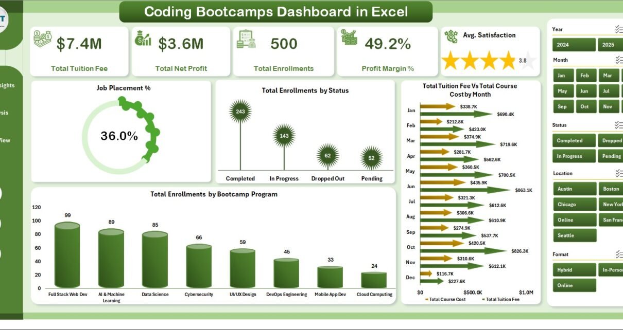
- 5 KPI cards on the Overview page — Total Tuition Fee, Total Net Profit, Total Enrollments, Profit Margin %, and Avg. Satisfaction update automatically on Refresh All.
- 16 pre-built charts across 5 pages — Job Placement %, Enrollment by Status, Tuition vs Cost by Month, Completion % by Bootcamp Program, Instructor rankings, and more.
- Dynamic slicers — filter every page by Bootcamp Program, Student Type, Format, Cohort, and Location instantly.
- Instructor benchmarking — rank top 5 instructors by enrollments, satisfaction score, and completion rate on a dedicated page.
- Pivot-driven auto-refresh — all 16 charts feed from the Support Sheet pivots; click Data > Refresh All and everything updates in seconds.
- Excel for Mac compatible — Microsoft 365 or Excel 2019+. No VBA macros or Windows-only features used.
Dashboard Pages Explanation
Page 1: Overview
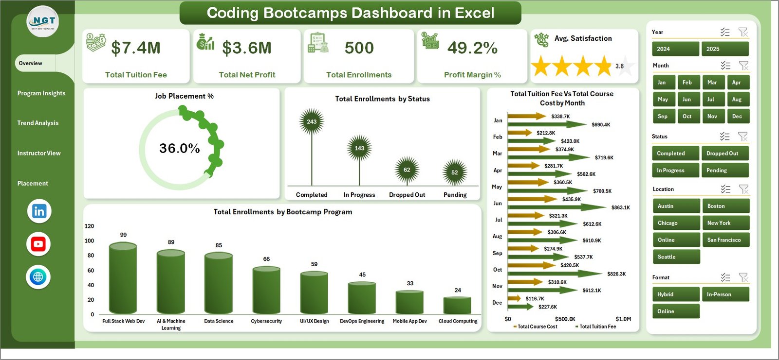
The Overview page combines 5 KPI cards — Total Tuition Fee, Total Net Profit, Total Enrollments, Profit Margin %, and Avg. Satisfaction — with dynamic slicers and 4 charts: Job Placement %, Total Enrollments by Status, Total Tuition Fee vs Total Course Cost by Month, and Total Enrollments by Bootcamp Program.
Page 2: Program Insights
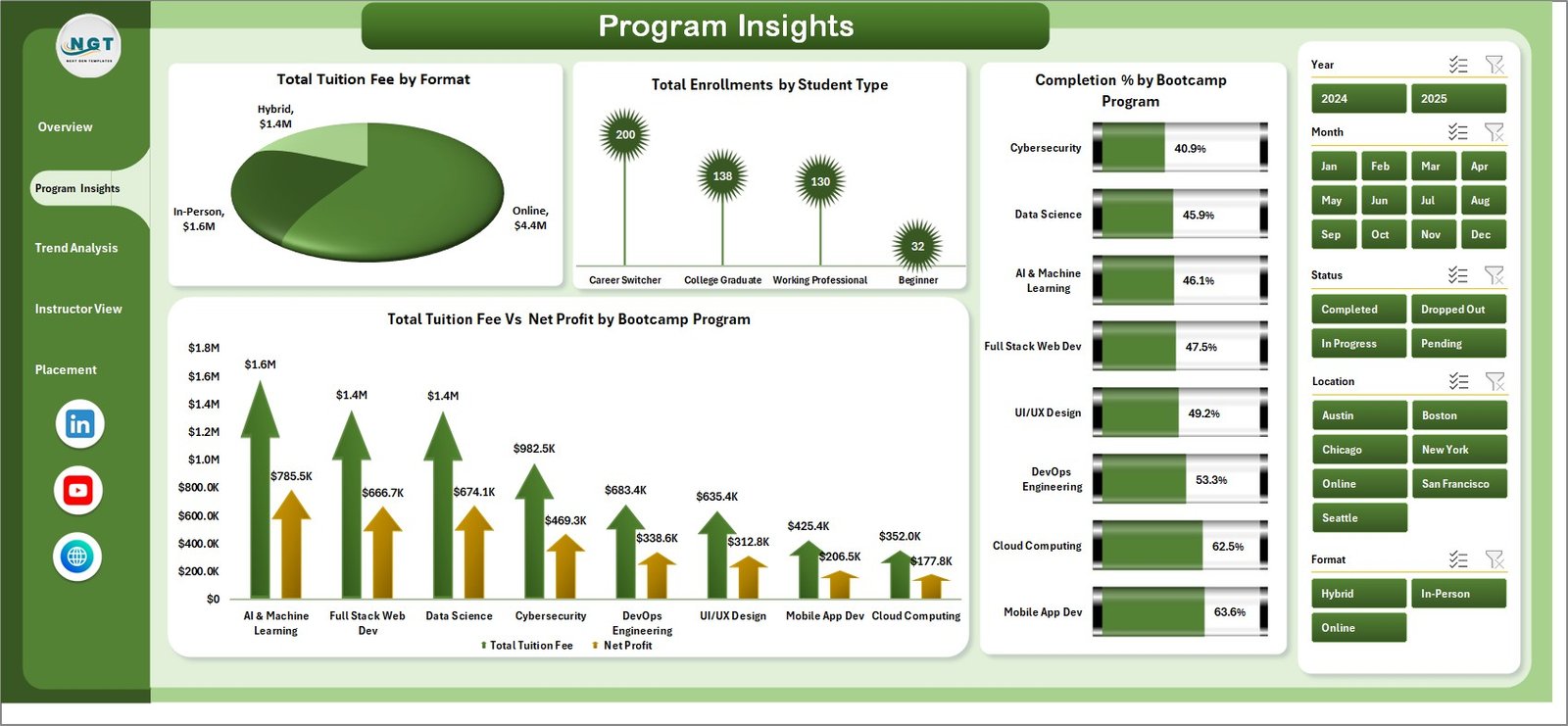
Program Insights answers the question every bootcamp operator needs to answer: which programs generate the most revenue and produce the best outcomes? Four charts — Total Tuition Fee by Format, Total Enrollments by Student Type, Completion % by Bootcamp Program, and Total Tuition Fee vs Net Profit by Bootcamp Program — provide that view instantly.
Page 3: Trend Analysis
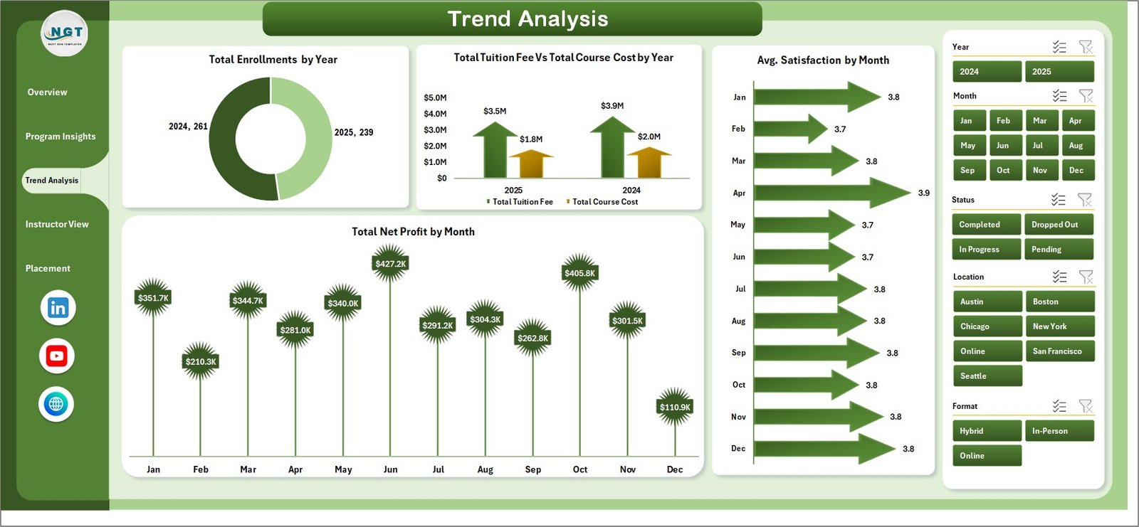
The Trend Analysis page tracks enrollment growth and financial performance over time through 4 charts: Total Enrollments by Year, Total Tuition Fee vs Total Course Cost by Year, Avg. Satisfaction by Month, and Total Net Profit by Month. These help you spot seasonal demand and plan cohort capacity in advance.
Page 4: Instructor View
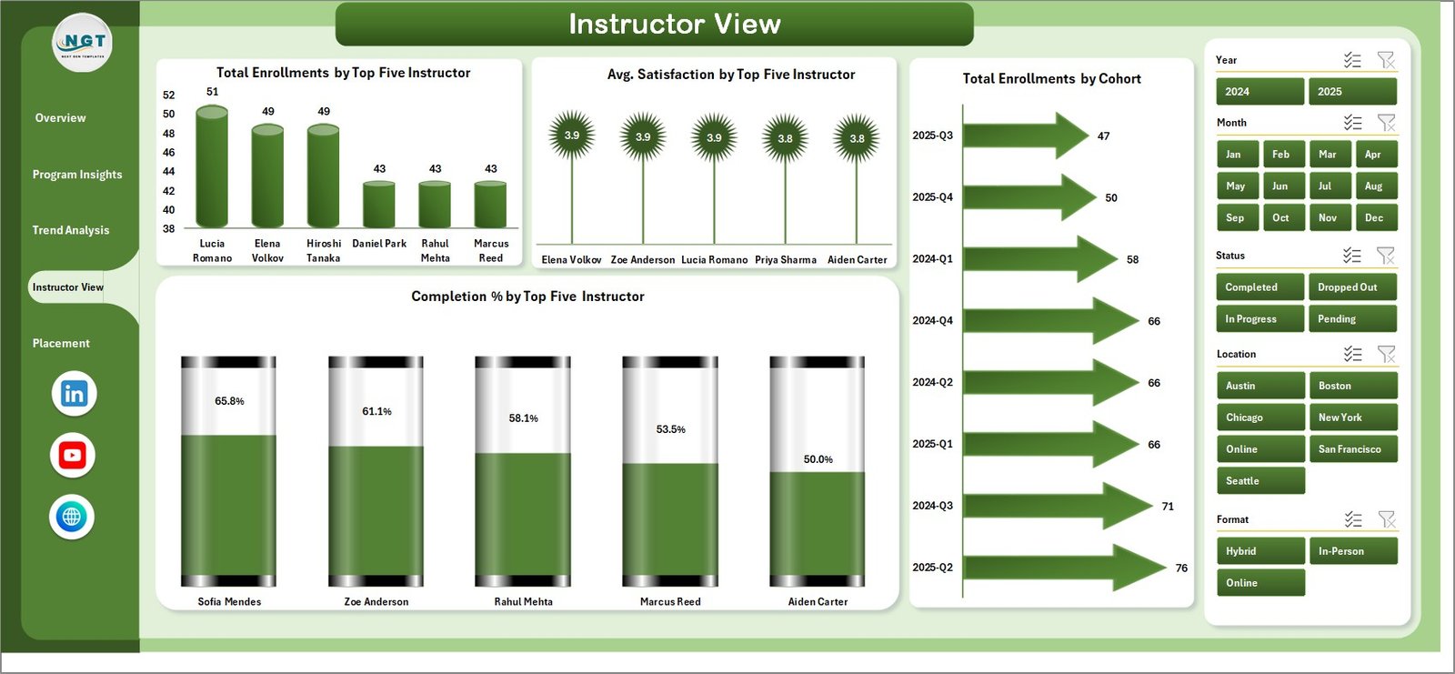
Instructor View benchmarks your top 5 instructors across 4 dimensions: Total Enrollments by Top Five Instructor, Avg. Satisfaction by Top Five Instructor, Total Enrollments by Cohort, and Completion % by Top Five Instructor. Use this for resourcing decisions and instructor performance reviews.
Page 5: Placement Analysis
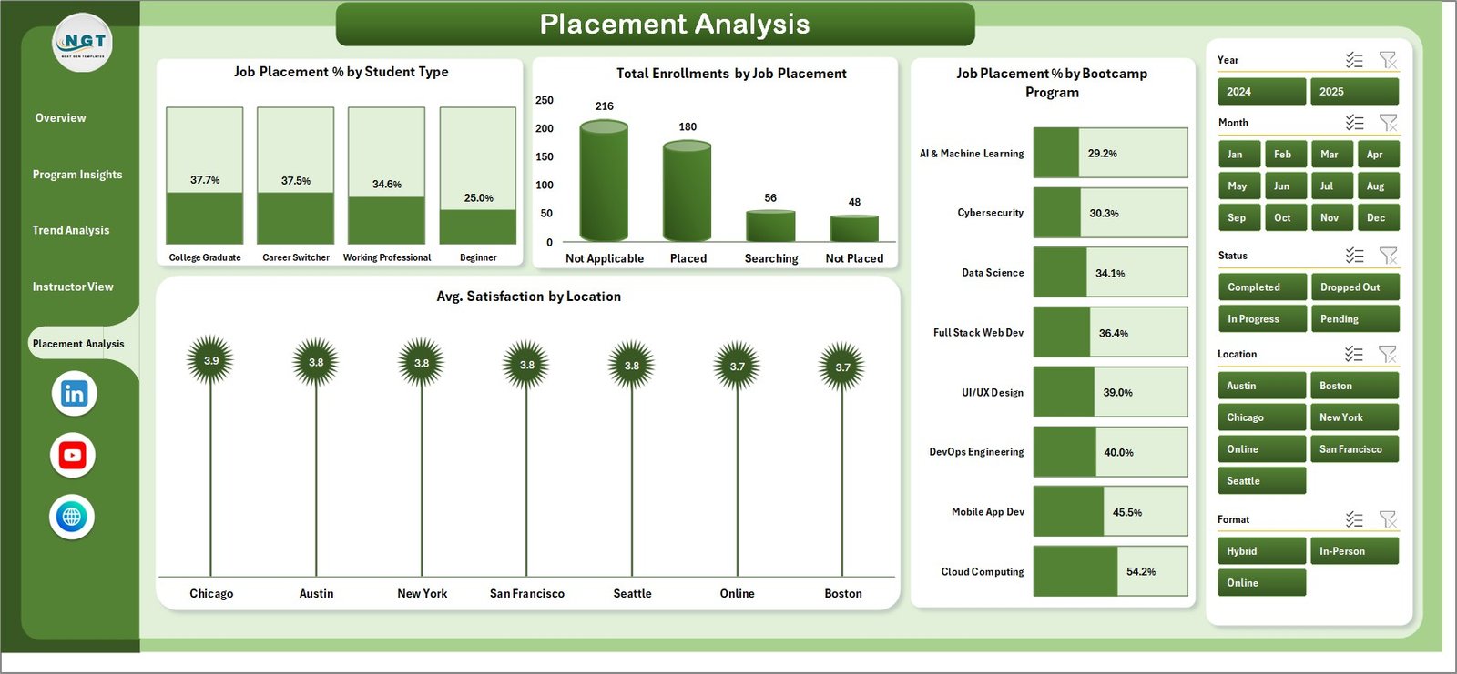
Placement Analysis is the career outcome hub: Job Placement % by Student Type, Total Enrollments by Job Placement, Job Placement % by Bootcamp Program, and Avg. Satisfaction by Location. Cross-referencing placement rates with satisfaction scores identifies your highest-ROI programs — the data investors and accreditors want to see.
Data Sheet
The Data Sheet has pre-labeled columns covering all required enrollment fields. Replace the sample rows with your LMS export data, then click Refresh All — every page updates instantly.

Support Sheet
The Support Sheet holds all underlying pivot tables. Keep it hidden in production — right-click the tab and select Hide. It only needs to be visible when adding custom columns or chart dimensions.

Coding Bootcamps Dashboard in Excel vs. Google Sheets vs. Canvas LMS — Feature Comparison
| Feature | Coding Bootcamps Dashboard in Excel | Google Sheets Dashboard | Canvas LMS / Salesforce Edu Cloud |
|---|---|---|---|
| Cost | $17.99 one-time ✅ | Free but build-your-own | $50–150+ / user / month |
| Platform | Microsoft Excel ✅ | Browser (Google) | Cloud SaaS |
| Setup time | Under 10 minutes ✅ | 2–5 hours to build | Days to weeks |
| Job Placement Tracking | 5 built-in views ✅ | Manual formulas required | Limited / add-on cost |
| Instructor Benchmarking | Top-5 ranking built-in ✅ | Manual build | Available but complex |
| Trend Analysis | Year & month charts ✅ | Build manually | Premium tiers only |
| Real-time collaboration | Shared Excel file | Native ✅ | Native ✅ |
| Year-1 cost (5 users) | $17.99 total ✅ | $0 + build time | $3,000–$9,000+ |
For bootcamp operators who want deep enrollment, placement, and instructor analytics without enterprise SaaS pricing, the Coding Bootcamps Dashboard in Excel sits in the sweet spot.
Who Should Use This Template
Perfect for:
- Coding bootcamp directors and operations managers tracking enrollment health, tuition revenue, and completion rates
- Program managers benchmarking instructor performance and placement outcomes across cohorts
- Education administrators at small to mid-size coding schools (10–500 students) who use Microsoft Excel
Not a fit if:
- You need SSO, real-time API integration, or a database backend (use an enterprise LMS)
- Your team needs simultaneous multi-user live editing (use a Google Sheets version)
Real-World Use Cases
Maria runs operations at a 200-student coding bootcamp. She presents monthly enrollment and placement reports to her board using the Placement Analysis page. The Job Placement % by Program chart is the metric her investors track, and the Trend Analysis page shows quarter-over-quarter growth without manual CRM exports.
David manages 8 instructors across 3 cohorts. Using the Instructor View, he identifies which instructors have the highest completion % and satisfaction scores, building better teaching pairs for each new cohort — replacing a manual process that took hours each month.
Priya is launching a new online bootcamp format. The Program Insights page’s Tuition Fee vs Net Profit by Bootcamp Program chart helps her decide which programs to scale, without paying for a $150/seat BI tool.
Advantages of Coding Bootcamps Dashboard in Excel
- One-time cost — $17.99 replaces $3,000–$9,000+ per year in enterprise SaaS fees for a team of 5.
- Zero technical setup — no integrations, no user accounts, no IT. Download, open in Excel, replace data, go.
- Covers the full bootcamp analytics stack — enrollment, financials, trends, instructor performance, and job placement in one file.
- Works offline — run reports and present to stakeholders from any device running Microsoft Excel, no internet required.
Opportunities for Improvement
- No real-time LMS integration — data must be exported from your LMS and pasted into the Data Sheet manually.
- With 5,000+ enrollment records, pivot refresh times may slow; summarize data at cohort level before importing for best performance.
- The Instructor View tracks top 5 only — bootcamps with large instructor pools may need custom pivot dimensions for full coverage.
Best Practices
- Refresh data monthly at a minimum to capture meaningful trend patterns in the Trend Analysis page.
- Standardize Data Sheet entries — use consistent Bootcamp Program names and Student Type values to avoid fragmented slicer options.
- Hide the Support Sheet before sharing with stakeholders to keep the dashboard presentation-ready.
- Use the Placement Analysis page as your board-level reporting view — job placement rate is the metric investors and accreditors focus on most.
Explore Relevant Templates
- Virtual Classrooms KPI Dashboard in Excel — for online learning program analytics
- Student Enrollment KPI Scorecard in Excel — monthly enrollment scorecard view
- Vocational Training KPI Scorecard in Excel — similar analytics for vocational programs
Frequently Asked Questions
What is the Coding Bootcamps Dashboard in Excel?
The Coding Bootcamps Dashboard in Excel is a 5-page, pivot-driven Excel template tracking 5 KPIs and 16 charts covering enrollment analytics, program profitability, instructor benchmarking, trend analysis, and job placement outcomes — all in one downloadable .xlsx file.
How do I update the data in this dashboard?
Paste your enrollment records into the Data Sheet tab following the pre-labeled column structure, then click Data > Refresh All in the Excel Ribbon. All 16 charts and 5 dashboard pages update automatically in seconds — no manual formula updates required.
How does this compare to Canvas LMS reporting tools?
Canvas LMS provides course-activity data; the Coding Bootcamps Dashboard in Excel is purpose-built for program-level analytics — tuition revenue, net profit, job placement rates, and instructor benchmarking. At $17.99 one-time versus $50–150+ per user per month, it’s a cost-effective alternative for small to mid-size bootcamps.
Is the dashboard compatible with Excel for Mac?
Yes. The Coding Bootcamps Dashboard in Excel uses standard pivot tables, slicers, and charts available in Excel for Mac (Microsoft 365 or Excel 2019+). No VBA macros or Windows-specific features are used. See Microsoft Excel Support for version details.
How many rows of data can the dashboard handle?
The dashboard handles typical bootcamp datasets up to a few thousand enrollment records. For very large datasets (5,000+ rows), summarize data at the cohort level before importing to maintain fast pivot refresh times.
Can I add custom slicers or charts to this dashboard?
Yes. Add new columns to the Data Sheet and reference them in the Support Sheet pivot tables. From there, assign them to new slicers or chart series. The pivot-driven architecture is fully extensible with basic Excel knowledge.
About the Author
Built by PK — Microsoft Certified Professional with 15+ years of Excel, Google Sheets, and Power BI experience. Founder of NextGenTemplates, reaching 300K+ subscribers across YouTube channels (@PK-AnExcelExpert, @NextGenTemplates, @NeoTechNavigators). Every template is hand-built and tested before release.
Conclusion
The coding bootcamp sector is growing fast, and operators need analytics that keep pace. The Coding Bootcamps Dashboard in Excel delivers 5-page, 16-chart coverage of enrollment health, program profitability, instructor performance, and job placement outcomes — in a one-time-purchase Excel file that takes under 10 minutes to set up.
Click here to Purchase Coding Bootcamps Dashboard in Excel
Instant download · One-time payment · No subscription
For video tutorials, visit Youtube.com/@PK-AnExcelExpert
Last updated: May 2026