Paving is a business of thin margins and short seasons. You place the tonnage between the frost dates, you fight for density on every mat, and the money you make or lose on a job is usually decided long before the invoice goes out. Most contractors already have the numbers – they sit in a job-cost export, a scale ticket summary, a safety log and somebody’s notebook. What they do not have is one page that says, for this month, which of those numbers hit target and which did not.
That is exactly what the Paving Contractor KPI Dashboard in Excel does. It is a 100% formula-driven monthly KPI scorecard: pick a month from a dropdown and 14 paving KPIs re-read themselves, MTD and YTD, against target and against last year, with traffic lights and direction-aware arrows. No macros. No Power Query. No data model. It opens in Excel 2013 and later, and in Excel for the web.
One thing to get straight before you read on. NextGenTemplates ships three families whose names look almost identical, and this article is about only one of them. This is the KPI Dashboard – the month-picker scorecard. It is not the Paving Contractor KPI Scorecard (a separate, smaller template that exists in both Excel and Google Sheets editions with a different layout and a different KPI count), and it is not one of the analytical Dashboard workbooks that sit pivots and slicers over a transaction table. Three different files, three different jobs. I will come back to the difference near the end.
What you actually see when you open it
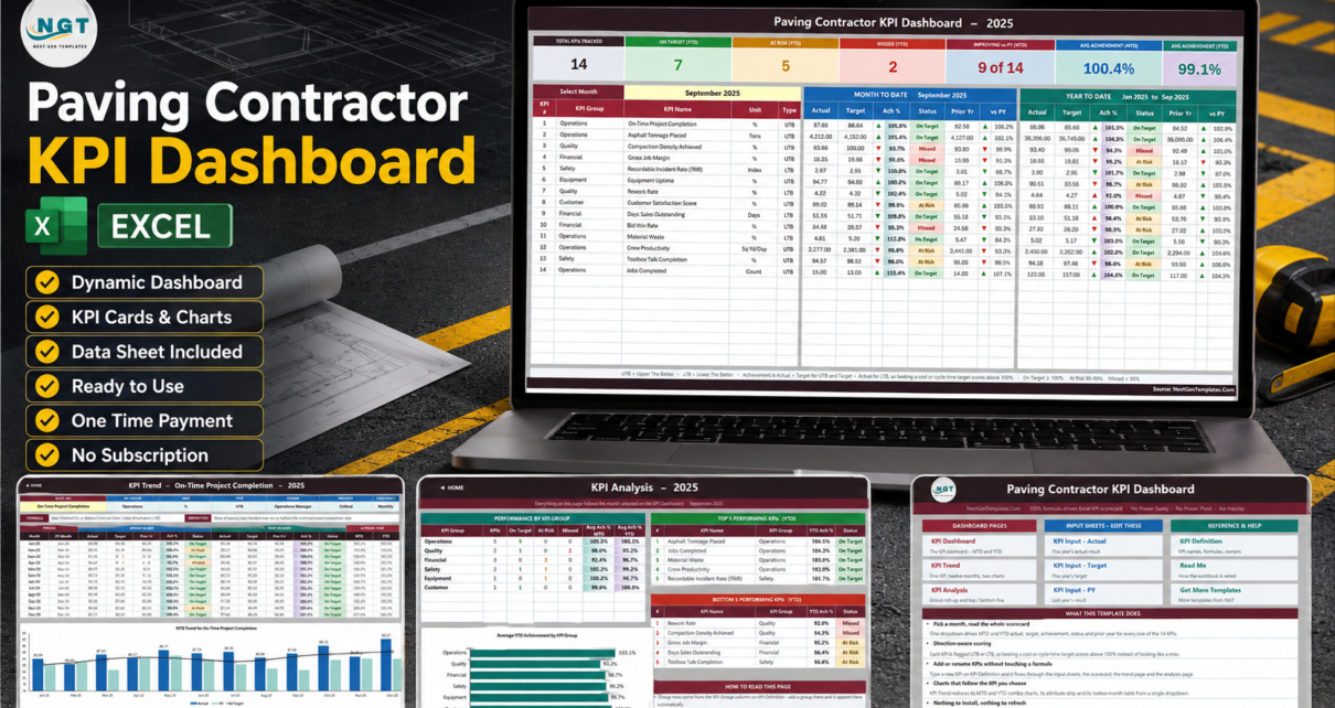
Eleven sheets – ten visible, one hidden helper. The Home page is a plain navigation panel: three columns for dashboard pages, input sheets and reference sheets, and a short list of what the template does.
The sheet that matters is KPI Dashboard.
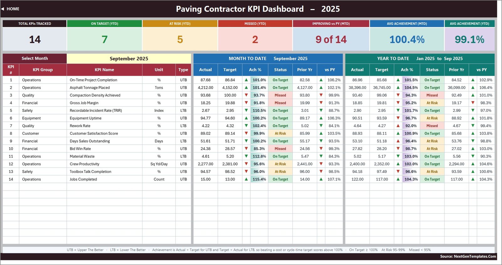
Seven summary cards run across the top: Total KPIs Tracked, On Target (YTD), At Risk (YTD), Missed (YTD), Improving vs PY (MTD), Avg Achievement (MTD) and Avg Achievement (YTD). In the sample year that ships with the file – 2025, September selected – they read 14, 7, 5, 2, 9 of 14, 100.4% and 99.1%. Below them, 14 rows, each with actual, target, achievement percentage, status, prior year and a year-on-year percentage, twice: once for the month, once for the year to date.
The 14 KPIs, and why four of them are scored upside down
The KPI list is not decoration. Each KPI carries a group, a unit, a formula, a plain-English definition, an owner, a priority, a frequency and – critically – a type: UTB (Upper The Better) or LTB (Lower The Better).
| # | KPI | Group | Unit | Type |
|---|---|---|---|---|
| 1 | On-Time Project Completion | Operations | % | UTB |
| 2 | Asphalt Tonnage Placed | Operations | Tons | UTB |
| 3 | Compaction Density Achieved | Quality | % | UTB |
| 4 | Gross Job Margin | Financial | % | UTB |
| 5 | Recordable Incident Rate (TRIR) | Safety | Index | LTB |
| 6 | Equipment Uptime | Equipment | % | UTB |
| 7 | Rework Rate | Quality | % | LTB |
| 8 | Customer Satisfaction Score | Customer | % | UTB |
| 9 | Days Sales Outstanding | Financial | Days | LTB |
| 10 | Bid Win Rate | Financial | % | UTB |
| 11 | Material Waste | Operations | % | LTB |
| 12 | Crew Productivity | Operations | Sq Yd/Day | UTB |
| 13 | Toolbox Talk Completion | Safety | % | UTB |
| 14 | Jobs Completed | Operations | Count | UTB |
Ten are UTB. Four are LTB: TRIR, Rework Rate, Days Sales Outstanding and Material Waste. Achievement is Actual / Target for a UTB KPI and Target / Actual for an LTB one. That single inversion is what stops the scorecard being nonsense. In the September sample, Material Waste comes in at 4.61% against a 5.20% target and scores 112.8%, On Target – because you used less mix than planned. TRIR comes in at 2.67 against 2.95 and scores 110.5%, On Target – because you had fewer recordable injuries than budgeted. A dashboard that scored those as “under target, red” would be telling you off for doing well.
The arrows follow the same logic. The arrow direction shows raw movement – actual above or below the comparator – and the arrow colour shows whether that movement is good for that KPI. A falling cost shows a green down-arrow.
Status bands: On Target from 100%, At Risk from 95% to 99%, Missed below 95%. Those thresholds are ordinary IF formulas in columns L and U of the scorecard – if your governance uses different bands, change them there.
The trend page: one KPI, twelve months, two charts
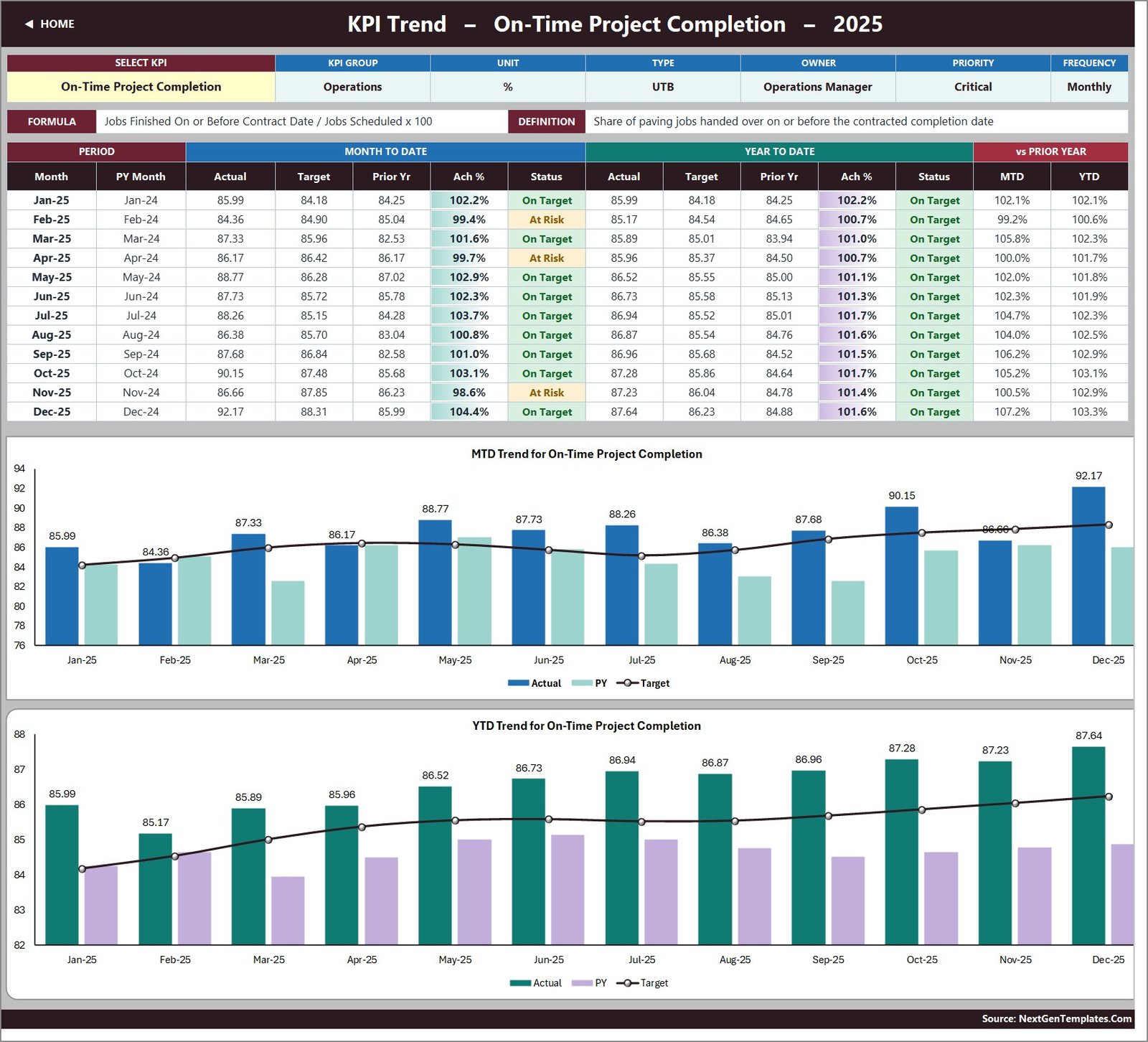
Cell B4 on KPI Trend is a dropdown of every KPI name. Choose one and you get its group, unit, type, owner, priority and frequency across the top; its formula and definition underneath; a twelve-month table with MTD and YTD blocks and a vs-prior-year pair; and two combo charts – actual and prior-year columns with a target line – one for MTD, one for YTD. Nothing to refresh; it is all formulas and chart ranges pointed at a hidden Support sheet.
The analysis page: where the problem actually is
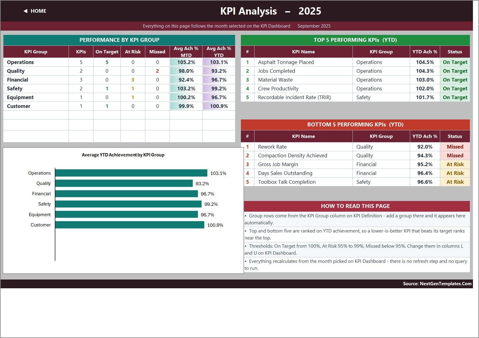
KPI Analysis rolls the 14 KPIs up into their six groups and counts the statuses in each. In the shipped sample:
| Group | KPIs | On Target | At Risk | Missed | Avg Ach % YTD |
|---|---|---|---|---|---|
| Operations | 5 | 5 | 0 | 0 | 103.1% |
| Quality | 2 | 0 | 0 | 2 | 93.2% |
| Financial | 3 | 0 | 3 | 0 | 96.7% |
| Safety | 2 | 1 | 1 | 0 | 99.2% |
| Equipment | 1 | 0 | 1 | 0 | 96.7% |
| Customer | 1 | 1 | 0 | 0 | 100.9% |
That is a readable story in six rows: production is fine, quality is the problem, finance is soft across the board. The Bottom 5 table names the two Quality failures directly – Rework Rate at 92.0% and Compaction Density Achieved at 94.3%, both Missed – followed by Gross Job Margin, Days Sales Outstanding and Toolbox Talk Completion at At Risk.
The Top 5 is worth a second look, because it proves the direction logic is real rather than cosmetic: Asphalt Tonnage Placed, Jobs Completed, Material Waste, Crew Productivity and then Recordable Incident Rate (TRIR) at 101.7%. A lower-is-better safety metric ranks in the top five because it beat its target. Ranking on achievement rather than raw value is the only way that works.
Where your numbers go
Three input sheets, and they are the only three you normally type in: KPI Input – Actual, KPI Input – Target and KPI Input – PY. Each holds an MTD and a YTD column for all twelve months, and the KPI rows on all three are driven by the KPI Definition sheet so they always line up. Cell E3 on the Actual sheet sets the first month of the reporting year; change it and the other two sheets, the month dropdown and every sheet title re-base themselves.
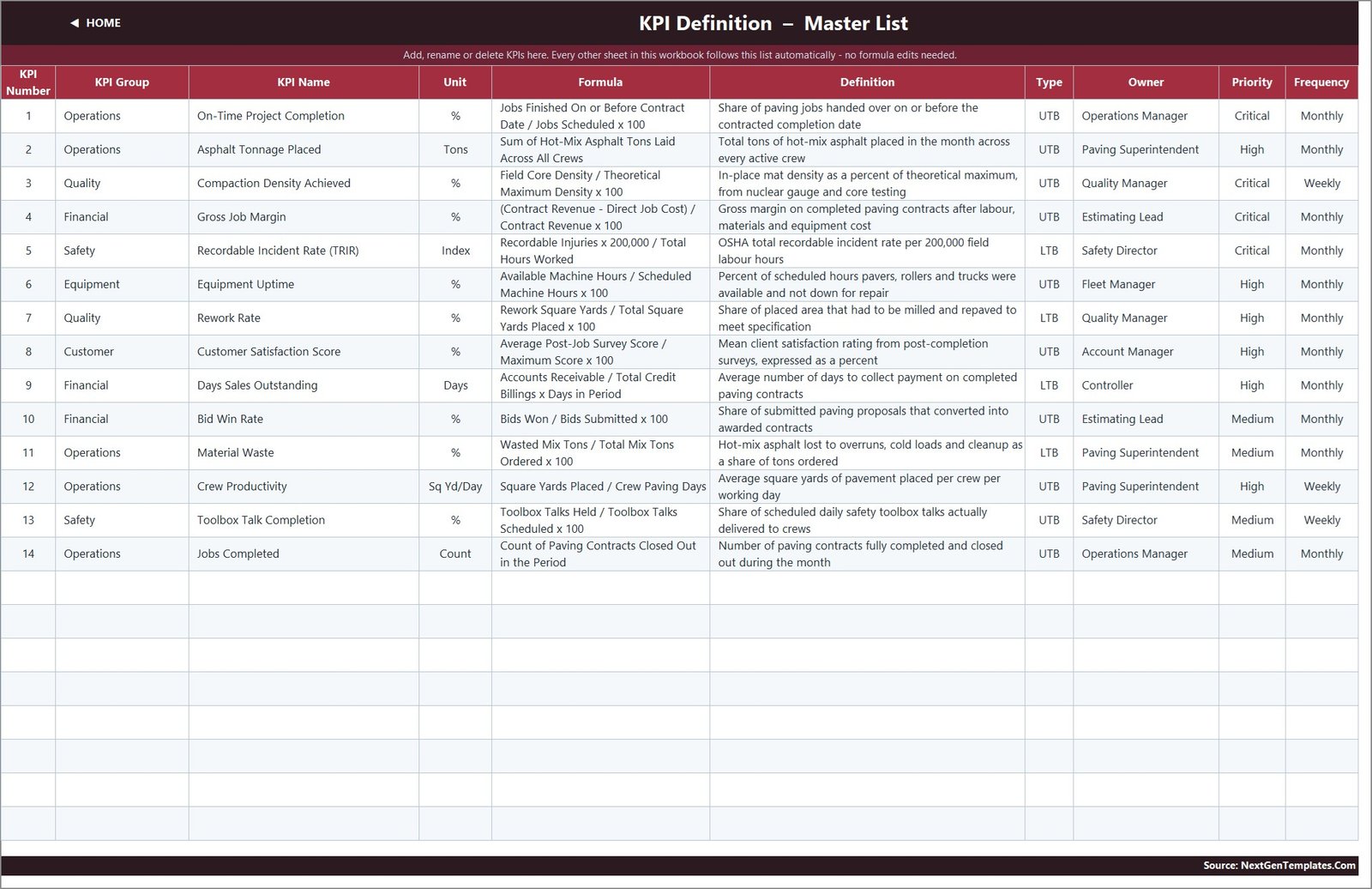
The KPI Definition sheet is where you make the template yours. Number, group, name, unit, formula, definition, type, owner, priority, frequency – ten columns, all free text or a simple flag. The sheets are wired for 22 KPIs; 14 are filled and eight live empty rows are already waiting, so adding a KPI needs no formula work at all. To go past 22, fill down the last data row on each sheet and widen the ranges in the summary cards and the Support helper columns. The Read Me sheet walks through it.
Three things it deliberately does not do
I would rather you know these before you buy than after.
1. It does not derive YTD from MTD. Both are typed on the input sheets. The workbook reads whatever you put in the YTD column – it does not sum or average for you. That is a design decision, and the Read Me explains why: volumes and counts should accumulate through the year, but rates, ratios and indices should be running averages. A compliance percentage that adds up to 1,100% by December is the classic sign of a KPI pack nobody thought about. If you want YTD derived, replace those cells with your own formula; nothing is locked.
2. The Frequency column is documentation, not a switch. Three KPIs are labelled Weekly – Compaction Density Achieved, Crew Productivity and Toolbox Talk Completion – but the input grid is monthly for all 14. The label tells your team how often to collect the number; it does not change any calculation.
3. It is not a safety or compliance system. TRIR is in the KPI list because paving contractors report it, and Toolbox Talk Completion is there because crews track it. Both are single numbers you type in each month. There is no incident log, no OSHA 300 or 300A form, no near-miss register, no core-test record, no mix-design document and no training file. Keep your statutory records where you keep them now; this workbook charts a rate, it does not evidence anything.
One more, in the interest of honesty: the Read Me sheet’s “Cumulative or average YTD” row still carries example wording left over from another build in the same template family – it cites “aircraft deliveries, non-conformance reports” rather than tonnage and rework. The explanation itself is correct and applies perfectly well to paving; only the examples are from the wrong trade. It is a text label on a help page, it affects no calculation, and it is on the list to fix in a future rebuild. Everything else checked out: the Home page’s “14 KPIs” claim matches the 14 the file actually ships, all twelve months of every KPI vary properly, and the number formatting is standard thousands grouping throughout.
KPI Dashboard vs KPI Scorecard vs analytical Dashboard
This is the comparison people get wrong, so here it is plainly.
| Paving Contractor KPI Dashboard in Excel (this one) | Paving Contractor KPI Scorecard in Excel / Google Sheets | Analytical Dashboard workbooks | |
|---|---|---|---|
| Core question | Did we hit target this month? | Did we hit target this month, in a lighter format | Slice and explore a transaction table |
| Driven by | A month dropdown | A month dropdown | Pivot tables and slicers |
| Pages | Scorecard, KPI Trend, KPI Analysis, 3 input sheets, KPI Definition, Read Me | Fewer pages, different layout, different KPI count | Chart pages over a data sheet of records |
| KPI count shipped | 14 (wired for 22) | Smaller set | N/A – measures, not a KPI list |
| What you type | Monthly actual, target and prior-year figures | Monthly figures | Rows of transactions |
If you want per-job or per-crew slicing, buy an analytical dashboard. If you want a lighter monthly scorecard, look at the KPI Scorecard family. If you want the full month-picker scorecard with trend and group analysis, this is the one.
Who it suits
Paving and asphalt contractors, highway and municipal surfacing crews, driveway and parking-lot companies, and civil subs who already keep monthly numbers somewhere and want one page that scores them. Operations managers, paving superintendents, owners and controllers building a monthly management pack.
It is the wrong tool if you need it to connect to your accounting, estimating, telematics or job-costing system – it connects to nothing, by design. Also wrong if you need alerts, scheduled emails, per-job drilldown or several people editing at once.
Related Templates
More related walkthroughs on this blog: Paving Contractor KPI Scorecard in Excel, HVAC Contractor KPI Dashboard in Excel and Drywall Contractor KPI Dashboard in Excel. Each is a separate template with its own layout and sample data.
Frequently asked questions
Do I need macros or any add-in?
No. It is a plain .xlsx built entirely from worksheet formulas – VLOOKUP, INDEX, MATCH, COUNTIF, COUNTIFS, AVERAGEIF, LARGE and SMALL. No VBA, no Power Query, no Power Pivot, no add-in. It opens in Excel 2013 and later and in Excel for the web.
Can I rename the KPIs to match our own reporting?
Yes, and that is the intended workflow. Change a name on KPI Definition and the input sheets, the scorecard, the trend dropdown and the analysis page all follow it. Same for units, formulas, owners and groups – add a new group and it appears on the analysis page automatically.
Are the sample figures industry benchmarks?
No. The 2025 sample year is demo data so the dashboard works the moment you open it. Do not quote it as a benchmark – type over it.
What exactly do I download?
One ZIP containing Paving Contractor KPI Dashboard.xlsx and Excel-KPI-Dashboard-User-Manual.pdf. One-time payment, lifetime access to the file.
Is there a Google Sheets or Power BI version of this exact template?
Not for paving at the time of writing. Other trades in this line do have Power BI and Google Sheets editions, and the paving KPI Scorecard exists in both Excel and Google Sheets. Check the store listing for the current range.
Get the template
Paving Contractor KPI Dashboard in Excel – one-time payment, no subscription, fully editable, instant download.
Related templates worth a look: Masonry Contractor KPI Dashboard in Excel, Road and Highway Construction KPI Dashboard in Excel, Bridge Construction KPI Dashboard in Excel, and – if you want the analytical family instead – Road and Highway Construction Dashboard in Excel.
Video walkthroughs of the whole range are on youtube.com/@PKAnExcelExpert.