Pool service is a business of small numbers repeated thousands of times. One visit is a few minutes of skimming, testing and brushing. One callback is an hour of drive time nobody billed. One extra bucket of chlorine is a rounding error. Multiply any of them by a summer’s worth of routes and they stop being rounding errors and start being the difference between a good year and a flat one.
The problem is that those numbers live in five different places – route sheets, the scheduling app, supplier invoices, timesheets and the owner’s head – and nobody has time to assemble them into one view every month. So most pool companies run on a revenue figure and a feeling.
The Swimming Pool Service KPI Scorecard in Excel is a single page that fixes that: ten pool-service KPIs, a month picker, an MTD/YTD switch and traffic lights that understand which direction is good. This post walks through exactly what is in it, what it does not do, and how to get it filled with your own numbers in about an hour.
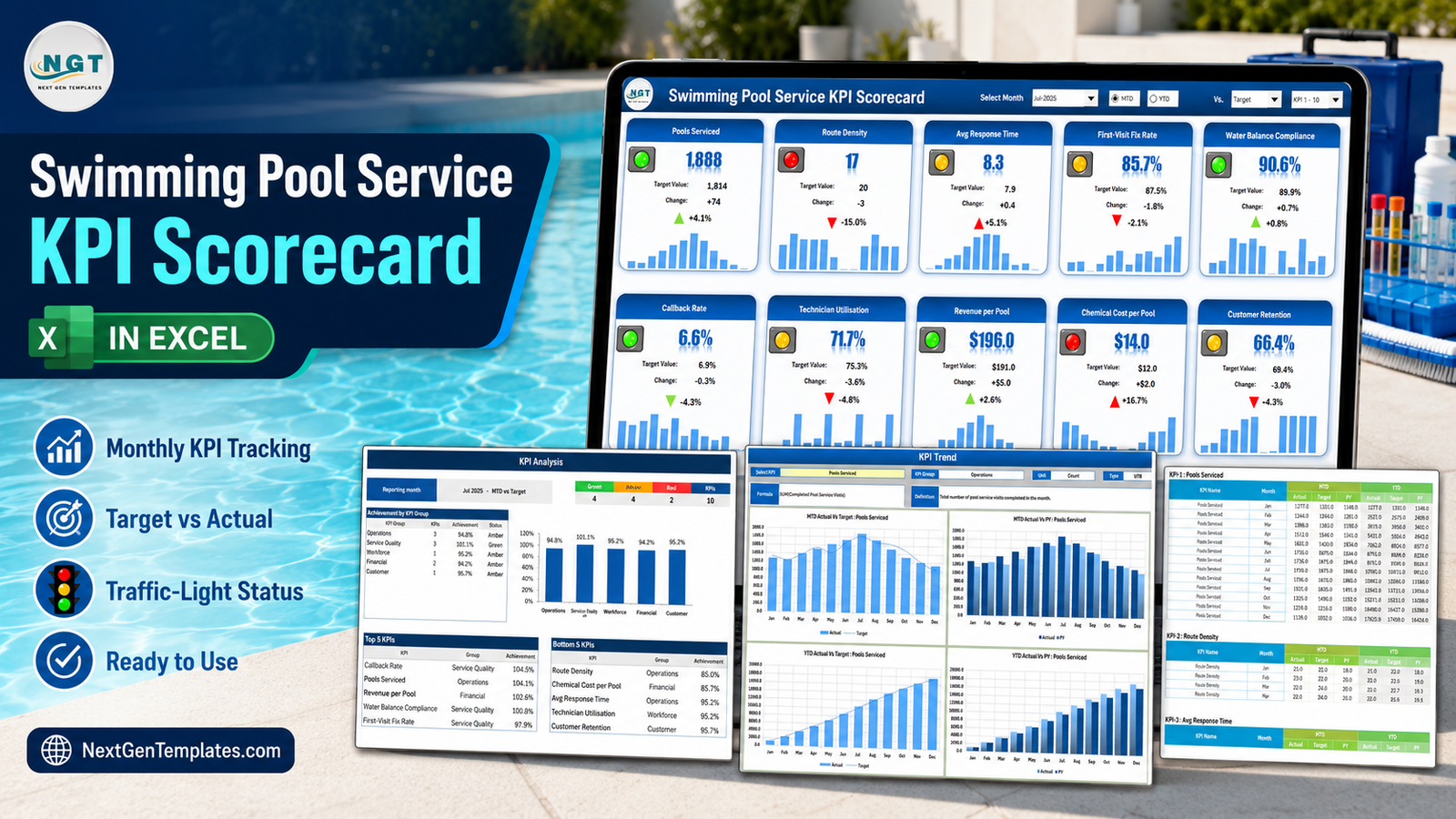
What a KPI scorecard actually is (and what it is not)
A scorecard is a monthly reporting page. You type the finished figures into it, it lays them out identically every month, and it colours them so a bad month looks different from a good one before you have read a single label. It is not a live system. Nothing syncs, nothing imports, nothing calls an API.
That is worth being blunt about because NextGenTemplates ships three families whose names are almost identical, and buying the wrong one is an annoying way to spend an afternoon:
- The KPI Scorecard line – this one. Month picker, tiles, traffic lights, a KPI Definition sheet you rename. Built for the monthly close.
- The KPI Dashboard line – slicer-driven, built for interactive analysis across a dataset.
- The plain Dashboard line – analytical reporting over a full transaction table.
Three different tools answering three different questions. This article is only about the first.
The ten KPIs it ships with
The workbook arrives loaded with ten pool-service metrics arranged in five groups, and a complete twelve-month 2025 sample year behind them. Every one of these names is just text on a sheet – rename any of them and the whole workbook follows.
| # | KPI | Group | Unit | Direction | How it is defined in the file |
|---|---|---|---|---|---|
| 1 | Pools Serviced | Operations | Count | Upper the better | Total pool service visits completed in the month |
| 2 | Route Density | Operations | Count | Upper the better | Average pools serviced per technician per working day |
| 3 | Avg Response Time | Operations | Hours | Lower the better | Average hours from service request to a technician on site |
| 4 | First-Visit Fix Rate | Service Quality | % | Upper the better | Share of calls fully resolved on the first visit |
| 5 | Water Balance Compliance | Service Quality | % | Upper the better | Share of serviced pools within your own target ranges at visit close |
| 6 | Callback Rate | Service Quality | % | Lower the better | Share of visits needing an unplanned return within seven days |
| 7 | Technician Utilisation | Workforce | % | Upper the better | Billable hours as a share of available hours |
| 8 | Revenue per Pool | Financial | USD | Upper the better | Service revenue divided by pools serviced |
| 9 | Chemical Cost per Pool | Financial | USD | Lower the better | Chemical spend divided by pools serviced |
| 10 | Customer Retention | Customer | % | Upper the better | Retained contracts as a share of active contracts |
Seven of the ten are Upper-the-Better and three are Lower-the-Better. That distinction is the whole point of the colour logic, and it is the thing cheap scorecards get wrong.
Why the direction flag matters more than the colour
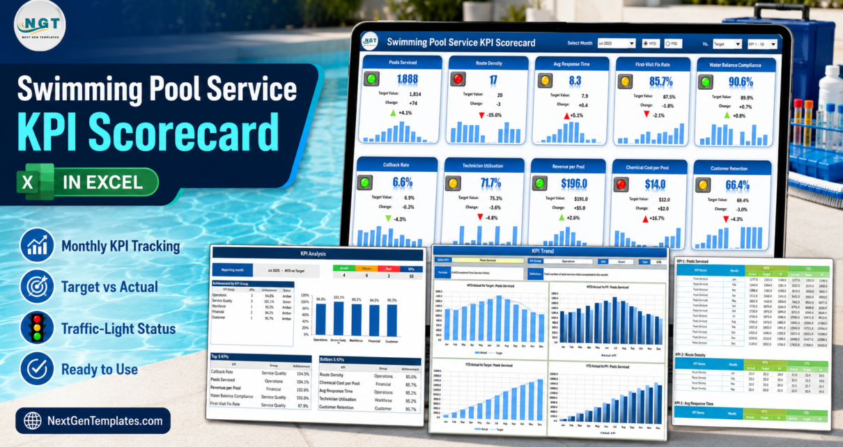
Open the sample file on Jul-2025 and Chemical Cost per Pool reads $14.0 against a $12.0 target. The change is +$2.0, or +16.7%, and the arrow beside it is red and pointing up. On a naive scorecard that same +16.7% would be green, because the number went up and up is usually good.
The workbook knows Chemical Cost per Pool is Lower-the-Better, so up is bad, the arrow is red and the light is red. Two rows away, Callback Rate falls from 6.9% to 6.6%, a change of -4.3%, and gets a green down-arrow and a green light for exactly the same reason. Avg Response Time behaves the same way: 7.9 hours budgeted, 8.3 delivered, a +5.1% move that is correctly amber rather than green.
The direction lives in the Type column on the KPI Definition sheet, one cell per KPI, reading UTB or LTB. Change it there and every tile, arrow and light on the workbook re-reads itself.
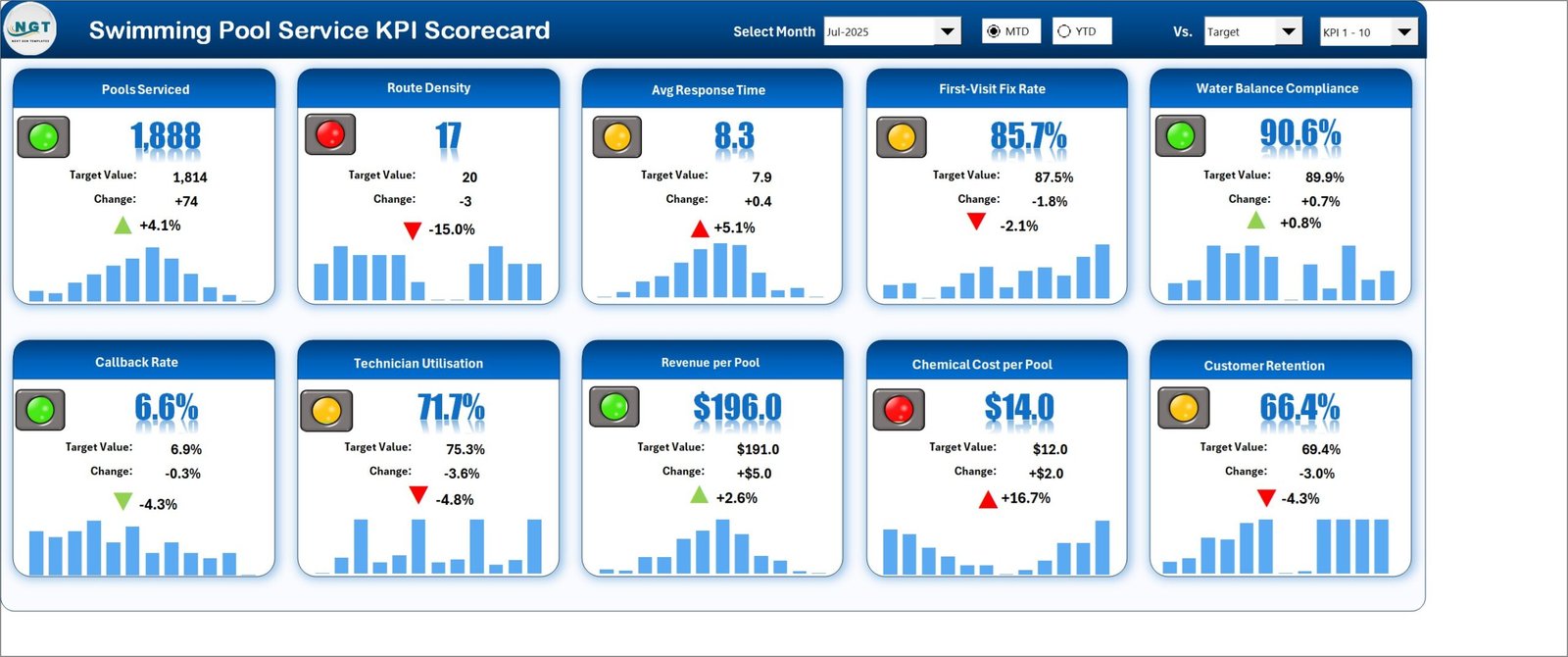
The header is the whole interface
There are four controls across the top of the Scorecard page and they drive every other sheet:
- Select Month – a dropdown running Jan-2025 to Dec-2025. The year comes from the Color Settings sheet, which is why it reads “Jul-2025” rather than a bare “Jul”.
- MTD / YTD – two option buttons switching every tile between the month and the year to date.
- Vs. – a dropdown choosing what the comparison column means: Target, PY (the same period last year) or Prior Month. The tile label renames itself to suit.
- KPI set – flips the tile wall between KPI 1-10 and KPI 11-20, because the workbook holds twenty slots and the page shows ten at a time.
Nothing else on the workbook needs clicking. There are no macros, no Power Query queries and no add-ins – the whole thing is formulas, conditional formatting, camera pictures, sparklines and Excel’s own form controls.
Three pages that do the reading for you
Scorecard
Ten tiles in two rows of five. Each carries the KPI name, the current value, the comparison value, the absolute change, the percentage change with a coloured arrow, a traffic light and a twelve-month column sparkline. The sparkline is the part people underestimate – it turns “1,888 visits” into “1,888 visits, at the top of a season that started climbing in March”.
KPI Analysis
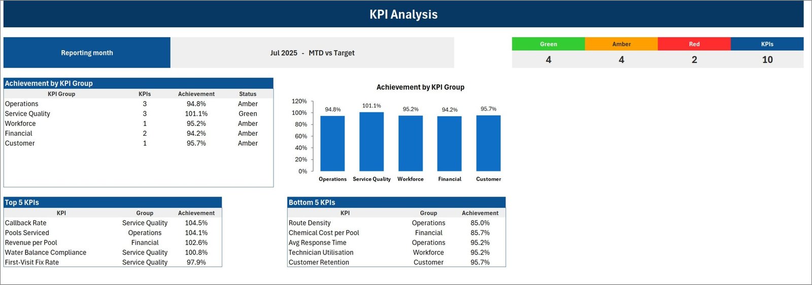
The same month, read differently. A banner states the period and the comparison (“Jul 2025 – MTD vs Target”), then a strip counts the lights: in the sample month, 4 Green, 4 Amber, 2 Red against 10 KPIs. Below it, achievement by KPI group as both a table and a column chart – Operations 94.8%, Service Quality 101.1%, Workforce 95.2%, Financial 94.2%, Customer 95.7% – and then Top 5 and Bottom 5 KPI tables. In the sample year the bottom two are Route Density at 85.0% and Chemical Cost per Pool at 85.7%, which is a fairly precise description of an overstretched summer.
KPI Trend
Pick one KPI from a dropdown and the page prints its group, unit, direction, formula and definition, then draws four charts: MTD Actual vs Target, MTD Actual vs PY, YTD Actual vs Target and YTD Actual vs PY. This is where a seasonal business gets its real answer – the MTD chart shows the summer peak, the YTD chart shows whether the year as a whole is still ahead.
What you type, and what you do not
Two sheets take input and nothing else does.
Input Data holds twenty numbered blocks, one per KPI slot, each twelve rows deep. Every month takes six figures: MTD Actual, MTD Target, MTD PY, then YTD Actual, YTD Target and YTD PY.
Yes – you type the YTD figures too. That is deliberate rather than lazy. The correct year-to-date roll-up is a sum for visit counts and a weighted average for rates like utilisation or retention, and no template can guess which one you meant. So the workbook asks you for the finished figure and gives you a YTD Basis column on KPI Definition to record the rule you used, so whoever fills it next month does it the same way.
KPI Definition is the naming table: number, group, name, unit, formula, definition, direction and YTD basis – plus a Check column that turns red if you accidentally create two KPIs with the same name. That check exists because every page looks its KPI up by name, so two identical names would silently add themselves together.

Moving the traffic light thresholds
Out of the box the bands are simple: Green at or above target, Amber within 10% of target, Red more than 10% off. They live on the Color Settings sheet as two small tables – one for the Upper-the-Better KPIs, one for the Lower-the-Better ones – and they are just numbers you overtype.
Ten percent is a sensible default and a poor universal rule. A 10% miss on Customer Retention is a crisis; a 10% miss on Route Density in February is weather. Widen or narrow either band and every tile and both analysis tables follow immediately.
What this template deliberately does not do
Being clear about the boundaries is more useful than another feature list.
- It does not connect to anything. Not Skimmer, not Pool Brain, not Jobber or ServiceTitan, not QuickBooks. You type or paste the monthly figures.
- It is not a water chemistry tool. Water Balance Compliance is one percentage that you work out elsewhere – the share of pools that met your own target ranges at visit close – and type in. The workbook stores no test readings, holds no pH, chlorine, alkalinity or stabiliser figures, does no chemical maths and gives no dosing or treatment guidance whatsoever.
- It makes no compliance or certification claim. It is a business reporting template, not a public-health, water-safety or testing-certification system, and it says nothing about any health-department pool code, operator certification or testing standard. Those obligations stay entirely with you and your local authority.
- It is not a safety or OSHA recordkeeping system. This KPI set ships no safety or incident metric at all. If you want one, rename a spare slot and type the figure in – but the workbook maintains no log and files nothing.
- It is not scheduling, routing, invoicing or a customer database. It holds no customer names, addresses or job records – only ten KPI names and their monthly numbers.
An honest note on the sample data and two cosmetic faults
The figures in every screenshot are a generated 2025 sample year – internally consistent, deliberately seasonal, and not data from a real pool company. Customer Retention reading 66.4% in July is sample behaviour, not a benchmark; replace the lot on Input Data.
Two small blemishes worth naming rather than hiding. The two callouts on the Color Settings sheet read “Change these number as per your requirements” – a missing plural – and in the exported page image the right-hand callout is clipped at the edge of the sheet. And on the KPI Trend page the two “vs PY” charts colour the Actual series differently from each other; both legends are correct, the palette just is not consistent between them. Neither affects a single calculation, a KPI, a threshold or a traffic light.
Getting it filled in about an hour
- Open the .xlsx. No macro prompt, no security banner.
- On Color Settings, set your report title and reporting year.
- On KPI Definition, work down the ten rows and make them yours – name, group, unit, formula, definition, UTB or LTB, YTD basis. Keep names unique.
- On Input Data, fill last year first (the PY columns) so your comparisons work from month one, then this year’s actuals and targets.
- Go back to the Scorecard, pick a month and click through MTD, YTD and all three comparison modes to sanity-check the colours.
- Adjust the bands on Color Settings if 10% is not your tolerance.
- Print or export the Scorecard and KPI Analysis pages into your monthly pack. The layout will not move again.
Related Templates
More related walkthroughs on this blog: Fencing Contractor KPI Scorecard in Excel, Paving Contractor KPI Scorecard in Excel and Concrete Contractor KPI Scorecard in Excel. Each is a separate template with its own layout and sample data.
Frequently asked questions
How many KPIs can it hold?
Twenty. Ten arrive filled, and Input Data carries twenty numbered blocks. The Scorecard shows ten at a time, and the KPI set picker in the header flips between KPI 1-10 and KPI 11-20.
Which Excel versions does it work on?
Excel 2016 and later on Windows, plus Microsoft 365. It opens on Excel for Mac and Excel mobile for reading, but the dropdowns and option buttons are most comfortable on desktop.
Is there a Google Sheets edition?
There is a companion Swimming Pool Service KPI Scorecard in Google Sheets. It is a separate build rather than a file conversion, so its KPI list and page count are its own – check that listing for what it actually ships rather than assuming it mirrors this one.
What is in the download?
One ZIP holding the .xlsx workbook and the Excel KPI Scorecard user manual as a PDF. Nothing else.
Can I use it for something other than pools?
Yes. Nothing about the engine is pool-specific – the industry lives entirely in ten rows of text on KPI Definition. Neighbouring trades already have their own editions if you would rather start from a closer set.
Get the template
The Swimming Pool Service KPI Scorecard in Excel is available on NextGenTemplates.com. One payment, instant download, and the ZIP contains the workbook plus the user manual PDF.
If a different trade fits better, the same scorecard line already covers plumbing businesses, insulation contractors, concrete contractors and drywall contractors – each with its own KPI set rather than the same ten metrics relabelled. And if you want slicers and an interactive dataset instead of a monthly close, look at the Plumbing Business KPI Dashboard in Excel or the analytical Facility Services Dashboard in Google Sheets.