Most HVAC contractors measure something. Very few measure the same things, the same way, every month. The result is the familiar one: a first-time fix number that nobody can reproduce, a callback rate argued over in the truck bay, and a maintenance renewal figure that only surfaces when the agreements have already lapsed. The HVAC Contractor KPI Dashboard in Excel fixes the reporting half of that problem. It scores 15 HVAC KPIs across 7 KPI groups, month by month, against a target and against last year – and it does it with nothing but worksheet formulas. No macros, no Power Query, no data model, no add-in.
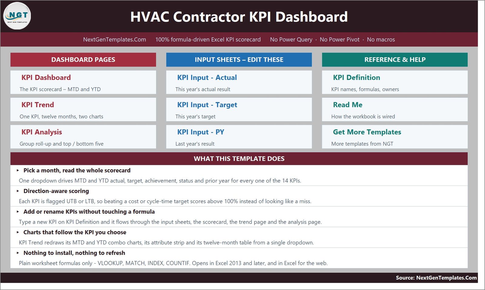
Before anything else, a name check, because three similarly titled HVAC templates exist and buyers mix them up. This article is about the KPI Dashboard: a month-picker scorecard with a 15-row traffic-light grid, a dedicated KPI Trend page and a KPI Analysis page, fed by three sheets you type into. It is not the HVAC Contractor KPI Scorecard, which is a card-style layout with a comparison-switch dropdown and one monthly data sheet, and it is not the analytical HVAC Service Dashboard, which sits on a transaction table with slicers and pivot charts. Same industry, three different builds.
Key Features of the HVAC Contractor KPI Dashboard in Excel
- One month dropdown drives the whole workbook. Cell D6 on the KPI Dashboard sheet picks the month. The seven summary cards, the 15-row grid and the entire KPI Analysis page re-read from it. There is no refresh step.
- Direction-aware achievement. Each KPI is typed UTB (upper the better) or LTB (lower the better). Achievement is Actual divided by Target for a UTB KPI and Target divided by Actual for an LTB one, so beating a 3.50-hour emergency response target scores 109.7 percent rather than looking like a shortfall. That single rule is what separates a real scorecard from a spreadsheet of percentages.
- Editable thresholds. On Target from 100 percent, At Risk 95 to 99 percent, Missed below 95 percent – and the numbers live in the formulas in columns L and U, so you can move them to match your own governance.
- MTD and YTD on the same row. Both blocks carry actual, target, achievement, status, prior year and vs-PY.
- A KPI master list that everything follows. KPI Definition holds number, group, name, unit, formula, definition, type, owner, priority and frequency. Rename a KPI there and all nine sheets pick it up. The sheets are wired for 22 KPI rows, so adding one needs no formula work.
- Twelve months of history per KPI on the KPI Trend page, with MTD and YTD combo charts.
- Group roll-up and rankings on the KPI Analysis page, including Top 5 and Bottom 5 for the year to date.
Dashboard Pages Explanation
Home
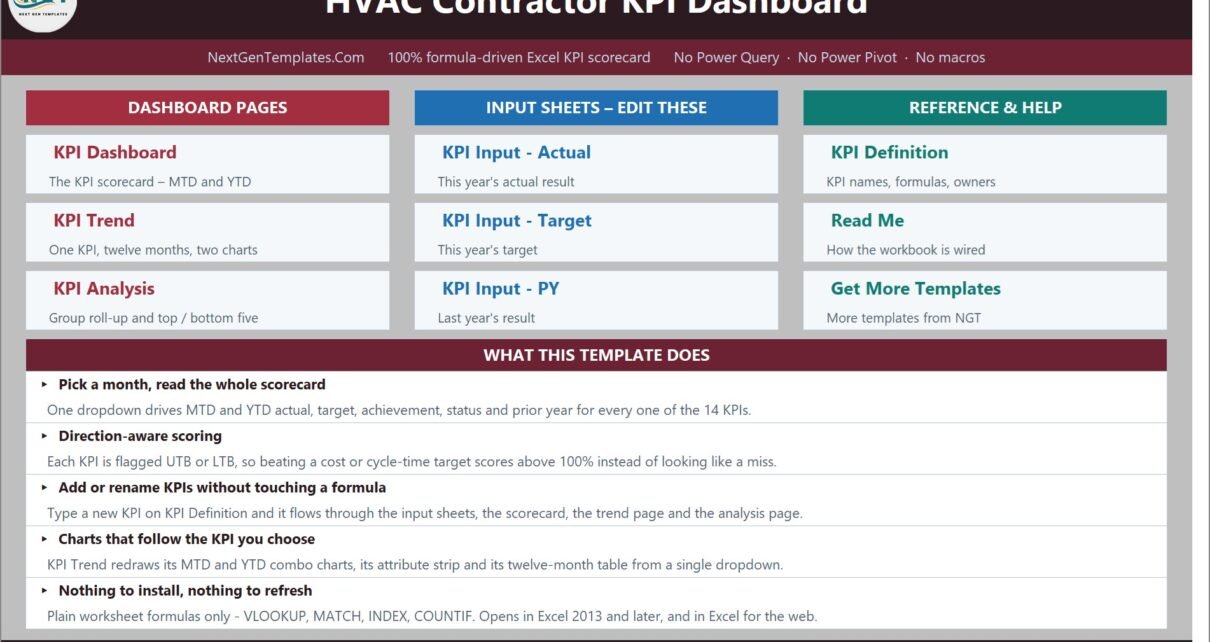
A navigation page grouped into Dashboard Pages, Input Sheets and Reference and Help, with a one-line description under each card and a “What This Template Does” panel underneath.
KPI Dashboard
The scorecard. Seven summary cards run along the top – Total KPIs Tracked, On Target (YTD), At Risk (YTD), Missed (YTD), Improving vs PY (MTD), Avg Achievement (MTD) and Avg Achievement (YTD). In the shipped sample for September 2025 those read 15, 6, 7, 2, 11 of 15, 99.1 percent and 98.8 percent. Below them, one row per KPI, split into a Month to Date block and a Year to Date block.
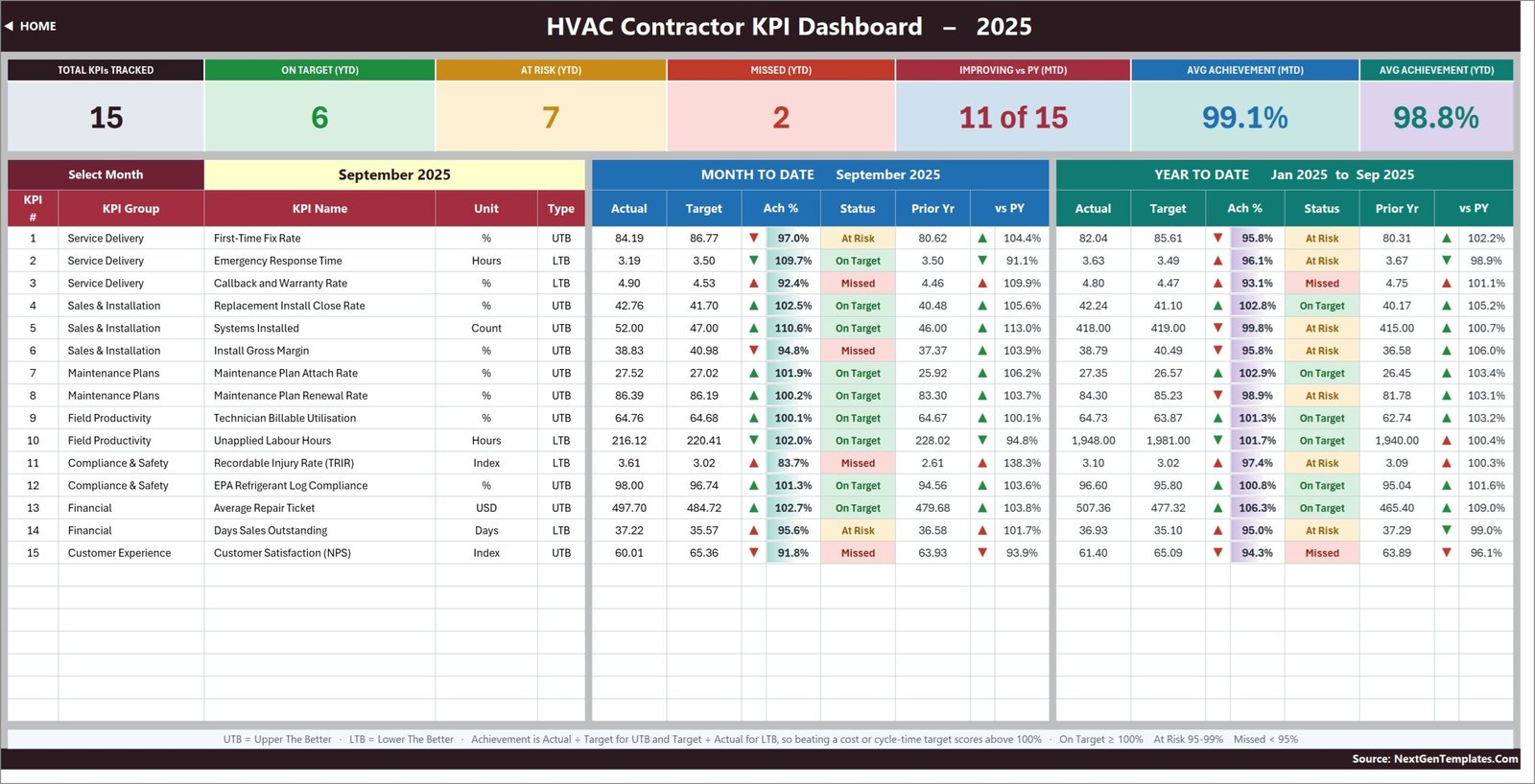
The 15 KPIs, by group:
- Service Delivery – First-Time Fix Rate, Emergency Response Time, Callback and Warranty Rate
- Sales and Installation – Replacement Install Close Rate, Systems Installed, Install Gross Margin
- Maintenance Plans – Maintenance Plan Attach Rate, Maintenance Plan Renewal Rate
- Field Productivity – Technician Billable Utilisation, Unapplied Labour Hours
- Compliance and Safety – Recordable Injury Rate (TRIR), EPA Refrigerant Log Compliance
- Financial – Average Repair Ticket, Days Sales Outstanding
- Customer Experience – Customer Satisfaction (NPS)
Five of those are lower-the-better, which is why the direction rule matters so much on this particular scorecard.
KPI Trend
One KPI at a time, chosen in cell B4. The attribute strip shows its group, unit, type, owner, priority and frequency; below it sit the formula and the plain-English definition; below that a twelve-month table with MTD, YTD and vs-PY columns; and at the bottom two combo charts – actual and prior-year columns with a target line – one for MTD and one for YTD.

KPI Analysis
Performance by KPI Group on the left – KPI count, On Target, At Risk, Missed and average achievement for MTD and YTD – with a bar chart of average YTD achievement by group beneath it. On the right, Top 5 and Bottom 5 Performing KPIs for the year to date, plus a short “How to read this page” panel. In the sample year the bottom of the list is Callback and Warranty Rate at 93.1 percent and Customer Satisfaction (NPS) at 94.3 percent, both Missed.

KPI Input – Actual, Target and PY
The three sheets you type in. Each holds an MTD and a YTD column for every month of the year, with the KPI rows driven by KPI Definition so the three always line up. Cell E3 on the Actual sheet is the first month of the reporting year; change it and the Target sheet, the Prior Year sheet, the month dropdown and every sheet title re-base themselves.
KPI Definition and Read Me
KPI Definition is the master list. Read Me explains the wiring in four blocks – the five-minute version, the rules the numbers follow, adding and renaming KPIs, and a sheet map. A hidden Support sheet holds the helper calculations and never needs editing.
HVAC Contractor KPI Dashboard in Excel vs. Google Sheets vs. Paid Field-Service SaaS – Feature Comparison
| What you get | This Excel template | Google Sheets edition | Field-service SaaS reporting |
|---|---|---|---|
| Cost | 19.99 one-off | 13.99 one-off | Per-technician monthly subscription |
| Platform | Excel 2013+, Microsoft 365, Excel for the web | Google Sheets, any browser | Vendor cloud plus mobile app |
| Setup time | Under 30 minutes | Under 30 minutes | Weeks, including migration and training |
| Real-time team collaboration | OneDrive or SharePoint co-authoring | Yes, native | Yes |
| Mobile access | Excel mobile app | Sheets mobile app | Yes, purpose-built |
| Customisable KPI list | Yes, up to 22 rows with no formula work | Yes | Only what the vendor exposes |
| Share with a link | OneDrive link | Yes | Inside your licence |
| Year-1 cost at 5 technicians | 19.99 | 13.99 | Thousands, and it recurs |
| Dispatch, job costing, invoicing | No | No | Yes |
| TRIR and refrigerant-log KPIs out of the box | Yes | Yes | Usually a custom report |
Who Should Use This Template
Owner-operators and general managers of residential and light-commercial HVAC firms who already have their numbers somewhere and want one page that scores them consistently. Service and install managers who run a monthly operations review. Controllers comparing branches on identical thresholds. Consultants and franchise support teams who need the same scorecard across several contractors.
It is the wrong tool if you expect it to pull data by itself, if you need dispatching or invoicing, or if you want the workbook to compute KPIs from raw job tickets. It takes the monthly result for each KPI as an input.
Real-World Use Cases
Catching a callback drift early. A nine-technician residential contractor watched Callback and Warranty Rate slide through the summer. On the KPI Analysis page it sat at the top of the Bottom 5, and the KPI Trend page pinned the month it started. That is a technician-training conversation with a date attached instead of a hunch.
Running a 20-minute monthly review. A service manager opens two pages: the scorecard for the closed month, then KPI Analysis so each group lead sees their own row. Nobody rebuilds a deck.
Comparing branches. A three-branch group keeps one copy per branch, edits only the input sheets, and compares Days Sales Outstanding and Install Gross Margin on the same rules.
Evidencing compliance discipline. TRIR and EPA refrigerant log compliance sit on the scorecard with the commercial KPIs, so safety and EPA Section 608 refrigerant recordkeeping are reviewed monthly rather than at audit time.
Advantages of the HVAC Contractor KPI Dashboard in Excel
- It opens anywhere. Plain worksheet formulas – VLOOKUP, MATCH, INDEX, COUNTIF – so there is no add-in to install, no macro warning and no data model to refresh. It works in Excel for the web too.
- Nothing is locked. No password, no hidden protection. Rebrand it, restructure it, extend it.
- The KPI list is data, not code. Because every sheet reads KPI Definition, changing the metrics is typing, not formula surgery.
- Honest lower-is-better handling. Response time, callbacks, unapplied hours, TRIR and DSO all score correctly instead of being inverted by hand.
- A full sample year ships with it, so you can judge the layout before committing your own data.
- One-off price. No seats, no renewal.
Opportunities for Improvement
Two things are worth knowing before you buy, and both are honest limitations rather than faults.
YTD is typed, not derived. Every input sheet has an MTD and a YTD column and you fill both. That is a deliberate design choice – it lets you decide whether a KPI accumulates (Systems Installed, Unapplied Labour Hours) or runs as an average (rates, indices, per-unit values) – but it does mean twice the typing, and a YTD figure that disagrees with its own months will not be flagged.
Two labels still say 14 KPIs. The Home sheet panel and the Read Me capacity row describe 14 filled-in KPIs; the file actually ships 15, and everything that calculates uses 15. It is a stale wording from an earlier draft, correctable in seconds, but it is on screen and you should not be surprised by it.
Beyond those: the Frequency column on KPI Definition is documentation, not a switch – the grid is monthly for every KPI – and the workbook has no alerts, no email reminders and no imports.
Best Practices
- Cut before you add. Clear the KPIs you will not actually collect. A scorecard with nine honest metrics beats fifteen with five guesses in them.
- Fix the definition first. Write your own wording into the Definition column on KPI Definition so first-time fix means the same thing to dispatch and to the service manager.
- Name an owner per KPI. The Owner column is there for a reason; an unowned KPI never improves.
- Set targets for all twelve months up front, including the seasonal swing. HVAC demand is not flat, and a flat target makes summer look like a triumph and February like a failure.
- Decide accumulate-or-average per KPI before you type a single YTD figure, and stay consistent all year.
- Review the Bottom 5 first, then the group roll-up. Ten minutes there is worth an hour of scrolling the grid.
- Keep one file per reporting entity, not one file with branch columns bolted on.
Explore Relevant Templates
- HVAC Contractor KPI Dashboard in Excel – the template in this article.
- HVAC Contractor KPI Dashboard in Power BI – the same scorecard rebuilt for Power BI Desktop.
- HVAC Contractor KPI Dashboard in Google Sheets – the browser-based edition.
- HVAC Contractor KPI Scorecard in Excel – the card-style sibling with a comparison switch.
- Plumbing Business KPI Dashboard in Excel and Electrical Contractor KPI Scorecard in Excel – the same approach for the other trades.
- HVAC Service Dashboard in Excel – the analytical alternative, built on a transaction table with slicers.
Frequently Asked Questions
How many KPIs does the HVAC Contractor KPI Dashboard track?
Fifteen, in seven groups, and the sheets are wired for up to 22 without any formula work. Two descriptive labels on the Home and Read Me sheets still read 14 from an earlier draft; the calculations all use 15.
Does it need macros or Power Query?
Neither. It is a plain .xlsx built on worksheet formulas, so it opens in Excel 2013 and later and in Excel for the web with nothing to enable.
Can I connect it to my field-service or accounting software?
No. You type the monthly KPI values into the three input sheets. If you want automated refresh, look at the Power BI edition and point it at your own source.
How is achievement calculated for a lower-is-better KPI?
Target divided by Actual. So a 3.19-hour response against a 3.50-hour target scores 109.7 percent, and a rising cost scores below 100 percent, exactly the way a revenue miss does. Microsoft’s own VLOOKUP documentation covers the lookup mechanics if you want to trace the formulas.
Can I add my own KPI groups?
Yes. Type a new group name in the KPI Group column on KPI Definition and it appears on the KPI Analysis roll-up automatically.
Is it editable and rebrandable?
Fully. Nothing is locked or hidden, so colours, logos and headings are all yours to change.
About the Author
Built by PK – Microsoft Certified Professional with 15+ years of Excel, Google Sheets, and Power BI experience. Founder of NextGenTemplates, reaching 300K+ subscribers across YouTube channels. Every template is hand-built and tested before release.
Conclusion
An HVAC scorecard only earns its place if the same 15 numbers appear, defined the same way, every month – and if a cost coming down reads as a win rather than a red cell. The HVAC Contractor KPI Dashboard in Excel does that in a file that opens on any machine, with a KPI list you can rewrite in an afternoon and thresholds you can set to your own standard. Type your numbers over the sample year, pick a month, and the review runs itself.
For walkthroughs of this and the rest of the range, subscribe on youtube.com/@PKAnExcelExpert.