In today’s fast-paced business environment, managing office assets effectively is crucial for optimizing resource utilization and minimizing operational costs. The Office Asset Management Dashboard in Power BI offers an innovative solution for tracking and managing office assets with real-time data visualization. This dashboard not only provides a clear overview of asset status but also enables insightful analysis of asset performance across various dimensions such as vendor, department, and asset type. In this article, we will explore the features, advantages, and best practices of using this dashboard, helping organizations streamline asset management processes and make data-driven decisions.
Click to Purchases Office Asset Management Dashboard in Power BI
What is the Office Asset Management Dashboard in Power BI?
The Office Asset Management Dashboard is a ready-to-use Power BI template designed to simplify and enhance the management of office assets. By capturing data in an Excel file, this dashboard seamlessly integrates with Power BI to deliver powerful insights into asset performance, including key metrics like asset depreciation, warranty status, and asset age.
Key Features of the Office Asset Management Dashboard in Power BI
This Office Asset Management Dashboard includes five key pages, each dedicated to a specific aspect of asset management. Below is a breakdown of each page’s functionality:
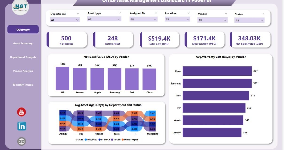
Overview Page
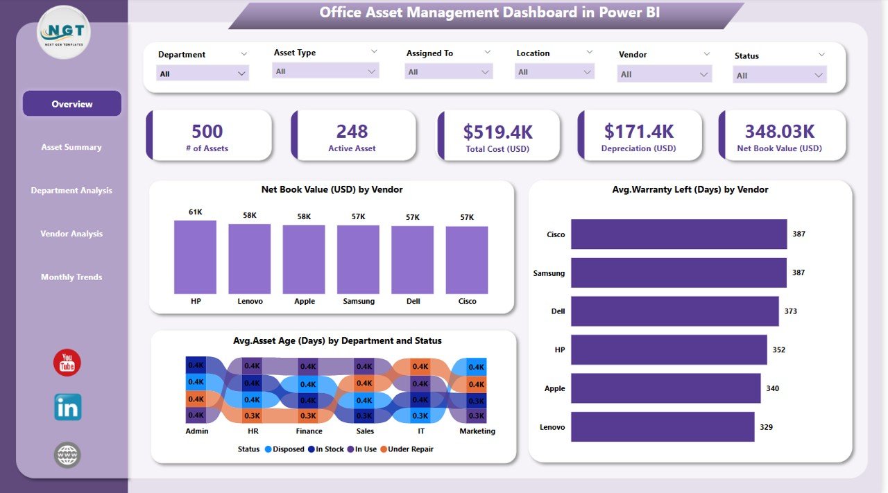
The Overview Page serves as the central hub of the dashboard. It provides a comprehensive snapshot of asset-related metrics and visualizations.
-
Key Metrics: The page includes 5 cards displaying key performance indicators (KPIs) such as total net book value, total assets, and more.
Charts:
- Net Book Value (USD) by Vendor: This chart visualizes the total net book value of assets by each vendor.
- Avg. Warranty Left (Days) by Vendor: A chart showing the average warranty left for assets categorized by vendor.
- Avg. Asset Age (Days) by Department and Status: This chart provides insights into the average age of assets by department and their current status.
Asset Summary Page
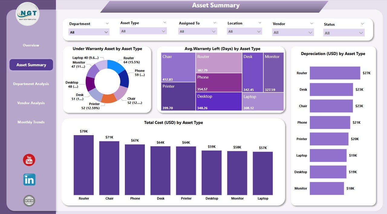
The Asset Summary Page dives deeper into the details of each asset type. It focuses on the condition and depreciation of assets.
-
Key Metrics: Similar to the overview, this page includes 6 silencers for filtering the data across different parameters.
Charts:
- Under Warranty Asset by Asset Type: This chart shows the number of assets under warranty, categorized by asset type.
- Avg. Warranty Left (Days) by Asset Type: Visualizes the average warranty left for each asset type.
- Depreciation (USD) by Asset Type: Displays the total depreciation in USD for each asset type.
- Total Cost (USD) by Asset Type: Represents the total cost of assets based on their type.
Department Analysis Page
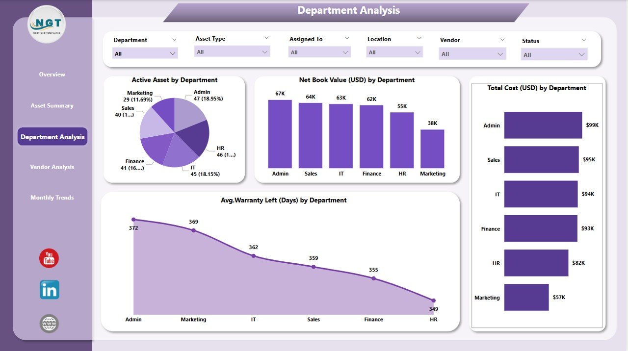
The Department Analysis Page provides insights into asset distribution and performance across various departments.
-
Key Metrics: The page includes 6 silencers for advanced data filtering.
Charts:
- Active Asset by Department: Displays the number of active assets in each department.
- Net Book Value (USD) by Department: Shows the net book value of assets per department.
- Total Cost (USD) by Department: Displays the total cost of assets by department.
- Avg. Warranty Left (Days) by Department: Visualizes the average warranty left for assets in each department.
Click to Purchases Office Asset Management Dashboard in Power BI
Vendor Analysis Page
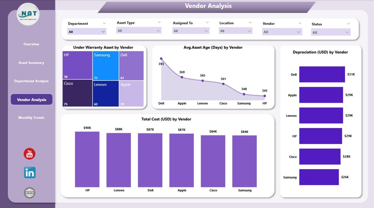
The Vendor Analysis Page helps track the performance and value of assets by vendor.
-
Key Metrics: This page also includes 6 silencers for data filtering.
Charts:
- Under Warranty Asset by Vendor: Tracks assets under warranty by vendor.
- Avg. Asset Age (Days) by Vendor: Displays the average age of assets by vendor.
- Depreciation (USD) by Vendor: Shows the depreciation of assets by vendor.
- Total Cost (USD) by Vendor: Visualizes the total cost of assets by vendor.
Monthly Trends Page
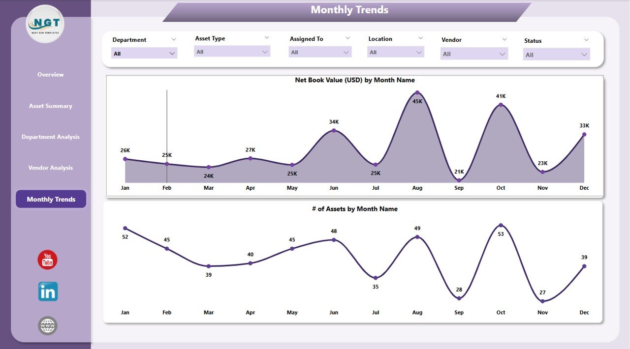
The Monthly Trends Page tracks asset performance over time, allowing organizations to see how assets evolve month by month.
-
Key Metrics: This page has 6 silencers for granular data filtering.
Charts:
- Net Book Value (USD) by Month: Visualizes the net book value of assets month by month.
- # of Assets by Month: Displays the total number of assets added or removed each month.
Advantages of Using the Office Asset Management Dashboard in Power BI
The Office Asset Management Dashboard in Power BI offers several benefits that make it a powerful tool for organizations:
1. Real-Time Insights
By integrating data from Excel into Power BI, the dashboard provides real-time insights into asset performance. This enables decision-makers to track asset status, depreciation, warranty periods, and more, without delays.
2. Centralized Asset Data
All asset-related data is consolidated in one place. This eliminates the need to juggle multiple spreadsheets or systems, saving time and reducing the risk of errors.
3. Customizable Data Views
The use of slicers in Power BI allows users to customize their view based on various parameters like asset type, department, vendor, and more. This makes it easy to drill down into specific areas of interest.
4. Improved Asset Lifecycle Management
By tracking assets over time, organizations can manage their asset lifecycles more effectively, optimizing asset usage, ensuring timely maintenance, and planning for replacements.
5. Cost Optimization
With the ability to track depreciation, warranty status, and costs by vendor, department, and asset type, organizations can identify opportunities to reduce asset-related costs, such as switching vendors or renegotiating contracts.
6. Data-Driven Decision Making
The dashboard’s visualizations and interactive features enable decision-makers to make data-driven decisions about asset management, improving operational efficiency and reducing overhead costs.
Best Practices for Office Asset Management Using Power BI
To maximize the benefits of the Office Asset Management Dashboard in Power BI, here are some best practices:
1. Keep Your Data Clean and Updated
Ensure that your asset data is regularly updated in Excel and free from duplicates or errors. Clean data ensures accurate reporting and analysis in Power BI.
2. Utilize Filters and Slicers Effectively
Leverage slicers and filters to customize views and zoom in on specific asset groups. This makes the dashboard more flexible and tailored to various departments or user needs.
3. Review Asset Performance Regularly
Make it a habit to review asset performance at regular intervals. This includes monitoring warranty status, asset depreciation, and total cost to ensure optimal asset management.
4. Collaborate with Teams
Encourage collaboration across departments by sharing the dashboard with relevant stakeholders. Different teams (finance, IT, operations) can gain insights into how assets are performing and make informed decisions.
5. Focus on Key Metrics
While the dashboard offers a wealth of information, focusing on key metrics (like warranty status, net book value, and asset age) helps prioritize asset management efforts and ensure that resources are allocated efficiently.
6. Track Trends Over Time
Use the Monthly Trends page to monitor how assets evolve over time. Tracking monthly trends can help identify patterns, such as asset aging or increasing costs, enabling proactive management.
Conclusion
The Office Asset Management Dashboard in Power BI is an invaluable tool for businesses looking to streamline their asset management processes. With its user-friendly interface, customizable data views, and powerful visualizations, this dashboard allows organizations to track and manage assets more effectively, reduce costs, and make informed decisions. By adopting best practices and regularly reviewing asset performance, companies can ensure their assets are utilized optimally and their operations remain efficient.
Frequently Asked Questions (FAQs)
1. What is the Office Asset Management Dashboard in Power BI?
The Office Asset Management Dashboard in Power BI is a tool that integrates data from Excel to provide real-time insights into asset management. It offers key metrics like asset depreciation, warranty status, and asset age, helping organizations manage their assets efficiently.
2. How does the dashboard help in asset management?
The dashboard provides interactive visualizations that allow users to monitor asset performance across various categories, such as vendor, department, and asset type. This helps organizations track asset conditions, manage depreciation, and make data-driven decisions.
3. Can the dashboard be customized for different departments?
Yes, the dashboard can be customized using slicers and filters, allowing users to focus on specific departments, vendors, or asset types. This customization enables departments to view the data most relevant to them.
4. What are the benefits of using Power BI for asset management?
Power BI offers real-time insights, customizable views, and data-driven visualizations. It helps businesses optimize asset usage, reduce costs, and track asset performance over time. By centralizing asset data, Power BI improves decision-making and efficiency.
5. How do I update the asset data in Power BI?
The asset data is typically stored in an Excel file, which can be updated regularly. Once the Excel file is updated, Power BI automatically syncs the data, ensuring that the dashboard reflects the most current information.
Visit our YouTube channel to learn step-by-step video tutorials