In today’s fast-paced business environment, managing vendors efficiently is critical to ensure timely deliveries, optimal pricing, and consistent quality. But how can you track all these moving parts and make data-driven decisions? The answer lies in a Vendor Performance Dashboard in Power BI.
This powerful, ready-to-use solution helps organizations analyze vendor-related metrics across various dimensions such as cost, delivery performance, ratings, and more. In this article, we’ll explore the key features, advantages, best practices, and frequently asked questions related to using this dashboard for better vendor management.
Click to Purchases Vendor Performance Dashboard in Power BI
What is the Vendor Performance Dashboard in Power BI?
The Vendor Performance Dashboard in Power BI is a dynamic and interactive tool designed to help procurement and supply chain teams monitor vendor-related KPIs in real time. It uses data sourced from an Excel file and presents it in a clean, visual format inside Power BI.
With five detailed pages and numerous slicers, charts, and KPIs, this dashboard provides a comprehensive view of vendor activities, enabling managers to evaluate vendor effectiveness and take action where necessary.
Key Features of the Vendor Performance Dashboard
The dashboard consists of five insightful pages, each focusing on a specific area of vendor performance:
Overview Page
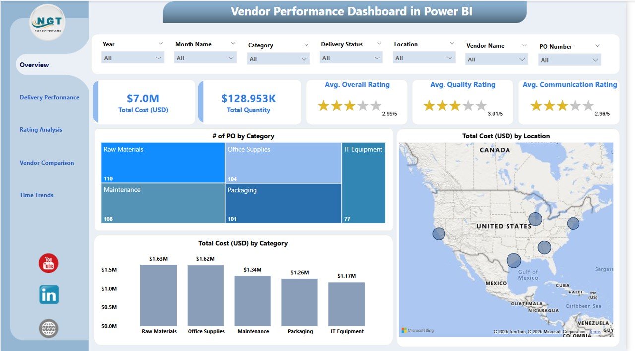
This is the heart of the dashboard where you can find:
-
7 slicers to filter the data by Vendor, Category, Location, etc.
-
5 KPI cards showing total POs, quantity, total cost, average delivery days, and rating.
3 visual charts:
- Number of POs by Category
- Total Cost (USD) by Location
- Total Cost (USD) by Category
This page gives you a snapshot of all essential vendor metrics at a glance.
Delivery Performance Page

Tracking on-time deliveries is crucial. This page includes:
-
7 slicers for better filtering
3 visualizations:
- Number of POs by Delivery Status
- Total Cost (USD) by Delivery Status
- Quantity Delivered by Delivery Status
You can quickly identify late deliveries and high-risk vendors through these visual cues.
Rating Analysis Page

Vendor rating is based on key attributes like quality, communication, and overall satisfaction.
Charts included:
- Average Quality Rating by Category
- Average Communication Rating by Location
- Overall Rating by Vendor Name
This helps compare vendor experience and satisfaction across business units or categories.
Click to Purchases Vendor Performance Dashboard in Power BI
Vendor Comparison Page

Need to compare vendors side-by-side?
3 insightful visuals:
- Total Quantity by Vendor Name
- Total Cost (USD) by Vendor Name
- Number of POs by Vendor Name
This makes it easy to identify top-performing vendors and underperformers.
Time Trends Page

This final page tracks performance over time.
Charts include:
- Number of POs by Month
- Total Cost (USD) by Month
- Quantity Ordered by Month
These trends help identify seasonal patterns or procurement shifts.
Why Use a Vendor Performance Dashboard?
Vendor management goes beyond just placing orders. You need to assess performance, build partnerships, and reduce risks. Here’s why using this dashboard makes sense:
1. Real-Time Monitoring
Get live updates and insights as data changes in the source Excel file.
2. Data-Driven Decisions
Use visual data to negotiate better contracts and choose reliable vendors.
3. Risk Mitigation
Spot delivery delays, rising costs, or quality issues early on.
4. Better Vendor Relationships
Identify reliable vendors and foster long-term partnerships.
Advantages of the Vendor Performance Dashboard in Power BI
Let’s dive deeper into the benefits of using this dashboard:
✅ Time-Saving: Automated insights save hours of manual data analysis.
✅ Interactive Visuals: Use slicers to segment data by vendor, category, location, and time.
✅ Customizable: Tailor the dashboard for your specific industry or department needs.
✅ Scalable: Works whether you’re tracking 10 vendors or 1,000.
✅ Improved Accuracy: Reduces human error in performance evaluation.
✅ Enhanced Negotiation: Use solid data to drive procurement discussions.
✅ Actionable KPIs: KPIs like delivery performance or average cost can trigger decisions instantly.
Click to Purchases Vendor Performance Dashboard in Power BI
Best Practices for Using the Vendor Performance Dashboard
To get the most value from your dashboard, follow these proven tips:
➤ Maintain Clean Data
Ensure the Excel input file is accurate, consistent, and regularly updated.
➤ Use Filters Smartly
Apply slicers thoughtfully to avoid misinterpreting the visualized data.
➤ Set Performance Thresholds
Color-code key KPIs using conditional formatting for quick alerts.
➤ Refresh Data Regularly
Update the data at least weekly or in sync with procurement cycles.
➤ Train Procurement Teams
Ensure users understand how to interpret charts and KPIs.
➤ Review Monthly
Conduct monthly performance reviews using the Time Trends and Vendor Comparison pages.
How to Set Up Your Vendor Performance Dashboard
-
Prepare Your Excel File
-
Include fields like PO Number, Vendor Name, Quantity, Category, Delivery Status, Cost, Ratings, etc.
-
-
Import the Data into Power BI
-
Use Power Query to clean and format the data.
-
-
Build Relationships
-
Create relationships between tables like vendors, orders, and ratings.
-
-
Create DAX Measures
-
Define KPIs like average delivery time or cost per PO.
-
-
Design Visuals
-
Use bar charts, cards, pie charts, and line graphs as per each page’s requirement.
-
-
Test Slicers
-
Ensure filters work seamlessly across pages.
-
-
Publish and Share
-
Share the dashboard within your organization via Power BI Service.
-
Use Cases: Who Can Benefit?
The Vendor Performance Dashboard is ideal for:
-
Procurement Teams: Track vendor reliability and cost trends.
-
Supply Chain Managers: Improve delivery timelines and vendor alignment.
-
Finance Teams: Monitor spend and identify high-cost vendors.
-
Quality Control: Evaluate vendor quality ratings.
-
Top Management: Get a big-picture view of vendor contribution and risks.
KPIs You Should Track
Here are some important KPIs featured in the dashboard:
-
Number of POs per Vendor
-
Total Procurement Cost
-
Quantity Ordered by Vendor
-
On-Time Delivery %
-
Average Quality Rating
-
Overall Rating
-
Monthly Spend Trend
-
Delivery Delay %
Tracking these KPIs helps create a vendor scorecard for internal benchmarking.
Conclusion
The Vendor Performance Dashboard in Power BI brings transparency, speed, and intelligence to your vendor management process. With five focused pages and multiple visual components, you can identify top vendors, spot weak performers, analyze delivery patterns, and much more.
Whether you’re running a small business or managing global suppliers, this dashboard is your go-to tool for making informed procurement decisions.
Frequently Asked Questions (FAQs)
1. What is the purpose of a Vendor Performance Dashboard?
A Vendor Performance Dashboard helps businesses monitor and assess vendor metrics like delivery time, cost, quality, and quantity using visual reports.
2. Can I customize this dashboard for my industry?
Yes! You can modify charts, KPIs, or slicers to fit any industry, from manufacturing to retail or IT services.
3. What data source does this dashboard use?
It uses a structured Excel file as the data source, which makes it easy to update and maintain.
4. How often should I refresh the dashboard data?
It depends on your operational cycle. Weekly or monthly refreshes are standard for procurement reviews.
5. What skills do I need to use this dashboard?
Basic Power BI knowledge is sufficient. Familiarity with slicers, filters, and simple DAX measures is helpful.
6. Can I compare multiple vendors at once?
Yes. Use the Vendor Comparison Page to see cost, quantity, and PO count by vendor side-by-side.
7. How does this help in decision-making?
With KPIs and visual trends, you can make faster, data-backed decisions about which vendors to keep, renegotiate with, or replace.
8. Does it show monthly trends in procurement?
Absolutely! The Time Trends Page displays monthly metrics, allowing trend spotting and seasonality analysis.
9. Can I track vendor ratings with this dashboard?
Yes. The Rating Analysis Page shows average quality, communication, and overall ratings.
10. Is this dashboard suitable for large enterprises?
Yes. It scales well with large datasets and multiple vendor types, making it perfect for enterprises.
Visit our YouTube channel to learn step-by-step video tutorials
Click to Purchases Vendor Performance Dashboard in Power BI