Energy efficiency is no longer a choice—it is a necessity for organizations that want to reduce costs, improve sustainability, and meet regulatory standards. Companies across industries are now focusing on monitoring and managing their energy usage more effectively. However, manual tracking through traditional spreadsheets often becomes messy, inaccurate, and time-consuming.
This is where an Energy Dashboard in Excel comes into play. It combines the familiarity of Microsoft Excel with dynamic charts, slicers, and automated calculations, giving managers a clear picture of energy consumption patterns, cost savings, efficiency levels, and environmental impact.
In this article, we will explore the key features of an Excel-based Energy Dashboard, its advantages, how organizations can use it, and the best practices to maximize its value.
Click to Purchases Energy Dashboard in Excel
What Is an Energy Dashboard in Excel?
An Energy Dashboard in Excel is a pre-built analytical tool designed to track, monitor, and visualize energy data. It works as a central hub where you can bring together multiple data points—like energy consumption, efficiency scores, project performance, CO2 emissions, and budget vs. actual costs—and convert them into easy-to-understand reports.
Unlike static spreadsheets, this dashboard offers interactive navigation, filters, and charts that provide real-time insights into energy management. Managers can identify trends, compare performance across departments, and make quick, data-driven decisions.
Key Features of the Energy Dashboard
The Energy Dashboard template comes with five interactive pages, each designed for a specific level of analysis. Here’s a breakdown:
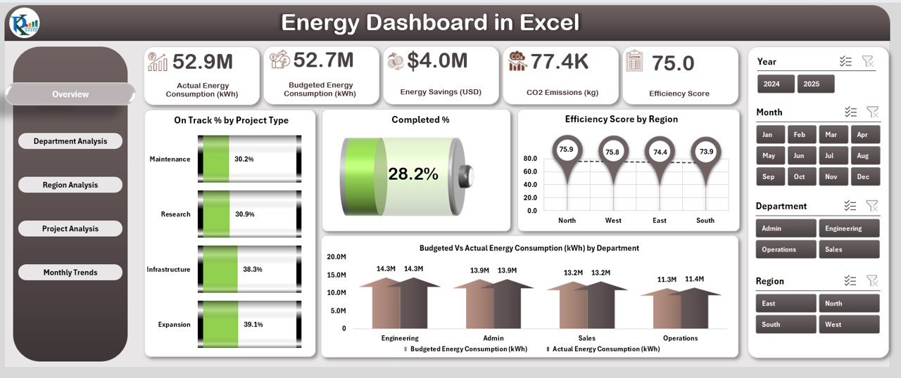
Overview Page
-
Acts as the main summary page of the dashboard.
-
Displays five key cards with metrics like overall energy consumption, efficiency percentage, completed projects, and more.
Includes four charts for quick analysis:
- On-Time % by Project Type
- Completed %
- Efficiency Score by Region
- Budget vs. Actual Energy Consumption (kWh) by Department
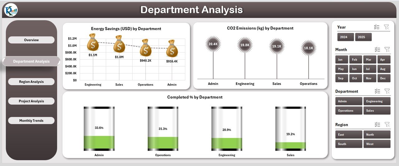
Department Analysis Page
-
Focuses on department-wise performance.
Provides three detailed charts:
- Energy Saving (USD) by Department
- CO2 Emission (KG) by Department
- Completed % by Department
Click to Purchases Energy Dashboard in Excel
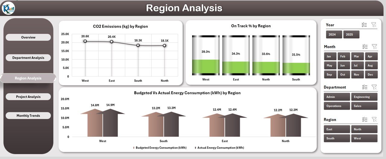
Region Analysis Page
-
Breaks down energy data by geographical region.
Key charts include:
- CO2 Emission (KG) by Region
- On-Time % by Region
- Budget vs. Actual Energy Consumption (kWh) by Region
Project Analysis Page
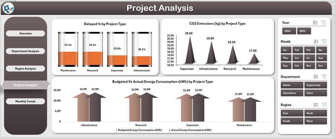
-
Designed to analyze performance based on project type.
Displays metrics like:
- Delayed % by Project Type
- CO2 Emission (KG) by Project Type
- Budget vs. Actual Energy Consumption (kWh) by Project Type
Monthly Trends Page
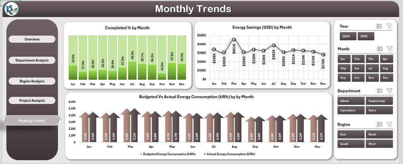
-
Tracks time-based performance with monthly insights.
Three important charts:
- Completed % by Month
- Energy Saving (USD) by Month
- Budget vs. Actual Energy Consumption (kWh) by Month
Data & Support Sheets
-
Data Sheet: Holds all raw energy data inputs that drive the dashboard visuals.
-
Support Sheet: Contains reference values, drop-down lists, and helper formulas for smooth functioning.
Why Use Excel for Energy Dashboards?
Many businesses already use Excel daily, which makes this dashboard highly accessible. Let’s look at the benefits:
-
Familiar Platform: No need for expensive software or lengthy training.
-
Interactive Charts: Users can apply filters, slicers, and pivots to view data from multiple angles.
-
Cost-Effective: A one-time setup that requires no recurring license fees.
-
Customizable: You can modify layouts, formulas, and visuals to match your organization’s needs.
-
Scalable: Can handle large datasets with the right formatting and structure.
Advantages of an Energy Dashboard in Excel
1. Real-Time Decision Making
Managers can access up-to-date performance insights, enabling faster and more accurate decision-making.
2. Improved Cost Efficiency
By tracking budget vs. actual consumption, companies can easily identify areas where energy costs exceed expectations.
3. Enhanced Sustainability
The dashboard highlights CO2 emissions and energy savings, helping organizations track their sustainability goals.
4. Better Accountability
Since the data is broken down by department, region, and project type, managers can assign accountability to specific units.
5. Simplified Reporting
Instead of preparing lengthy manual reports, the dashboard generates visual insights automatically.
Opportunities for Improvement in Energy Dashboards
Even though Excel dashboards are powerful, they also have some areas for growth:
-
Automation: Integrating with real-time IoT energy meters or APIs would reduce manual data entry.
-
Scalability: For very large organizations, Power BI or Tableau might be better for handling massive datasets.
-
Advanced Analytics: Adding predictive modeling (like forecasting energy use) could make dashboards more strategic.
-
Collaboration: Since Excel is file-based, multiple users working simultaneously might cause version issues.
Best Practices for Building and Using an Energy Dashboard
To get the maximum benefits, organizations should follow these practices:
✅ Standardize Data Entry: Use drop-downs and pre-defined formats to avoid errors.
✅ Automate Updates: Link your data sheet to a source file or database for automatic refresh.
✅ Keep It Simple: Do not overload the dashboard with too many charts. Focus on the most relevant KPIs.
✅ Use Conditional Formatting: Add arrows, progress bars, or traffic light indicators for clarity.
✅ Review Monthly: Conduct regular reviews to ensure data accuracy and relevance.
✅ Train Staff: Ensure all users know how to filter, interpret, and update the dashboard.
How to Implement an Energy Dashboard in Your Organization
-
Identify KPIs: Define metrics such as energy savings, CO2 emissions, efficiency scores, and budget utilization.
-
Gather Data: Collect monthly or weekly energy consumption data across departments and regions.
-
Input into Excel: Populate the data sheet with structured fields.
-
Use Dashboard Template: Connect the data with pre-built charts and slicers.
-
Analyze Trends: Use the dashboard to spot inefficiencies and opportunities for savings.
-
Take Action: Implement changes in projects, departments, or processes based on insights.
Use Cases of an Energy Dashboard in Excel
1. Corporate Sustainability Reporting
Companies can include visual charts from the dashboard in their annual sustainability reports.
2. Facility Management
Facilities teams can track energy consumption per building or region.
3. Manufacturing Plants
Plant managers can monitor energy consumption by machine, line, or process.
4. Government Agencies
Agencies can track compliance with energy efficiency targets across projects.
5. Educational Institutions
Schools and universities can monitor electricity consumption in different campuses or departments.
Step-by-Step Example: Budget vs. Actual Energy Consumption
Suppose your company set a monthly target of 50,000 kWh for energy use in the production department. At the end of the month, the actual usage recorded is 60,000 kWh.
-
Variance = Actual – Budget = 60,000 – 50,000 = +10,000 kWh
-
This variance is displayed visually in the dashboard, making it clear that energy consumption exceeded the target by 20%.
-
The manager can then investigate the reason (machine inefficiency, process delays, or over-utilization).
Future of Energy Dashboards
The future lies in combining Excel with automation and AI. For example:
-
IoT Integration: Automated real-time data feed from smart meters.
-
AI Forecasting: Predicting peak demand periods for better load management.
-
Cloud Collaboration: Dashboards hosted online for shared access.
-
Integration with BI Tools: Seamless migration from Excel to Power BI for large organizations.
Conclusion
The Energy Dashboard in Excel is a powerful yet simple solution for organizations that want to improve energy efficiency, reduce costs, and track sustainability progress. It brings clarity to complex data and helps managers make informed decisions. While it may not have all the advanced features of dedicated BI tools, its accessibility and flexibility make it an ideal choice for small to mid-sized businesses.
By following best practices and continuously improving the setup, companies can ensure that their energy dashboard becomes a cornerstone of smarter energy management.
Frequently Asked Questions (FAQs)
1. What is an Energy Dashboard in Excel?
It is a pre-built template that tracks energy data such as consumption, savings, CO2 emissions, and efficiency, with interactive charts and slicers.
2. Who can use this dashboard?
Facilities managers, sustainability officers, corporate managers, manufacturing plants, and even educational institutions can use it.
3. What kind of data do I need?
You need data on monthly or weekly energy consumption, budget targets, project details, and regional or departmental breakdowns.
4. Can I customize the dashboard?
Yes. You can add or remove KPIs, change chart types, or include your company branding.
5. Is Excel enough for large organizations?
Excel works well for small and mid-sized businesses. Large organizations with huge datasets might consider tools like Power BI or Tableau.
6. How often should I update the dashboard?
Most companies update it monthly, but it depends on your monitoring needs. Weekly or even daily updates are possible if data is available.
7. Does this dashboard support sustainability reporting?
Yes. It includes CO2 emission and energy saving metrics that directly align with corporate sustainability goals.
8. What is the future of energy dashboards?
The future includes IoT integration, AI-based forecasting, cloud hosting, and advanced visualization with BI tools.
Visit our YouTube channel to learn step-by-step video tutorials