The insurance and finance sectors depend heavily on data accuracy and risk analysis. Actuaries play a vital role in analyzing uncertainties, predicting future outcomes, and ensuring financial stability. However, with vast amounts of data — from claims and premiums to risk categories and satisfaction ratings — managing and visualizing this information can be overwhelming.
That’s where the Actuarial Services Dashboard in Excel comes in.
This ready-to-use Excel template empowers actuaries and insurance analysts to track, visualize, and interpret key performance indicators (KPIs) across multiple domains — including claims management, policy analysis, and risk assessment.
In this detailed guide, you’ll discover everything about the Actuarial Services Dashboard in Excel — its structure, features, advantages, best practices, and frequently asked questions.
Click to Purchases Actuarial Services Dashboard in Excel
💼 What Is an Actuarial Services Dashboard in Excel?
An Actuarial Services Dashboard in Excel is a data visualization and analysis tool designed specifically for actuaries, insurance professionals, and risk managers.
It consolidates large datasets into easy-to-read visuals that help evaluate claims performance, policy distribution, risk exposure, regional performance, and customer satisfaction — all within a single Excel file.
Instead of manually analyzing spreadsheets, this dashboard automates performance tracking through interactive charts, KPIs, and slicers — saving time and reducing errors.
🧾 Key Features of the Actuarial Services Dashboard in Excel
The Actuarial Services Dashboard is structured into five analytical pages supported by data and reference sheets. Each page provides deep insights into different operational aspects of actuarial services.
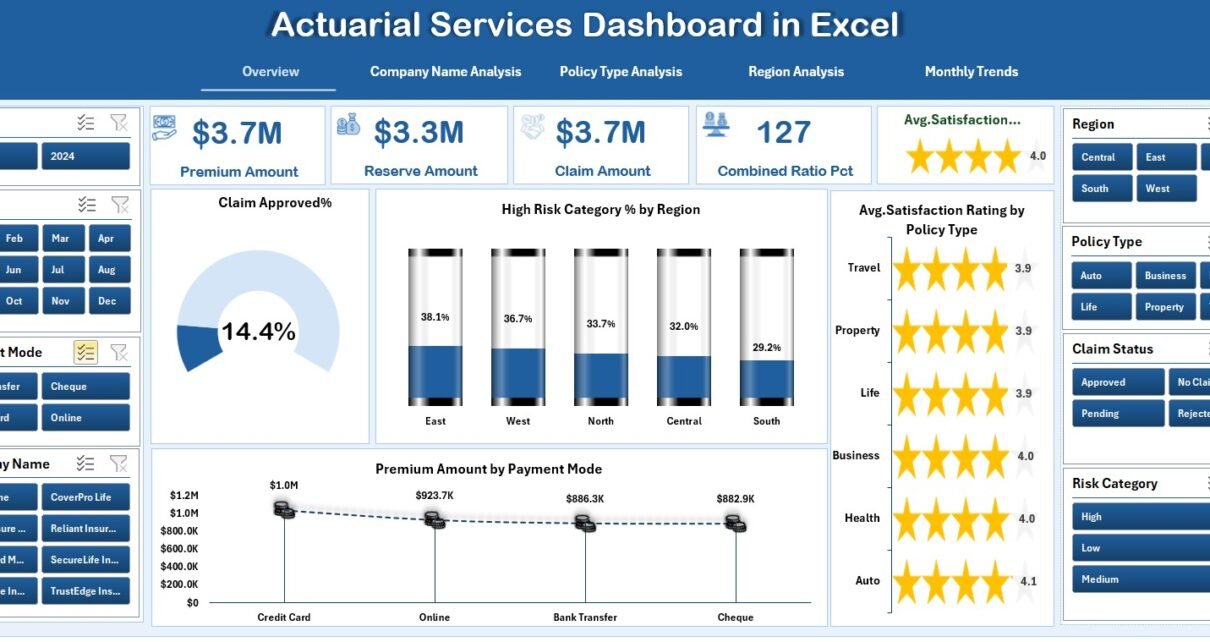
1️⃣ Overview Page – Your Central Insight Hub
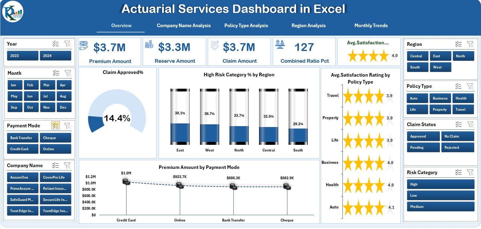
The Overview Page acts as the main interface. On the left side, you’ll find a page navigator that allows instant switching between all analysis pages.
Key visual components include:
-
5 KPI cards displaying vital metrics such as Total Claims, Premium Amount, and Customer Satisfaction.
-
4 interactive charts:
-
Claim Approved %
-
High-Risk Category % by Region
-
Premium Amount by Payment Mode
-
Average Satisfaction Rating by Policy Type
-
This page delivers a 360° summary of business performance, helping actuaries identify immediate risk or profitability trends.
Click to Purchases Actuarial Services Dashboard in Excel
2️⃣ Company Name Analysis – Compare Insurer Performance
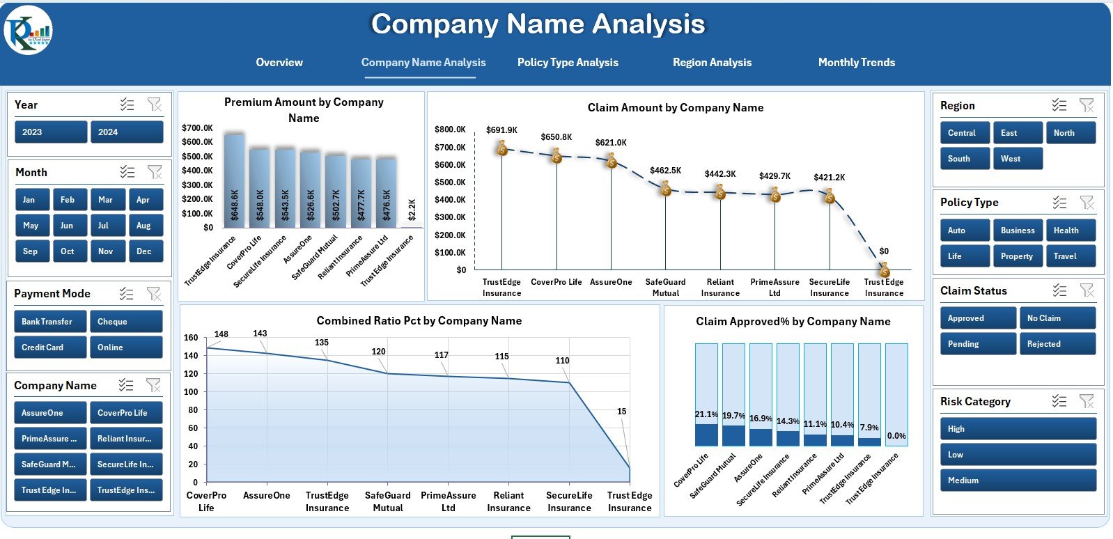
The Company Name Analysis Page focuses on comparing multiple insurance providers.
It includes:
-
4 charts showing:
-
Premium Amount by Company Name
-
Claim Amount by Company Name
-
Combined Ratio (%) by Company Name
-
Claim Approved % by Company Name
-
By reviewing this page, actuaries can identify which companies maintain healthy claim ratios or need better risk mitigation strategies.
3️⃣ Policy Type Analysis – Evaluate Policy Effectiveness
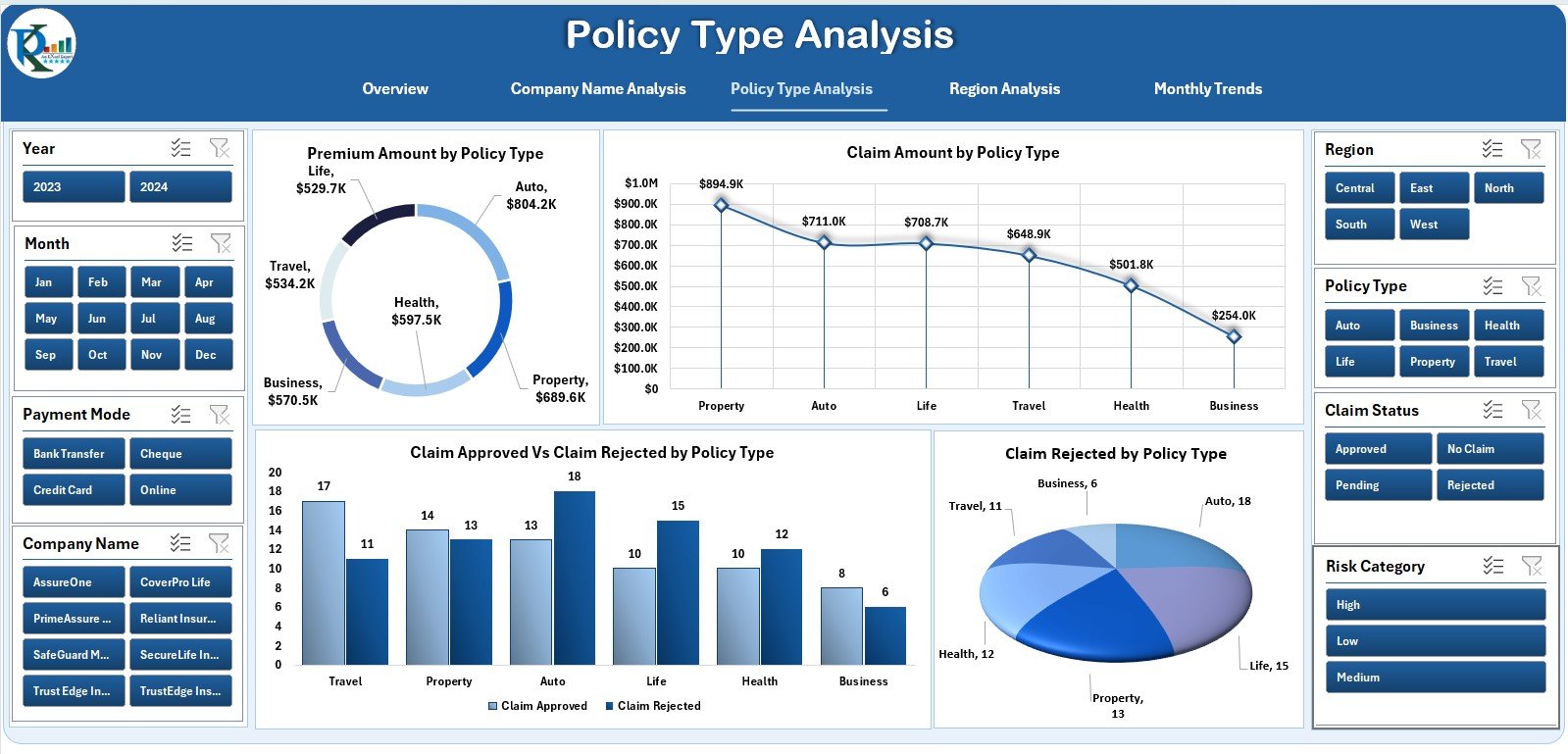
This page allows actuaries to assess performance across different policy types — such as health, motor, or life insurance.
Charts include:
-
Premium Amount by Policy Type
-
Claim Amount by Policy Type
-
Claim Approved vs. Rejected %
-
Claim Rejected % by Policy Type
This data reveals which policy types contribute most to profits and which face higher rejection or risk levels.
4️⃣ Region Analysis – Visualize Geographical Risk
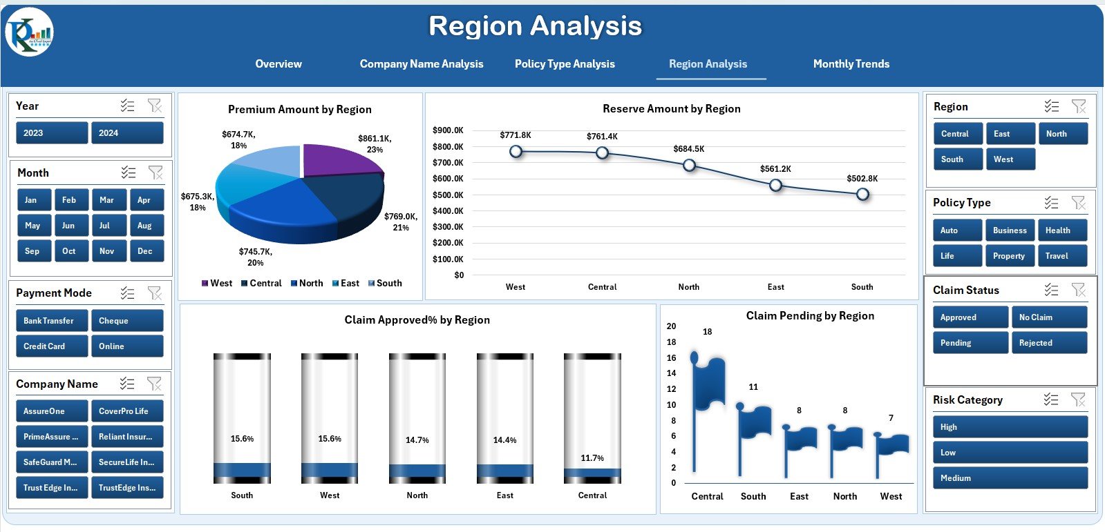
Geographical performance plays a key role in actuarial decision-making. The Region Analysis Page highlights how claims and premiums vary by region.
Charts featured:
-
Premium Amount by Region
-
Reserve Amount by Region
-
Claim Approved % by Region
-
Claim Pending Count by Region
With these visuals, actuaries can detect risk hotspots, plan regional premium adjustments, and manage reserves effectively.
5️⃣ Monthly Trends – Track Performance Over Time
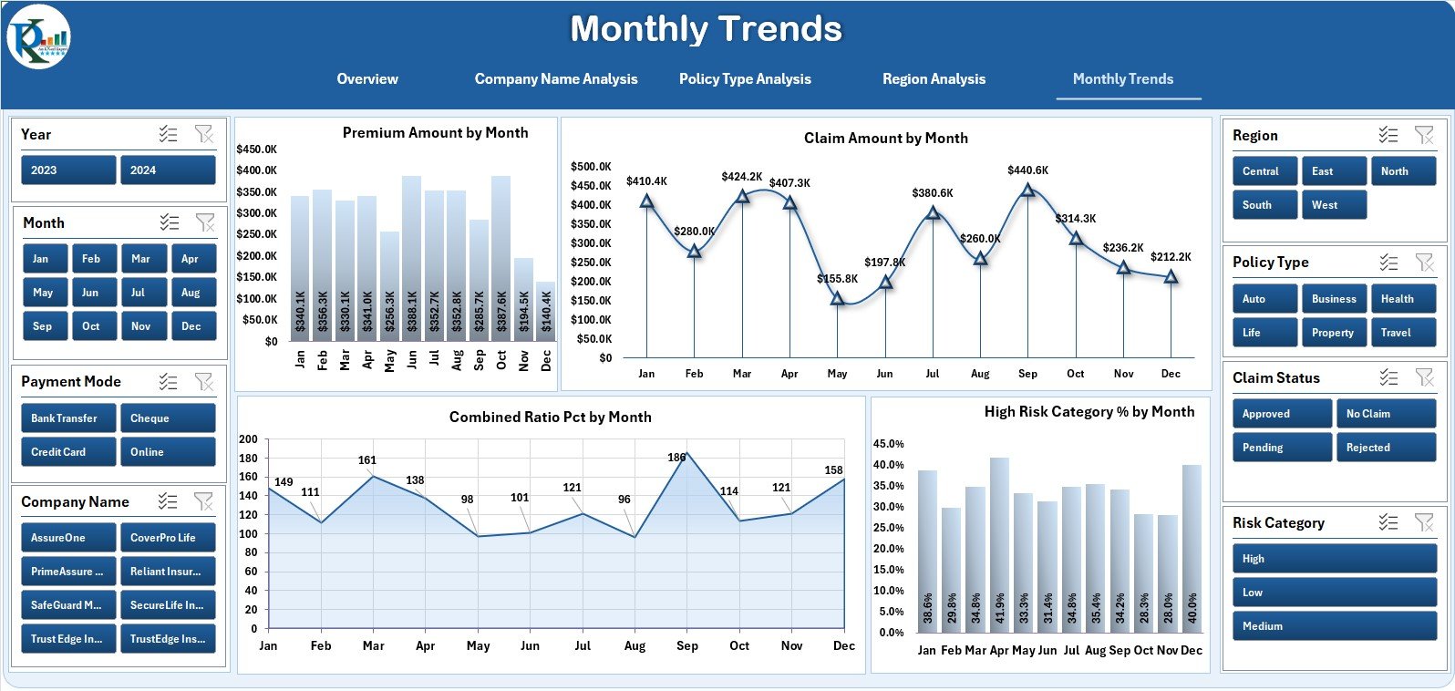
The Monthly Trends Page provides a time-series view of the company’s operational KPIs.
Charts include:
-
Premium Amount by Month
-
Claim Amount by Month
-
Combined Ratio % by Month
-
High-Risk Category % by Month
This page enables month-over-month performance tracking, helping actuaries identify seasonal trends and improve forecasting accuracy.
📂 Supporting Sheets
-
Support Sheet: Stores reference data like category names, payment modes, and dropdown values.
-
Data Sheet: Acts as the foundation where all transactional and summary data are entered.
Together, these sheets make the dashboard fully dynamic and easy to maintain.
Click to Purchases Actuarial Services Dashboard in Excel
💡 Advantages of the Actuarial Services Dashboard in Excel
Implementing this dashboard brings measurable improvements in data accuracy, decision-making, and reporting efficiency.
✅ 1. Centralized Performance Tracking
All actuarial and insurance metrics are visible in one structured Excel file. This centralization simplifies reviews and audits.
✅ 2. Automated Analysis
With formulas and conditional formatting, the dashboard automatically updates charts and KPIs when data changes — minimizing manual effort.
✅ 3. Informed Risk Management
Visualizing high-risk categories and claim ratios enables actuaries to make data-driven decisions to minimize losses.
✅ 4. Enhanced Transparency
Managers, underwriters, and executives can view the same dashboard for consistent understanding and performance evaluation.
✅ 5. Cost-Efficient Solution
Compared to high-end actuarial software, this Excel-based tool offers advanced analytics at a fraction of the cost.
✅ 6. Ready for Customization
Users can easily add new KPIs, adjust formulas, or integrate with existing insurance data systems.
⚙️ Opportunities for Improvement
While this dashboard provides a strong foundation, there are opportunities to make it even more powerful:
-
Integration with Power BI: For advanced visualization and automated reporting.
-
Automated Data Feeds: Link Excel to policy or claims databases for real-time data updates.
-
Predictive Analytics: Add trend-based formulas for forecasting future claim probabilities.
-
Machine Learning Integration: Use Python or R add-ins for risk scoring and scenario modeling.
-
Cloud Sharing: Host on OneDrive or Google Sheets for multi-user collaboration.
🏆 Best Practices for Using the Actuarial Dashboard
Follow these proven best practices to maximize the accuracy and usability of your actuarial insights:
1️⃣ Maintain Data Accuracy
-
Validate all entries in the Data Sheet.
-
Regularly update claims, premiums, and reserves.
2️⃣ Define KPI Targets Clearly
-
Establish benchmark values for key indicators like Combined Ratio or Claim Approval %.
3️⃣ Review Monthly
-
Analyze Monthly Trends regularly to detect risk escalation early.
4️⃣ Collaborate Across Teams
-
Share insights with finance, risk, and operations teams to align strategies.
5️⃣ Back Up Regularly
-
Store copies in secure cloud storage for version control.
6️⃣ Visualize Effectively
-
Use slicers and filters to focus on specific time frames, companies, or regions.
👥 Who Can Benefit from This Dashboard?
This Excel dashboard is valuable for:
-
Actuarial analysts and consultants
-
Insurance companies and brokers
-
Risk management teams
-
Finance and compliance departments
-
Academic institutions offering actuarial courses
Whether for risk analysis or management reporting, this tool fits organizations of all sizes.
Click to Purchases Actuarial Services Dashboard in Excel
📊 How to Use the Actuarial Services Dashboard
-
Open the Overview Page to explore navigation and summaries.
-
Go to the Data Sheet and input all relevant claim, premium, and risk information.
-
Switch to analytical pages (Company, Policy, Region, Month) for detailed visualization.
-
Apply filters to refine data by time period, policy type, or company.
-
Monitor KPIs on the Overview Page to evaluate progress toward business targets.
Within minutes, actuaries can convert raw insurance data into actionable insights.
📘 Why Use Excel for Actuarial Analytics?
Despite modern data platforms, Excel remains the most trusted tool for actuarial analysis because:
-
It offers flexibility and full customization.
-
It supports pivot tables, charts, and complex formulas.
-
It’s accessible and easy to share across teams.
-
It provides rapid prototyping for actuarial models before system integration.
This dashboard combines Excel’s versatility with actuarial precision.
🧮 Example Use Cases
-
Insurance Company Reporting: Visualize claim approval ratios and profitability by product line.
-
Risk Analysis: Identify regions or policies with high loss ratios.
-
Performance Benchmarking: Compare multiple insurers or policy categories.
-
Client Presentations: Use visually engaging charts to explain complex actuarial data.
🧩 Conclusion
The Actuarial Services Dashboard in Excel simplifies complex actuarial tasks by turning large datasets into visual insights.
It’s designed for professionals who need accuracy, speed, and clarity in decision-making.
From tracking claims and premiums to assessing risk and satisfaction — this dashboard is a complete actuarial performance toolkit that enhances transparency, saves time, and supports better forecasting.
Whether you’re a corporate actuary or an independent consultant, this Excel template offers the structure and intelligence needed to make confident, data-driven decisions.
Click to Purchases Actuarial Services Dashboard in Excel
❓ Frequently Asked Questions (FAQs)
1. What is the purpose of the Actuarial Services Dashboard in Excel?
It helps actuaries visualize and analyze insurance performance metrics such as claims, premiums, and risk exposure in one interactive Excel file.
2. Can I customize this dashboard for my organization?
Yes, all charts, KPIs, and fields are editable. You can add company-specific data, formulas, and additional charts.
3. Is the dashboard beginner-friendly?
Absolutely. The built-in navigation panel and structured layout make it easy for both beginners and experts to use.
4. Can this be integrated with other data sources?
Yes. You can link it to external databases or use Power Query to automate data imports.
5. What software is required?
Microsoft Excel 2016 or later is recommended for full compatibility with dynamic charts and slicers.
6. How often should I update the dashboard?
Ideally, update it monthly or weekly depending on the volume of new claims and premiums.
Click to Purchases Actuarial Services Dashboard in Excel
Visit our YouTube channel to learn step-by-step video tutorials


