In today’s fast-paced world, data-driven decision-making is essential for the growth of any business. For apparel manufacturers, tracking key performance indicators (KPIs) is crucial to improving operational efficiency, meeting production targets, and maintaining profitability. A powerful tool that can help monitor these KPIs is the Apparel Manufacturing KPI Dashboard in Power BI. This dashboard is an essential tool for any apparel manufacturing unit, as it provides a clear and concise view of vital business metrics.
In this article, we will explore the features, advantages, best practices, and answer some of the frequently asked questions about the Apparel Manufacturing KPI Dashboard in Power BI. We will also provide insights into how to leverage this dashboard for maximum productivity and performance tracking.
Click to Purchases Apparel Manufacturing KPI Dashboard in Power BI
Key Features of the Apparel Manufacturing KPI Dashboard
The Apparel Manufacturing KPI Dashboard in Power BI is designed to give manufacturers a comprehensive view of their performance metrics. This dashboard helps to monitor progress, identify issues early, and make informed decisions based on real-time data. Here are the three key components of the dashboard:
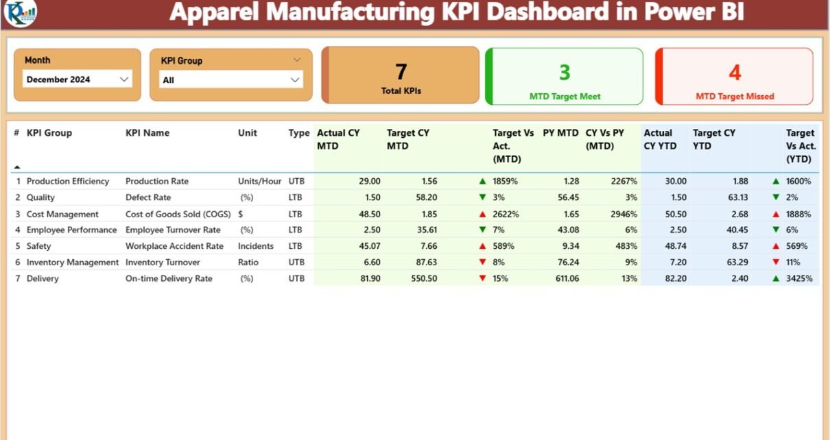
Summary Page
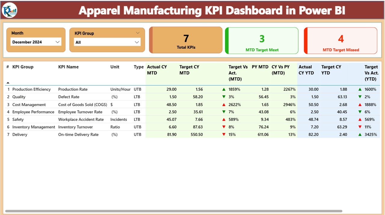
The Summary Page is the heart of the dashboard. It displays important KPIs and performance data. Key features of this page include:
-
KPI Group and Month Slicers: These slicers allow you to filter data by KPI category and month.
KPIs Overview: Three cards that display:
- Total KPIs Count: Shows the total number of KPIs being tracked.
- MTD (Month to Date) Target Met Count: Tracks the number of KPIs that have met their targets for the current month.
- MTD Target Missed Count: Displays the number of KPIs that failed to meet their targets for the current month.
Below the slicers, there is a detailed KPI table that shows the following columns:
-
KPI Number: The sequence number of each KPI.
-
KPI Group: The category or group to which the KPI belongs.
-
KPI Name: The specific KPI being tracked.
-
Unit: The unit of measurement for each KPI.
-
Type: Whether the KPI is an LTB (Lower the Better) or UTB (Upper the Better).
-
Actual CY MTD: The actual MTD value for the current year.
-
Target CY MTD: The target MTD value for the current year.
-
MTD Icon: Visual indicators (green and red arrows) that show whether the KPI is meeting its target.
-
Target vs. Actual (MTD): A percentage calculation comparing the actual value to the target.
-
PY MTD: The MTD value for the same period in the previous year.
-
CY vs PY (MTD): A percentage comparison between the current year’s MTD and the previous year’s MTD.
-
Actual CY YTD: The current year’s YTD (Year to Date) actual value for the KPI.
-
Target CY YTD: The target YTD value for the current year.
-
YTD Icon: Indicates if the KPI is on target for the year.
-
Target vs. Actual (YTD): A percentage comparison of YTD actual and target.
-
PY YTD: YTD number for the same period in the previous year.
-
CY vs PY (YTD): Compares the current year’s YTD with last year’s YTD.
KPI Trend Page
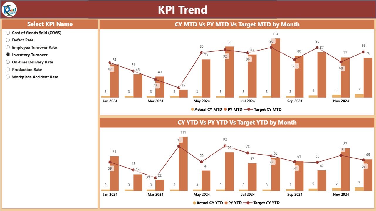
The KPI Trend Page visually represents the trends for each KPI over time. This page features:
Two Combo Charts: These charts display:
- The Actual Numbers for the current year and previous year.
- Target Values for both MTD and YTD periods.
-
KPI Slicer: A slicer on the left allows users to select a specific KPI for trend analysis.
KPI Definition Page
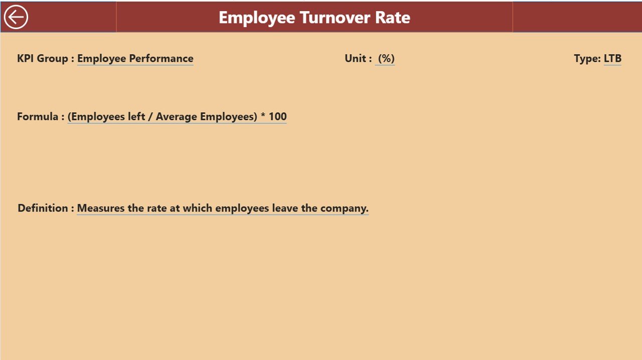
The KPI Definition Page provides detailed definitions and formulas for each KPI. This is a drill-through page, meaning users can click from the summary page to see the details for any specific KPI. The definition page includes:
-
KPI Number
-
KPI Group
-
KPI Name
-
Unit of Measure
-
Formula
-
Definition
-
Type (LTB or UTB)
Advantages of Using the Apparel Manufacturing KPI Dashboard
Click to Purchases Apparel Manufacturing KPI Dashboard in Power BI
Implementing an Apparel Manufacturing KPI Dashboard in Power BI offers numerous benefits to manufacturers. Here are some of the key advantages:
1) Centralized Data for Better Decision-Making
The dashboard centralizes all essential data in one place, eliminating the need to search through multiple systems or spreadsheets. This allows stakeholders to access real-time, accurate information for informed decision-making.
2) Improved Performance Tracking
Manufacturers can track the performance of their KPIs in real-time, ensuring that targets are being met consistently. This allows for immediate action if performance deviates from expected standards.
3) Visual Representation of Data
With Power BI’s interactive visuals, manufacturers can easily interpret trends, comparisons, and performance metrics. The use of colors and icons (green for on target, red for off target) makes it easy to spot areas that need attention.
4) Historical Comparison
The dashboard allows users to compare current performance with previous years’ data. This historical context helps in analyzing growth, identifying patterns, and setting more accurate future targets.
5) Time and Cost Efficiency
The use of automation and pre-set formulas reduces manual tracking and reporting efforts. This significantly saves time and ensures that reports are generated quickly and accurately.
6) User-Friendly Interface
The dashboard is designed for non-technical users, with slicers, drill-throughs, and interactive visuals that are easy to navigate. Users can focus on key metrics without being overwhelmed by complex data.
Best Practices for Using the Apparel Manufacturing KPI Dashboard
To maximize the effectiveness of the Apparel Manufacturing KPI Dashboard, it is essential to follow some best practices:
1) Regularly Update Data
Ensure that both the Actual Data and Target Data are updated regularly to maintain accurate tracking. Set a monthly schedule to update these data sheets.
2) Set Realistic Targets
While it’s important to challenge the team, setting unrealistic targets can lead to frustration. Ensure that the targets are achievable and based on historical performance data.
3) Use the KPI Trend Page Effectively
Use the KPI Trend Page to identify patterns over time. Look for any seasonal trends or sudden drops in performance that could indicate underlying issues.
4) Drill Down to Get Detailed Insights
Don’t just rely on the summary page. Use the drill-through feature to get a deeper understanding of each KPI’s performance, including the formulas and definitions behind them.
5) Customize Slicers to Filter Data
The slicers on the Summary Page and KPI Trend Page can help you narrow down data to focus on specific KPIs, months, or performance periods. Customize these slicers based on your reporting needs.
6) Share Insights Across Teams
The dashboard can be shared with multiple stakeholders, including production managers, quality control teams, and executives. Regularly share insights and discuss how to optimize performance.
Frequently Asked Questions (FAQs)
1) What is the Apparel Manufacturing KPI Dashboard in Power BI?
The Apparel Manufacturing KPI Dashboard in Power BI is a powerful tool that helps apparel manufacturers track and analyze their performance metrics in real-time. It provides insights into key KPIs related to production, quality, and target achievement.
2) How do I update the data in the Apparel Manufacturing KPI Dashboard?
The data is updated by filling out the Input_Actual and Input_Target sheets in the linked Excel file. Simply enter the values for each KPI and month, and the dashboard will automatically update.
3) Can I customize the KPIs in the dashboard?
Yes, you can customize the KPIs based on your specific requirements. You can adjust the KPI names, targets, and even the formulas in the Excel data sheets.
4) How can I use the KPI Trend Page?
The KPI Trend Page provides visual representations of the current year’s actuals, targets, and previous year comparisons. Use the slicer to select a specific KPI, and the trend charts will update to show the data over time.
5) Is this dashboard suitable for small apparel manufacturers?
Yes, this dashboard is scalable and can be used by both small and large apparel manufacturers. The user-friendly design ensures that even small teams can efficiently track and manage KPIs.
Conclusion
The Apparel Manufacturing KPI Dashboard in Power BI is a game-changer for apparel manufacturers looking to optimize their operations and improve performance. By centralizing key metrics, offering historical comparisons, and providing easy-to-use visuals, this dashboard empowers manufacturers to make data-driven decisions, ensuring their success in a competitive market.
Visit our YouTube channel to learn step-by-step video tutorials