In today’s unpredictable business environment, every organization faces potential disruptions — from cyberattacks and system failures to natural disasters and supply chain interruptions. These disruptions can cause downtime, financial loss, and reputational damage.
That’s where a Business Continuity Report in Excel becomes invaluable. It helps businesses prepare, monitor, and respond effectively to any unexpected events by providing real-time insights into critical operations, test results, downtime costs, and recovery performance.
This article explains everything you need to know about creating, using, and optimizing a Business Continuity Report in Excel — including structure, advantages, best practices, and practical FAQs.
Click to Purchases Business Continuity Report in Excel
What Is a Business Continuity Report in Excel?
A Business Continuity Report is a structured document that tracks an organization’s ability to maintain or quickly resume operations during a crisis or disruption.
When built in Microsoft Excel, it becomes an interactive, data-driven tool for visualizing and analyzing key continuity metrics such as:
-
Test pass rate
-
Cost of downtime
-
Resolved incident percentage
-
In-progress tests by month
-
Recovery performance by department
This Excel-based report allows business continuity managers, IT teams, and executives to view key performance indicators (KPIs) on one dashboard, compare results over time, and identify high-risk areas that need attention.
Unlike static reports, this Excel version is interactive, customizable, and easy to update, making it a cost-effective solution for both small and large organizations.
Key Features of the Business Continuity Report in Excel
Our Business Continuity Report in Excel template includes three main pages and an additional support sheet for reference data. Each part serves a specific function to make analysis smooth and decision-making faster.
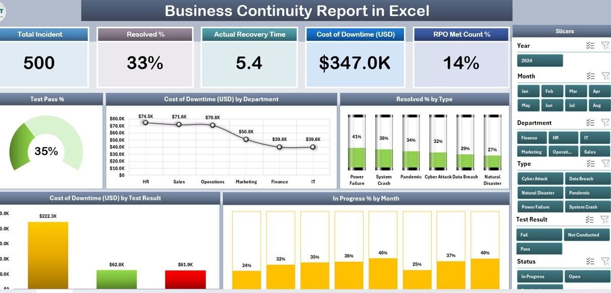
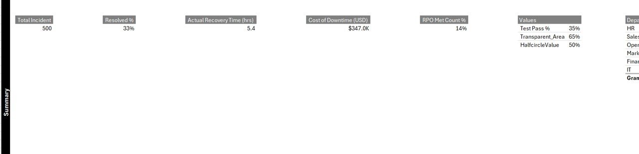
Summary Page
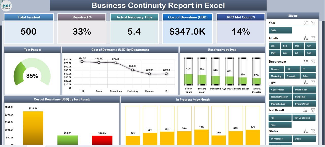
The Summary Page is the main dashboard that gives a snapshot of overall continuity performance.
It includes five key cards that display essential metrics at the top — such as total tests, pass percentage, downtime cost, incidents resolved, and in-progress tests.
On the right side, a slicer panel allows users to filter data by month, department, or test type, instantly updating all visuals and metrics.
Charts on the Summary Page:
-
Test Pass %: Displays the success rate of continuity or disaster recovery tests.
-
Cost of Downtime (USD) by Department: Highlights financial impact for each department.
-
Resolved % by Type: Shows the percentage of incidents resolved by category.
-
Cost of Downtime (USD) by Test Result: Compares downtime costs for successful vs failed tests.
-
In Progress % by Month: Tracks testing activity trends across the year.
This combination of metrics and visuals provides a real-time, holistic view of your organization’s resilience.
Report Page
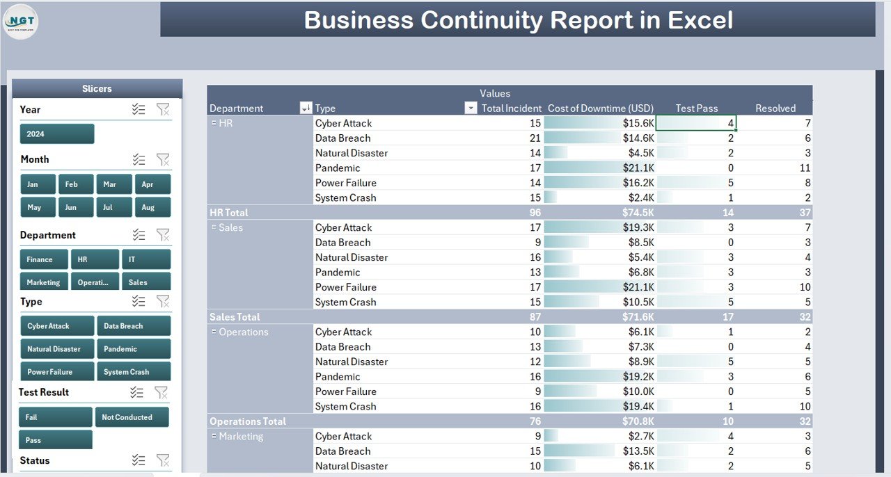
The Report Page is designed for deeper analysis.
It includes left-side slicers to filter data based on test result, department, or month. The main section contains a detailed information table, displaying each test or incident with columns such as:
-
Test ID
-
Department
-
Type of Test
-
Test Result
-
Start Date
-
End Date
-
Downtime Cost (USD)
-
Resolved %
-
Responsible Person
This table enables users to examine raw data, conduct audits, or export specific records for presentations and management reviews.
Data Sheet
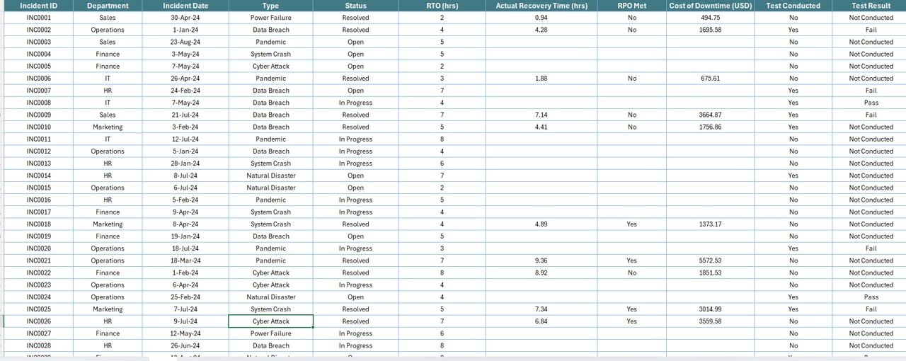
The Data Sheet serves as the data backbone of the report.
Here, all source data related to tests, incidents, downtime, and recovery details are stored in a clean, tabular format. The structure is pivot-table-ready, which makes it easy to update and refresh charts automatically.
Users can enter new records monthly, ensuring the report always reflects the latest continuity performance.
Support Sheet
The Support Sheet contains all reference lists — such as department names, test types, or responsible persons — used to populate dropdown menus and slicers throughout the file.
This ensures consistency and minimizes data-entry errors, making the report more reliable and easier to maintain.
Why You Need a Business Continuity Report
Business continuity planning is not optional anymore. Organizations must proactively monitor their resilience to minimize financial and operational risks.
A Business Continuity Report in Excel helps you:
-
Track test results and response efficiency
-
Quantify the cost of downtime per department
-
Identify high-risk areas that need improvement
-
Communicate readiness to management and stakeholders
-
Ensure continuous improvement in crisis response
With all critical data visualized clearly, teams can make informed decisions faster and stay ready for any challenge.
Click to Purchases Business Continuity Report in Excel
Advantages of Business Continuity Report in Excel
Implementing a structured continuity report provides multiple business benefits. Below are some of the key advantages:
✅ 1. Real-Time Insights
-
Get instant visibility into testing performance and downtime costs.
-
Easily filter and compare data by month, department, or incident type.
✅ 2. Centralized Information
-
Consolidate all continuity-related data in one workbook.
-
Reduce duplication and eliminate scattered reports.
✅ 3. Cost-Effective and Scalable
-
No need for expensive business-continuity software.
-
Excel offers a flexible, budget-friendly solution that scales with your data.
✅ 4. Visual Performance Tracking
-
Charts and conditional formatting help you quickly identify problem areas.
-
Visual cues like up/down arrows make trend analysis intuitive.
✅ 5. Easy Customization
-
Add your company logo, brand colors, or new KPIs.
-
Modify charts and slicers to suit unique reporting needs.
✅ 6. Audit and Compliance Support
-
Maintain a historical record of all test results and recovery actions.
-
Simplify audit preparation with ready-to-share summaries.
How to Create a Business Continuity Report in Excel
If you wish to build your own version, follow these steps for success.
Step 1: Define Key Metrics
Identify what you need to monitor — such as test pass %, recovery time, downtime cost, or number of incidents.
Step 2: Design the Data Sheet
Create columns like:
-
Date of Test
-
Department
-
Test Type
-
Result
-
Downtime (USD)
-
Responsible Person
Keep the data structured and ready for pivot analysis.
Step 3: Insert Pivot Tables
Use Excel’s Insert > PivotTable to summarize data by department, test result, and month.
Step 4: Add Visualizations
Add charts such as:
-
Bar chart – Downtime by Department
-
Pie chart – Resolved % by Type
-
Line chart – Tests in Progress by Month
Step 5: Create Dashboard Layout
Combine all visuals on one sheet. Use cards for KPIs and slicers for interactivity.
Step 6: Add Conditional Formatting
Highlight top risks or failed tests using red/yellow/green color scales.
Step 7: Refresh Regularly
Update the data monthly to keep your report relevant and actionable.
Best Practices for the Business Continuity Report
To make your report effective, follow these proven best practices:
1️⃣ Keep the Structure Simple
Use clear sheet names — “Summary,” “Report,” “Data,” “Support.” Avoid cluttered visuals.
2️⃣ Automate Data Refresh
Link charts and pivot tables to your main data source to reduce manual work.
3️⃣ Use Meaningful KPIs
Focus on metrics that drive decision-making, such as recovery time, test pass rate, and downtime cost.
4️⃣ Maintain Data Accuracy
Review inputs monthly and use dropdown lists to prevent entry errors.
5️⃣ Version Control
Save backup copies before every major update to maintain historical data.
6️⃣ Secure Sensitive Information
If the report includes confidential data, use Excel’s password protection or restricted access.
7️⃣ Share the Dashboard
Export the Summary Page as PDF or share via Microsoft Teams for management visibility.
8️⃣ Track Trends Over Time
Use line charts to visualize long-term improvements in recovery readiness.
Tips for Maintaining an Effective Business Continuity Report
-
Update data consistently after every continuity test.
-
Review KPIs with management during monthly meetings.
-
Use Excel formulas like
AVERAGEIF,SUMIFS, andCOUNTIFSfor quick analysis. -
Store reports in a shared drive for team collaboration.
-
Visualize year-to-year improvements to demonstrate return on preparedness investments.
How the Report Helps During Real Incidents
During a real business disruption — such as a power outage or cyberattack — this Excel report helps decision-makers understand:
-
Which departments are affected most.
-
Estimated downtime cost.
-
Recovery performance vs previous incidents.
-
Which tests failed and need follow-up.
By reviewing historical data, you can improve response plans and allocate resources efficiently.
Conclusion
A Business Continuity Report in Excel is an essential tool for organizations that value preparedness, performance tracking, and operational stability.
By combining structured data, interactive visuals, and key performance insights, this report empowers teams to minimize downtime, improve test outcomes, and strengthen resilience across all departments.
Frequently Asked Questions (FAQs)
1️⃣ What is the main purpose of a Business Continuity Report?
The primary goal is to monitor and evaluate an organization’s readiness to handle disruptions, ensuring critical operations continue with minimal downtime.
2️⃣ Can I customize the Business Continuity Report in Excel?
Yes. You can modify the template to include new KPIs, change visual styles, or add more departments and test categories.
3️⃣ How often should I update the report?
It’s recommended to update the report monthly or after every continuity test to keep data relevant.
4️⃣ Who should maintain the report?
Typically, the Business Continuity Manager or Risk Management Team is responsible for maintaining and updating the data.
5️⃣ How can I reduce downtime costs using this report?
By analyzing department-wise downtime data, you can identify root causes, prioritize preventive actions, and allocate resources efficiently.
6️⃣ Is Excel suitable for large organizations?
Yes. With proper structuring and automation (using Power Query or Power Pivot), Excel can efficiently handle large datasets.
7️⃣ Can this report be linked to Power BI or Google Sheets?
Absolutely. You can export or connect Excel data to Power BI for advanced visualization or share it via Google Sheets for collaborative access.
8️⃣ What is the difference between Business Continuity and Disaster Recovery Reports?
Business Continuity covers all aspects of keeping operations running, while Disaster Recovery focuses mainly on IT system recovery after failures.
9️⃣ How do I ensure data accuracy?
Use data validation lists, dropdowns, and periodic reviews to maintain accuracy and consistency.
🔟 What are the top KPIs every organization should track?
Key KPIs include:
-
Test Pass %
-
Downtime Cost (USD)
-
Resolved % by Type
-
Recovery Time (Hours)
-
Departmental Impact Score
Visit our YouTube channel to learn step-by-step video tutorials