In today’s fast-paced business environment, courier service companies rely heavily on performance metrics to stay competitive and meet customer expectations. The Courier Service KPI Dashboard in Power BI is a comprehensive tool that helps track key performance indicators (KPIs) effectively. This dashboard not only provides insightful data but also helps businesses identify trends, monitor progress, and make informed decisions. In this article, we’ll explore the features, benefits, best practices, and frequently asked questions about the Courier Service KPI Dashboard in Power BI.
Click to Purchases Courier Service KPI Dashboard in Power BI
Introduction to the Courier Service KPI Dashboard
Power BI, a powerful data visualization tool, allows businesses to design interactive and visually appealing dashboards that present key data in a user-friendly format. For courier services, these dashboards are crucial for monitoring performance, managing logistics, and optimizing delivery processes. The Courier Service KPI Dashboard is designed to capture and analyze data related to various key performance indicators such as delivery times, costs, customer satisfaction, and much more.
Key Features of the Courier Service KPI Dashboard
The Courier Service KPI Dashboard in Power BI comes equipped with several key features that make it a valuable asset for any logistics-based business. The dashboard is divided into three main pages, each serving a distinct function:
Summary Page
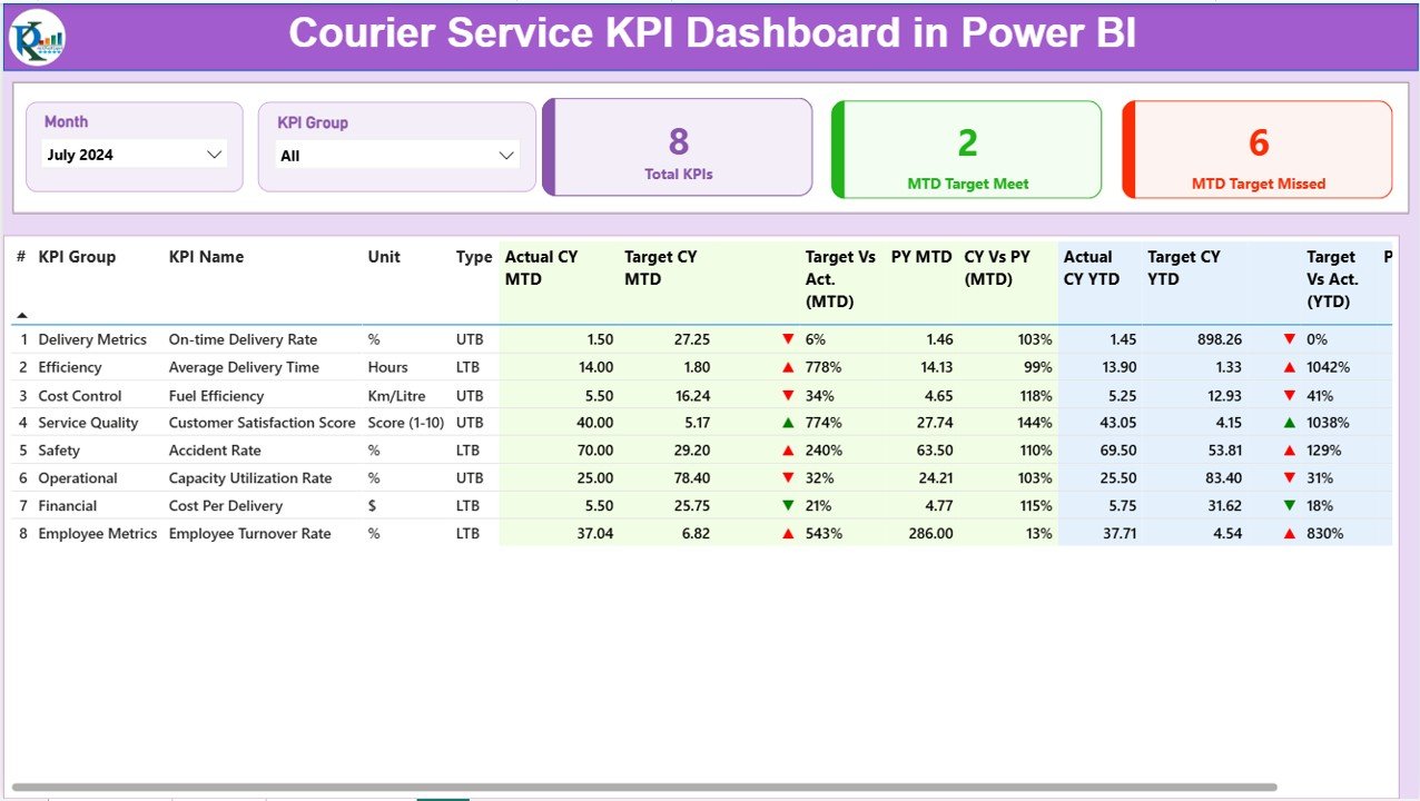
The Summary Page is the central hub of the dashboard, providing an overview of key metrics. It includes:
-
KPI Number: A sequential identifier for each KPI.
-
KPI Group: The category to which the KPI belongs (e.g., delivery time, customer satisfaction).
-
KPI Name: The specific metric being tracked (e.g., Delivery Time, Customer Feedback).
-
Unit: The unit of measurement for the KPI (e.g., minutes, percentage).
-
KPI Type: Whether the KPI is “Lower the Better” (LTB) or “Upper the Better” (UTB).
-
Actual CY MTD and Target CY MTD: The current year’s month-to-date (MTD) actual performance versus the target.
-
MTD Icon: A visual indicator (▼ or ▲) showing whether the actual value is above or below the target, color-coded for easy understanding (red for missed target, green for achieved target).
-
Target vs Actual (MTD): The percentage comparison of the actual number to the target number for MTD.
-
PY MTD: The same metric for the previous year’s MTD.
-
CY vs PY (MTD): A comparison of the current year’s MTD value against the previous year’s MTD.
-
Actual CY YTD and Target CY YTD: The actual year-to-date (YTD) number for the current year and the target for the same period.
-
YTD Icon: Similar to the MTD icon, this shows whether the YTD performance is on track or not.
-
Target vs Actual (YTD): The percentage comparison of actual to target for YTD.
-
PY YTD: The YTD number for the previous year.
-
CY vs PY (YTD): A comparison of the current year’s YTD performance against the previous year’s YTD.
Click to Purchases Courier Service KPI Dashboard in Power BI
KPI Trend Page
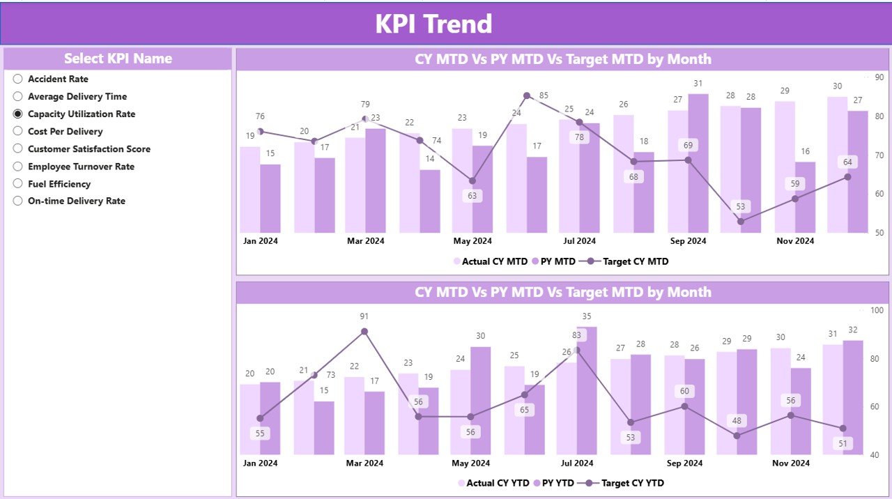
The KPI Trend Page provides a visual representation of KPI performance over time. It includes:
-
Combo Charts: These charts display both the current year’s actual numbers and the previous year’s figures, alongside the targets, for both MTD and YTD.
-
KPI Selection Slicer: A slicer on the left allows users to select specific KPIs for deeper analysis, enabling them to focus on the data most relevant to their goals.
KPI Definition Page
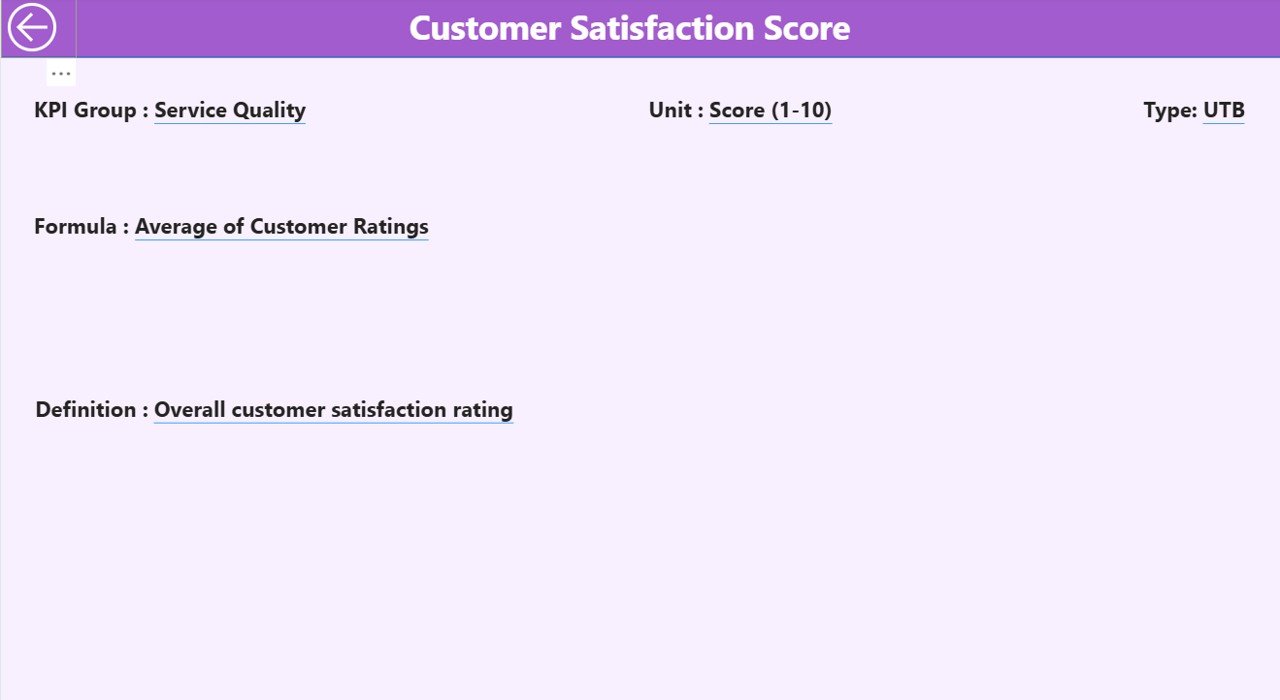
The KPI Definition Page is a drill-through page where users can explore detailed information about each KPI, including:
-
KPI Formula: The formula used to calculate the KPI.
-
KPI Definition: A description of what the KPI represents and how it is used to measure performance.
-
KPI Type: Whether the KPI is a “Lower the Better” (LTB) or “Upper the Better” (UTB) type.
This page is hidden by default and can be accessed through the Summary Page, providing users with more detailed insights into the KPIs they are tracking.
Excel Data Input for Power BI Integration
The Courier Service KPI Dashboard uses Excel as its data source. Users must fill in three worksheets:
-
Input_Actual Sheet: Enter the actual numbers for each KPI, along with the MTD and YTD data.
-
Input_Target Sheet: Enter the target numbers for the KPIs, including MTD and YTD targets.
-
KPI Definition Sheet: This sheet includes the KPI number, group, name, unit, formula, definition, and type (LTB or UTB).
These Excel sheets feed into Power BI, which dynamically updates the dashboard based on the inputted data.
Advantages of the Courier Service KPI Dashboard
The Courier Service KPI Dashboard offers several benefits for businesses:
-
Real-Time Insights: The dashboard provides up-to-date information, enabling quick decision-making and timely interventions.
-
Improved Visibility: It offers a clear overview of performance, highlighting areas that need attention and areas where the business is excelling.
-
Actionable Data: With visual indicators like the MTD and YTD icons, businesses can easily identify whether they are meeting their targets and make adjustments as needed.
-
Data-Driven Decisions: By tracking and comparing performance across multiple periods (MTD, YTD, and PY), businesses can make informed decisions that drive improvements.
-
User-Friendly: The dashboard is designed to be intuitive, allowing users to quickly understand the data and make informed decisions, even without technical expertise.
Best Practices for Using the Courier Service KPI Dashboard
To get the most out of your Courier Service KPI Dashboard, follow these best practices:
-
Regularly Update Data: Ensure that the Excel sheets are updated regularly to provide accurate data for analysis. The more frequently you update the data, the more valuable the insights.
-
Use Filters and Slicers: Make use of the slicers to drill down into specific KPIs and get a deeper understanding of performance.
-
Monitor Key Metrics Closely: Pay attention to KPIs that are critical to your business, such as delivery time and customer satisfaction. Make these KPIs a priority for improvement.
-
Leverage Historical Data: Compare current performance against previous periods (MTD, YTD, and PY) to identify trends and areas for improvement.
-
Customize the Dashboard: Tailor the dashboard to your business needs by adding or removing KPIs and adjusting targets as necessary.
Conclusion
The Courier Service KPI Dashboard in Power BI is an essential tool for any logistics business. It helps track and analyze key performance metrics in real-time, offering insights that can drive improvements and enhance decision-making. By using this dashboard, courier services can optimize their operations, ensure timely deliveries, and maintain high customer satisfaction levels.
Frequently Asked Questions (FAQs)
What KPIs should I track for a courier service?
-
Key KPIs for a courier service include delivery time, customer satisfaction, delivery success rate, cost per delivery, and on-time delivery percentage.
How often should I update the data in the dashboard?
-
It’s recommended to update the data at least once a week to ensure the dashboard provides accurate and up-to-date insights.
Can I customize the dashboard to suit my business needs?
-
Yes, the dashboard is highly customizable. You can add or remove KPIs and adjust targets based on your specific business goals.
What tools do I need to use the Courier Service KPI Dashboard?
-
You will need Power BI for creating and viewing the dashboard and Excel for entering the data. Both tools are required to integrate and display the data effectively.
How do I drill through to see detailed KPI definitions?
-
You can access detailed KPI definitions by clicking on the drill-through option available in the Summary Page.
Click to Purchases Courier Service KPI Dashboard in Power BI
Visit our YouTube channel to learn step-by-step video tutorials