In today’s competitive world, customer satisfaction is the backbone of every successful business. However, managing risks in customer service and support often gets overlooked until problems arise. That’s where a Customer Service and Support Risk Management KPI Dashboard in Excel becomes essential. This tool not only tracks performance but also highlights areas of concern before they escalate into major issues.
In this article, we’ll explore how this Excel-based dashboard works, its benefits, key features, best practices, and everything else you need to know. Whether you’re a service manager, analyst, or business owner, this dashboard will help you manage risk like a pro.
Click to Purchases Customer Service and Support Risk Management KPI Dashboard in Excel
What Is a Customer Service and Support Risk Management KPI Dashboard?
A Customer Service and Support Risk Management KPI Dashboard is a data visualization tool designed in Microsoft Excel that tracks critical Key Performance Indicators (KPIs) related to customer service operations and their associated risks.
It provides an overview of performance metrics such as issue resolution time, customer complaints, escalation rates, and other risk-related parameters—allowing teams to take timely actions and minimize disruptions.
Why Risk Management Is Crucial in Customer Support
Risk management in customer support is not just about avoiding disasters. It’s about identifying bottlenecks, performance gaps, and inconsistencies in customer interactions. If left unchecked, these risks can lead to:
-
Poor customer experiences
-
Loss of customer trust
-
Negative online reviews
-
Reduced customer retention
-
Compliance failures
With a well-designed dashboard, businesses can stay one step ahead.
Key Features of the Risk Management KPI Dashboard in Excel
This ready-to-use Excel template includes 7 professionally structured worksheet tabs. Each tab plays a critical role in collecting, analyzing, and displaying risk-related KPIs.
Home Sheet (Your Navigation Hub)

The Home sheet is the dashboard’s control center. It contains clickable buttons to navigate directly to each functional tab. With this, users can jump between sheets easily without searching.
Dashboard Sheet (The Visual Control Panel)
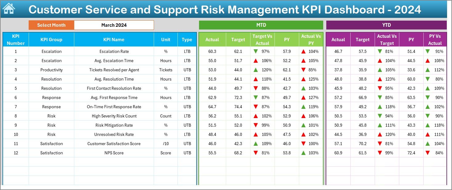
This is the heart of the system. It allows users to:
-
Select a month from a dropdown menu in cell D3.
-
View Month-To-Date (MTD) and Year-To-Date (YTD) data for Actuals, Targets, and Previous Year.
Instantly understand performance through color-coded arrows (Conditional Formatting) that indicate:
- Actual vs. Target
- Actual vs. Previous Year
This visual summary helps managers spot red flags immediately.
Click to Purchases Customer Service and Support Risk Management KPI Dashboard in Excel
KPI Trend Sheet (Track Metrics Over Time)
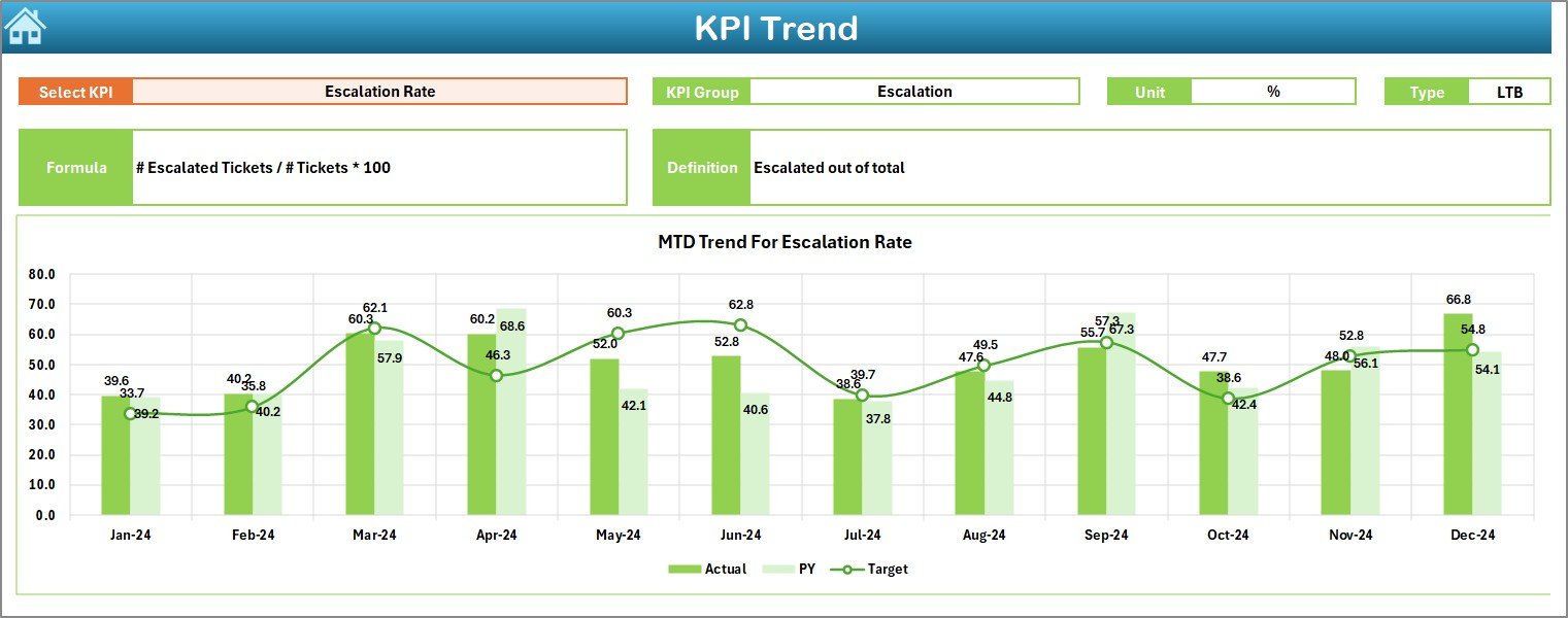
Users can select any KPI using the dropdown in C3. This sheet then displays:
-
KPI Group
-
Unit
-
Type (Lower/Upper the Better)
-
Formula
-
Definition
Also, it presents MTD and YTD trend charts for Actuals, Targets, and PY data, helping to visualize how performance is moving over time.
Actual Numbers Input Sheet (Real-time Data Entry)
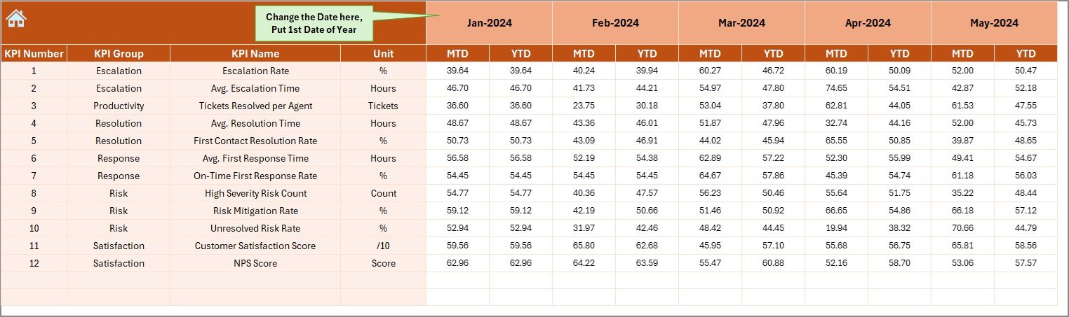
You can enter current data month-by-month. Change the first month of the year in E1, and input your MTD and YTD numbers accordingly.
Target Sheet (Define Performance Goals)
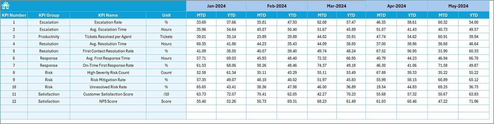
This sheet lets you define the MTD and YTD targets for each KPI. Having a benchmark is critical for risk analysis, and this sheet centralizes that process.
Previous Year Numbers Sheet (Baseline Comparison)

Input previous year’s data here. Comparing past performance against current numbers helps in identifying recurring issues and trends.
KPI Definition Sheet (Reference Guide)
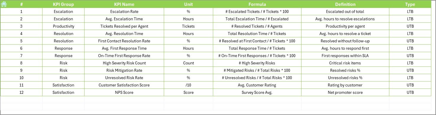
This sheet lists all the KPIs along with their:
-
Names
-
Groups
-
Units
-
Formulas
-
Definitions
It serves as a reference for analysts and team members to ensure alignment and understanding of each KPI.
Click to Purchases Customer Service and Support Risk Management KPI Dashboard in Excel
Advantages of Using the Customer Service Risk Management KPI Dashboard
Implementing this dashboard brings numerous advantages, especially in dynamic customer service environments.
✅ Risk Visibility at a Glance
You get a quick snapshot of where risks are emerging—be it slower response times or increased complaint volumes.
✅ Data-Driven Decision Making
With real-time data inputs and trend charts, managers can make informed decisions rather than relying on assumptions.
✅ Enhanced Accountability
KPIs tied to specific team functions ensure that every individual is aware of their role in risk prevention.
✅ Performance Benchmarking
Comparing Actual vs. Target and Previous Year helps to evaluate performance trends and apply corrective actions.
✅ Fully Customizable Template
Being Excel-based, you can customize fields, KPIs, formats, and calculations without needing any advanced software.
Best Practices for Using the KPI Dashboard
To make the most of this tool, follow these simple yet powerful practices:
🔹 Update Data Regularly
Enter actual performance data every month without fail. This ensures your MTD and YTD calculations stay accurate.
🔹 Use Clear KPI Definitions
Avoid confusion by maintaining accurate and consistent definitions in the KPI Definition Sheet.
🔹 Train Your Team
Make sure everyone understands how to read and use the dashboard. A 15-minute team walkthrough can go a long way.
🔹 Review Trends Monthly
Check the KPI Trend Sheet every month. Use the visual insights to assess whether your risk levels are increasing or improving.
🔹 Keep a Backup
Always keep a backup of the original Excel file before making structural changes, especially if formulas are being updated.
How to Customize the Dashboard for Your Business
The beauty of Excel lies in its flexibility. Here’s how you can tailor the dashboard to suit your unique business needs:
-
Add/Remove KPIs: Use the KPI Definition Sheet to add more KPIs or remove irrelevant ones.
-
Change Units/Formats: Modify units (e.g., % to counts) in the Definition tab to reflect the data you track.
-
Insert More Charts: Add custom visualizations using Excel’s chart tools.
-
Color Scheme: Modify conditional formatting colors to align with your brand or priority scale.
Real-Life Use Case Example
Let’s say you manage a telecom customer service center. You use this dashboard to track:
-
First Response Time
-
Escalation Rate
-
Ticket Backlog
-
Complaint Resolution within SLA
By monitoring these KPIs monthly, you notice a spike in escalation rate in April. Upon reviewing the KPI trend, you identify the root cause: delays in handing complex queries. You assign more trained staff for complex tickets, and by May, escalation rate drops. Without the dashboard, this proactive step would’ve been delayed.
How This Dashboard Supports Strategic Planning
The data-driven approach enables strategic advantages:
-
Forecasting: Use past trends to plan staffing and resource allocation.
-
Risk Mitigation: Predict customer service crises and resolve them early.
-
Customer Retention: Identify pain points quickly, fix them, and improve loyalty.
-
Cost Control: Optimize workflows to reduce overhead costs due to repeated service failures.
Conclusion
The Customer Service and Support Risk Management KPI Dashboard in Excel is more than a tracking tool—it’s a strategic asset. It empowers your service team to act proactively, respond faster, and mitigate risks effectively. With its easy-to-use format, actionable insights, and customizable structure, it fits seamlessly into any business environment looking to improve customer satisfaction and reduce support-related risks.
Click to Purchases Customer Service and Support Risk Management KPI Dashboard in Excel
Frequently Asked Questions (FAQs)
❓What KPIs should I include in a customer service risk management dashboard?
Some essential KPIs are:
-
First Contact Resolution Rate
-
Customer Complaint Volume
-
Escalation Rate
-
SLA Compliance
-
Customer Satisfaction Score (CSAT)
-
Ticket Backlog
-
Agent Response Time
❓Can I use this dashboard without advanced Excel skills?
Yes. This template is user-friendly and built for people with basic to intermediate Excel skills. Most fields use dropdowns, formulas, and simple inputs.
❓Is the dashboard compatible with Google Sheets?
No. This dashboard relies on Excel-specific formulas and formatting, especially for dropdowns and conditional formatting. It is best used in Microsoft Excel.
❓How often should I update the data?
You should update it monthly. For high-risk environments, bi-weekly updates can be considered for more granular monitoring.
❓Can I track multiple teams in one dashboard?
Yes. You can expand the KPI table by adding team-specific KPIs or duplicating sections for each team. Just ensure consistency in formatting and data sources.
❓Is this dashboard suitable for small businesses?
Absolutely! Whether you’re a startup or an enterprise, the template is scalable. Smaller businesses can start with fewer KPIs and expand over time.
❓How does this dashboard help with risk management?
It highlights performance gaps in real-time. By comparing actuals with targets and previous year data, you can catch issues early and resolve them before they impact customers.
Visit our YouTube channel to learn step-by-step video tutorials