In today’s data-driven economy, financial planning is more than just crunching numbers—it’s about making informed decisions that drive sustainable growth. Whether you’re a CFO, financial analyst, or business strategist, having a clear view of your Key Performance Indicators (KPIs) is critical to success. That’s where a Financial Planning KPI Dashboard in Power BI comes into play.
This comprehensive dashboard doesn’t just present data—it transforms it into actionable insights. In this article, we’ll walk you through everything you need to know about this powerful tool, from its core features and benefits to best practices and FAQs. Let’s dive right in!
Click to Purchases Financial Planning KPI Dashboard in Power BI
What is a Financial Planning KPI Dashboard in Power BI?
A Financial Planning KPI Dashboard in Power BI is an interactive visualization tool that helps organizations monitor, analyze, and improve financial performance. It tracks essential KPIs such as revenue, expenses, budgets, targets, and year-over-year performance—all in one place.
Unlike static Excel reports or complex ERP systems, Power BI dashboards provide dynamic, real-time insights. They make it easier to spot trends, identify bottlenecks, and take timely decisions to improve financial health.
Why Should You Use a Financial Planning KPI Dashboard?
If you’re still relying on manual spreadsheets or disconnected systems, you’re likely missing out on faster insights and more informed decision-making. Here’s why a KPI dashboard is a game-changer:
-
✔ Tracks both MTD (Month-to-Date) and YTD (Year-to-Date) performance
-
✔ Offers real-time visualization of actual vs. target numbers
-
✔ Compares performance with previous year benchmarks
-
✔ Uses slicers for intuitive filtering by month or KPI group
-
✔ Shows visual indicators (icons, arrows) for immediate performance feedback
-
✔ Reduces reporting errors and improves accuracy
And the best part? All of this is powered by Excel as the backend data source—making updates easy for any finance team.
Core Components of the Power BI Financial Planning KPI Dashboard
This dashboard includes three main pages within Power BI Desktop, along with an Excel-based data entry system that ensures flexibility and control.
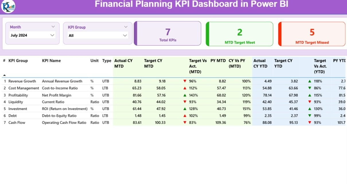
Summary Page: Your Financial Control Center

This is the primary page of the dashboard and acts as the starting point for all users. At a glance, you can track overall performance across all KPIs. Here’s what it includes:
-
Top Slicers: Select Month and KPI Group to narrow your view.
-
KPI Cards: See the total number of KPIs, how many met their MTD targets, and how many missed.
KPI Detail Table:
- KPI Number, Group, and Name
- Unit of Measure (e.g., %, INR, $, Days)
- Type: UTB (Upper the Better) or LTB (Lower the Better)
- Actual vs Target: For both MTD and YTD, with performance %
- CY vs PY Comparison: For MTD and YTD using formulas
- Visual Indicators: Arrows ▲▼ with green/red color to show progress
This layout empowers users to understand not just what the current numbers are—but also how they stack up against past trends and set goals.
KPI Trend Page: See the Bigger Picture
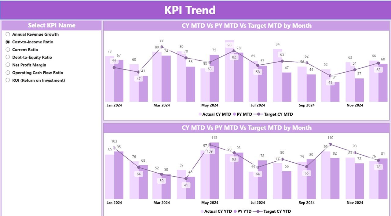
On this page, you’ll find two combo charts—one for MTD and one for YTD. These charts show:
-
Current Year Actuals
-
Previous Year Actuals
-
Targets
You can use a KPI name slicer to focus on a specific KPI and evaluate how it has performed month-over-month. This page is ideal for spotting seasonality trends or recurring dips and peaks in performance.
KPI Definition Page: Your Drill-Through Assistant
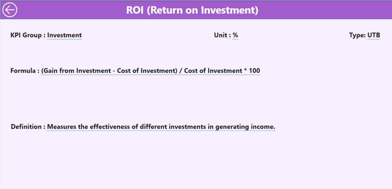
Though this page remains hidden during regular use, you can access it via drill-through from the Summary page. It gives deeper insight into each KPI’s:
-
Formula
-
Description
-
Measurement Unit
-
Type (LTB or UTB)
This ensures transparency, especially for stakeholders who want to understand how each metric is calculated before making strategic decisions.
Excel Backend Structure: Simple Yet Powerful
Click to Purchases Financial Planning KPI Dashboard in Power BI
The dashboard pulls data from a structured Excel file containing three essential sheets:
Input_Actual Sheet
This sheet captures the actual numbers for each KPI:
This sheet includes the corresponding targets:
KPI Definition Sheet
Here, define each KPI with the following columns:
Advantages of Financial Planning KPI Dashboard in Power BI
Switching to a Power BI-based dashboard offers numerous benefits for finance teams:
-
📈 Real-Time Monitoring: Stay on top of your targets with up-to-date visuals.
-
🧠 Better Decision Making: Use trend data to make smarter strategic choices.
-
⏱ Time Savings: Eliminate manual report building and automate monthly updates.
-
🎯 Target Visibility: Clearly understand where performance is exceeding or lagging.
-
💬 Drill-Down Clarity: Explain every KPI using definitions and formulas.
-
📉 Trend Detection: Easily compare current year data with the previous year.
-
💡 User-Friendly Interface: Slicers and icons help non-technical users navigate with ease.
-
🔧 Excel Integration: Keeps data entry simple and accessible for every team.
Best Practices for the Financial Planning KPI Dashboard
To make the most of your Power BI dashboard, follow these proven best practices:
🔹 Standardize KPI Definitions
Always use clear and consistent definitions. Ambiguous KPIs can lead to misinterpretations and poor decision-making.
🔹 Maintain Data Hygiene
Ensure data entry in Excel follows proper format and date consistency. Use validations to prevent errors.
🔹 Use Meaningful Visuals
Avoid cluttered charts. Use combo charts, cards, and trend lines that communicate insights instantly.
🔹 Review KPIs Monthly
Update Actual and Target sheets at the beginning of each month. Compare MTD and YTD values regularly.
🔹 Keep Stakeholders Involved
Get feedback from decision-makers to add or modify KPIs. The dashboard should evolve with business priorities.
🔹 Use Conditional Formatting Wisely
The green and red icons (▲▼) for MTD/YTD progress offer instant visual clarity—use them consistently.
Real-World Applications of This Dashboard
This Financial Planning Dashboard suits many sectors and roles:
-
🏢 Corporate Finance Teams – Monitor departmental spend and financial goals
-
📊 Consulting Firms – Provide visual KPI performance reports for clients
-
🏦 Banks & Financial Institutions – Track key ratios and year-over-year metrics
-
🏗 Construction or Real Estate – Compare project budgets and targets
-
🏫 Education & Nonprofits – Manage grant budgets and cost-saving initiatives
No matter the industry, this tool helps you align financial performance with your strategic goals.
How to Get Started
Setting up the dashboard is simple. Here’s how you can start:
✅ Open the Power BI Desktop template
✅ Link your Excel file as the data source
✅ Fill in the Actual, Target, and KPI Definition sheets
✅ Refresh the Power BI model
✅ Customize visuals or add additional filters as needed
With just a few clicks, your financial monitoring becomes smarter and faster.
Conclusion
The Financial Planning KPI Dashboard in Power BI is not just a reporting tool—it’s a decision-enabling powerhouse. With clean visuals, drill-down capabilities, and seamless Excel integration, it empowers finance professionals to track goals, compare performance, and pivot strategies quickly.
Whether you’re looking to manage budgets, identify underperforming areas, or forecast better, this dashboard gives you the clarity and control to do it all.
Frequently Asked Questions (FAQs)
1. What is the difference between MTD and YTD in this dashboard?
MTD (Month-to-Date) reflects performance from the beginning of the current month to today.
YTD (Year-to-Date) shows cumulative performance from January to the current month.
2. Can I use this dashboard with other data sources like SQL or Google Sheets?
Yes, Power BI supports various data sources. However, this template is optimized for Excel, which makes it more accessible to most users.
3. How many KPIs can this dashboard support?
There’s no strict limit. You can track dozens or even hundreds of KPIs, depending on your data model’s size and Power BI performance.
4. What do UTB and LTB mean?
-
UTB (Upper the Better): Higher values indicate better performance (e.g., Revenue, ROI)
-
LTB (Lower the Better): Lower values are preferred (e.g., Expense Ratio, Cost per Unit)
5. How do I drill through to see KPI details?
Right-click on a KPI row in the Summary Page and select Drill Through > KPI Definition. You’ll then see detailed info like formula, unit, and explanation.
6. What happens if I forget to update the Excel file monthly?
The dashboard will show outdated results. It’s best to set a monthly reminder or automate the data refresh to maintain accuracy.
Absolutely. Just add the new group in the KPI Definition sheet and reflect it in your visuals. Power BI will handle the rest after a data refresh.
8. Is this suitable for small businesses too?
Yes! In fact, small businesses benefit even more as it helps them set and monitor financial goals without investing in expensive ERP tools.
Visit our YouTube channel to learn step-by-step video tutorials