In today’s fast-paced business environment, organizations are constantly looking for ways to streamline their processes and improve efficiency. One area where efficiency can significantly impact overall productivity is office workflow management. A well-structured office workflow ensures tasks are completed on time, reduces the risk of errors, and improves team collaboration. One of the most effective ways to manage and improve office workflow is through the use of a dashboard. This article will explore the Office Workflow Efficiency Dashboard in Excel, a ready-to-use template designed to help businesses track and enhance their office workflows.
Click to Purchases Office Workflow Efficiency Dashboard in Excel
What is the Office Workflow Efficiency Dashboard?
The Office Workflow Efficiency Dashboard is an Excel-based tool that helps organizations monitor and manage their office workflows. By using this dashboard, teams can track task completion, measure performance, and identify bottlenecks. It serves as a comprehensive tool for evaluating the status of tasks, analyzing departmental performance, and improving overall productivity.
Key Features of the Office Workflow Efficiency Dashboard
This Office Workflow Efficiency Dashboard template includes several essential features that make it an all-in-one solution for tracking office workflow efficiency. Below are the key components:
-
Page Navigator: This feature, located on the left side of the dashboard, allows users to quickly navigate between different analytical pages for detailed insights.
Five Analytical Pages: The dashboard includes five pages that each focus on a specific aspect of office workflow:
- Overview Page
- Department Performance
- Task Type Analysis
- Priority Summary
- Monthly Trends
-
Comprehensive Data Sheet: The data sheet captures critical details about tasks, including task ID, department, priority, status, assigned date, due date, completion date, and more.
-
Support Sheet: This sheet provides additional data and assists in the calculation of key metrics, ensuring all analysis is accurate and up-to-date.
Now that we’ve looked at the basic features, let’s dive into the details of each page to understand how it contributes to improving workflow efficiency.
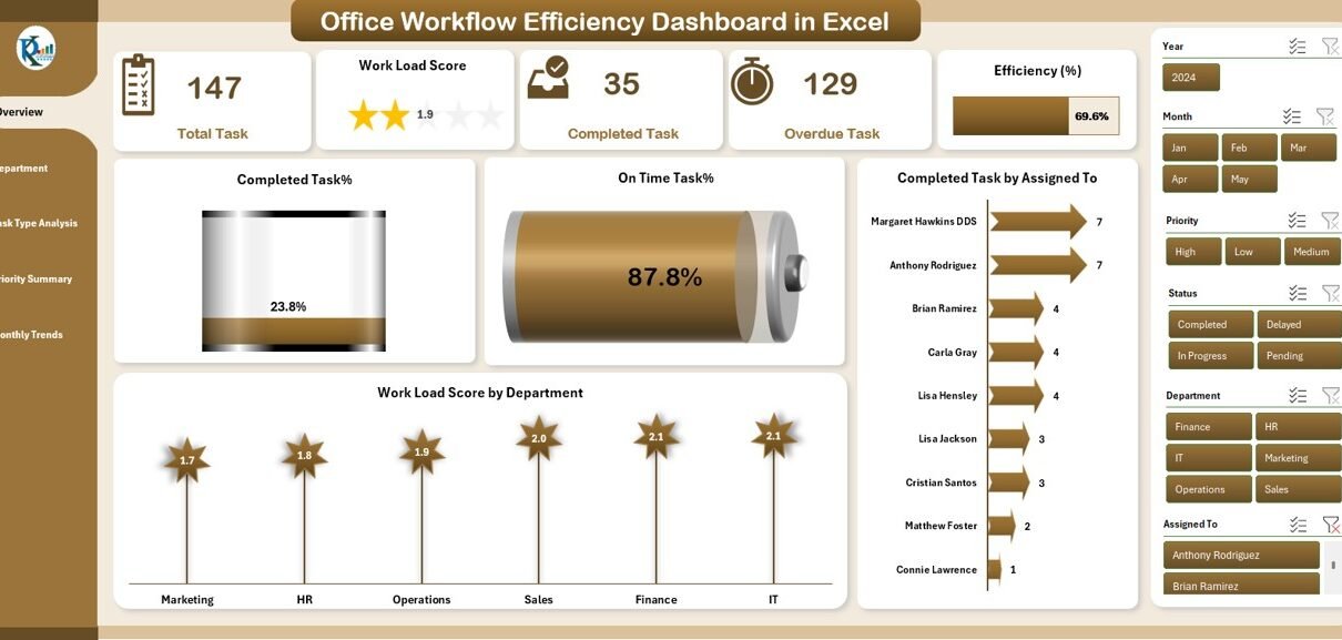
Overview Page: The Central Hub of Workflow Monitoring
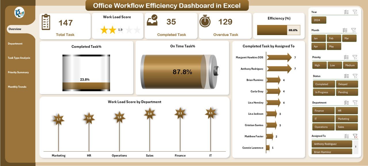
The Overview Page serves as the central hub for tracking and analyzing overall office workflow performance. It includes several key performance indicators (KPIs) that provide insights into how tasks are progressing across the organization.
Key Features of the Overview Page:
-
Completed Task %: This chart shows the percentage of tasks that have been completed.
-
On-Time Task %: This chart tracks the percentage of tasks that were completed on time.
-
Completed Tasks by Assigned To: This chart helps managers identify who is completing tasks and whether there is an imbalance in workload distribution.
-
Workload Score by Department: This chart evaluates each department’s workload, helping identify potential resource constraints.
By having a visual representation of task progress and departmental workload, decision-makers can easily spot areas that need attention and optimize task allocation.
Department Performance: Measuring the Efficiency of Different Departments
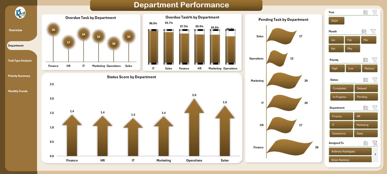
The Department Performance page is dedicated to evaluating the performance of various departments within the organization. It focuses on tasks that are overdue, pending, and completed, providing valuable insights into departmental productivity.
Key Features of the Department Performance Page:
-
Overdue Task by Department: This chart shows the number of tasks that are past their due dates, helping identify departments that may need additional support.
-
Overdue Task % by Department: This chart measures the percentage of tasks overdue in each department, allowing for more granular analysis.
-
Pending Task by Department: This chart provides an overview of tasks that are still pending in each department.
-
Status Score by Department: This chart assigns a performance score based on the status of tasks in each department, helping teams monitor progress against deadlines.
With these insights, managers can focus on underperforming departments and make data-driven decisions to enhance workflow efficiency.
Task Type Analysis: Understanding Task Distribution
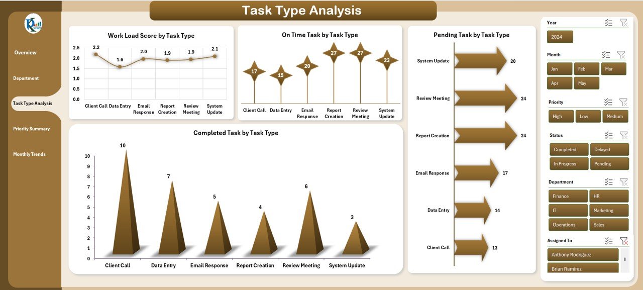
The Task Type Analysis page provides insights into how tasks are distributed based on their type. This helps managers understand whether certain types of tasks require more attention or resources.
Key Features of the Task Type Analysis Page:
-
Workload Score by Task Type: This chart evaluates the workload for different task types, allowing managers to identify high-effort areas.
-
On-Time Task by Task Type: This chart tracks the percentage of tasks that are completed on time, categorized by task type.
-
Pending Task by Task Type: This chart shows the pending tasks for each task type, giving a clear picture of where tasks are getting stuck.
-
Completed Task by Task Type: This chart tracks how many tasks of each type have been completed, helping teams identify which types are more challenging to complete.
By examining task type performance, organizations can improve their resource allocation strategies.
Click to Purchases Office Workflow Efficiency Dashboard in Excel
Priority Summary: Prioritizing High-Impact Tasks
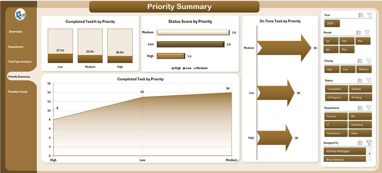
The Priority Summary page helps teams focus on the most important tasks by evaluating their status based on priority. High-priority tasks require more attention to ensure they are completed on time.
Key Features of the Priority Summary Page:
-
Completed Task % by Priority: This chart shows the percentage of tasks completed based on their priority.
-
Status Score by Priority: This chart evaluates how well high-priority tasks are progressing in comparison to lower-priority ones.
-
On-Time Task by Priority: This chart tracks the completion of high-priority tasks on time, helping teams stay on track with critical tasks.
-
Completed Task by Priority: This chart provides insights into how many high-priority tasks have been completed, highlighting performance gaps.
Monthly Trends: Tracking Performance Over Time
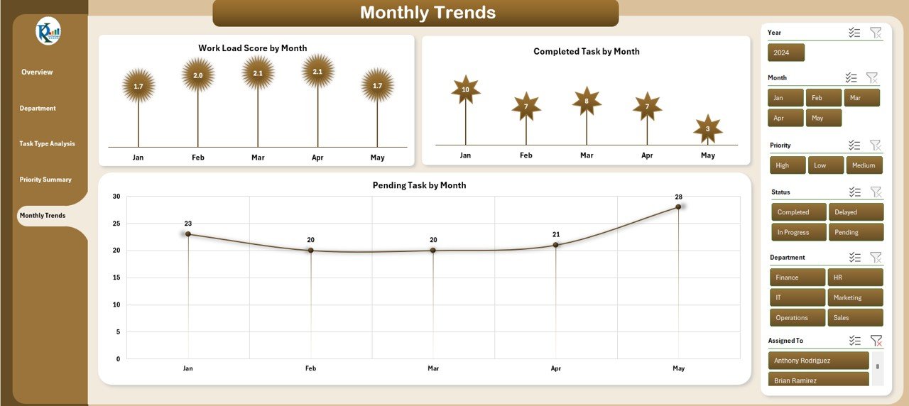
The Monthly Trends page tracks task performance over a period of time, offering valuable insights into trends and patterns in office workflow. It helps organizations monitor progress month by month and make adjustments to improve workflow efficiency.
Key Features of the Monthly Trends Page:
-
Workload Score by Month: This chart shows how the workload fluctuates from month to month, helping teams prepare for peak periods.
-
Completed Task by Month: This chart tracks the number of tasks completed each month, allowing teams to assess their performance over time.
-
Pending Task by Month: This chart tracks the number of tasks that remain pending at the end of each month.
Advantages of Using an Office Workflow Efficiency Dashboard
Implementing an Office Workflow Efficiency Dashboard can significantly improve the overall performance of an organization. Here are some of the key benefits:
-
Enhanced Task Monitoring: The dashboard allows teams to track tasks in real time, making it easier to monitor progress and make adjustments as needed.
-
Better Resource Allocation: By visualizing workload and task completion across departments, organizations can allocate resources more effectively.
-
Improved Decision-Making: With comprehensive data on task performance, managers can make data-driven decisions to enhance workflow efficiency.
-
Increased Productivity: By identifying bottlenecks and inefficiencies, the dashboard helps organizations streamline their processes and boost productivity.
Best Practices for Office Workflow Efficiency Dashboard
To get the most out of the Office Workflow Efficiency Dashboard, consider the following best practices:
-
Regularly Update Data: Ensure that the dashboard is updated regularly with the latest task information to maintain its accuracy.
-
Monitor Trends: Keep an eye on monthly trends and task performance to spot emerging issues before they become major problems.
-
Set Clear KPIs: Define clear KPIs that align with your organization’s goals and ensure the dashboard is tracking these metrics accurately.
-
Encourage Team Collaboration: Use the dashboard to promote collaboration across teams by sharing insights on task performance and workload distribution.
Frequently Asked Questions (FAQs)
1. How can I use the Office Workflow Efficiency Dashboard in Excel?
The Office Workflow Efficiency Dashboard is a ready-to-use Excel template. Simply input your task data into the data sheet, and the dashboard will automatically update with visual charts and performance metrics.
2. Can I customize the dashboard according to my organization’s needs?
Yes, the template is fully customizable. You can adjust the task categories, departments, and performance indicators to match your specific requirements.
3. Is the Office Workflow Efficiency Dashboard suitable for small businesses?
Absolutely! The dashboard is designed to be scalable, making it suitable for businesses of all sizes. Whether you’re a small team or a large organization, it can help streamline your workflow processes.
4. Does the dashboard support multiple users?
The dashboard can be shared with multiple users, allowing teams to collaborate and monitor task progress in real time. However, to avoid data discrepancies, it’s recommended to control who has access to edit the data sheet.
Conclusion
The Office Workflow Efficiency Dashboard in Excel is an invaluable tool for any organization looking to improve its workflow management. With its user-friendly interface and comprehensive tracking features, it helps businesses monitor task completion, assess departmental performance, and optimize resource allocation. By incorporating this dashboard into your office operations, you can ensure smoother processes, better decision-making, and increased productivity.
Visit our YouTube channel to learn step-by-step video tutorials