Running a test preparation centre feels exciting because you help students achieve their academic dreams. However, it also brings many challenges. You track student performance, enrollments, attendance, revenue, satisfaction, instructor quality, class completion, and more. When this information scatters across many Excel sheets, teachers and managers struggle to make decisions. As a result, student outcomes drop and the centre loses growth opportunities.
A Test Preparation Centres KPI Dashboard in Power BI solves this problem. It brings all important metrics into one clean and dynamic dashboard. You can compare month-wise performance, track targets, study trends, and understand year-to-year movement within minutes. Because the dashboard uses Power BI, you enjoy automation, clear visuals, and powerful analysis.
In this detailed article, you will explore everything about this dashboard. You will understand its pages, features, benefits, and best practices. You will also get answers to common questions asked by test preparation centre owners and academic teams.
Click to Purchases Test Preparation Centres KPI Dashboard in Power BI
What Is a Test Preparation Centres KPI Dashboard in Power BI?
A Test Preparation Centres KPI Dashboard in Power BI is a ready-to-use reporting solution designed for coaching centres, competitive exam training institutes, online learning academies, and test prep organisations. It tracks all major KPIs related to:
-
Student performance
-
Monthly trends
-
Target achievements
-
Instructor effectiveness
-
Enrolment growth
-
Batch performance
-
Attendance
-
Revenue metrics
As you use it, you understand exactly where your coaching centre stands today and how it performs compared to targets and previous years. This clear insight helps you plan better, improve performance, and take faster decisions.
Click to Purchases Test Preparation Centres KPI Dashboard in Power BI
Why Do Test Preparation Centres Need a KPI Dashboard?
A test preparation centre deals with thousands of data points every month. Without a proper dashboard:
-
You miss performance patterns.
-
You spend too much time collecting data.
-
You fail to track targets.
-
You find it hard to monitor multiple batches.
-
You lose clarity on monthly and yearly progress.
-
You cannot make data-based decisions.
However, when you use this Power BI dashboard, you organise everything in one place. Therefore, managers and teachers gain full control over performance at every level.
Key Features of the Test Preparation Centres KPI Dashboard in Power BI
This dashboard contains three main analytical pages. Each page provides clear insights and simple navigation so you can check any KPI in seconds.
Click to Purchases Test Preparation Centres KPI Dashboard in Power BI
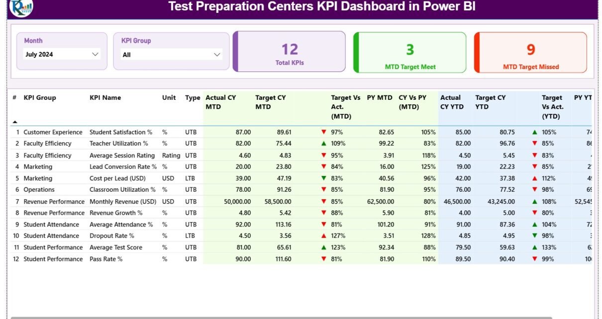
1. Summary Page
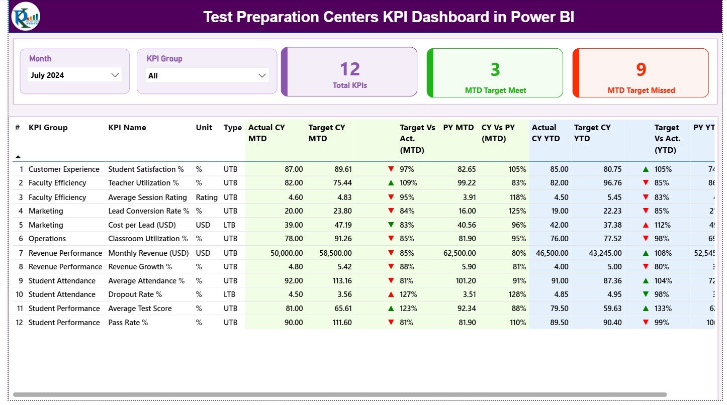
The Summary Page works as the main page of the dashboard. It gives you a complete picture of all KPIs in one view.
What You See on the Summary Page
✔ Month Slicer:
Select the month you want to analyse.
✔ KPI Group Slicer:
Filter KPIs by categories such as Academic KPIs, Revenue KPIs, Attendance KPIs, Student Growth KPIs, etc.
✔ Three Important Cards:
-
Total KPIs Count
-
MTD Target Met Count
-
MTD Target Missed Count
These cards help teachers and centre managers understand how the centre performs in the current month.
The Detailed Table on the Summary Page Shows:
-
KPI Number – The unique sequence number
-
KPI Group – Category of the KPI
-
KPI Name – The KPI that you track
-
Unit – Unit of measurement
-
Type – LTB (Lower the Better) or UTB (Upper the Better)
-
Actual CY MTD – Current Year Actual Month-to-Date
-
Target CY MTD – Target Month-to-Date
-
MTD Icon – Green ▲ or Red ▼ based on performance
-
Target vs Actual (MTD) – Actual MTD / Target MTD
-
PY MTD – Previous Year MTD
-
CY vs PY (MTD) – Current MTD / Previous MTD
-
Actual CY YTD – Current Year Year-to-Date
-
Target CY YTD – Target Year-to-Date
-
YTD Icon – Green ▲ or Red ▼ based on YTD performance
-
Target vs Actual (YTD) – Actual YTD / Target YTD
-
PY YTD – Previous Year YTD
-
CY vs PY (YTD) – Current YTD / Previous YTD
You get everything in one structured view. As a result, you save time and make fast decisions.
2. KPI Trend Page
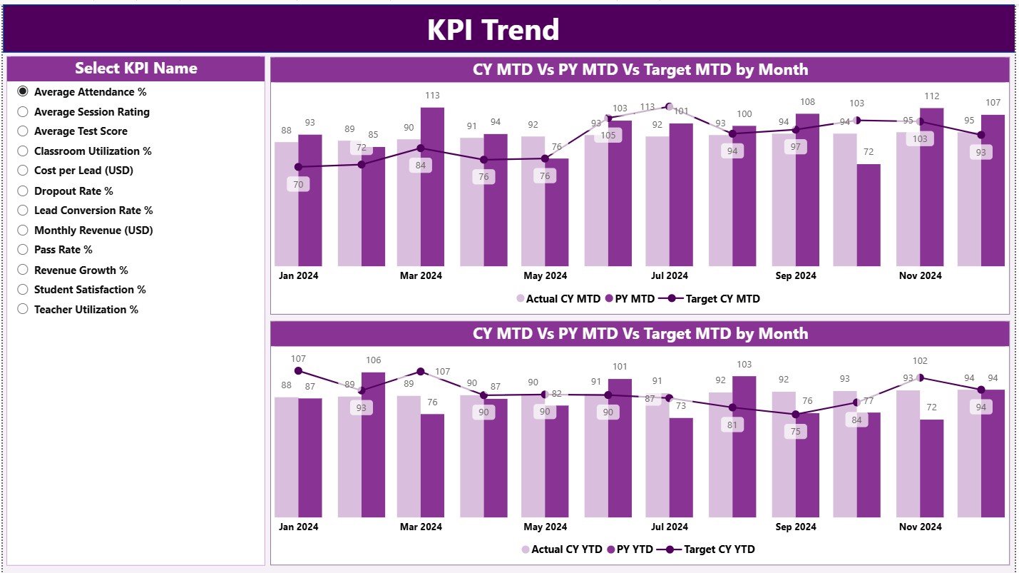
The KPI Trend Page helps you study performance over time. You can compare trends for current year, previous year, and targets in a simple and visual way.
This Page Includes:
✔ A slicer to select KPI Name
✔ Two combo charts:
-
MTD Trend Chart: Current Year vs Previous Year vs Target
-
YTD Trend Chart: Current Year vs Previous Year vs Target
This trend view gives you complete clarity on how a KPI behaves across months. Teachers, academic heads, and management teams use this page to understand performance patterns and decide improvement plans.
Click to Purchases Test Preparation Centres KPI Dashboard in Power BI
3. KPI Definition Page
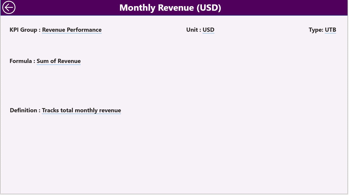
The KPI Definition Page works as a hidden drill-through page. When you click on any KPI in the summary page, you can see its:
-
KPI Number
-
KPI Group
-
KPI Name
-
Unit
-
Formula
-
Detailed Definition
-
Type (LTB or UTB)
This helps users understand the logic behind each KPI. You also get a Back Button on the top left to return to the main page instantly.
Data Source – How the Excel File Works
The dashboard uses a linked Excel file that contains three main sheets. You only update these sheets and the dashboard updates automatically.
1. Input_Actual Sheet
Use this sheet to fill:
-
KPI Name
-
Month (first day of the month)
-
MTD number
-
YTD number
This sheet captures all Actual values for the current year.
2. Input_Target Sheet
Use this sheet to fill:
-
KPI Name
-
Month (first day of the month)
-
MTD Target
-
YTD Target
This sheet handles all target values for the year.
3. KPI Definition Sheet
Use this sheet to fill:
-
KPI Number
-
KPI Group
-
KPI Name
-
Unit
-
Formula
-
Definition
-
KPI Type (LTB or UTB)
Once you fill all three sheets properly, the dashboard updates itself.
Click to Purchases Test Preparation Centres KPI Dashboard in Power BI
Advantages of the Test Preparation Centres KPI Dashboard in Power BI
This dashboard brings many advantages for every coaching centre. It helps academic teams track performance with accuracy and confidence.
1. You get a single source of truth
All KPIs come together in one dashboard. Therefore, teachers and managers do not waste time searching for data.
2. You make better academic decisions
You compare monthly and yearly trends in seconds. As a result, you plan better strategies for student improvement and centre growth.
3. You track targets faster
The green and red icons help you check performance instantly. You immediately know whether a KPI meets the target or not.
4. You study performance trends
The trend charts show MTD and YTD movement clearly. You see how performance changes across months and compare it with last year.
5. You increase student success rates
When teachers track KPIs, they identify problem areas quickly. As a result, they take actions that increase student success.
6. You improve operational efficiency
The dashboard reduces manual work, removes errors, and increases the speed of reporting.
7. You get a professional analysis tool
The dashboard uses Power BI visuals, filters, and drill-through pages. Therefore, the centre looks more professional and organised.
Best Practices for Using the Test Preparation Centres KPI Dashboard in Power BI
To get the best results from this dashboard, follow these easy best practices.
1. Update the Excel Sheets Regularly
Enter accurate actual and target numbers every month. This keeps your dashboard fresh and useful.
2. Review the Summary Page Every Week
This helps teachers and management stay aware of performance.
3. Add clear definitions in the KPI Definition Sheet
A clear definition avoids confusion and makes analysis smoother.
4. Compare CY vs PY numbers often
Year-to-year comparison shows real progress more clearly than monthly numbers.
5. Use UTB and LTB types correctly
-
UTB (Upper The Better): Attendance %, Batch Completion %, Revenue, New Enrolments
-
LTB (Lower The Better): Dropout %, Refund %, Complaint Count
This improves clarity.
6. Use the KPI Trend Page for long-term planning
This page helps the team understand behaviour patterns and decide improvement plans.
7. Train your staff to use the dashboard
When teachers understand the dashboard, they use it effectively to improve performance.
8. Keep KPI Names consistent
Consistent naming avoids errors while importing or analysing data.
Conclusion
A Test Preparation Centres KPI Dashboard in Power BI gives complete control over academic, operational, and financial performance. It brings clarity, speed, and accuracy to reporting. With its well-structured pages, powerful trend charts, and simple Excel input sheets, it becomes the perfect tool for test preparation centres of all sizes.
When you use this dashboard regularly, you make strong decisions, improve student results, and grow your coaching centre with confidence.
Click to Purchases Test Preparation Centres KPI Dashboard in Power BI
Frequently Asked Questions (FAQs)
1. What is the purpose of a Test Preparation Centres KPI Dashboard in Power BI?
It helps coaching centres track student performance, revenue, attendance, and monthly targets in one dashboard.
2. Who should use this dashboard?
Academic heads, centre managers, teachers, owners, and operations teams should use this dashboard.
3. Do I need technical skills to use this dashboard?
No. You only update the Excel sheets. Power BI updates everything automatically.
4. Can I add more KPIs to the dashboard?
Yes. You can add more KPIs in the KPI Definition sheet and update actual and target numbers.
5. Does the dashboard show year-to-year comparison?
Yes. The dashboard shows CY vs PY values for both MTD and YTD.
6. Can I use this dashboard for multiple test preparation programs?
Yes. You can use KPI Groups to manage different programs such as SAT, GRE, GMAT, IIT-JEE, NEET, etc.
7. Can I export the insights from Power BI?
Yes. Power BI allows export of visuals, tables, and complete pages.
Click to Purchases Test Preparation Centres KPI Dashboard in Power BI
Visit our YouTube channel to learn step-by-step video tutorials