In today’s competitive business environment, customer experience plays a decisive role in brand loyalty, retention, and revenue growth. However, managing customer experience without clear visibility across every interaction point often leads to guesswork rather than informed decision-making. That is exactly where a Customer Journey Mapping KPI Dashboard in Power BI becomes a powerful and practical solution.
This in-depth, SEO-friendly article explains what a Customer Journey Mapping KPI Dashboard in Power BI is, why it matters, how it works, its page-wise structure, key KPIs, advantages, best practices, and frequently asked questions. Moreover, the article uses simple language, clear explanations, and real-world logic so that business leaders, CX teams, marketers, and analysts can easily understand and implement it.
Click to Purchases Customer Journey Mapping KPI Dashboard in Power BI
What Is a Customer Journey Mapping KPI Dashboard in Power BI?
A Customer Journey Mapping KPI Dashboard in Power BI is an interactive, visual reporting tool that tracks and analyzes customer experience performance metrics across different stages of the customer journey.
Instead of relying on disconnected spreadsheets, surveys, and reports, this dashboard consolidates actuals, targets, and historical data into a single, dynamic Power BI report. As a result, organizations gain a clear view of how customers move through awareness, consideration, purchase, onboarding, usage, and loyalty stages.
Moreover, because the dashboard uses Power BI, users benefit from interactive slicers, drill-through capabilities, trend analysis, and automated comparisons—all without complex manual work.
Why Is Customer Journey Mapping Important for Businesses?
Customer journey mapping matters because customers no longer interact with brands through a single channel. Instead, they engage through websites, apps, emails, support tickets, social media, and physical touchpoints.
Therefore, businesses need a structured way to measure and optimize these interactions.
Key Reasons Customer Journey Mapping Is Critical
-
It identifies friction points in the customer experience
-
It highlights drop-offs across journey stages
-
It improves customer satisfaction and loyalty
-
It aligns teams around customer-centric goals
-
It supports data-driven CX improvement initiatives
However, journey maps alone are not enough. You also need KPIs and performance tracking, which is why a Customer Journey Mapping KPI Dashboard in Power BI becomes essential.
How Does a Customer Journey Mapping KPI Dashboard in Power BI Work?
This dashboard works by combining Excel-based input data with Power BI’s visualization and analytics capabilities.
Data Flow Overview
-
You capture actual performance data in Excel
-
You define KPI targets in Excel
-
You maintain KPI definitions and logic in Excel
-
Power BI connects to the Excel file
-
Power BI transforms, models, and visualizes the data
As a result, users can track Month-to-Date (MTD) and Year-to-Date (YTD) performance, compare results against targets, and evaluate trends against previous years.
Data Source Structure: Excel-Based Input System
The Customer Journey Mapping KPI Dashboard in Power BI uses a simple yet structured Excel data source. Therefore, even non-technical users can maintain it easily.
1. Input_Actual Sheet
This sheet captures the actual performance values.
Key Columns Include:
-
KPI Name
-
Month (use the first date of the month)
-
MTD Actual Value
-
YTD Actual Value
You only need to update this sheet monthly, which ensures consistency and accuracy.
2. Input_Target Sheet
This sheet stores target values for each KPI.
Key Columns Include:
-
KPI Name
-
Month (first date of the month)
-
MTD Target Value
-
YTD Target Value
Because targets remain separate, you can revise them without impacting historical actuals.
3. KPI Definition Sheet
This sheet defines the logic and purpose of each KPI.
Key Columns Include:
-
KPI Number
-
KPI Group
-
KPI Name
-
Unit of Measurement
-
Formula
-
Definition
-
KPI Type (LTB or UTB)
This structure ensures clarity, governance, and transparency across teams.
Click to Purchases Customer Journey Mapping KPI Dashboard in Power BI
Page-Wise Structure of the Customer Journey Mapping KPI Dashboard in Power BI
The dashboard consists of three well-structured pages, each designed for a specific analytical purpose.
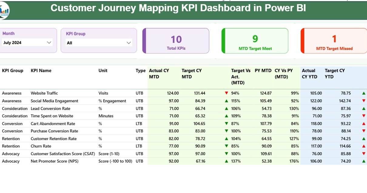
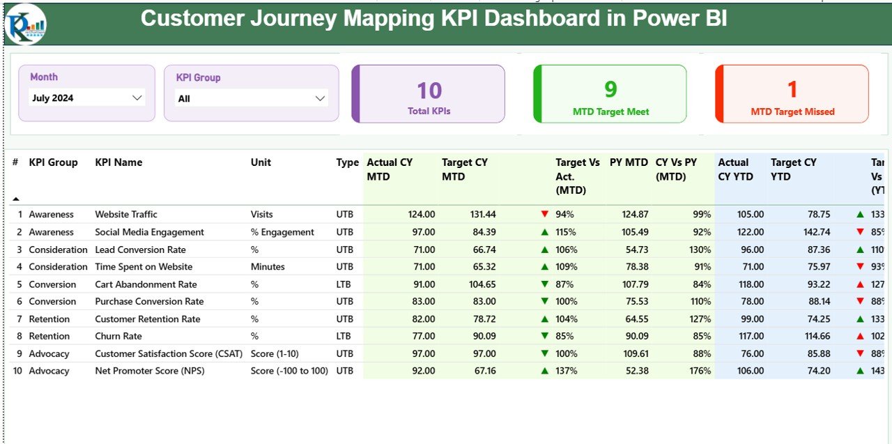
1) Summary Page: The Central Control Panel
The Summary Page acts as the main landing page of the dashboard. It provides a complete overview of customer journey performance at a glance.
Top-Level Filters and Cards
At the top of the page, you will find:
-
Month slicer for period selection
-
KPI Group slicer for category-based analysis
Additionally, three KPI cards display:
-
Total KPIs Count
-
MTD Target Met Count
-
MTD Target Missed Count
As a result, leadership can instantly assess overall performance.
Detailed KPI Performance Table
Below the cards, a detailed table displays comprehensive KPI information.
Columns Explained Clearly:
-
KPI Number: Sequence number of the KPI
-
KPI Group: Customer journey stage or category
-
KPI Name: Name of the KPI
-
Unit: Measurement unit
-
Type: LTB (Lower the Better) or UTB (Upper the Better)
MTD Performance Metrics
-
Actual CY MTD: Current Year Month-to-Date actual value
-
Target CY MTD: Current Year Month-to-Date target
-
MTD Icon: ▲ (green) or ▼ (red) performance indicator
-
Target vs Actual (MTD): Actual ÷ Target (%)
-
PY MTD: Previous Year MTD value
-
CY vs PY (MTD): CY Actual ÷ PY Actual (%)
These metrics help teams identify short-term performance gaps quickly.
YTD Performance Metrics
-
Actual CY YTD: Current Year Year-to-Date actual value
-
Target CY YTD: Current Year Year-to-Date target
-
YTD Icon: ▲ or ▼ performance indicator
-
Target vs Actual (YTD): Actual ÷ Target (%)
-
PY YTD: Previous Year YTD value
-
CY vs PY (YTD): CY Actual ÷ PY Actual (%)
Therefore, teams gain both tactical and strategic performance visibility.
2) KPI Trend Page: Performance Over Time
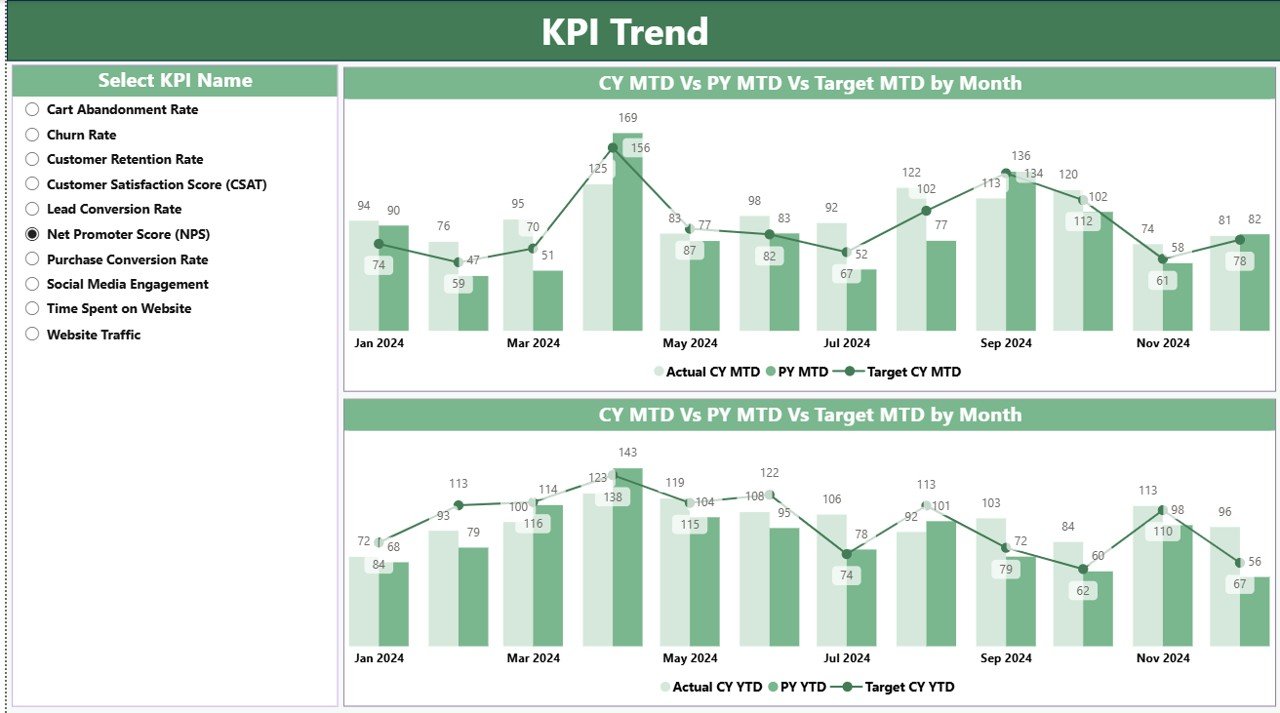
The KPI Trend Page focuses on historical analysis and trend evaluation.
Key Features of the KPI Trend Page
-
Two combo charts for MTD and YTD
-
Displays Current Year Actual, Previous Year Actual, and Target
-
Interactive KPI Name slicer on the left
Because of this setup, users can easily compare performance trajectories and detect patterns.
Why Trend Analysis Matters in Customer Journey Mapping
-
It highlights improvement or decline over time
-
It validates whether initiatives deliver results
-
It supports forecasting and planning
-
It enables proactive decision-making
As a result, trend analysis transforms raw data into actionable insight.
Click to Purchases Customer Journey Mapping KPI Dashboard in Power BI
3) KPI Definition Page: Drill-Through Insights
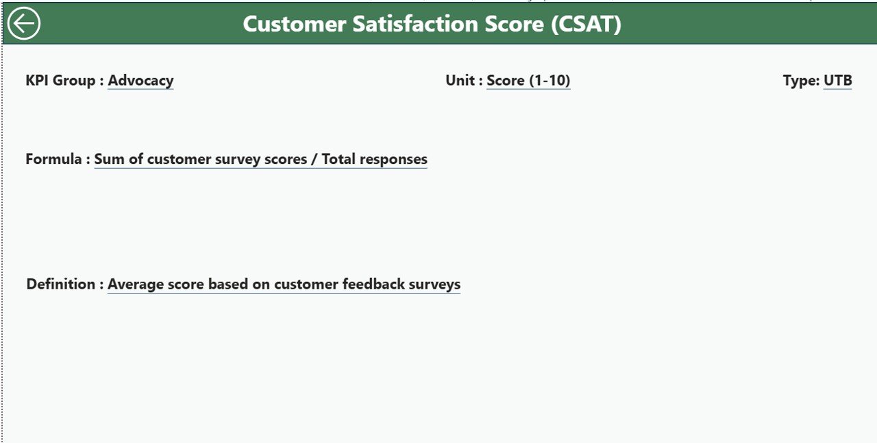
The KPI Definition Page serves as a drill-through reference page.
Purpose of This Page
-
Explains KPI formulas clearly
-
Defines business meaning of each KPI
-
Clarifies whether a KPI is LTB or UTB
This page remains hidden by default. However, users can drill through from the Summary Page to view detailed definitions.
A Back button at the top-left corner allows seamless navigation back to the main page.
What Types of KPIs Can You Track in Customer Journey Mapping?
This dashboard supports a wide range of customer journey KPIs across different stages.
Awareness Stage KPIs
-
Website Traffic Growth
-
Campaign Reach
-
Cost per Lead
Consideration Stage KPIs
-
Engagement Rate
-
Content Interaction Rate
-
Lead Conversion Rate
Purchase Stage KPIs
-
Conversion Rate
-
Cart Abandonment Rate
-
Average Order Value
Onboarding Stage KPIs
-
Onboarding Completion Rate
-
Time to First Value
-
Customer Activation Rate
Retention and Loyalty KPIs
-
Repeat Purchase Rate
-
Customer Lifetime Value
-
Net Promoter Score (NPS)
Because the dashboard uses a flexible KPI definition structure, you can customize KPIs easily.
Click to Purchases Customer Journey Mapping KPI Dashboard in Power BI
Advantages of Customer Journey Mapping KPI Dashboard in Power BI
1. Centralized Customer Experience Visibility
This dashboard consolidates all journey KPIs into one unified view. Therefore, teams no longer rely on scattered reports.
2. Faster and Better Decision-Making
Interactive visuals, icons, and comparisons help leaders act quickly and confidently.
3. Clear Target Accountability
Target vs Actual comparisons ensure teams stay accountable for performance goals.
4. Historical and Trend-Based Insights
MTD, YTD, and Previous Year analysis supports long-term strategy planning.
5. User-Friendly and Scalable Design
Excel-based inputs make data maintenance simple, while Power BI ensures scalability.
6. Improved Cross-Functional Alignment
Marketing, sales, CX, and leadership teams align around shared KPIs and objectives.
Best Practices for the Customer Journey Mapping KPI Dashboard in Power BI
1. Define Clear KPI Ownership
Assign each KPI to a responsible team or role to ensure accountability.
2. Use Meaningful KPI Groups
Group KPIs by customer journey stages to improve clarity and storytelling.
3. Keep KPI Definitions Simple
Use clear formulas and definitions so everyone understands the metrics.
4. Review Targets Regularly
Update targets based on business changes and market conditions.
5. Analyze Trends, Not Just Numbers
Focus on performance movement over time rather than isolated values.
6. Limit KPI Overload
Track only KPIs that truly impact customer experience and outcomes.
7. Leverage Drill-Through for Deeper Insights
Encourage users to explore KPI definitions and trends for context.
How Does This Dashboard Improve Customer Experience Strategy?
This dashboard transforms customer journey mapping from a static exercise into a living, data-driven system.
-
It identifies bottlenecks early
-
It measures improvement initiatives objectively
-
It supports continuous optimization
-
It connects experience metrics with business outcomes
Therefore, organizations move from reactive CX management to proactive experience leadership.
Conclusion: Why You Should Use a Customer Journey Mapping KPI Dashboard in Power BI
A Customer Journey Mapping KPI Dashboard in Power BI empowers organizations to monitor, analyze, and improve customer experience with clarity and confidence.
By combining structured Excel inputs with interactive Power BI visuals, this dashboard delivers real-time performance visibility, trend analysis, and actionable insights across the entire customer journey.
Ultimately, businesses that adopt this dashboard gain stronger customer relationships, improved retention, and sustainable growth.
Frequently Asked Questions (FAQs)
What is the main purpose of a Customer Journey Mapping KPI Dashboard in Power BI?
The main purpose is to track and analyze customer experience KPIs across different journey stages using interactive visuals and comparisons.
Can I customize KPIs in this dashboard?
Yes, you can easily customize KPIs by updating the KPI Definition sheet and input data in Excel.
Does this dashboard require advanced Power BI skills?
No, basic Power BI knowledge is enough because the dashboard uses structured data and standard visuals.
How often should I update the data?
You should update actual and target data monthly for accurate MTD and YTD analysis.
Can this dashboard support multiple departments?
Yes, the dashboard supports cross-functional analysis for marketing, sales, CX, and leadership teams.
Is Excel mandatory as a data source?
In this setup, Excel acts as the primary data source. However, you can extend it to other sources if required.
How does this dashboard help improve customer retention?
By identifying weak journey stages and tracking improvement over time, the dashboard helps optimize customer experience and retention.
Visit our YouTube channel to learn step-by-step video tutorials