Subscription box services continue to grow rapidly across industries such as beauty, food, fashion, wellness, and lifestyle. However, as competition increases, managing performance without clear data becomes risky. Therefore, subscription businesses must track the right metrics at the right time.
That is exactly why a Subscription Box Services KPI Dashboard in Power BI becomes a powerful and practical solution.
In this detailed article, you will understand what a Subscription Box Services KPI Dashboard in Power BI is, why it is important, how it works, its page-wise structure, Excel data requirements, advantages, best practices, and frequently asked questions. Moreover, the language remains simple, clear, and action-oriented so that business owners and analysts can easily use it.
Click to Purchases Subscription Box Services KPI Dashboard in Power BI
What Is a Subscription Box Services KPI Dashboard in Power BI?
A Subscription Box Services KPI Dashboard in Power BI is a centralized and interactive reporting tool designed to monitor key performance indicators related to subscription-based businesses.
Instead of managing scattered Excel reports, this dashboard converts raw data into meaningful visuals. As a result, decision-makers can track subscriber growth, target achievement, and performance trends in one place.
Furthermore, Power BI enables dynamic filtering, drill-through analysis, and automatic calculations. Consequently, businesses gain better visibility and control.
Why Do Subscription Box Businesses Need a KPI Dashboard?
Subscription box services operate on recurring revenue models. Therefore, small performance changes can significantly impact profitability.
A KPI dashboard becomes essential because:
-
It tracks performance consistently
-
It highlights target achievement and gaps
-
It supports data-driven decisions
-
It reduces manual reporting effort
-
It improves accountability across teams
As a result, subscription businesses can scale operations with confidence.
How Does a Subscription Box Services KPI Dashboard in Power BI Work?
This dashboard uses Excel as the data source and Power BI as the visualization layer.
The process works as follows:
-
Users enter actual and target KPI values into Excel
-
Power BI reads and processes the data
-
MTD, YTD, and variance metrics calculate automatically
-
Visuals update instantly using slicers
-
Users analyze insights and take action
Therefore, the dashboard remains flexible, scalable, and easy to maintain.
Click to Purchases Subscription Box Services KPI Dashboard in Power BI
Page-Wise Structure of the Subscription Box Services KPI Dashboard in Power BI
This dashboard includes three structured pages, each designed to serve a specific analytical purpose.
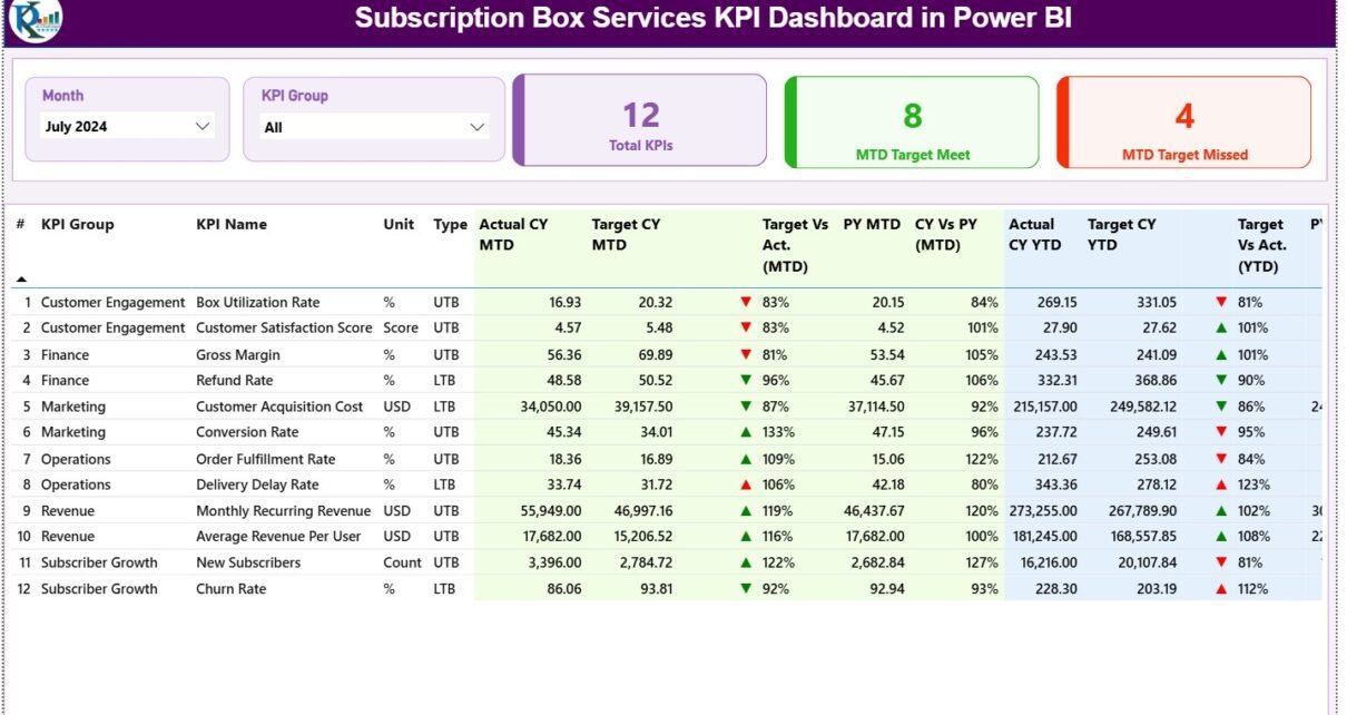
1. Summary Page: How Does It Help Monitor Overall Performance?
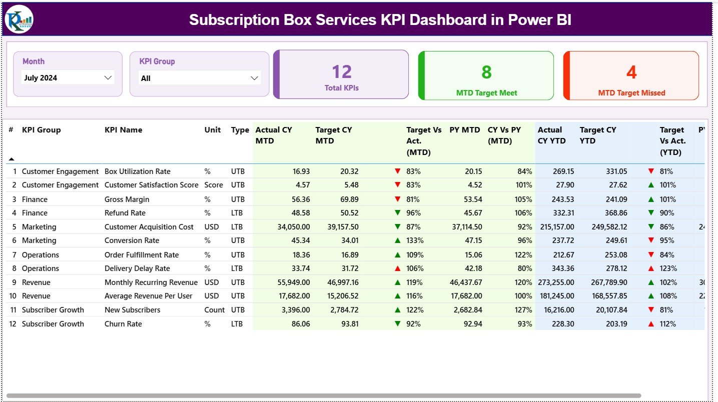
The Summary Page acts as the main control center of the dashboard. It provides a complete performance snapshot at a glance.
Slicers on the Summary Page
At the top of the page, two slicers allow quick filtering:
-
Month slicer – Selects the reporting month
-
KPI Group slicer – Filters KPIs by category
Because of these slicers, users can instantly focus on relevant KPIs.
KPI Cards for Quick Insights
Just below the slicers, three KPI cards provide instant clarity:
-
Total KPIs Count – Shows the total number of tracked KPIs
-
MTD Target Met Count – Displays KPIs meeting monthly targets
-
MTD Target Missed Count – Highlights KPIs missing targets
As a result, decision-makers immediately understand overall performance health.
Detailed KPI Performance Table
Below the cards, a detailed table displays comprehensive KPI metrics.
Column-by-Column Explanation
-
KPI Number
A unique sequence number assigned to each KPI. -
KPI Group
The category or classification of the KPI. -
KPI Name
The specific KPI being measured. -
Unit
The measurement unit such as %, count, or currency. -
Type (LTB / UTB)
-
LTB (Lower the Better)
-
UTB (Upper the Better)
-
Monthly Metrics (MTD)
-
Actual CY MTD
Actual performance for the current year month-to-date. -
Target CY MTD
Target value defined for the month. -
MTD Icon
▲ (green) or ▼ (red) to indicate target status. -
Target vs Actual (MTD)
Formula:
Actual MTD / Target MTD -
PY MTD
Previous year MTD value for comparison. -
CY vs PY (MTD)
Formula:
Current Year MTD / Previous Year MTD
Year-to-Date Metrics (YTD)
-
Actual CY YTD
Cumulative actual value for the current year. -
Target CY YTD
Cumulative target value for the current year. -
YTD Icon
Visual indicator for YTD performance. -
Target vs Actual (YTD)
Formula:
Actual YTD / Target YTD -
PY YTD
Previous year YTD value. -
CY vs PY (YTD)
Formula:
Current Year YTD / Previous Year YTD
Because of this structure, users can evaluate short-term and long-term performance together.
Click to Purchases Subscription Box Services KPI Dashboard in Power BI
2. KPI Trend Page: How Can You Analyze Subscription Trends?
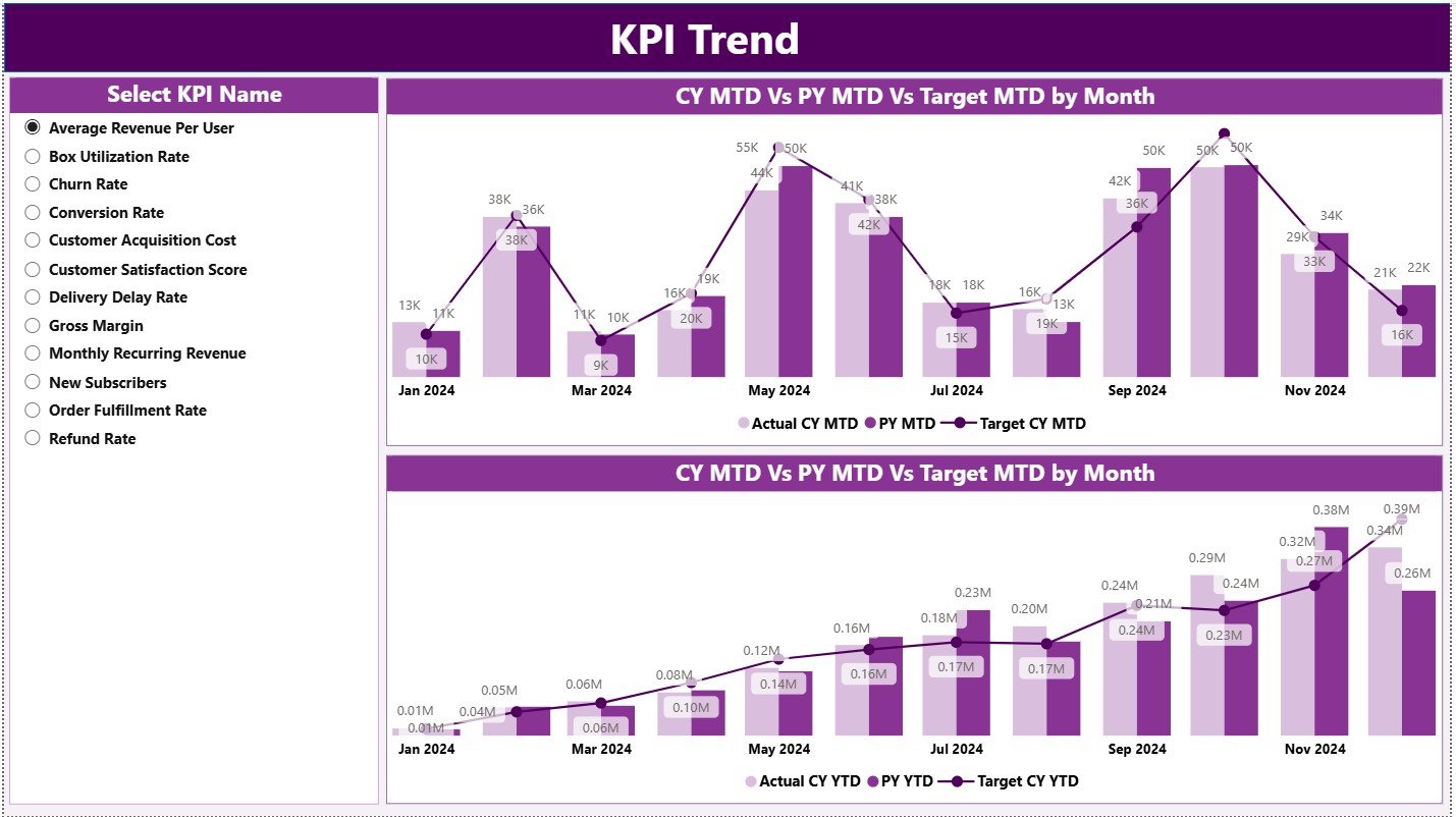
The KPI Trend Page focuses on performance movement over time.
Key Features of the KPI Trend Page
-
Two combo charts for:
-
MTD trends
-
YTD trends
-
-
Each chart compares:
-
Current Year Actual
-
Previous Year Actual
-
Target values
-
-
A KPI Name slicer on the left
As a result, users can analyze one KPI at a time in detail.
Why Trend Analysis Matters for Subscription Box Services
Trend analysis helps businesses:
-
Identify growth patterns
-
Detect churn-related issues
-
Compare seasonal performance
-
Improve target-setting accuracy
Therefore, this page supports proactive planning.
3. KPI Definition Page: Why Is KPI Transparency Important?
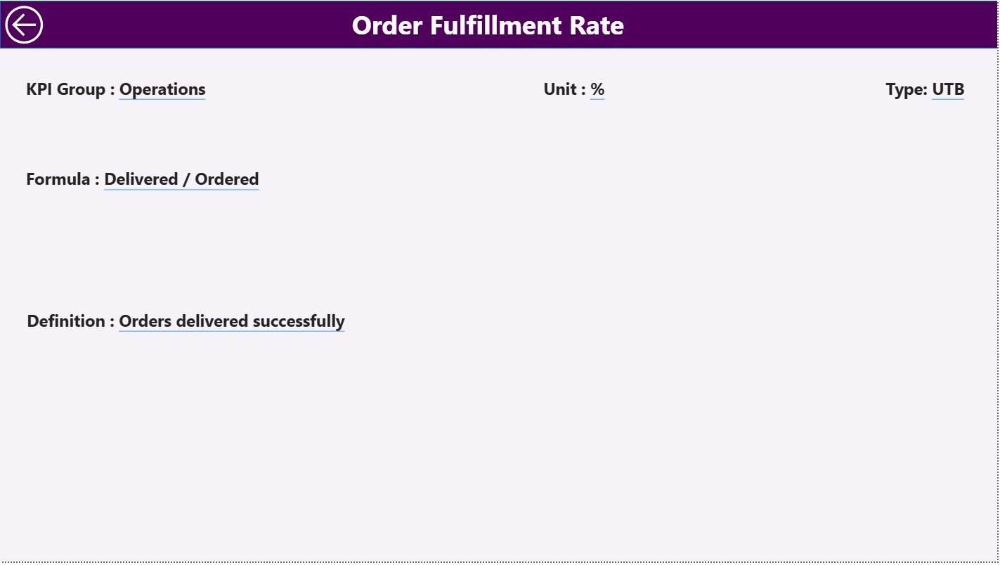
The KPI Definition Page explains KPIs clearly and consistently.
What Does the KPI Definition Page Show?
-
KPI Formula
-
KPI Definition
-
KPI Type (LTB or UTB)
This page stays hidden by default. However, users can drill through from the Summary Page.
To return, users simply click the Back button at the top-left corner.
As a result, the dashboard remains clean yet informative.
Excel Data Structure for the Dashboard
The dashboard uses an Excel file as its data source. This approach keeps data entry simple and user-friendly.
1. Input_Actual Sheet: How Do You Enter Actual KPI Data?
The Input_Actual sheet captures real performance values.
Required Columns
-
KPI Name
-
Month (use the first date of the month)
-
MTD value
-
YTD value
This sheet reflects actual subscription performance.
2. Input_Target Sheet: How Do You Define KPI Targets?
The Input_Target sheet stores target values.
Required Columns
-
KPI Name
-
Month (use the first date of the month)
-
MTD target
-
YTD target
Targets help measure performance gaps.
3. KPI Definition Sheet: How Do You Maintain KPI Consistency?
The KPI Definition sheet stores metadata.
Required Columns
-
KPI Number
-
KPI Group
-
KPI Name
-
Unit
-
Formula
-
Definition
-
Type (LTB or UTB)
This structure ensures clarity and standardization.
Advantages of Subscription Box Services KPI Dashboard in Power BI
This dashboard offers multiple business benefits.
Key Advantages Explained
-
Centralized KPI tracking
All subscription metrics stay in one place. -
Time-efficient reporting
Power BI automates calculations. -
Clear performance visibility
Icons and variances highlight issues instantly. -
Improved decision-making
Leaders act based on real data. -
Scalable design
Easily add new KPIs as the business grows. -
User-friendly interface
Simple slicers and visuals improve adoption.
Best Practices for Subscription Box Services KPI Dashboard in Power BI
Following best practices ensures long-term success.
Recommended Best Practices
-
Define KPIs clearly and consistently
-
Update Excel data on a fixed schedule
-
Group KPIs logically
-
Review MTD and YTD performance regularly
-
Avoid tracking too many KPIs
-
Align targets with business goals
-
Train users on slicers and drill-through
By following these practices, the dashboard remains reliable and actionable.
Who Should Use This Dashboard?
This dashboard benefits:
-
Subscription box founders
-
Operations managers
-
Growth and retention teams
-
Finance and analytics teams
-
Business analysts
Because of its flexible structure, it suits both startups and established brands.
Conclusion: Why Is a Subscription Box Services KPI Dashboard in Power BI Essential?
A Subscription Box Services KPI Dashboard in Power BI converts complex data into simple, actionable insights. It improves visibility, supports smarter decisions, and drives sustainable growth.
Instead of relying on assumptions, businesses track real performance. Moreover, Excel-based data entry keeps maintenance easy and cost-effective.
If you want better control, faster insights, and consistent performance tracking, this dashboard becomes an essential tool for your subscription business.
Click to Purchases Subscription Box Services KPI Dashboard in Power BI
Frequently Asked Questions (FAQs)
What is a Subscription Box Services KPI Dashboard?
It is a Power BI dashboard designed to track performance metrics for subscription-based businesses.
Do I need Power BI expertise to use this dashboard?
No. Basic Power BI knowledge is enough for daily use.
Can I customize KPIs in this dashboard?
Yes. You can modify KPIs using the Excel data source.
How often should I update the data?
You should update it monthly or as needed.
Can this dashboard handle multiple subscription plans?
Yes. With minor customization, it can support multiple plans.
Is this dashboard suitable for startups?
Yes. It works well for both startups and large subscription businesses.
Click to Purchases Subscription Box Services KPI Dashboard in Power BI
Visit our YouTube channel to learn step-by-step video tutorials