Modern oncology services handle complex clinical workflows, high treatment costs, diverse cancer types, and strict regulatory requirements. Because of this complexity, hospitals and cancer care centers struggle to track performance, revenue, treatment efficiency, and patient outcomes using traditional reports.
That is exactly why an Oncology Services Dashboard in Power BI becomes a critical tool for healthcare organizations.
Instead of working with scattered Excel files and manual reports, oncology teams can visualize key performance indicators in one centralized, interactive dashboard. As a result, leadership teams gain clarity, doctors make informed decisions, and finance teams track revenue accurately.
In this detailed guide, you will learn what an Oncology Services Dashboard in Power BI is, why it matters, how it works, its page-wise structure, advantages, best practices, and frequently asked questions. Moreover, this article uses clear language, smooth transitions, and practical examples to ensure easy understanding and strong SEO performance.
Click to Purchases Oncology Services Dashboard in Power BI
What Is an Oncology Services Dashboard in Power BI?
An Oncology Services Dashboard in Power BI is an interactive reporting solution that helps hospitals and cancer treatment centers monitor oncology operations, treatments, revenue, and trends using visual analytics.
Instead of relying on static reports, this dashboard transforms raw oncology data into charts, cards, and slicers that update automatically. As a result, users analyze performance by cancer type, treatment method, doctor, region, gender, and time period.
Because the dashboard runs on Power BI, it allows:
-
Real-time filtering
-
Interactive exploration
-
Clear visual storytelling
-
Secure data sharing
Therefore, oncology departments gain both operational and financial visibility without complex tools.
Why Do Oncology Departments Need a Power BI Dashboard?
Oncology care involves multiple departments, treatments, insurance rules, and cost structures. However, without a centralized reporting system, teams face several challenges.
Common Problems Without a Dashboard
-
Teams use disconnected Excel sheets
-
Doctors lack visibility into treatment revenue
-
Finance teams struggle to track gross charges and discounts
-
Leadership cannot identify trends quickly
-
Monthly reviews take too much time
However, an Oncology Services Dashboard in Power BI solves these issues by consolidating all critical metrics in one place.
Because Power BI offers interactive visuals, users quickly identify trends, gaps, and opportunities. As a result, organizations improve both patient care and financial performance.
How Does an Oncology Services Dashboard in Power BI Work?
The dashboard connects oncology data sources such as hospital billing systems, patient management systems, or Excel files. Then, Power BI models the data and displays it using visuals.
Key Functional Elements
-
Slicers to filter by cancer type, region, gender, doctor, or month
-
Cards to highlight summary metrics
-
Charts to analyze trends and comparisons
-
Pages dedicated to specific analysis areas
Because of this structure, users move seamlessly from high-level insights to detailed analysis.
What Pages Are Included in the Oncology Services Dashboard in Power BI?
This dashboard includes five well-structured pages, each designed to answer specific business and clinical questions.
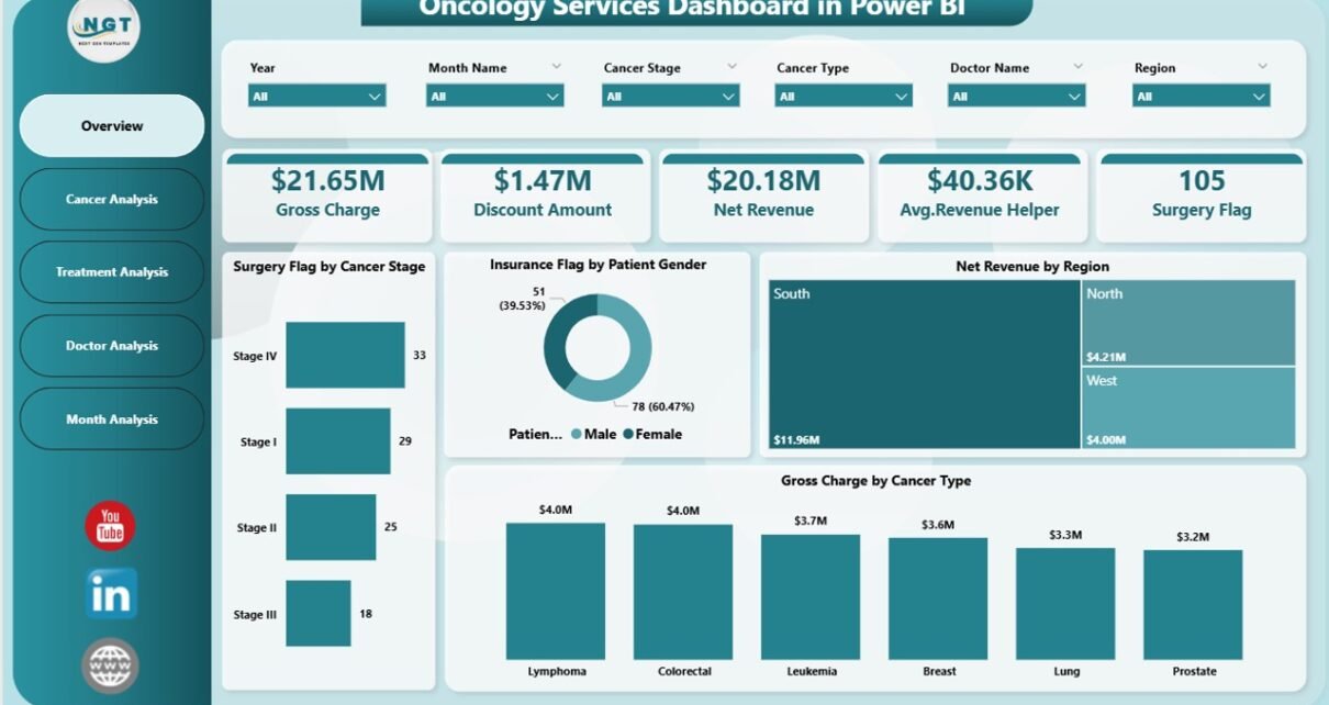
1. Overview Page: What Is Happening Across Oncology Services?
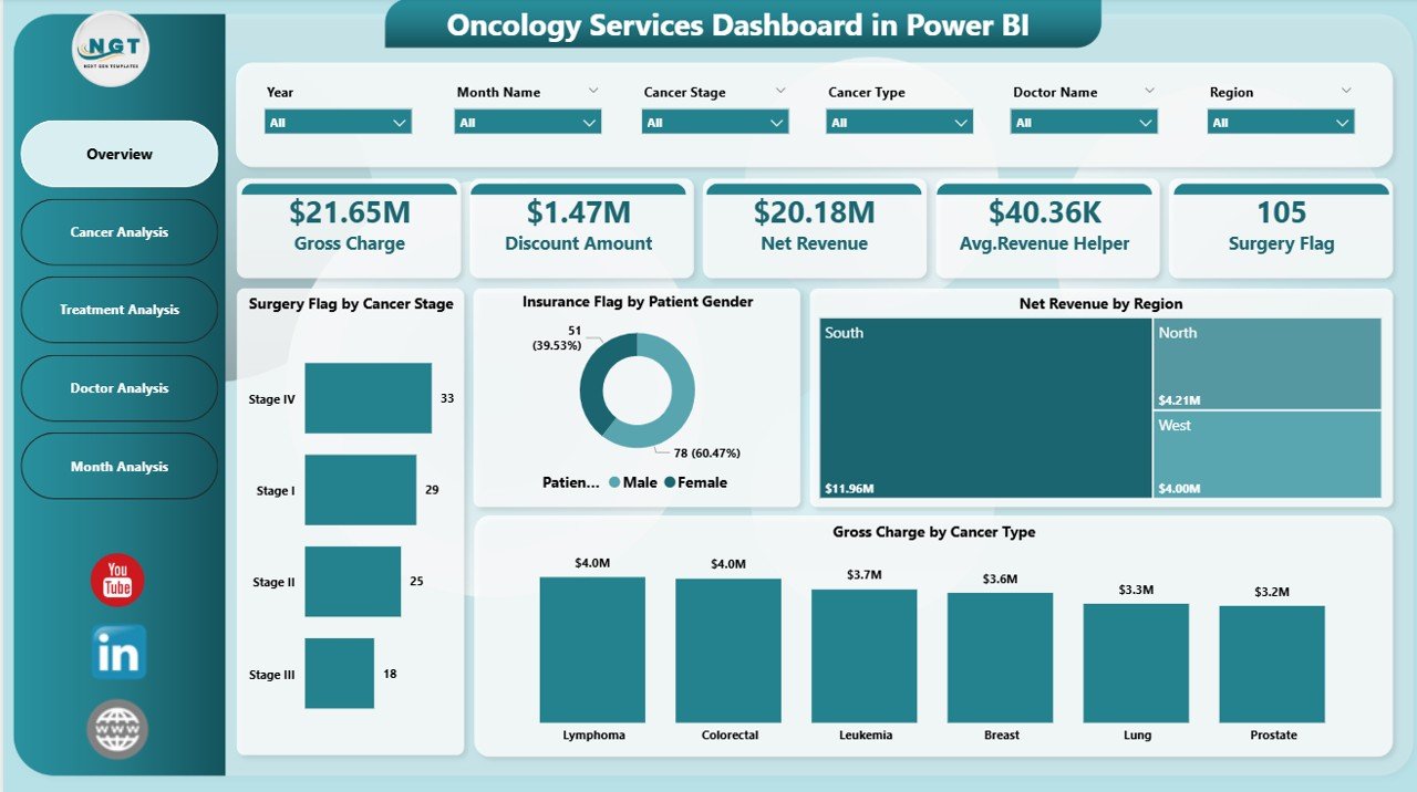
The Overview Page acts as the entry point of the dashboard. It provides a snapshot of overall oncology performance.
Key Elements of the Overview Page
Interactive Slicers
Users filter data by:
-
Cancer type
-
Region
-
Gender
-
Time period
Because of slicers, the entire dashboard updates instantly.
KPI Cards
This page includes four KPI cards, which show high-level metrics at a glance. These cards help leadership understand performance without scrolling.
Click to Purchases Oncology Services Dashboard in Power BI
Visual Charts on the Overview Page
The page includes four powerful charts:
-
Surgery Flag by Cancer Stage
This chart highlights how surgical treatments vary across cancer stages. As a result, teams assess treatment intensity patterns. -
Insurance Flag by Patient Gender
This chart shows insurance coverage trends by gender. Therefore, finance teams analyze coverage gaps easily. -
Net Revenue by Region
This chart compares revenue contribution from different regions. As a result, leadership identifies high-performing locations. -
Gross Charge by Cancer Type
This chart shows which cancer types generate the highest charges. Therefore, pricing and cost planning become easier.
2. Cancer Analysis Page: How Do Different Cancer Types Perform?
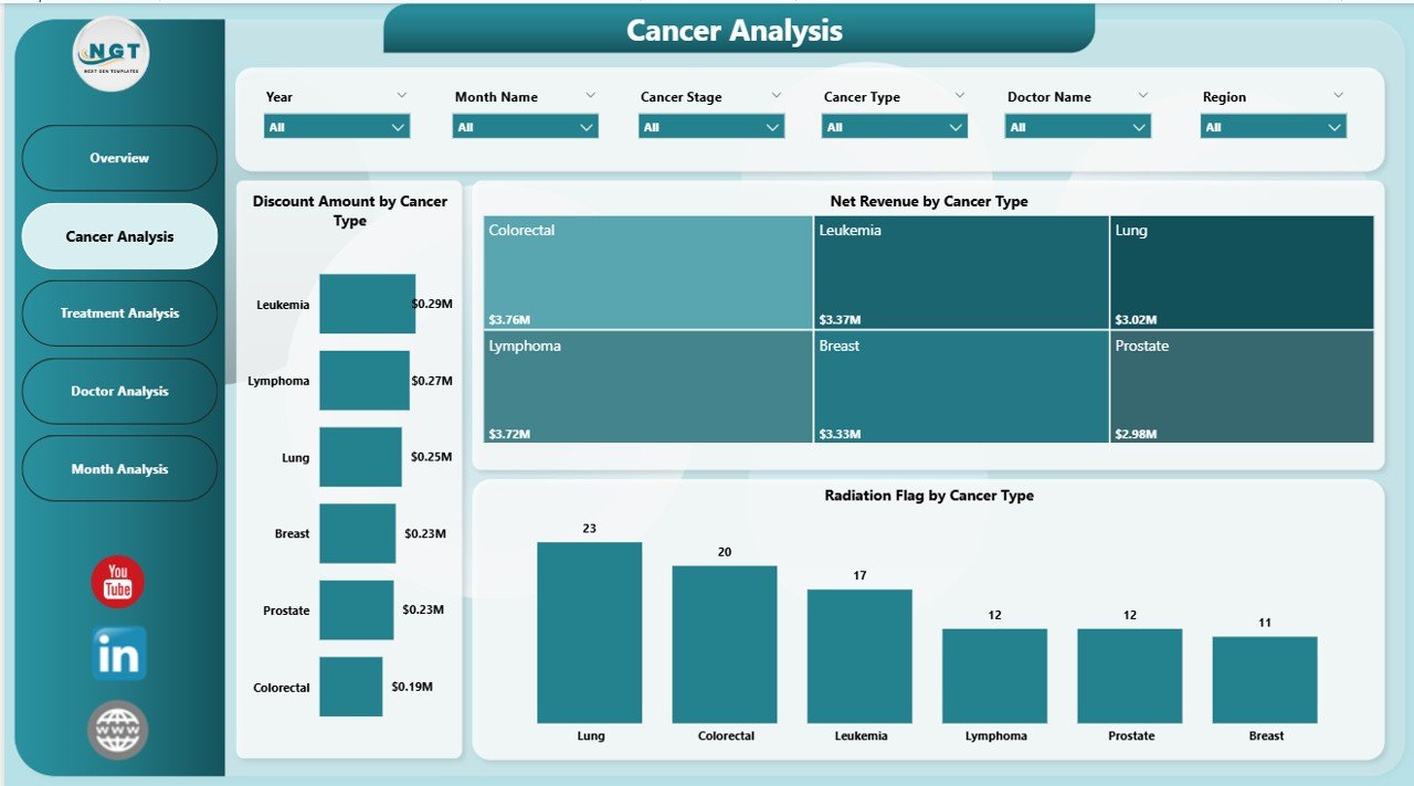
The Cancer Analysis Page dives deeper into cancer-specific financial performance.
Why This Page Matters
Cancer types differ in treatment complexity, cost, and insurance coverage. Because of this, cancer-wise analysis becomes essential.
Key Charts on the Cancer Analysis Page
-
Discount Amount by Cancer Type
This chart shows how discounts vary across cancer categories. As a result, finance teams identify revenue leakage. -
Net Revenue by Cancer Type
This chart highlights the actual revenue generated by each cancer type. Therefore, hospitals focus on profitable service lines. -
Radiation Flag by Cancer Type
This chart shows radiation therapy usage across cancers. As a result, oncology teams assess treatment patterns.
Because all visuals respond to slicers, users analyze cancer performance quickly and accurately.
3. Treatment Analysis Page: Which Treatments Drive Visits and Revenue?
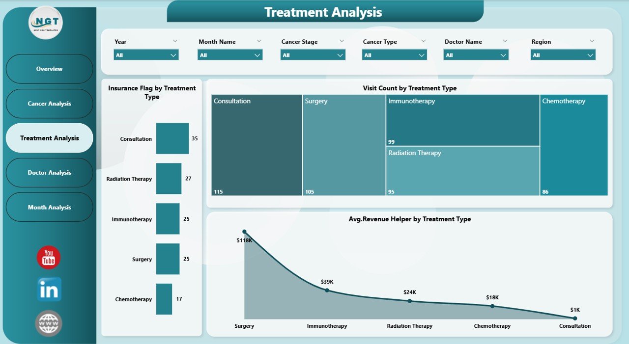
The Treatment Analysis Page focuses on treatment-level insights.
Why Treatment Analysis Is Important
Different treatments require different resources, staff, and costs. Therefore, treatment-wise tracking improves operational efficiency.
Key Charts on the Treatment Analysis Page
-
Insurance Flag by Treatment Type
This chart shows insurance coverage across treatments. As a result, billing teams identify reimbursement risks. -
Visit Count by Treatment Type
This chart displays how frequently each treatment occurs. Therefore, operations teams plan staffing effectively. -
Average Revenue Helper by Treatment Type
This chart highlights average revenue per treatment. As a result, leadership evaluates treatment profitability.
Because these visuals update dynamically, users make faster decisions.
4. Doctor Analysis Page: How Do Doctors Contribute to Revenue?
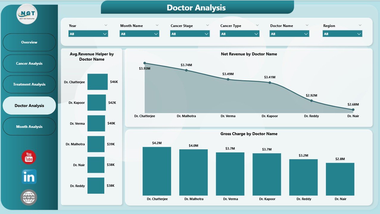
The Doctor Analysis Page focuses on physician-level performance.
Why Doctor-Wise Analysis Matters
Doctors play a critical role in patient outcomes and revenue generation. However, many organizations lack transparent doctor-wise metrics.
Key Charts on the Doctor Analysis Page
-
Average Revenue Helper by Doctor Name
This chart shows average revenue generated by each doctor. Therefore, leadership identifies high performers. -
Net Revenue by Doctor Name
This chart displays total revenue contribution by doctors. As a result, organizations reward performance fairly. -
Gross Charge by Doctor Name
This chart shows gross charges associated with each doctor. Therefore, pricing and cost analysis become easier.
Because of this page, hospitals maintain transparency and accountability.
Click to Purchases Oncology Services Dashboard in Power BI
5. Monthly Trends Page: How Does Oncology Performance Change Over Time?
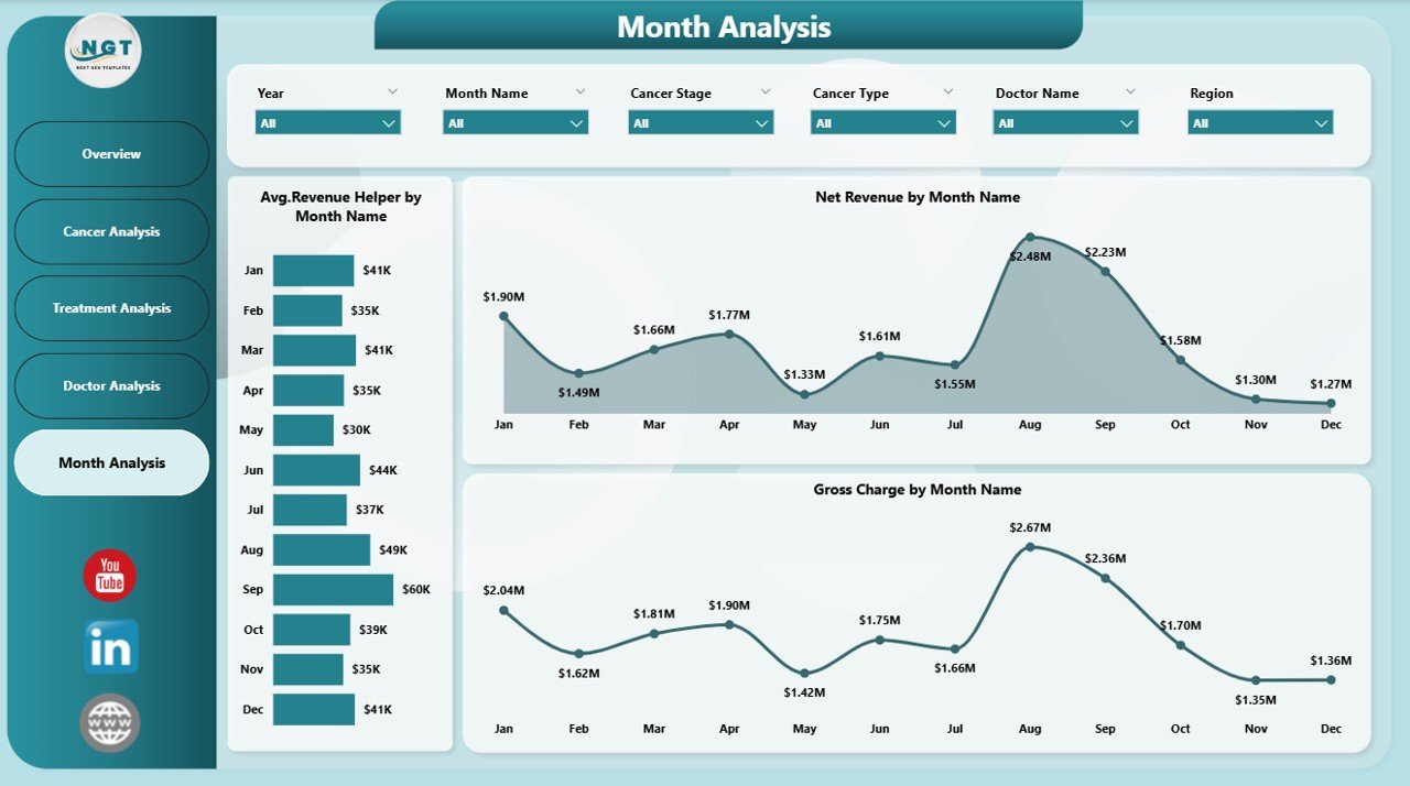
The Monthly Trends Page focuses on time-based analysis.
Why Monthly Trend Analysis Is Essential
Oncology services experience seasonal patterns, treatment cycles, and revenue fluctuations. Therefore, trend analysis supports forecasting.
Key Charts on the Monthly Trends Page
-
Average Revenue Helper by Month
This chart tracks average revenue trends over time. As a result, leadership predicts future performance. -
Net Revenue by Month
This chart shows revenue growth or decline. Therefore, financial planning becomes proactive. -
Gross Charge by Month
This chart highlights billing trends. As a result, finance teams manage cash flow better.
Because this page highlights patterns clearly, decision-makers act early.
Advantages of an Oncology Services Dashboard in Power BI
An Oncology Services Dashboard in Power BI offers several powerful advantages.
1. Centralized Oncology Insights
All oncology data appears in one dashboard. Therefore, teams stop juggling multiple reports.
2. Faster Decision-Making
Because visuals update instantly, leaders make quicker and smarter decisions.
3. Improved Revenue Tracking
The dashboard tracks gross charges, net revenue, and discounts accurately.
4. Better Treatment Optimization
Teams analyze treatment effectiveness and resource usage easily.
5. Enhanced Doctor Performance Visibility
Doctor-wise analysis improves transparency and accountability.
6. Scalable and Customizable
Organizations customize pages, KPIs, and visuals as needs change.
Best Practices for the Oncology Services Dashboard in Power BI
To maximize value, organizations should follow proven best practices.
1. Define Clear KPIs First
Always define what you want to measure before building visuals.
2. Keep Visuals Simple
Use clear charts and avoid clutter. Simple visuals improve adoption.
3. Use Consistent Naming
Maintain consistent cancer types, treatment names, and regions.
4. Validate Data Regularly
Accurate data ensures reliable insights.
5. Train Users Properly
Provide training so doctors and managers use the dashboard effectively.
6. Review Performance Monthly
Regular reviews help teams act on insights quickly.
Who Can Use the Oncology Services Dashboard in Power BI?
Click to Purchases Oncology Services Dashboard in Power BI
This dashboard benefits multiple stakeholders:
-
Hospital leadership
-
Oncology department heads
-
Finance and billing teams
-
Doctors and care coordinators
-
Operations and strategy teams
Because the dashboard supports multiple roles, it becomes a shared decision-making platform.
Conclusion: Why Should You Use an Oncology Services Dashboard in Power BI?
An Oncology Services Dashboard in Power BI transforms complex oncology data into clear, actionable insights. Instead of working blindly, teams gain visibility into cancer performance, treatment efficiency, doctor contribution, and revenue trends.
Because the dashboard includes structured pages, interactive slicers, and meaningful visuals, organizations improve both patient care and financial outcomes.
In today’s data-driven healthcare environment, an oncology dashboard is not optional. Instead, it becomes essential for sustainable growth and high-quality care.
Frequently Asked Questions (FAQs)
What is an Oncology Services Dashboard in Power BI used for?
It helps hospitals track cancer treatments, revenue, doctor performance, and trends using interactive visuals.
Can this dashboard work with Excel data?
Yes, Power BI easily connects to Excel and other data sources.
Is Power BI suitable for healthcare analytics?
Yes, Power BI offers secure, scalable, and flexible healthcare analytics.
Can we customize KPIs in the dashboard?
Yes, users can customize KPIs, visuals, and pages based on needs.
Does this dashboard support monthly and yearly analysis?
Yes, the Monthly Trends page supports time-based analysis.
Who should use this dashboard?
Hospital leaders, oncology teams, finance teams, and doctors benefit from it.
Visit our YouTube channel to learn step-by-step video tutorials