Office communication plays a crucial role in day-to-day business operations. Teams exchange thousands of messages every month through emails, chat tools, service platforms, and internal systems. However, when organizations fail to track communication properly, delays increase, critical messages get ignored, and accountability becomes unclear.
That is exactly where an Office Communication Dashboard in Power BI becomes a powerful solution.
An Office Communication Dashboard in Power BI helps organizations monitor message flow, response times, urgency levels, escalations, and departmental performance in one centralized and interactive reporting system. Instead of relying on scattered logs or manual reports, teams gain real-time insights through visuals and KPIs.
In this detailed guide, you will learn what an Office Communication Dashboard in Power BI is, why businesses need it, how it works, its key pages and features, advantages, best practices, and answers to the most common questions.
Click to buy Office Communication Dashboard in Power BI
What Is an Office Communication Dashboard in Power BI?
An Office Communication Dashboard in Power BI is an interactive analytics solution designed to track, measure, and visualize internal office communication data.
It consolidates message data such as total messages, critical messages, response times, escalation status, communication channels, departments, senders, and message types into one structured dashboard. As a result, managers and leadership teams can understand communication efficiency clearly.
Because it runs on Power BI, users can apply slicers, filters, and drill-downs to analyze communication trends by time, department, channel, urgency, or sender.
Why Do Businesses Need an Office Communication Dashboard?
Modern workplaces depend heavily on fast and effective communication. However, without visibility, communication gaps grow quickly.
Here is why businesses need an Office Communication Dashboard in Power BI:
- Teams lose track of critical messages without centralized monitoring
- Delayed responses increase operational risks
- Escalated messages remain unresolved due to poor visibility
- Managers struggle to identify communication bottlenecks
- Departments operate in silos without accountability
By using a structured Power BI dashboard, organizations can proactively manage communication instead of reacting to issues later.
How Does an Office Communication Dashboard in Power BI Work?
An Office Communication Dashboard works by collecting and transforming message-related data into visual insights.
Typically, the process includes:
- Importing communication data into Power BI
- Cleaning and transforming data using Power Query
- Creating calculated measures for response time, pending messages, and escalations
- Designing interactive visuals such as cards, charts, and tables
- Applying slicers for time period, department, channel, and sender
As a result, teams see accurate and up-to-date communication performance metrics at a glance.
Key Features of the Office Communication Dashboard in Power BI
This Office Communication Dashboard includes 5 well-structured pages, each designed to answer specific business questions. Let’s explore each page in detail.
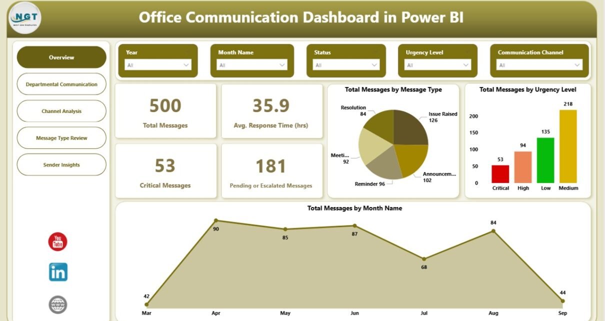
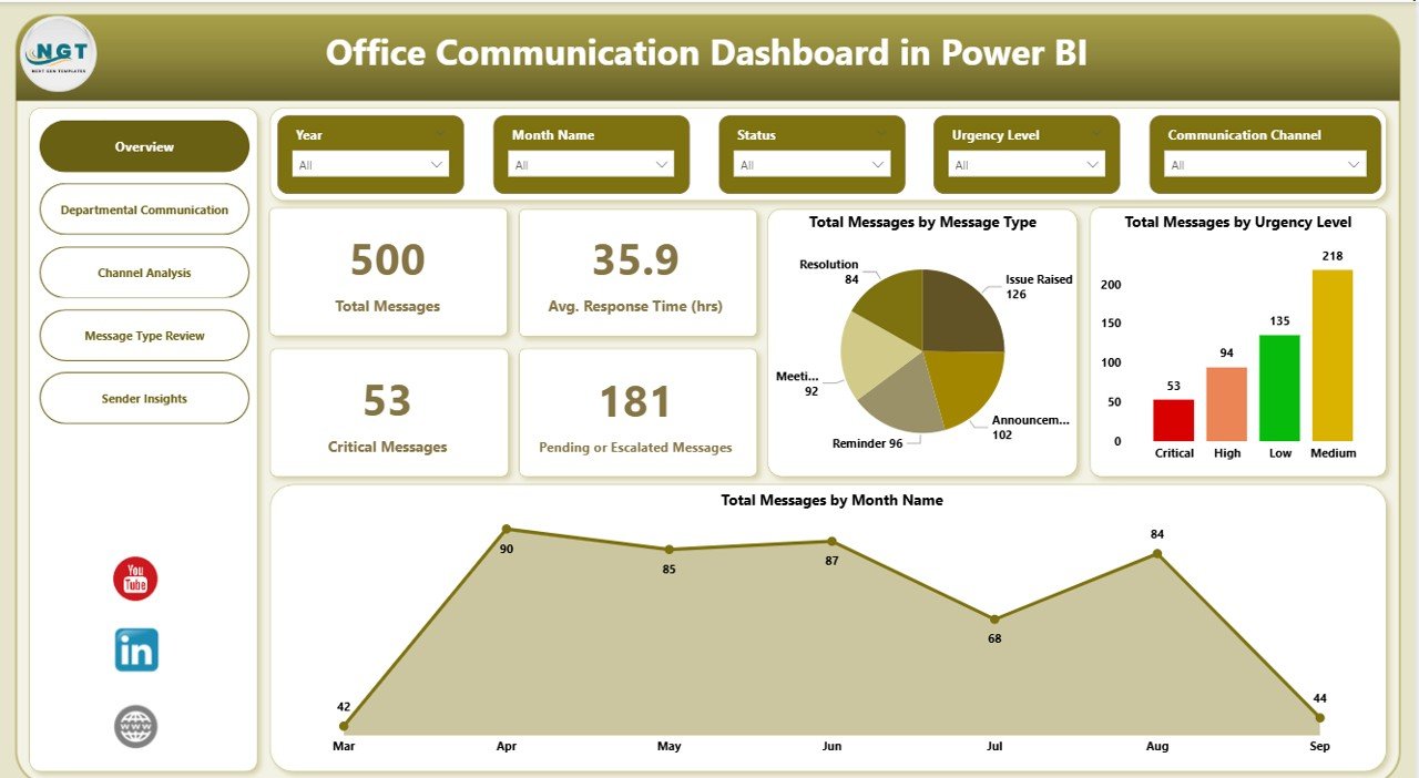
Overview Page: How Do You Monitor Overall Office Communication Performance?
The Overview Page acts as the control center of the dashboard. It provides a high-level summary of office communication performance across the organization.
Key KPIs on the Overview Page
This page displays important KPI cards, including:
- Total Messages – Total number of messages received
- Critical Messages – Messages marked as high priority
- Average Response Time (Hours) – Time taken to respond to messages
- Pending or Escalated Messages – Messages awaiting resolution
Because these KPIs appear instantly, leadership teams can quickly assess communication health.
Key Charts on the Overview Page
The Overview Page also includes multiple charts for deeper insights:
- Total Messages by Message Type
- Total Messages by Urgency Level
- Total Messages by Month
Together, these visuals help teams understand message volume trends, urgency distribution, and seasonal communication patterns.
Click to buy Office Communication Dashboard in Power BI
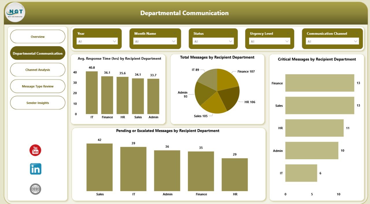
Departmental Communication Page: How Are Departments Handling Communication?
The Departmental Communication Page focuses on analyzing communication performance by recipient department.
This page helps managers identify which departments respond efficiently and which departments need improvement.
Key Metrics on the Departmental Communication Page
This page includes the following charts:
- Average Response Time (Hours) by Recipient Department
- Total Messages by Recipient Department
- Critical Messages by Recipient Department
- Pending or Escalated Messages by Recipient Department
Because these insights remain department-specific, organizations can easily assign responsibility and improve accountability.
Click to buy Office Communication Dashboard in Power BI
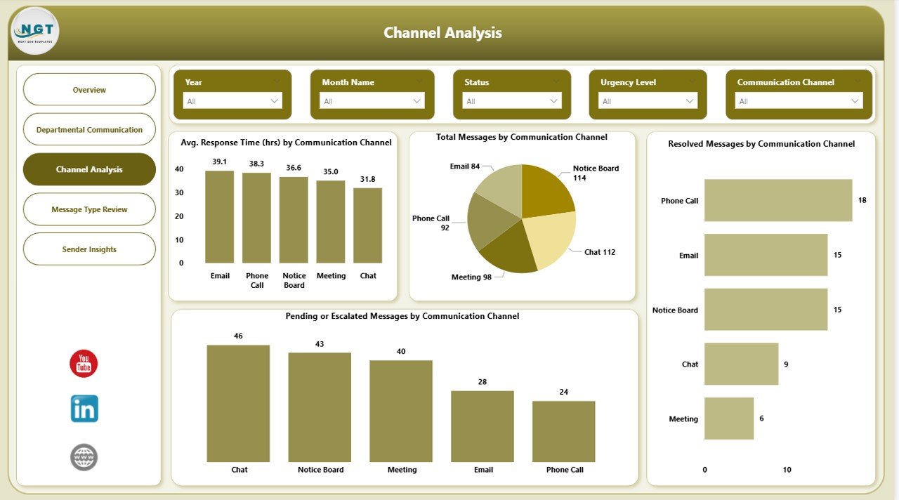
Channel Analysis Page: Which Communication Channels Perform Best?
Office communication happens through multiple channels such as email, chat tools, internal portals, or ticketing systems. Therefore, tracking channel performance becomes essential.
The Channel Analysis Page evaluates how each communication channel performs.
Key Insights from Channel Analysis
This page includes the following visuals:
- Average Response Time (Hours) by Communication Channel
- Total Messages by Communication Channel
- Resolved Messages by Communication Channel
- Pending or Escalated Messages by Communication Channel
As a result, organizations can identify slow channels, overloaded platforms, and underperforming communication methods.
Click to buy Office Communication Dashboard in Power BI
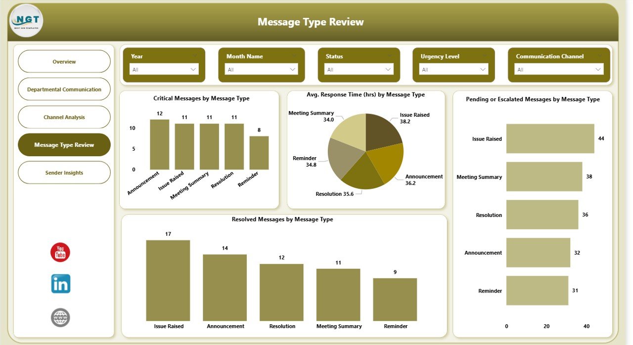
Message Type Review Page: Which Types of Messages Cause Delays?
Not all messages require the same level of attention. Some message types demand urgent action, while others remain informational.
The Message Type Review Page helps teams analyze performance by message category.
Key Charts on the Message Type Review Page
This page displays:
- Critical Messages by Message Type
- Average Response Time (Hours) by Message Type
- Pending or Escalated Messages by Message Type
- Resolved Messages by Message Type
With this analysis, managers can redesign workflows, define escalation rules, and improve response strategies.
Click to buy Office Communication Dashboard in Power BI
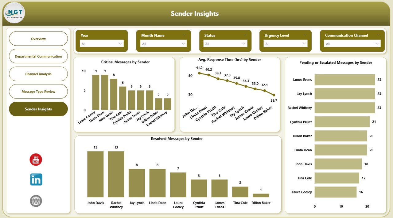
Sender Insights Page: Who Sends the Most Critical Messages?
Understanding sender behavior helps organizations identify communication patterns and workload distribution.
The Sender Insights Page focuses on analyzing messages by sender.
Key Insights on the Sender Insights Page
This page includes:
- Critical Messages by Sender
- Average Response Time (Hours) by Sender
- Pending or Escalated Messages by Sender
- Resolved Messages by Sender
Consequently, teams can identify frequent senders, high-impact users, and communication hotspots.
Click to buy Office Communication Dashboard in Power BI
Advantages of Office Communication Dashboard in Power BI
An Office Communication Dashboard in Power BI delivers several powerful benefits for organizations of all sizes.
Improved Communication Visibility
Teams gain complete visibility into messages, response times, and escalations. As a result, nothing stays hidden.
Faster Decision-Making
Because data appears visually and interactively, managers make faster and more confident decisions.
Reduced Response Delays
By tracking average response times, teams improve turnaround speed consistently.
Better Accountability
Department-level and sender-level insights encourage ownership and responsibility.
Proactive Issue Resolution
Instead of reacting late, organizations identify communication issues early and act immediately.
Who Can Use an Office Communication Dashboard?
This dashboard benefits multiple roles across the organization:
- Office managers
- Operations managers
- HR teams
- IT support teams
- Department heads
- Senior leadership
Because the dashboard works in Power BI, both technical and non-technical users can access insights easily.
Best Practices for the Office Communication Dashboard in Power BI
To get maximum value from your Office Communication Dashboard, follow these best practices.
Define Clear Communication KPIs
Always define what qualifies as critical, pending, or escalated messages.
Standardize Message Categories
Use consistent message types and urgency levels across departments.
Update Data Regularly
Refresh data daily or weekly to maintain accuracy and relevance.
Use Slicers Effectively
Apply slicers for date, department, channel, and sender to analyze trends quickly.
Monitor Response Time Trends
Track response time trends monthly to identify improvement or decline.
Act on Insights
Insights alone do not create value. Always follow up with actions and process improvements.
How Does This Dashboard Improve Workplace Efficiency?
An Office Communication Dashboard improves efficiency by:
- Reducing confusion
- Improving response speed
- Enhancing coordination
- Eliminating communication blind spots
- Supporting data-driven decisions
As a result, teams communicate clearly, respond faster, and collaborate better.
Is Power BI Suitable for Office Communication Analysis?
Yes, Power BI suits office communication analysis perfectly.
Power BI offers:
- Interactive visuals
- Advanced filtering
- Real-time insights
- Secure data access
- Easy sharing across teams
Therefore, organizations prefer Power BI for communication analytics.
Conclusion: Why Should You Use an Office Communication Dashboard in Power BI?
Office communication determines how efficiently an organization operates. Without visibility, delays and miscommunication increase rapidly. However, with an Office Communication Dashboard in Power BI, teams gain control, clarity, and confidence.
This dashboard transforms raw communication data into actionable insights. It helps organizations monitor response times, manage critical messages, analyze departments, evaluate channels, and improve accountability.
If your organization wants to strengthen internal communication and reduce operational risks, this dashboard becomes an essential tool.
Frequently Asked Questions About Office Communication Dashboard in Power BI
What is an Office Communication Dashboard in Power BI used for?
It tracks and analyzes internal office communication metrics such as messages, response times, urgency, and escalations.
Can this dashboard handle large volumes of message data?
Yes, Power BI handles large datasets efficiently and supports advanced filtering.
Who should use this dashboard?
Managers, department heads, operations teams, HR teams, and leadership teams can all benefit.
Can the dashboard analyze different communication channels?
Yes, the Channel Analysis page compares performance across communication channels.
Does this dashboard support real-time updates?
Yes, with scheduled refresh or live connections, it supports near real-time insights.
Is customization possible?
Absolutely. Teams can customize KPIs, visuals, and filters based on business needs.
Visit our YouTube channel to learn step-by-step video tutorials
Watch the step-by-step video tutorial:
Click to buy Office Communication Dashboard in Power BI