The Clinical Data Management Dashboard in Excel tracks 5 headline KPIs and 16 analytical charts across 7 interactive pages, with 5 built-in slicers covering Region, Study ID, Therapeutic Area, Trial Phase, and Monitor. Setup takes under 10 minutes — paste your trial data into the Data sheet, click Data → Refresh All, and every pivot, chart, and KPI card recalculates automatically. At $17.99 one-time, it sits alongside validated EDC systems like Medidata Rave and Veeva Vault that cost $50,000+ per study annually.
Clinical Data Managers (CDMs) spend hours every week stitching together query logs, adverse event counts, monitor activity, and budget burn into something a sponsor can read in five minutes. This dashboard does that work for you — and because it lives in Microsoft Excel, there’s no IT install, no SSO approval, and no per-user licence to renew. According to a 2024 Applied Clinical Trials survey, roughly 60% of mid-sized biotechs still rely on Excel for clinical operations reporting alongside their EDC — this template makes that workflow polished and repeatable.
Key Features of the Clinical Data Management Dashboard in Excel
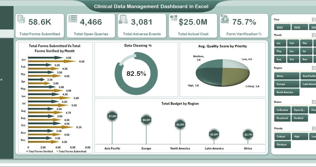
- 5 KPI Cards on the Overview page — Total Forms Submitted, Total Open Queries, Total Adverse Events, Total Actual Cost, and Form Verification %.
- 16 pivot-driven charts across Query Analysis, Site Performance, Safety & Compliance, and Cost & Budget pages.
- 5 interactive slicers — Region, Study ID, Therapeutic Area, Trial Phase, and Monitor — filter the entire dashboard in one click.
- Native Microsoft Excel — no macros, no VBA, no add-ins. Works in Excel 2016, 2019, 2021, Microsoft 365, and Excel for Mac.
- Dedicated Data sheet with pre-defined columns for Study ID, Site, Patient ID, Form Type, Query Category, Adverse Event flag, Trial Phase, Therapeutic Area, Region, Monitor, CDM Manager, Quality Score, Budget, and Actual Cost.
- Hidden Support sheet holds all pivot tables that drive the dashboard — click Data → Refresh All and every visual updates in seconds.
- ICH E6(R2) GCP-aligned terminology for query categories, form verification, adverse events, trial phase, and monitor activity.
Dashboard Pages Explanation
Page 1: Overview Page
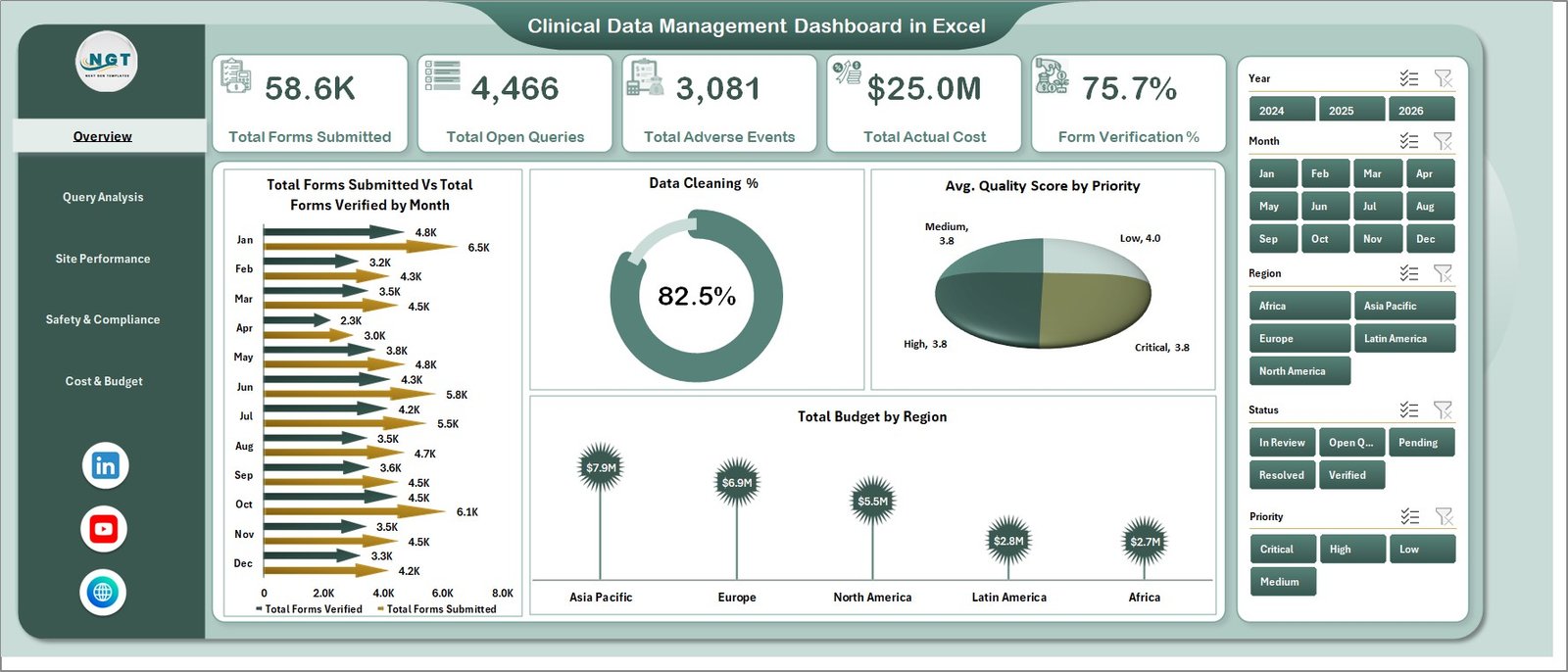
The Overview page is the CDM lead’s home screen. Five KPI cards surface Total Forms Submitted, Total Open Queries, Total Adverse Events, Total Actual Cost, and Form Verification %. Below them, four trend charts — Total Forms Submitted vs. Total Forms Verified by Month, Data Cleaning %, Avg. Quality Score by Priority, and Total Budget by Region — give context on study health. Five slicers sit at the top for instant filtering.
Page 2: Query Analysis
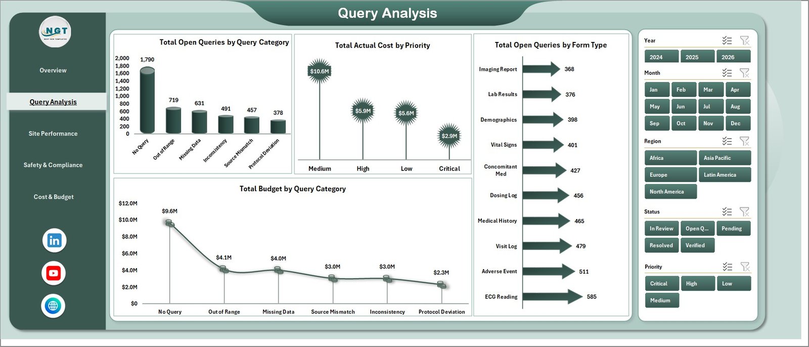
The Query Analysis page diagnoses the open-query backlog that delays database lock. Charts include Total Open Queries by Query Category, Total Actual Cost by Priority, Total Open Queries by Form Type, and Total Budget by Query Category — pinpointing where queries are piling up and which categories are burning the most budget.
Page 3: Site Performance
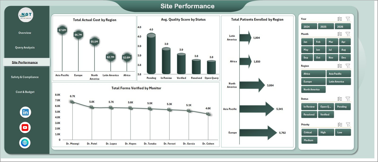
The Site Performance page benchmarks investigator sites and clinical monitors. Charts include Total Actual Cost by Region, Avg. Quality Score by Status, Total Patients Enrolled by Region, and Total Forms Verified by Monitor — making it easy to spot under-performing sites and recognise top monitors during sponsor reviews.
Page 4: Safety & Compliance
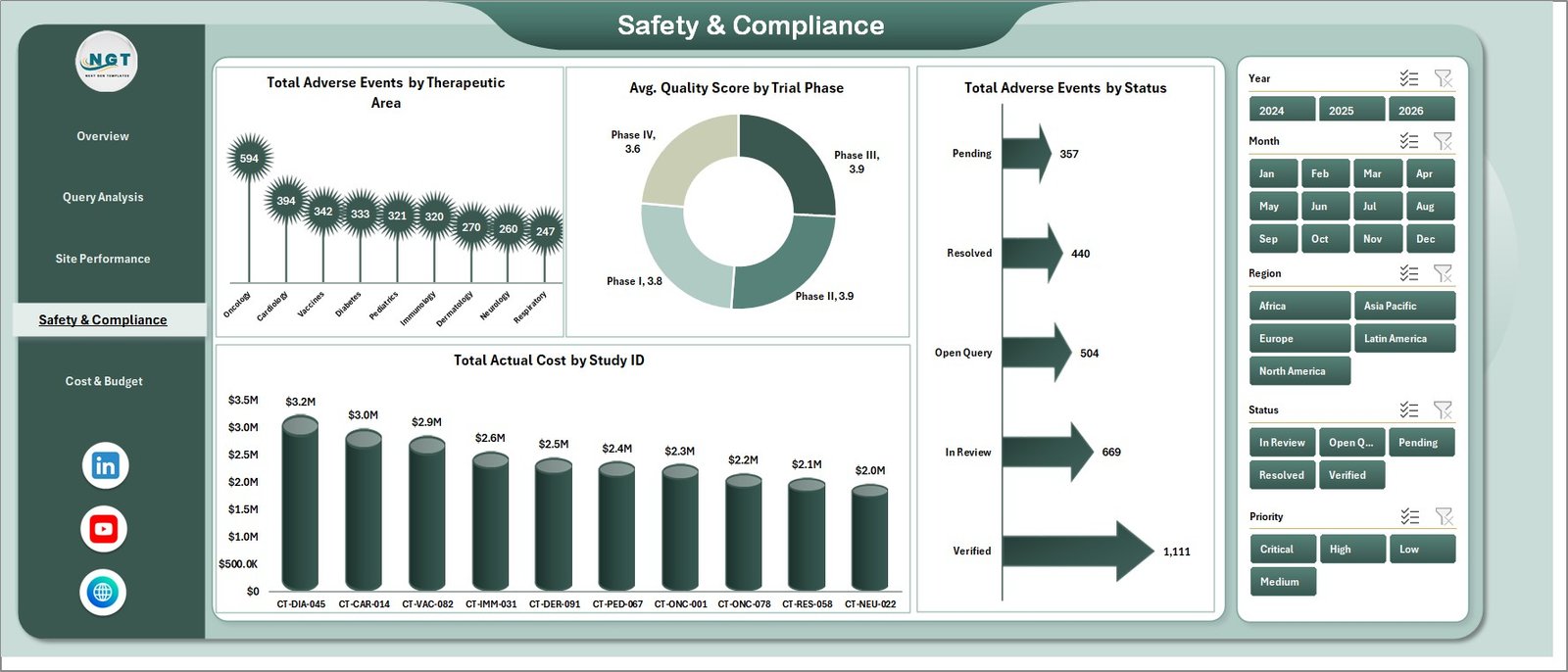
The Safety & Compliance page focuses on adverse event tracking and quality across trial phases. Charts include Total Adverse Events by Therapeutic Area, Avg. Quality Score by Trial Phase, Total Adverse Events by Status, and Total Actual Cost by Study ID — supporting pharmacovigilance reviews and protocol deviation discussions.
Page 5: Cost & Budget
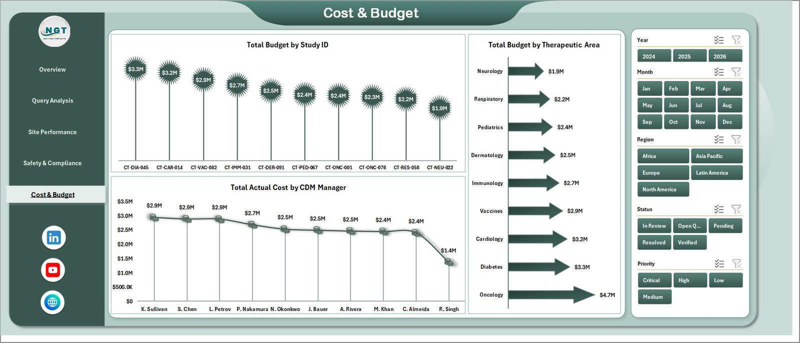
The Cost & Budget page exposes where trial money goes. Charts include Total Budget by Study ID, Total Budget by Therapeutic Area, and Total Actual Cost by CDM Manager — pairing budget vs. actuals with CDM accountability for every study in the portfolio.
Data Sheet
The Data sheet is the single source of truth. Maintain the column structure — Study ID, Site, Patient ID, Form Type, Query Category, Priority, Trial Phase, Therapeutic Area, Region, Monitor, CDM Manager, Status, Quality Score, Budget, and Actual Cost — and every chart on the five dashboard pages refreshes from this one table. Microsoft’s CSV import guide covers cleanup if your EDC export needs reshaping before paste.

Support Sheet
The Support sheet holds all pivot tables that drive the 16 charts and 5 KPI cards across the dashboard pages. The maintenance pattern is simple — update Data sheet → Data ribbon → Refresh All. Keep this sheet hidden in production so sponsors and stakeholders only see the polished front-end pages.

Clinical Data Management Dashboard in Excel vs. Power BI vs. Medidata Rave / Veeva Vault — Feature Comparison
| Feature | Clinical Data Management Dashboard in Excel | Power BI / Tableau CDM build | Medidata Rave / Veeva Vault EDC |
|---|---|---|---|
| Cost | $17.99 one-time ✅ | $10–25 / user / month | $50,000+ per study / year |
| Platform | Microsoft Excel ✅ | Power BI Desktop + Service | Cloud EDC platform |
| Setup time | Under 10 minutes ✅ | 2–5 days to model | 6–12 weeks of configuration |
| Pivot refresh | One-click Refresh All ✅ | Scheduled or gateway | Real-time, locked-down |
| Customisable fields | Yes — edit columns directly ✅ | Yes (requires modelling) | Validated changes only |
| Share with team | Email or SharePoint ✅ | Power BI workspace | Per-user login + role setup |
| Adverse-event tracking | By therapeutic area, status, phase ✅ | Custom build required | Yes, fully validated |
| Year-1 cost at 5 users | $17.99 total ✅ | $600–1,500 | $50,000+ |
| 21 CFR Part 11 validation | No — for reporting only | No — needs custom validation | Yes (audit trail) ✅ |
For sponsor CRAs, biotech CDMs, and CROs that need a fast, lightweight view of trial data alongside their validated EDC — without paying $50K for another dashboard licence — the Clinical Data Management Dashboard in Excel sits in the sweet spot.
Who Should Use This Template
Perfect for:
- Clinical Data Managers and CDM leads at biotech, pharma, and CROs running 1–50 active studies
- Clinical project managers preparing weekly sponsor calls on query backlog, adverse events, and site performance
- CRAs and clinical monitors tracking site visits, form verification, and query resolution
- Biostatisticians and trial operations analysts who already export from EDC to Excel
- Independent clinical research consultants who want a portable reporting layer across client engagements
Not a fit if:
- You need source data capture or a primary EDC — this is a reporting dashboard, not an EDC
- Your studies require 21 CFR Part 11 / Annex 11 compliant audit trails (use Medidata Rave, Veeva Vault EDC, or Castor instead)
- You’re working with zero Excel familiarity — basic pivot knowledge helps when extending the model
Real-World Use Cases
Priya runs data management at a 60-person biotech in Boston. Her team manages three Phase II oncology trials across 28 sites in North America and Europe. She uses the Clinical Data Management Dashboard in Excel to prepare the weekly sponsor update — slicing Open Queries by Site and Adverse Events by Therapeutic Area in seconds, without waiting for the EDC vendor’s reporting team to build a custom report. What used to be a half-day exercise on Tuesday mornings is now a 20-minute refresh-and-screenshot.
Marcus is a Clinical Project Manager at a mid-size CRO in London. Each Monday he refreshes a sanitised export from Medidata Rave into the Data sheet, hits Refresh All, and screenshots the Site Performance page into his sponsor deck. Total Forms Verified by Monitor and Avg. Quality Score by Status give him the talking points he needs without licensing a $50K analytics platform on top of the EDC.
Dr. Lin is an independent clinical research consultant. She works with three small biotechs on a fractional CDM basis. Carrying her own dashboard template means every client engagement starts with a working reporting layer on Day 1 — she just plugs in their data and her output looks consistent across studies. Clients see a polished, branded report from week one.
Advantages of the Clinical Data Management Dashboard in Excel
The most obvious advantage is cost. At $17.99 one-time versus $50,000+ per study for Medidata Rave or Veeva Vault analytics, the savings compound across a multi-study portfolio — a 10-study biotech could save $500,000+ annually on reporting infrastructure alone.
Beyond cost, the template removes the IT bottleneck. Because it’s a native .xlsx file with no macros and no add-ins, it opens in any locked-down enterprise Excel install — no security approval, no SSO setup, no help-desk ticket. CDMs in regulated environments can deploy it the same afternoon they buy it.
The pivot-driven architecture also future-proofs the dashboard. Add a new therapeutic area or a new monitor to the Data sheet, hit Refresh All, and every slicer, chart, and KPI updates automatically. There’s no chart-by-chart re-pointing or formula maintenance — the pattern scales from one study to fifty without rework.
Opportunities for Improvement
To be honest, this template has clear limitations that matter for some teams. First, it’s not a validated system — there’s no 21 CFR Part 11 audit trail, no electronic signatures, and no role-based access control. If your study requires regulatory-grade traceability, you need a real EDC, not this dashboard. Use it alongside Rave or Vault for reporting, not instead of them.
Second, the workflow is manual paste. There’s no HL7/FHIR integration, no API connection to your EDC, and no scheduled refresh. Someone has to export from the EDC and paste into the Data sheet each week. For high-frequency reporting cycles, that overhead adds up.
Third, large datasets (50,000+ rows) can slow down pivot refresh on older laptops. For studies at that scale, Power BI Desktop with a proper star schema will perform better than Excel pivots, even though it costs more in time and licences.
Best Practices
To get the most out of the Clinical Data Management Dashboard in Excel, standardise your column headers in the Data sheet before pasting any new export. The pivot tables depend on consistent column names, so a single renamed header can break the entire downstream chain.
Keep one master version of the template per study and version-control with filename dates (e.g. CDM-Dashboard-Study-ONC-2026-05-27.xlsx). Pivot caches can accumulate over weeks, so starting fresh each month also keeps file size manageable.
For multi-study portfolios, consider a Power Query layer that consolidates multiple study exports into one Data sheet, then use the Study ID slicer to filter views. This pattern scales the same template across an entire programme without duplicating files.
Finally, save your filtered views as Excel Custom Views (View → Custom Views). One click switches between sponsor view, internal weekly view, and adverse-event-focused view — handy when the same dashboard serves multiple audiences.
Explore Relevant Templates
- Clinical Data Management Dashboard in Excel — the template covered in this post.
- Clinical Trials Management Dashboard in Excel — companion dashboard focused on overall trial management, milestones, and enrolment.
- Clinical Trials Management Dashboard in Power BI — Power BI equivalent for teams that standardise on Power BI.
- Medical Practice Dashboard in Excel — useful for site-level operations and patient flow.
- Cardiac Care Units Dashboard in Excel — therapeutic-area-specific KPI tracking.
- Browse all Excel Dashboard Templates — 700+ ready-to-use dashboards across every industry.
Frequently Asked Questions
What KPIs does the Clinical Data Management Dashboard in Excel track?
The Clinical Data Management Dashboard in Excel tracks 5 headline KPIs — Total Forms Submitted, Total Open Queries, Total Adverse Events, Total Actual Cost, and Form Verification % — plus 16 analytical charts across Query Analysis, Site Performance, Safety & Compliance, and Cost & Budget pages. All metrics refresh automatically when you update the Data sheet.
How does this compare to Medidata Rave or Veeva Vault EDC?
The Clinical Data Management Dashboard in Excel is a reporting dashboard, not a validated EDC system. It costs $17.99 one-time versus $50K+ annually for Rave or Vault. Use it alongside your EDC for fast weekly views of query backlog, site performance, and adverse events — but rely on your EDC for source data capture and 21 CFR Part 11 audit trails.
How long does setup take?
Setup of the Clinical Data Management Dashboard in Excel takes under 10 minutes. Download, unzip, paste your trial data into the Data sheet (keeping column headers intact), and click Data → Refresh All. Every chart, KPI card, and pivot table updates automatically. No macros, add-ins, or IT approval required.
Does this dashboard require macros or VBA?
No. The Clinical Data Management Dashboard in Excel uses only native Excel features — pivot tables, SUMIFS, slicers, and standard charts. There are no macros, VBA, or add-ins, so it opens cleanly in any locked-down enterprise environment, on Excel for Windows and Excel for Mac.
Can I customise the columns or add new therapeutic areas?
Yes. The Clinical Data Management Dashboard in Excel is fully editable. Add new rows or new therapeutic areas in the Data sheet, then click Refresh All — pivots in the Support sheet expand automatically. You can also edit chart titles, add new slicers, or change colours to match sponsor branding.
Is this dashboard suitable for Phase I, II, III, or IV trials?
The Clinical Data Management Dashboard in Excel works for any trial phase. The Safety & Compliance page includes an Avg. Quality Score by Trial Phase chart, and the Data sheet has a Trial Phase column you can populate with Phase I, II, III, IV, or post-marketing surveillance entries.
Will this work in Excel for Mac and Office 365?
Yes. The Clinical Data Management Dashboard in Excel is tested on Excel 2016, 2019, 2021, Microsoft 365, and Excel for Mac. Pivot tables, slicers, and Refresh All work identically across all supported versions — making it portable across teams that mix Windows and macOS workstations.
About the Author
Built by PK — Microsoft Certified Professional with 15+ years of Excel, Google Sheets, and Power BI experience. Founder of NextGenTemplates, reaching 300K+ subscribers across YouTube channels. Every template is hand-built and tested before release. Subscribe at YouTube.com/@PK-AnExcelExpert for step-by-step video tutorials.
Conclusion
The Clinical Data Management Dashboard in Excel gives CDMs, CRAs, and clinical project managers a polished, one-click reporting layer that sits on top of any EDC export. Five KPI cards, 16 charts, 7 pages, and 5 slicers — all native Excel, no macros, no IT approval, no per-user fees. For $17.99 you get the kind of management view that used to require a six-figure analytics contract.
👉 Click here to Purchase the Clinical Data Management Dashboard in Excel
✅ Instant download · One-time payment · No subscription · Lifetime access
📅 Last updated: May 2026