Fitness Apps Dashboard in Power BI helps app founders, wellness product teams, analysts, and subscription managers turn exported app data into a clear interactive report. Fitness apps usually collect revenue, sessions, ad revenue, plan, trainer, platform, region, support, and acquisition-channel data across multiple systems. When those records stay scattered, monthly reporting becomes slow and hard to trust.
This dashboard gives users a ready Power BI report with 5 pages, 5 executive KPI cards, multiple slicers, and 16 focused visuals. It is designed for recurring reviews where teams need to discuss total revenue, net revenue, total ad revenue, sessions, support cost, active users, plans, regions, platforms, trainers, and channels in one place.
You can review the product draft here: Fitness Apps Dashboard in Power BI.
Key Features of Fitness Apps Dashboard in Power BI
- 5 Power BI report pages for Overview, Revenue, Engagement, Retention, and Channels.
- 5 KPI cards on the Overview page: Total Support Cost, Total Revenue, Net Revenue, Total Ad Revenue, and Total Sessions.
- Multiple slicers to filter the report quickly by available app, user, region, platform, trainer, plan, channel, and time fields.
- Revenue analysis by app name, month number, acquisition channel, region, and workout category.
- Engagement reporting for sessions, ad revenue, user segment, active users, and trainers.
- Retention reporting by region, plan type, active users, and acquisition channel.
- Channel reporting for net revenue by segment, support cost by app name, and net revenue by platform.
- Editable .pbix file so users can customize visuals, fields, measures, labels, and colors in Power BI Desktop.
Dashboard Pages Explanation
1. Overview Page
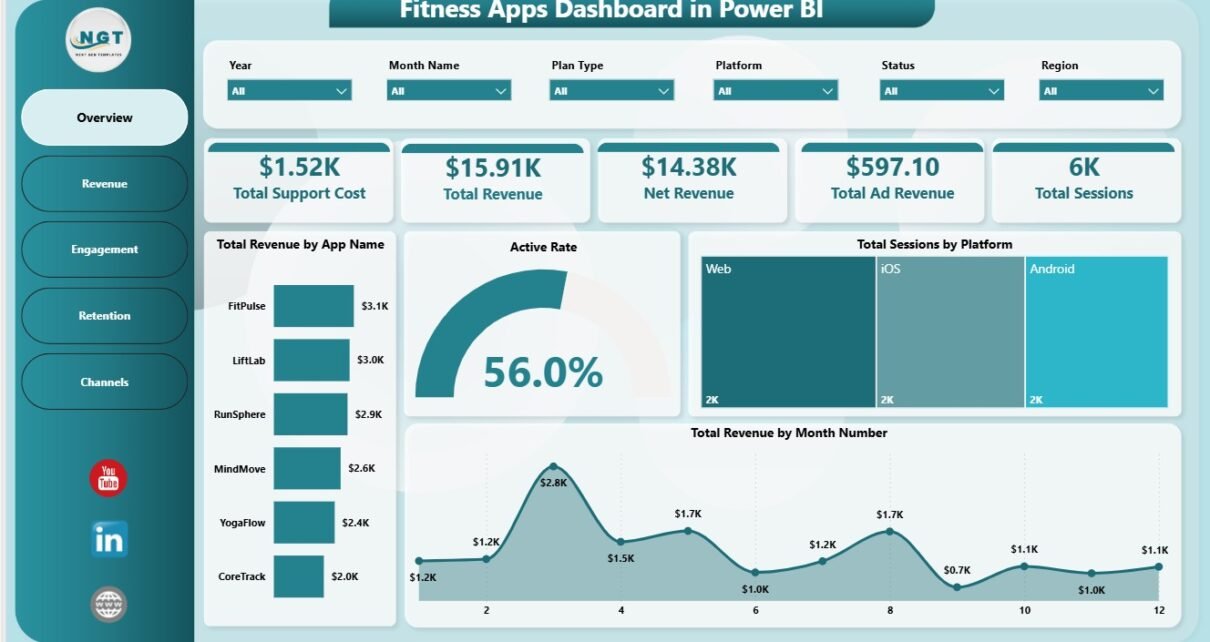
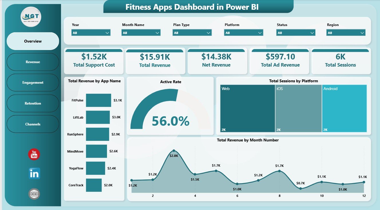
The Overview page is the executive summary of the report. The KPI cards show Total Support Cost, Total Revenue, Net Revenue, Total Ad Revenue, and Total Sessions, helping managers understand app performance before moving into deeper analysis.
Total Revenue by App Name: This chart compares revenue across app names or app brands. It helps portfolio owners identify which fitness apps are producing the strongest revenue contribution.
Active Rate by Overall Users: This visual shows how active users compare with the overall user base. It is useful for spotting activation issues, engagement decline, or healthy usage patterns.
Total Sessions by Platform: This chart compares session volume across platforms such as iOS, Android, or web. It helps product teams understand where users are most active.
Total Revenue by Month Number: This chart tracks revenue by month number. It helps teams review seasonality, campaign impact, and month-to-month growth or decline.
2. Revenue
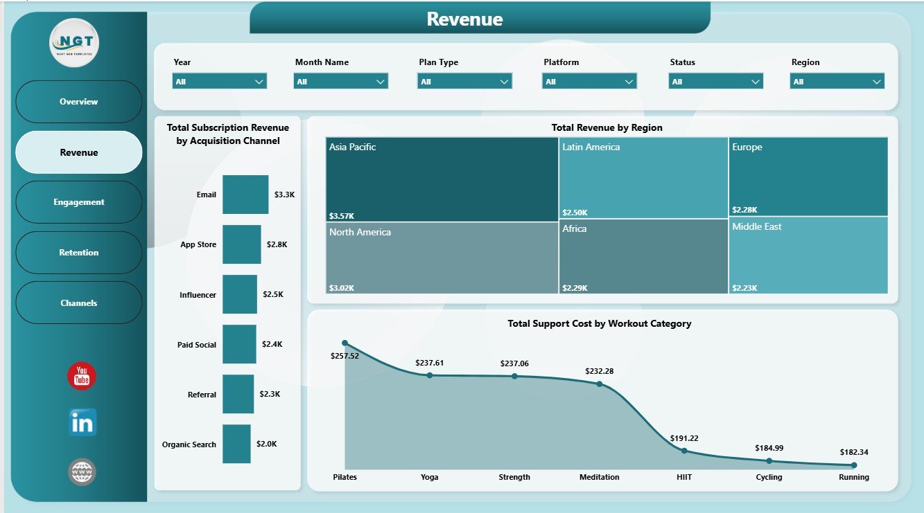
The Revenue page focuses on monetization and cost pressure. It includes Total Subscription Revenue by Acquisition Channel, Total Revenue by Region, and Total Support Cost by Workout Category.
This page helps teams understand where subscription revenue is coming from and which workout categories create more support demand. It is useful for campaign planning, regional performance review, and content improvement discussions.
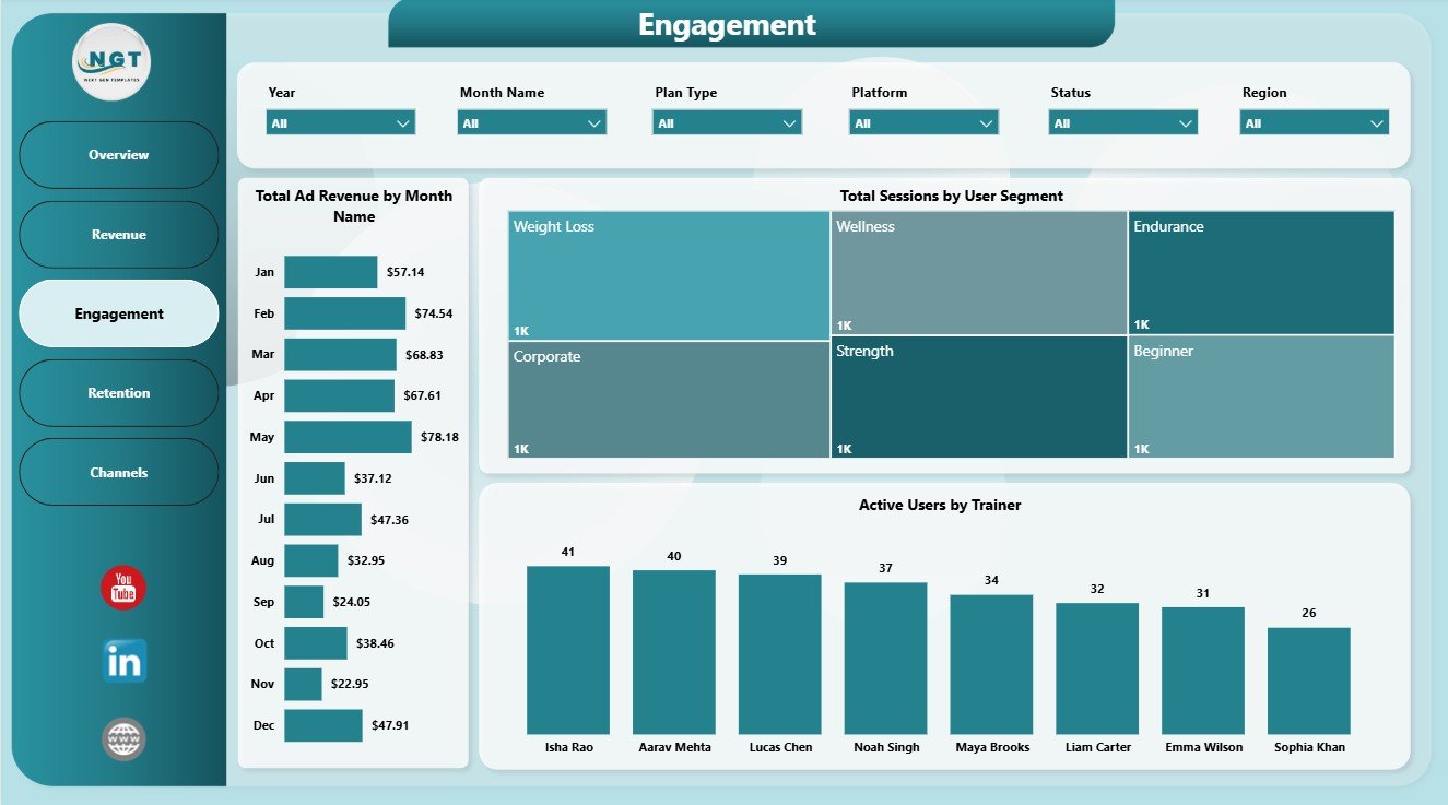
3. Engagement
The Engagement page explains how users interact with the app. It includes Total Ad Revenue by Month Name, Total Sessions by User Segment, and Active Users by Trainer.
This page is helpful when teams want to connect user activity with monetization. Product managers can review which segments, trainers, and months are driving stronger activity and ad revenue.
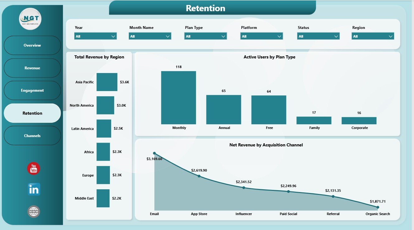
4. Retention
The Retention page focuses on active users, plans, regions, and channels. It includes Total Revenue by Region, Active Users by Plan Type, and Net Revenue by Acquisition Channel.
This page helps teams see whether revenue quality is linked with the right plan types and acquisition sources. It can highlight channels that bring revenue but weak active-user behavior.
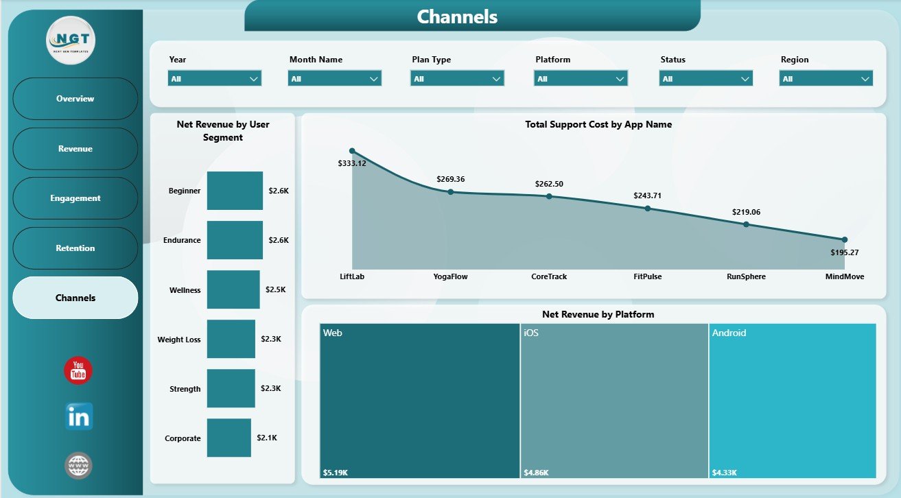
5. Channels
The Channels page connects user segment, app name, platform, support cost, and net revenue. It includes Net Revenue by User Segment, Total Support Cost by App Name, and Net Revenue by Platform.
This page is useful for deciding where to invest marketing, product, and support resources. Instead of looking only at top-line revenue, users can compare net revenue and support cost by channel-related dimensions.
Fitness Apps Dashboard in Power BI vs. Tableau vs. Paid App Analytics SaaS – Feature Comparison
| Feature | This Power BI Dashboard | Tableau Alternative | Paid App Analytics SaaS |
|---|---|---|---|
| Cost | $17.99 one-time | License plus build time | Monthly or annual subscription |
| Platform | Power BI Desktop and Power BI Service | Tableau Desktop or Cloud | Vendor cloud platform |
| Setup time | Open .pbix, connect or replace data, refresh | Build or adapt workbook | Requires onboarding and integrations |
| Real-time team collaboration | Available after publishing to Power BI Service | Available after publishing | Usually included by plan |
| Mobile access | Available after Power BI publishing | Available after publishing | Usually included |
| Customizable fields | Editable model, visuals, measures, and filters | Editable if you own the workbook | Limited by vendor configuration |
| Share with link | Available through Power BI Service | Available through Tableau Cloud | Login controlled |
| Year-1 cost at 5 users | $17.99 plus any Microsoft licensing | Usually much higher | Often hundreds or thousands |
| Fitness app reporting pages | 5 ready report pages included | Requires custom dashboard design | Depends on plan and connected events |
Who Should Use This Template
This dashboard is useful for fitness app founders, wellness app operators, product managers, subscription analysts, app marketers, finance teams, trainer-led program managers, and consultants who need recurring Power BI reporting. It is especially helpful when the team already exports app performance data and wants a reusable report instead of rebuilding visuals every month.
It is not the right fit if you need live SDK tracking, push notification automation, user-level journey analysis, attribution modeling, or a real-time product analytics platform. For advanced event instrumentation, tools like Firebase, Amplitude, and Mixpanel may still be needed. For setup and publishing concepts, Microsoft provides helpful documentation for Power BI Desktop.
Real-World Use Cases
Monthly app performance review: A founder refreshes the report before a leadership meeting and reviews support cost, revenue, net revenue, ad revenue, and sessions from the Overview page.
Trainer and content review: A product manager checks Active Users by Trainer and Total Sessions by User Segment to understand which coaching programs drive stronger activity.
Growth channel review: A marketing analyst compares subscription revenue and net revenue by acquisition channel to decide where paid campaigns deserve more budget.
Advantages of Fitness Apps Dashboard in Power BI
- Fast setup: Start with ready report pages instead of building every card and visual manually.
- Clear executive view: The Overview page summarizes revenue, ad revenue, support cost, sessions, and net revenue quickly.
- Channel-level insight: Net revenue and support cost can be reviewed by user segment, platform, app name, and acquisition source.
- Retention visibility: Active users by plan type and revenue by region help teams find useful retention patterns.
- Power BI flexibility: Users can adjust measures, fields, pages, colors, and slicers inside Power BI Desktop.
Opportunities for Improvement
The dashboard depends on clean source data. If app names, platforms, plan types, trainers, segments, regions, or acquisition channels are inconsistent, the report may need cleanup before charts become reliable.
The report is built for analysis, not automatic event collection. Teams that need real-time cohorts, funnels, push automation, or user-level event tracking can still use this report as an executive layer after exporting clean data from their app analytics tools.
Best Practices
- Keep field names and data types consistent when replacing sample data.
- Use standardized names for app, platform, plan type, trainer, region, segment, and acquisition channel.
- Refresh the Power BI report after every data update.
- Validate KPI cards before sharing the dashboard with leadership.
- Review retention and engagement before increasing ad spend.
- Publish to Power BI Service only after checking visuals, filters, and access permissions.
- Save a backup before making major model or measure changes.
Explore Relevant Templates
You can review the Fitness Apps Dashboard in Power BI on NextGenTemplates. Related downloads include Fitness Apps Dashboard in Excel, FinOps Teams Dashboard in Power BI, and Franchise Performance Dashboard in Power BI. You can also browse more Power BI Dashboard Templates.
Frequently Asked Questions
What does the Fitness Apps Dashboard in Power BI track?
It tracks support cost, total revenue, net revenue, ad revenue, sessions, subscription revenue, active users, regions, platforms, app names, plan types, trainers, workout categories, user segments, and acquisition channels.
How many report pages are included?
The Power BI file includes 5 report pages: Overview, Revenue, Engagement, Retention, and Channels.
Can I track more than one fitness app?
Yes. The report includes analysis by App Name, so multiple fitness or wellness app brands can be reviewed together if the dataset is structured consistently.
Do I need advanced Power BI skills?
No. The main workflow is to open the .pbix file, replace or connect data, refresh, and use slicers. Advanced users can customize visuals, fields, and measures if needed.
Can I publish this to Power BI Service?
Yes. After reviewing the report in Power BI Desktop, you can publish it to Power BI Service if you use Microsoft Power BI sharing and refresh features.
Does this dashboard include a live app connector?
No. It is a Power BI dashboard template for prepared or exported data. It does not include a live SDK, billing feed, or app-store connector.
About the Author
Built by PK – Microsoft Certified Professional with 15+ years of Excel, Google Sheets, and Power BI experience. Founder of NextGenTemplates, reaching 300K+ subscribers across YouTube channels. Every template is hand-built and tested before release.
Conclusion
The Fitness Apps Dashboard in Power BI gives fitness app teams a practical way to review revenue, engagement, retention, channels, and support cost from one interactive report. Instead of rebuilding the same visuals every reporting cycle, users can refresh the model and use slicers to review app performance by platform, region, plan, trainer, user segment, and acquisition channel.
Visit our YouTube channel for step-by-step tutorials: Youtube.com/@PKAnExcelExpert.
Last updated: June 13, 2026.