Medical Tourism Dashboard in Power BI is a ready-to-use reporting template for medical tourism agencies, international patient departments, hospital partnership teams, healthcare travel coordinators, finance analysts, and consultants who need a clear view of travel cost, quoted fee, hospital cost, net contribution, case status, treatment demand, referral channels, hospitals, package types, destination performance, coordinator workload, completion rate, and satisfaction.
Medical tourism teams often work across multiple countries, hospitals, treatment categories, coordinators, and referral sources. Even a small reporting delay can hide where the pipeline is stuck, where cost is rising, or which destinations are creating better contribution. This Power BI dashboard gives you 5 interactive pages, 4 high-level cards, 17 analysis visuals, and slicers so you can review the business quickly without building every report page from scratch.
Click here to purchase Medical Tourism Dashboard in Power BI

Medical Tourism Dashboard in Power BI
Key Features of Medical Tourism Dashboard in Power BI
- 5 report pages: Overview Page, Case Pipeline, Destination Mix, Treatment Insights, and Coordinator Ops.
- 4 executive cards: Total Travel Cost, Total Quoted Fee, Total Hospital Cost, and Net Contribution.
- 17 analysis visuals: Analyze costs, cases, quoted fee, completion rate, referral channels, hospitals, package types, coordinators, travel status, and contribution margin.
- Interactive slicers: Apply filters quickly during weekly and monthly reviews.
- Editable PBIX file: Open in Power BI Desktop, replace or connect your prepared data, and refresh the report.
- Healthcare travel focus: Designed around patient travel, hospital cost, destination mix, treatment demand, and coordinator operations.
If you are new to Power BI Desktop, Microsoft provides official setup guidance here: Microsoft Learn – Get started with Power BI Desktop.
Dashboard Pages Explanation
1. Overview Page
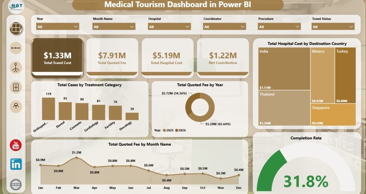
The Overview Page gives leadership a fast snapshot of the medical tourism business. The cards show Total Travel Cost, Total Quoted Fee, Total Hospital Cost, and Net Contribution, so users can review revenue opportunity and cost pressure together.
Total Hospital Cost by Destination Country: This chart compares hospital cost across destination countries. It helps teams see where provider cost is concentrated and where hospital partnership terms may need review.
Total Cases by Treatment Category: This visual shows how many cases come from each treatment category. It helps sales and care teams identify the treatments driving the most demand.
Total Quoted Fee by Year: This chart compares quoted fee across years. It helps owners and managers understand whether the pipeline is growing, flat, or declining.
Total Quoted Fee by Month Name: This monthly visual shows seasonal movement in quoted fee. It helps teams plan marketing, follow-up, and coordinator capacity around stronger months.
Completion Rate: This visual summarizes the percentage of cases that reach completion. It helps leadership track delivery reliability and identify where case follow-up may need improvement.
2. Case Pipeline
The Case Pipeline page focuses on case movement, referral source quality, destination contribution, and month-wise contribution trends. It is useful for weekly pipeline calls and conversion discussions.
Net Contribution by Destination Country: This visual compares contribution after cost by destination. It helps leaders identify which countries create stronger financial outcomes.
Total Cases by Case Status: This chart shows how cases are distributed across statuses. It helps coordinators spot pending, booked, completed, cancelled, or delayed work.
Total Cases by Referral Channel: This visual compares case volume by referral source. It helps marketing and partnership teams understand which channels produce the most opportunities.
Net Contribution by Month Name: This chart tracks contribution movement month by month. It helps finance teams explain profitable months and weak periods.
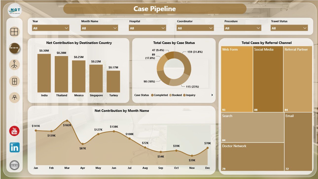
Case Pipeline
3. Destination Mix
The Destination Mix page explains how travel cost, package type, hospital partner, and patient country affect the business. It supports destination planning, hospital partner reviews, and package strategy.
Total Travel Cost by Treatment Category: This visual compares travel cost by treatment category. It helps teams understand which treatments require higher travel support and planning.
Total Quoted Fee by Package Type: This chart compares quoted fee across package structures. It helps teams review standard, premium, bundled, or other package performance.
Total Quoted Fee by Hospital: This visual shows which hospitals are associated with higher quoted fee. It helps business teams prioritize hospital relationships and sales focus.
Total Hospital Cost by Patient Country: This chart compares hospital cost by patient country. It helps analysts review whether source markets have different cost patterns.
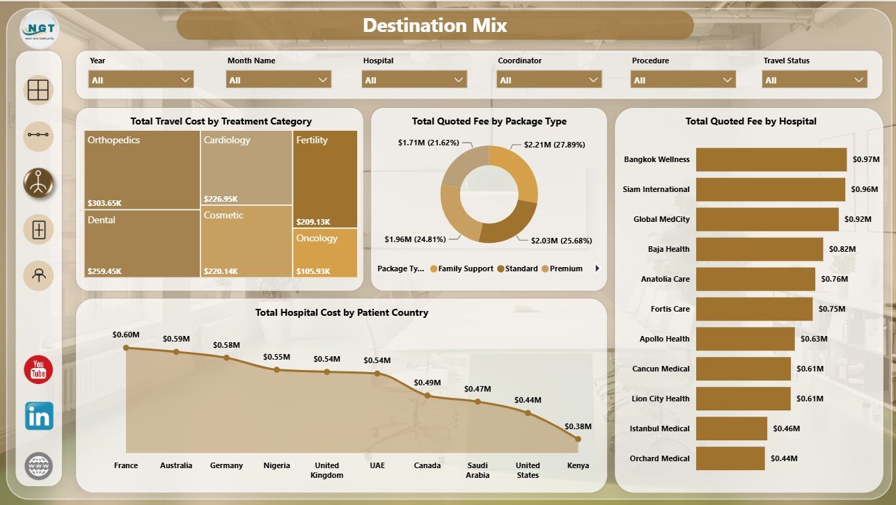
Destination Mix
4. Treatment Insights
The Treatment Insights page connects booked treatment demand, satisfaction, completion rate, and coordinator output. It helps teams improve patient experience and evaluate treatment category performance.
Booked Cases by Treatment Category: This chart compares booked cases by treatment category. It helps teams identify which treatments are converting into confirmed cases.
Average Satisfaction by Destination Country: This visual compares satisfaction across destinations. It helps managers monitor patient experience and destination quality.
Completion Rate by Destination Country: This chart shows completion reliability by destination. It helps reveal where coordination, provider process, or patient readiness may need attention.
Completed Cases by Coordinator: This visual compares completed case count by coordinator. It helps leaders review workload, follow-through, and operational ownership.
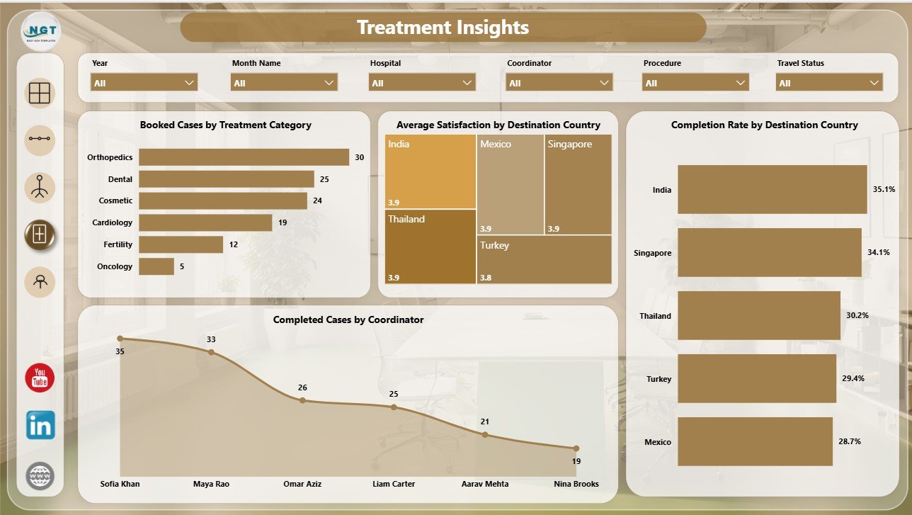
Treatment Insights
5. Coordinator Ops
The Coordinator Ops page brings referral channel bookings, travel status, coordinator quoted fee, and contribution margin together. It is helpful for monthly coordinator performance reviews.
Booked Cases by Referral Channel: This visual compares booked cases by source. It helps teams find referral channels that produce patients who move beyond inquiry.
Total Cases by Travel Status: This chart shows where patients are in the travel process. It helps coordinators track pre-travel, active travel, completed, delayed, or cancelled stages.
Total Quoted Fee by Coordinator: This chart compares quoted fee managed by coordinator. It helps leadership understand commercial workload and account ownership.
Contribution Margin by Month Name: This visual tracks margin movement over time. It helps finance teams see whether profitability is improving or weakening.
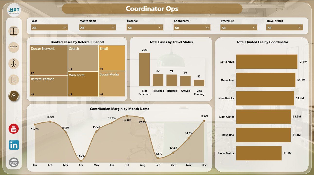
Coordinator Ops
Medical Tourism Dashboard in Power BI vs. Tableau vs. Paid CRM/SaaS – Feature Comparison
| Feature | This Power BI Dashboard | Tableau or Qlik Alternative | Paid Healthcare CRM/SaaS |
|---|---|---|---|
| Cost | $17.99 sale price | License plus report build time | Recurring subscription |
| Platform | Power BI Desktop / Power BI Service | Tableau, Qlik, or another BI tool | Vendor cloud platform |
| Setup time | Open PBIX, replace or connect data, refresh | Build or customize report pages | Implementation and onboarding |
| Real-time team collaboration | Available through Power BI Service when published | Available with cloud plans | Usually seat-based |
| Mobile access | Available through Power BI mobile after publishing | Plan dependent | Usually available |
| Customizable fields | Editable visuals, measures, model, and pages | Editable with BI skills | Limited by vendor settings |
| Share with link | Available through Power BI Service | Available with cloud publishing | Login controlled |
| Year-1 cost at 5 users | $17.99 plus Microsoft licensing if needed | License and development cost dependent | Often hundreds or thousands |
| Medical tourism analysis | Already structured across 5 report pages | Must be designed | Depends on module and export access |
Who Should Use This Template
This template is useful for medical tourism agencies, hospital international patient departments, healthcare travel coordinators, destination management partners, referral teams, finance analysts, and consultants. It works best when you already maintain structured data and need a Power BI reporting layer.
It is not a replacement for a CRM, booking engine, patient portal, billing system, hospital information system, payment processor, or clinical record system. Use it for reporting and analysis, not for managing private clinical workflows.
Real-World Use Cases
Agency owner: Reviews quoted fee, travel cost, hospital cost, and net contribution before deciding which destinations deserve more sales investment.
Coordinator manager: Uses the Case Pipeline and Coordinator Ops pages to monitor case status, booked cases, travel status, and coordinator workload.
Healthcare consultant: Uses the Destination Mix and Treatment Insights pages to advise clients on hospital partners, package types, treatment categories, satisfaction, and completion rate.
Advantages of Medical Tourism Dashboard in Power BI
The first advantage is speed. The report pages, cards, charts, slicers, and page structure are already built, so users do not need to start from a blank Power BI file.
The second advantage is interactivity. Power BI slicers and visuals allow users to explore the data by destination, treatment category, referral source, coordinator, month, and status.
The third advantage is flexibility. You can rename fields, change visuals, adjust measures, update colors, add pages, and adapt the dashboard to your own reporting language.
Opportunities for Improvement
This dashboard is an analytics template, not a live operating system. Teams that need automatic imports from CRM, hospital systems, call centers, billing tools, or finance systems may need Power Query, API work, database connectors, or a dedicated integration. Sensitive patient data should only be used according to your privacy, consent, and security rules.
Best Practices
- Keep country, hospital, treatment category, package type, referral channel, coordinator, case status, and travel status names consistent.
- Refresh the Power BI report after every data update.
- Review quoted fee and net contribution together so high revenue does not hide weak margin.
- Use completion rate and satisfaction together when reviewing destination quality.
- Publish to Power BI Service only when your data privacy rules allow it.
Explore Relevant Templates
You may also like Medical Tourism Dashboard in Excel, Medical Tourism KPI Dashboard in Power BI, and Home Healthcare KPI Dashboard in Power BI.
Browse more Power BI templates and Power BI Dashboard templates.
Frequently Asked Questions
What does the Medical Tourism Dashboard in Power BI track?
It tracks travel cost, quoted fee, hospital cost, net contribution, cases, booked cases, completed cases, case status, referral channel, treatment category, package type, hospital, patient country, destination country, satisfaction, completion rate, coordinator, travel status, and contribution margin.
Can I use my own data?
Yes. Replace the sample data or connect your prepared source data, then refresh the report in Power BI Desktop.
Do I need advanced Power BI skills?
No. Basic Power BI users can open the PBIX file, refresh the report, and use slicers. Advanced users can customize the data model, visuals, measures, and pages.
Does this replace a medical tourism CRM?
No. It is a reporting dashboard, not a CRM, booking system, payment gateway, or patient communication platform.
Can I publish it to Power BI Service?
Yes, if you have the required Microsoft licensing and your organization allows the data to be published under your privacy and security policy.
Can I customize the dashboard?
Yes. You can edit visuals, measures, fields, page names, colors, slicers, and model relationships in Power BI Desktop.
About the Author
Built by PK – Microsoft Certified Professional with 15+ years of Excel, Google Sheets, and Power BI experience. Founder of NextGenTemplates, reaching 300K+ subscribers across YouTube channels. Every template is hand-built and tested before release.
Conclusion
The Medical Tourism Dashboard in Power BI gives healthcare travel teams a practical way to review the case pipeline, destination mix, treatment demand, coordinator workload, costs, contribution, completion rate, and satisfaction without designing a PBIX report from zero. It is best for teams that want an editable Power BI reporting file they can refresh and adapt.
Download here: Medical Tourism Dashboard in Power BI
Visit our YouTube channel to learn step-by-step video tutorials.