The Peer to Peer Insurance Dashboard in Excel helps P2P insurance teams track 5 headline KPIs, 20 analysis charts, 5 dashboard pages, a Data sheet, and a Support sheet from one refreshable workbook. Peer-to-peer insurance models depend on member trust, reserve discipline, and fast claims handling; even a small delay in claim approval or payout review can change how policyholders judge the pool. This template gives founders, claims leads, and risk analysts an Excel-based way to review premiums, payouts, claims, fraud flags, reserves, channels, regions, and risk pools without rebuilding charts every month.
👉 Click here to purchase the Peer to Peer Insurance Dashboard in Excel
For teams using PivotTables, Microsoft recommends refreshing source-connected summaries after source data changes; this dashboard follows that practical workflow through Excel’s Refresh PivotTable data process.
Key Features of Peer to Peer Insurance Dashboard in Excel
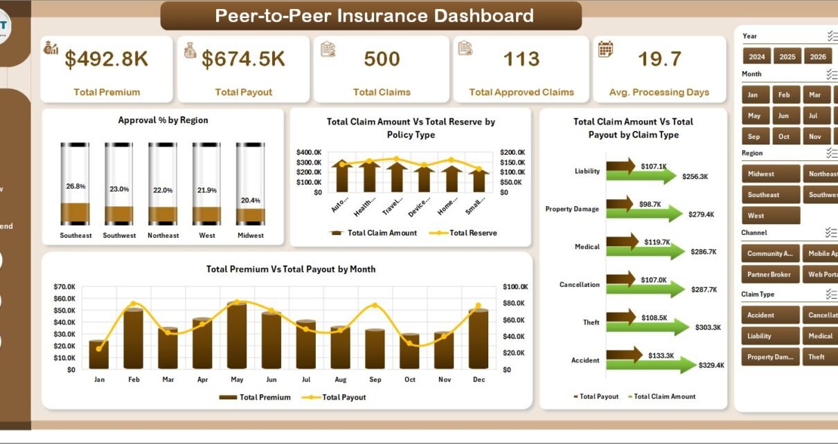
- 5 KPI cards: Total Premium, Total Payout, Total Claims, Total Approved Claims, and Avg. Processing Days.
- 5 analysis pages: Overview, Claims, Policy Mix, Risk Review, and Regional Trend.
- 20 chart views: Analyze approval rate, claim amount, reserve, payout, policy type, claim type, risk pool, customer segment, fraud flag, priority, region, channel, month, and year.
- Slicer-driven filtering: Review filtered dashboard views quickly instead of creating separate reports for every team request.
- Data sheet included: Add your records in the same format and refresh the workbook.
- Support sheet included: Pivot tables power the dashboard dynamically and can be hidden from business users.
Dashboard Pages Explanation
1. Overview Page
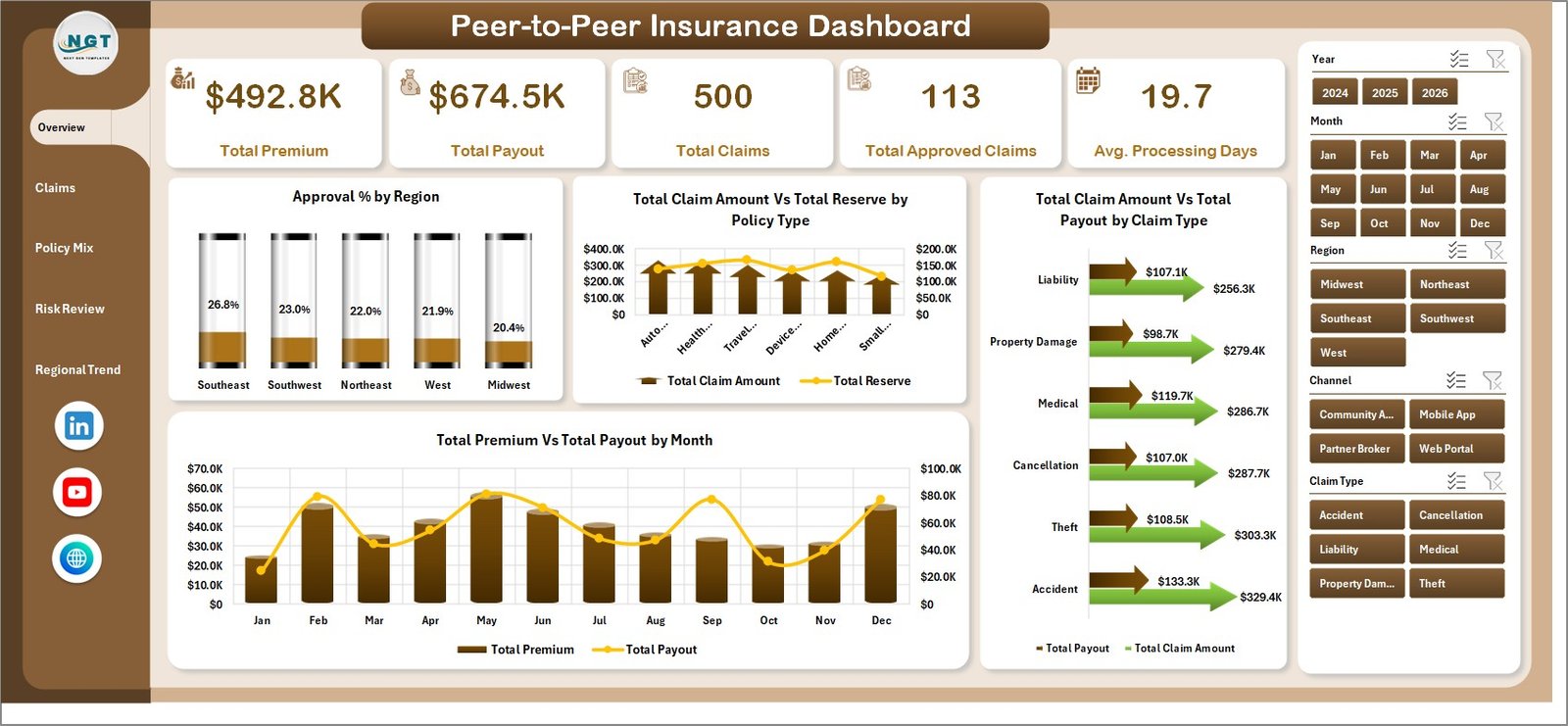
The Overview page gives the high-level picture of the insurance pool. The cards show Total Premium, Total Payout, Total Claims, Total Approved Claims, and Avg. Processing Days, so leadership can immediately compare incoming premium value with outgoing claim activity.
Approval % by Region: This chart shows how approval performance changes across regions. It helps managers identify locations where claims may need better documentation, review guidelines, or operational follow-up.
Total Claim Amount Vs Total Reserve by Policy Type: This comparison explains whether reserves are aligned with claim exposure for each policy type. It is useful for checking whether a policy category is absorbing more risk than expected.
Total Claim Amount Vs Total Payout by Claim Type: This view compares claimed value with paid value across claim types. Claims teams can use it to identify claim categories where settlement ratios need closer review.
Total Premium Vs Total Payout by Month: This monthly trend compares premium inflow against payout outflow. It helps a P2P insurance team monitor whether the pool is staying financially balanced over time.
2. Claims
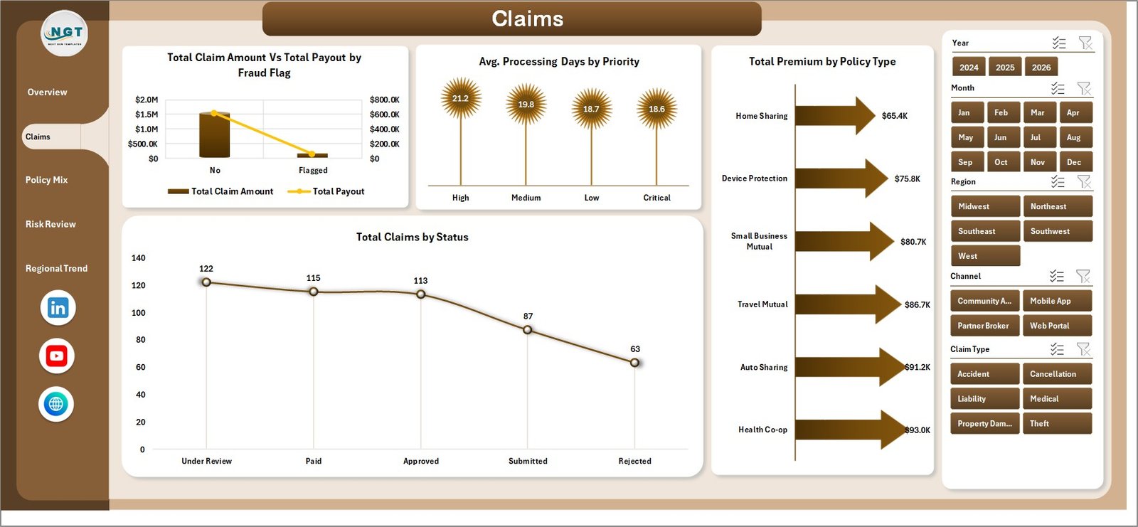
The Claims tab focuses on claim behavior, fraud review, priority handling, policy type premium contribution, and claim status movement.
Total Claim Amount Vs Total Payout by Fraud Flag: This chart compares claim values and payout values for flagged and non-flagged records. It helps reviewers see whether fraud flags are linked with different payment outcomes.
Avg. Processing Days by Priority: This chart shows how long claims take to process by priority level. It helps operations teams check whether urgent claims are actually moving faster than normal claims.
Total Premium by Policy Type: This chart shows which policy categories contribute the most premium. It helps leadership understand the business mix behind the claims results.
Total Claims by Status: This chart breaks down claim volume by status. It is useful for monitoring pending, approved, rejected, and other workflow stages.
3. Policy Mix
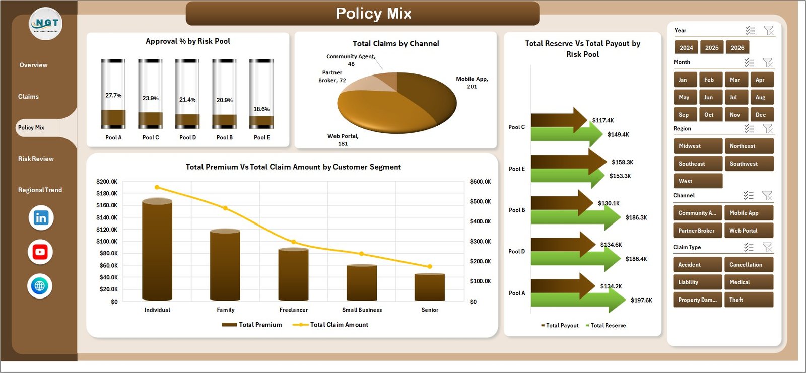
The Policy Mix tab explains the structure of the insurance portfolio by risk pool, channel, reserve, payout, customer segment, and claim exposure.
Approval % by Risk Pool: This chart shows approval performance across different risk pools. It helps identify pools where underwriting rules or member behavior may need closer review.
Total Claims by Channel: This chart shows where claims are coming from by channel. It can help teams compare broker, direct, online, partner, or other intake sources.
Total Reserve Vs Total Payout by Risk Pool: This comparison shows whether payouts are consuming reserves unevenly across pools. It helps risk teams spot areas where reserve planning may need adjustment.
Total Premium Vs Total Claim Amount by Customer Segment: This chart compares premium contribution with claim exposure by customer segment. It helps determine whether a segment is profitable, balanced, or claim-heavy.
4. Risk Review
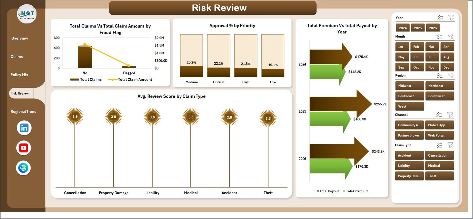
The Risk Review tab helps reviewers connect fraud flags, priority levels, year trends, and review scores with claims and payout performance.
Total Claims Vs Total Claim Amount by Fraud Flag: This chart shows both claim count and claim amount by fraud flag. It helps separate frequent low-value issues from fewer high-value risk cases.
Approval % by Priority: This chart shows how approval rates differ by priority level. It helps teams check whether high-priority cases are receiving consistent and fair outcomes.
Total Premium Vs Total Payout by Year: This yearly view compares premium inflow with payout outflow. It is useful for board reviews, annual planning, and reserve policy discussions.
Avg. Review Score by Claim Type: This chart shows average review quality or risk score by claim type. It helps analysts detect claim categories that require more documentation or scrutiny.
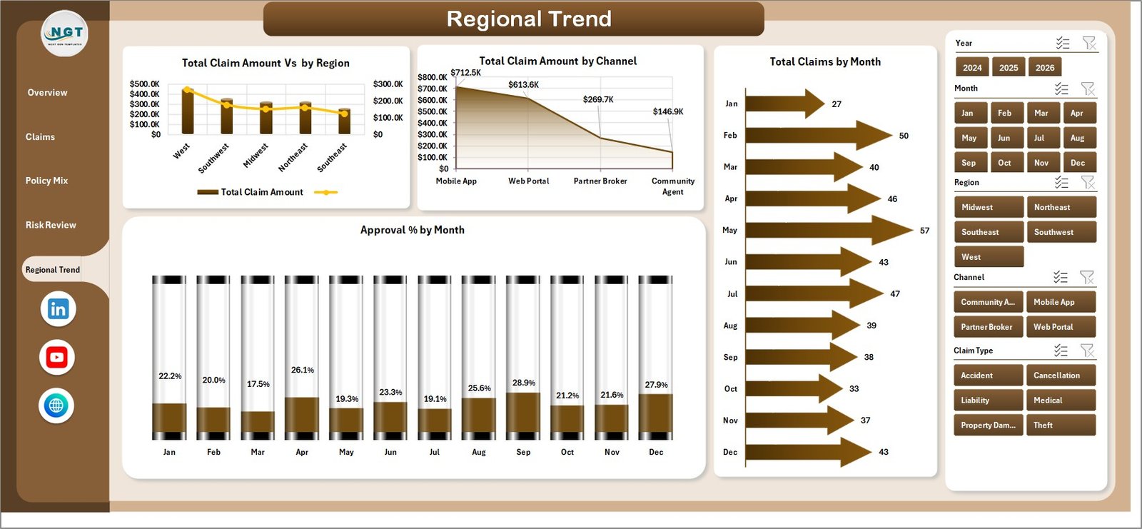
5. Regional Trend
The Regional Trend tab shows how claims and approval rates move by geography, channel, and month.
Total Claim Amount by Region: This chart highlights which regions carry the largest claim value. It helps leadership focus regional risk review where financial exposure is highest.
Total Claim Amount by Channel: This chart compares claim value by acquisition or claims channel. It helps identify channels that may need tighter screening or better member education.
Total Claims by Month: This chart tracks monthly claim volume. It helps teams see seasonality, unusual spikes, or operational workload trends.
Approval % by Month: This chart tracks monthly approval percentage. It helps managers spot whether claim approval behavior is changing over time.
6. Data Sheet Tab
The Data sheet is the input area. Add your insurance records in the same column format, including the fields used for premiums, payouts, claims, reserves, regions, channels, risk pools, policy types, priorities, statuses, months, years, and review scores.

7. Support Sheet
The Support sheet contains the pivot tables that drive the dashboard dynamically. After updating the Data sheet, go to the Data tab in the Excel Ribbon and click Refresh All. All pivots and charts will refresh, and you can keep this sheet hidden.

Peer to Peer Insurance Dashboard in Excel vs. Google Sheets vs. Paid CRM/SaaS – Feature Comparison
| Feature | Peer to Peer Insurance Dashboard in Excel | Google Sheets equivalent | Paid insurance SaaS |
|---|---|---|---|
| Cost | $17.99 one-time | Low template cost or internal build | Recurring subscription |
| Platform | Microsoft Excel | Google Sheets browser workspace | Vendor-hosted app |
| Setup time | Replace data and refresh | Requires building charts and formulas | Onboarding and configuration |
| Offline access | Yes | Limited | No |
| Customizable fields | Editable workbook | Editable spreadsheet | Depends on vendor plan |
| Share with link | Via OneDrive or file sharing | Native sharing | Account-based access |
| Year-1 cost at 5 users | $17.99 template cost | Template cost plus setup time | Often hundreds or thousands |
| Best fit | Internal insurance analytics and reporting | Cloud collaboration | Live operational claims management |
Who Should Use This Template
This dashboard is a good fit for peer-to-peer insurance startups, mutual aid groups, claims analysts, risk-pool managers, insurance brokers, insurtech consultants, and finance teams that need a practical Excel report for recurring claims and premium reviews.
It is not the right fit if you need a live policy administration system, automated claims adjudication, regulatory workflow controls, payment gateway integration, actuarial pricing models, or a member-facing portal.
Real-World Use Cases
Aisha, P2P insurance founder: Aisha uses the Overview and Regional Trend pages before the monthly member update to explain premium inflows, payouts, approved claims, and claim pressure by region.
Marco, claims operations lead: Marco checks the Claims and Risk Review tabs each week to see whether high-priority or fraud-flagged claims are taking too long to process.
Priya, risk analyst: Priya uses the Policy Mix page to compare premiums, claim amounts, reserves, payouts, and approval percentage by risk pool and customer segment.
Advantages of Peer to Peer Insurance Dashboard in Excel
- It gives small insurance teams a ready reporting structure without a long BI implementation.
- It works in Microsoft Excel, so many analysts can edit formulas, charts, and layouts themselves.
- It keeps sample-data replacement simple through a Data sheet and pivot-driven Support sheet.
- It separates overview reporting from claims, policy mix, risk review, and regional trend analysis.
- It supports quick management conversations around payout pressure, reserves, approval rates, and processing days.
Opportunities for Improvement
This dashboard is designed for descriptive reporting, not live insurance operations. It does not automatically connect to a policy system, claims portal, payment processor, fraud detection engine, or regulatory audit workflow. Teams with strict compliance requirements should review workbook access controls, data privacy rules, and file-sharing practices before using real customer data.
Best Practices
- Keep the Data sheet column headers unchanged so pivots refresh correctly.
- Refresh the workbook before every review meeting.
- Use consistent names for regions, channels, policy types, risk pools, and statuses.
- Hide the Support sheet before sharing the dashboard with non-technical users.
- Keep a clean backup copy of the original file before adding production data.
Explore Relevant Templates
Explore more Excel dashboard templates and MS Excel templates from NextGenTemplates. You may also find related reporting ideas in the Medical Practice Dashboard in Excel and Procurement Dashboard in Excel.
Frequently Asked Questions
What does the Peer to Peer Insurance Dashboard in Excel track?
It tracks premiums, payouts, claims, approved claims, processing days, claim amount, reserves, fraud flags, policy types, claim types, risk pools, channels, regions, months, years, and review scores.
Does the dashboard require VBA or macros?
No. The dashboard uses Excel sheets, PivotTables, charts, slicers, and refreshable workbook logic.
Can I replace the sample data?
Yes. Add your records to the Data sheet in the same format, then click Data > Refresh All in Excel.
Can I customize the charts and colors?
Yes. You can edit chart titles, colors, slicers, layouts, and pivot tables directly in Excel.
Is this a complete insurance management system?
No. It is a reporting dashboard, not a live policy administration, claims adjudication, or payment-processing system.
Who is this dashboard best for?
It is best for P2P insurance startups, claims analysts, risk-pool managers, insurance consultants, and finance teams that need recurring Excel-based reporting.
About the Author
Built by PK – Microsoft Certified Professional with 15+ years of Excel, Google Sheets, and Power BI experience. Founder of NextGenTemplates, reaching 300K+ subscribers across YouTube channels. Every template is hand-built and tested before release.
Conclusion
The Peer to Peer Insurance Dashboard in Excel gives a P2P insurance team a practical way to monitor premium, payout, claims, approval rate, fraud flag, reserve, channel, risk pool, and regional trends from a single workbook. It is simple enough for Excel users, detailed enough for management review, and flexible enough to adapt to your reporting cycle.
👉 Click here to purchase the Peer to Peer Insurance Dashboard in Excel
For step-by-step Excel tutorials, visit Youtube.com/@PKAnExcelExpert.
Last updated: July 21, 2026.